Picker

Pickers enable users to pick an option from a collapsible list of options, often used when the space is limited.
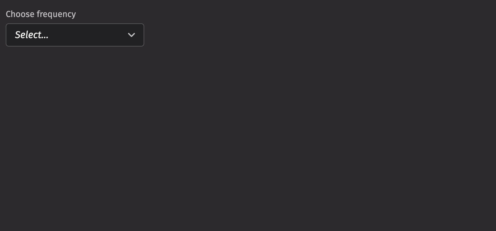
Example

from deephaven import ui


@ui.component
def ui_picker_basic():
    option, set_option = ui.use_state(None)

    return ui.picker(
        "Rarely",
        "Sometimes",
        "Always",
        label="Choose frequency",
        selected_key=option,
        on_selection_change=set_option,
    )


my_picker_basic = ui_picker_basic()

Picker Basic Example

UI recommendations

Recommendations for creating pickers:

  1. Every picker should have a label specified. Without one, the picker is ambiguous. In the rare case that context is sufficient, the label is unnecessary; you must still include an aria-label via the aria_label prop.
  2. Options in the picker should be kept short and concise; multiple lines are strongly discouraged.
  3. The picker’s width should be set so that the field button does not prevent options being displayed in full.
  4. The label, menu items, and placeholder text should all be in sentence case.
  5. A picker’s help text should provide actionable guidance on what to select and how to select it, offering additional context without repeating the label.
  6. When an error occurs, the help text specified in a picker should be replaced by error text.
  7. Write error messages in a concise and helpful manner, guiding users to resolve the issue. Error text should be 1-2 short, complete sentences ending with a period.

Data sources

We can use a Deephaven table as a data source to populate the options for pickers. A table automatically uses the first column as both the key and label. If there are duplicate keys, an error will be thrown; to avoid this, a select_distinct can be used on the table before using it as a picker data source.

from deephaven import ui
from deephaven.plot import express as dx

stocks = dx.data.stocks().select_distinct("Sym")

my_picker_table_source_example = ui.picker(stocks, label="Stock Symbol Picker")

If you wish to specify the keys and labels manually, you can use a ui.item_table_source to dynamically derive the options from a table.

from deephaven import ui, empty_table

icon_names = ["vsAccount"]
columns = [
    "Key=new Integer(i)",
    "Label=new String(`Display `+i)",
    "Icon=(String) icon_names[0]",
]
column_types = empty_table(20).update(columns)

item_table_source = ui.item_table_source(
    column_types,
    key_column="Key",
    label_column="Label",
    icon_column="Icon",
)

my_picker_item_table_source_example = ui.picker(item_table_source, label="User Picker")

Labeling

The picker can be labeled using the label prop. If no label is provided, an aria_label must be provided to identify the control for accessibility purposes.

from deephaven import ui


@ui.component
def ui_picker_label_examples():
    return [
        ui.picker(
            ui.item("Option 1"),
            ui.item("Option 2"),
            ui.item("Option 3"),
            label="Pick an option",
        ),
        ui.picker(
            ui.item("Option 1"),
            ui.item("Option 2"),
            ui.item("Option 3"),
            ui.item("Option 4"),
            aria_label="Pick an option",
        ),
    ]


my_picker_label_examples = ui_picker_label_examples()

The is_required prop and the necessity_indicator props can be used to show whether selecting an option in the picker is required or optional.

When the necessity_indicator prop is set to “label”, a localized string will be generated for “(required)” or “(optional)” automatically.

from deephaven import ui


@ui.component
def ui_picker_required_examples():
    return [
        ui.picker(
            ui.item("Option 1"),
            ui.item("Option 2"),
            ui.item("Option 3"),
            label="Pick an option",
            is_required=True,
        ),
        ui.picker(
            ui.item("Option 1"),
            ui.item("Option 2"),
            ui.item("Option 3"),
            ui.item("Option 4"),
            label="Pick an option",
            is_required=True,
            necessity_indicator="label",
        ),
        ui.picker(
            ui.item("Option 1"),
            ui.item("Option 2"),
            ui.item("Option 3"),
            ui.item("Option 4"),
            label="Pick an option",
            necessity_indicator="label",
        ),
    ]


my_picker_required_examples = ui_picker_required_examples()

Selection

In a picker, the default_selected_key or selected_key props set a selected option.

from deephaven import ui


@ui.component
def ui_picker_selected_key_examples():
    option, set_option = ui.use_state("Option 1")
    return [
        ui.picker(
            ui.item("Option 1"),
            ui.item("Option 2"),
            ui.item("Option 3"),
            default_selected_key="Option 2",
            label="Pick an option (uncontrolled)",
        ),
        ui.picker(
            ui.item("Option 1"),
            ui.item("Option 2"),
            ui.item("Option 3"),
            ui.item("Option 4"),
            selected_key=option,
            on_selection_change=set_option,
            label="Pick an option (controlled)",
        ),
    ]


my_picker_selected_key_examples = ui_picker_selected_key_examples()

Providing a value to the selected_key prop runs the component in “controlled” mode where the selection state is driven from the provided value. A value of None can be used to indicate nothing is selected while keeping the component in controlled mode. The default value is ui.types.Undefined, which causes the component to run in “uncontrolled” mode.

from deephaven import ui


@ui.component
def ui_picker_key_variations():
    controlled_value, set_controlled_value = ui.use_state(None)

    return [
        ui.picker(
            "Option 1",
            "Option 2",
            selected_key=controlled_value,
            on_change=set_controlled_value,
            label="Key: Controlled",
        ),
        ui.picker(
            "Option 1",
            "Option 2",
            on_change=lambda x: print(x),
            label="Key: Undefined",
        ),
    ]


my_picker_key_variations = ui_picker_key_variations()

HTML Forms

Pickers can support a name prop for integration with HTML forms, allowing for easy identification of a value on form submission.

from deephaven import ui


my_picker_name_example = ui.form(
    ui.flex(ui.picker(ui.item("Option 1"), ui.item("Option 2"), name="Sample Name"))
)

Sections

Picker supports sections that group options. Sections can be used by wrapping groups of items in a section element. Each section takes a title and key prop.

from deephaven import ui

my_picker_section_example = ui.picker(
    ui.section(ui.item("Option 1"), ui.item("Option 2"), title="Section 1"),
    ui.section(ui.item("Option 3"), ui.item("Option 4"), title="Section 2"),
)

Events

The Picker component supports selection through mouse, keyboard, and touch inputs via the on_selection_change prop, which receives the selected key as an argument.

from deephaven import ui


@ui.component
def ui_picker_event_example():
    value, set_value = ui.use_state("")
    return ui.form(
        ui.picker(
            ui.section(ui.item("Option 1"), ui.item("Option 2"), title="Section 1"),
            on_selection_change=set_value,
        )
    )


my_picker_event_example = ui_picker_event_example()

Complex items

Items within a picker can include additional content to better convey options. You can add icons, avatars, and descriptions to the children of an ui.item. When adding a description, set the slot prop to “description” to differentiate between the text elements.

from deephaven import ui

my_picker_complex_items_example = ui.picker(
    ui.item(
        ui.icon("vsGithubAlt"),
        ui.text("Github"),
        ui.text("Github Option", slot="description"),
        text_value="Github",
    ),
    ui.item(
        ui.icon("vsAzureDevops"),
        ui.text("Azure"),
        ui.text("Azure Option", slot="description"),
        text_value="Azure",
    ),
)

Loading

The is_loading prop displays a progress circle indicating that the picker is loading or processing data, which can be used to give immediate visual feedback to users. It also prevents users from interacting with the picker while data is loading, avoiding potential bad states.

from deephaven import ui


@ui.component
def ui_picker_loading_example():
    loading, set_loading = ui.use_state("loading")
    return ui.form(
        ui.picker(
            ui.section(ui.item("Option 1"), ui.item("Option 2"), title="Section 1"),
            is_loading=True if loading == "loading" else False,
        )
    )


my_picker_loading_example = ui_picker_loading_example()

Validation

The is_required prop ensures that the user selects an option. The related validation_behaviour prop allows the user to specify aria or native verification.

When the prop is set to “native”, the validation errors block form submission and are displayed as help text automatically.

from deephaven import ui


@ui.component
def ui_picker_validation_behaviour_example():
    return ui.form(
        ui.picker(
            ui.section(ui.item("Option 1"), ui.item("Option 2"), title="Section 1"),
            validation_behavior="native",
            is_required=True,
        )
    )


my_picker_validation_behaviour_example = ui_picker_validation_behaviour_example()

Label position

By default, the position of a picker’s label is above the picker, but it can be moved to the side using the label_position prop.

from deephaven import ui


@ui.component
def ui_picker_label_position_examples():
    return [
        ui.picker(
            ui.section(ui.item("Option 1"), ui.item("Option 2"), title="Section 1"),
            label="Test Label",
        ),
        ui.picker(
            ui.section(ui.item("Option 1"), ui.item("Option 2"), title="Section 1"),
            label="Test Label",
            label_position="side",
        ),
    ]


my_picker_label_position_examples = ui_picker_label_position_examples()

Quiet state

The is_quiet prop makes a picker “quiet”. This can be useful when the picker and its corresponding styling should not distract users from surrounding content.

from deephaven import ui


my_picker_is_quiet_example = ui.picker(
    ui.section(ui.item("Option 1"), ui.item("Option 2"), title="Section 1"),
    is_quiet=True,
)

Disabled state

The is_disabled prop disables a picker to prevent user interaction. This is useful when the picker should be visible but not available for selection.

from deephaven import ui


my_picker_is_disabled_example = ui.picker(
    ui.section(ui.item("Option 1"), ui.item("Option 2"), title="Section 1"),
    is_disabled=True,
)

Help text

A picker can have both a description and an error_message. Use the error message to offer specific guidance on how to correct the input.

The is_invalid prop can be used to set whether the current picker state is valid or invalid.

from deephaven import ui


@ui.component
def ui_picker_help_text_examples():
    return [
        ui.picker(
            ui.section(ui.item("Option 1"), ui.item("Option 2"), title="Section 1"),
            label="Sample Label",
            description="Enter a comment.",
        ),
        ui.picker(
            ui.section(ui.item("Option 1"), ui.item("Option 2"), title="Section 1"),
            label="Sample Label",
            is_invalid=False,
            error_message="Sample invalid error message.",
        ),
        ui.picker(
            ui.section(ui.item("Option 1"), ui.item("Option 2"), title="Section 1"),
            label="Sample Label",
            is_invalid=True,
            error_message="Sample invalid error message.",
        ),
    ]


my_picker_help_text_examples = ui_picker_help_text_examples()

Contextual help

Using the contextual_help prop, a ui.contextual_help can be placed next to the label to provide additional information about the picker.

from deephaven import ui


picker_contextual_help_example = ui.picker(
    ui.section(ui.item("Option 1"), ui.item("Option 2"), title="Section 1"),
    label="Sample Label",
    contextual_help=ui.contextual_help(ui.heading("Content tips")),
)

Custom width

The width prop adjusts the width of a picker, and the max_width prop enforces a maximum width.

from deephaven import ui


@ui.component
def ui_picker_width_examples():
    return [
        ui.picker(
            ui.section(ui.item("Option 1"), ui.item("Option 2"), title="Section 1"),
            width="size-3600",
        ),
        ui.picker(
            ui.section(ui.item("Option 1"), ui.item("Option 2"), title="Section 1"),
            width="size-3600",
            max_width="100%",
        ),
    ]


my_picker_width_examples = ui_picker_width_examples()

Align and direction

The align prop sets the text alignment of the options in the picker, while the direction prop specifies which direction the menu will open.

It is important to note that the popover will not open in the set direction if there is not enough room to open in that direction.

from deephaven import ui


@ui.component
def ui_picker_alignment_direction_examples():
    return ui.flex(
        ui.picker(
            ui.section(ui.item("Option 1"), ui.item("Option 2"), title="Section 1"),
            align="end",
            menu_width="size-3000",
        ),
        ui.picker(
            ui.section(ui.item("Option 1"), ui.item("Option 2"), title="Section 1"),
            direction="top",
        ),
        gap="size-150",
        direction="column",
        padding=40,
    )


my_picker_alignment_direction_examples = ui_picker_alignment_direction_examples()

The open state of the picker menu can be controlled through the is_open and default_open props.

from deephaven import ui


@ui.component
def ui_picker_open_state_examples():
    open, set_open = ui.use_state(False)
    return [
        ui.picker(
            ui.section(ui.item("Option 1"), ui.item("Option 2"), title="Section 1"),
            is_open=open,
            on_open_change=set_open,
        ),
        ui.picker(
            ui.section(ui.item("Option 1"), ui.item("Option 2"), title="Section 1"),
            default_open=True,
        ),
    ]


my_picker_open_state_examples = ui_picker_open_state_examples()

API Reference

A picker that can be used to select from a list. Children should be one of five types:

  1. If children are of type Item, they are the dropdown options.
  2. If children are of type SectionElement, they are the dropdown sections.
  3. If children are of type Table, the values in the table are the dropdown options.

Returns: BaseElement The rendered Picker.

ParametersTypeDefaultDescription
*childrenstr |
int |
float |
bool |
BaseElement |
Element |
Table |
PartitionedTable |
ItemTableSource
The options to render within the picker.
default_selected_keystr |
int |
float |
bool |
None
NoneThe initial selected key in the collection (uncontrolled).
selected_keystr |
int |
float |
bool |
None |
UndefinedType
<deephaven.ui.types.types.UndefinedType object>The currently selected key in the collection (controlled).
is_quietbool |
None
NoneWhether the TextField should be displayed with a quiet style
alignLiteral['start', 'end']'start'Alignment of the menu relative to the input target.
directionLiteral['bottom', 'top']'bottom'Direction in which the menu should open relative to the Picker.
should_flipboolTrueWhether the menu should flip when it reaches the viewport boundaries.
menu_widthstr |
float |
None
NoneWidth of the menu. By default, matches width of the trigger. Note that the minimum width of the dropdown is always equal to the trigger's width.
auto_focusbool |
None
NoneWhether the input should be focused on render.
auto_completestr |
None
NoneDescribes the type of autocomplete functionality the input should provide if any.
namestr |
None
NoneName of the input, used when submitting an HTML form.
is_openbool |
None
NoneSets the open state of the menu.
default_openbool |
None
NoneSets the default open state of the menu.
is_disabledbool |
None
NoneWhether the Picker is disabled.
is_requiredbool |
None
NoneWhether user input on the Picker is required before form submission.
is_invalidbool |
None
NoneWhether the Picker is in an invalid state.
validation_behaviorLiteral['aria', 'native'] |
None
NoneWhether to use native HTML form validation to prevent form submission when the value is missing or invalid, or mark the field as required or invalid via ARIA.
descriptionElement |
None
NoneA description for the field. Provides a hint such as specific requirements for what to choose.
error_messageElement |
None
NoneAn error message for the field.
labelNone |
bool |
int |
str |
Element |
List[NodeType]
NoneA label for the field.
placeholderstr |
None
NonePlaceholder text for the input.
is_loadingbool |
None
NoneWhether the Picker is in a loading state.
label_positionLiteral['top', 'side']'top'The label's overall position relative to the element it is labeling.
label_alignLiteral['start', 'end'] |
None
NoneThe label's horizontal alignment relative to the element it is labeling.
necessity_indicatorLiteral['icon', 'label'] |
None
NoneWhether the required state should be shown as an icon or text.
contextual_helpElement |
None
NoneA ContextualHelp element to place next to the label.
keystr |
None
NoneA unique identifier used by React to render elements in a list.