Table
Tables are wrappers for Deephaven tables that allow you to change how the table is displayed in the UI and handle user events.
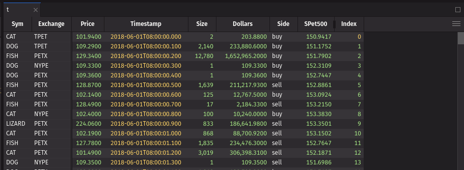
Example
UI recommendations
- It is not necessary to use a UI table if you do not need any of its properties. You can just use the Deephaven table directly.
- Use a UI table to show properties like filters as if the user had created them in the UI. Users can change the default values provided by the UI table, such as filters.
- UI tables handle ticking tables automatically, so you can pass any Deephaven table to a UI table.
Table data source
The first argument to ui.table is the table data source. This can be any Deephaven table, a URI to a table, or a string which will be resolved as a URI. See the URI Element documentation for more information on how to use URIs with UI elements.
Formatting
You can format the table using the format_ prop. This prop takes a ui.TableFormat object or list of ui.TableFormat objects. ui.TableFormat is a dataclass that encapsulates the formatting options for a table. The full list of formatting options can be found in the API Reference.
Formatting rows and columns
Every formatting rule may optionally specify cols and if_ properties. The cols property is a column name or list of column names to which the formatting rule applies. If cols is omitted, then the rule will be applied to the entire row. The if_ property is a Deephaven formula that indicates a formatting rule should be applied conditionally. The if_ property must evaluate to a boolean. If if_ is omitted, then the rule will be applied to every row. These may be combined to apply formatting to specific columns only when a condition is met.
Note
The if_ property is a Deephaven formula evaluated in the engine. You can think of it like adding a new boolean column using update_view.
The following example shows how to format the Sym and Exchange columns with a red background and white text when the Sym is DOG.
Formatting rule priority
The last matching formatting rule for each property will be applied. This means the lowest priority rules should be first in the list with higher priority rules at the end.
In the following example, the Sym column will have a red background with white text, and the rest of the table will have a blue background with white text.
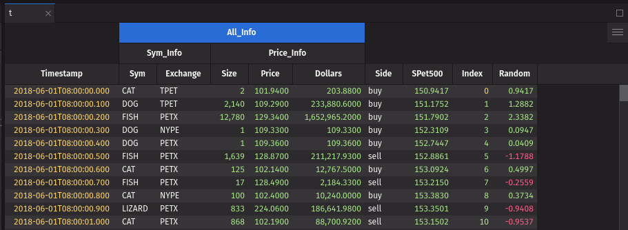
Formatting values from a column source
Any string value for a formatting rule can be read from a column by specifying the column name as the value. Note that if a value matches a column name, it will always be used (i.e., the theme color positive can not be used as a direct value if there is also a column called positive). The following example sets the background_color of column x using the value of the bg_color column.
Formatting color
Formatting rules for colors support theme colors, hex colors, or any valid CSS color (e.g., red, #ff0000, rgb(255, 0, 0)). It is recommended to use Deephaven theme colors when possible to maintain a consistent look and feel across the UI. Theme colors will also automatically update if the user changes the theme.
Formatting text color
The color property sets the text color of the cell. If a cell has a background_color, but no color set, the text color will be set to black or white depending on which contrasts better with the background color. Setting the color property will override this behavior.
The following example will make all text the foreground color except the Sym column, which will be white. In dark mode, the foreground color is white, and in light mode, it is black. In light mode, the Sym column will be nearly invisible because it is not a theme color.
Formatting background color
The background_color property sets the background color of the cell. Setting the background_color without setting color will result in the text color automatically being set to black or white based on the contrast with the background_color.
The following example will make all the background color what is usually the foreground color. This means the table will have a white background with black text in dark theme and a black background with white text in light theme. The Sym column text will be the accent color in both themes.
Formatting numeric values
Warning
Datetime values are considered numeric. If you provide a default format for numeric values, it will also apply to datetime values. It is recommended to specify cols when applying value formats.
Numeric values can be formatted using the value property. The value property is a string that follows the GWT Java NumberFormat syntax. If a numeric format is applied to a non-numeric column, it will be ignored.
This example will format the Price and Dollars columns with the dollar sign, a comma separator for every 3 digits, 2 decimal places, and a minimum of 1 digit to the left of the decimal point. The Random column will be formatted with 3 decimal places and will drop the leading zero if the absolute value is less than 1.
Formatting datetime and timestamp values
Datetime and timestamp values can be formatted using the value property. The value property is a string that follows the GWT Java DateTimeFormat syntax with additional support for nanoseconds. You may provide up to 9 S characters after the decimal to represent partial seconds down to nanoseconds.
The following example formats the Timestamp column to show the short date of the week, day of the month, short month name, full year, hours, minutes, seconds, and microseconds with the user selected timezone.
Formatting cell text alignment
You can control text alignment using the alignment property. This property accepts the values left, center, and right, overriding the default alignment based on the column type. By default, numeric columns are right-aligned, string columns are left-aligned, and date columns are center-aligned.
Formatting databars
Table databars provide a visual representation of numeric data directly within table cells, making it easy to compare values at a glance. Databars appear as horizontal bars behind or alongside cell values.
To add a databar, set the mode of a ui.TableFormat to ui.TableDatabar(). The cols prop specifies which column(s) should display the databar.
Value Column
The value_column prop allows you to use a different column’s values for calculating the databar length while displaying the original column’s values. This is useful for log-scaled visualizations or when displaying formatted text with calculated bar lengths.
Scale Configuration
The min and max props control the scaling of databars. These can be set to fixed values or reference other columns for dynamic scaling.
By default these props will change to the min and max of the values in the column.
Axis Configuration
The axis prop controls how the zero point is positioned within the databar.
Options:
"proportional"(default): relative to the min and max of the values"middle": always centered, regardless of values in column"directional": left-most or right-most, dependent ondirectionprop. The sign of the value is ignored, and the databar will show the magnitude of the value (i.e., -7 and 7 are the same).
Direction
The direction prop controls which direction the databar grows from its zero point.
Options:
"LTR": (left to right, default)"RTL": (right to left)
Value Placement
The value_placement prop controls how cell values are displayed relative to the databar.
Options:
"beside"(default): to the right of the databar"overlap": on top of the databar"hide": not displayed
Color
The color prop defines the databar’s color scheme. Use single colors for uniform appearance or color arrays for gradients.
Opacity
The opacity prop controls the transparency of databars, accepting values from 0.0 (fully transparent) to 1.0 (fully opaque).
Markers
The markers prop adds reference lines or thresholds to databars. Each marker requires a value (column name or constant) and color.
Aggregations
You can add aggregation rows to the table using ui.TableAgg with the aggregations prop. These will be shown as floating rows at the top or bottom of the table and account for any user-applied filters. The aggregations_position prop determines if aggregations are shown at the top or bottom of the table and defaults to the bottom. The full list of aggregations can be found in the “Aggregate Columns” section in the table sidebar menu and in our JavaScript API docs.
Aggregations will be applied to all columns that can use the chosen aggregation unless cols or ignore_cols are provided. If cols is provided, only the specified columns will be aggregated. If ignore_cols is provided, all columns which can be aggregated except those specified will be aggregated.
The following example show aggregations of the first row for each column, the last row for the Timestamp column, and the sum of all columns which can be summed except Index and Random. One table shows the aggregations at the bottom, and the other shows the aggregations at the top.
Events
Press Events
You can listen for different user press events on a ui.table. There is both a press and double_press event for row, cell, and column. These events typically correspond to a click or double click on the table. The event payloads include table data related to the event. For row and column events, the corresponding data within the viewport will be sent to the event handler. The viewport is typically the visible area ± a window equal to the visible area (e.g., if rows 5-10 are visible, rows 0-15 will be in the viewport). Data specified via always_fetch_columns is also included.
Note that there is no row index in event data because the row index is not a safe way to reference a row between the client and server since the user could have manipulated the table, resulting in a different client order.
A double_press event will be preceded by 2 press events with the same data.
The following example shows how to listen for the different events and prints the event data to the console.
Selection Events
The on_selection_change event is triggered when the user selects or deselects a row. The event data will contain all selected rows within the viewport as a list of dictionaries keyed by column name. There are a few caveats to the selection event.
- The event will only send data from columns in the
always_fetch_columnsprop. - The event will only send data from rows that are visible in the viewport.
- The event will not be triggered if a ticking table row is replaced or shifted. This may cause what the user sees after row shifts to differ from the selection event data.
With these caveats in mind, it is highly recommended that the on_selection_change event be used only with static tables. It is also recommended to only use this event for relatively small actions where you can see all selected rows at once.
Always fetching some columns
Deephaven only fetches data for visible rows and columns within a window around the viewport (typically the viewport plus 1 page in all directions). This reduces the amount of data transferred between the server and client and allows tables with billions of rows to be displayed. Sometimes you may need to always fetch columns, such as a key column for a row press event. You can use the always_fetch_columns prop to specify columns that should always be fetched regardless of their visibility.
The always_fetch_columns prop takes a single column name, a list of column names, or a boolean to always fetch all columns. The data for these columns is included in row event data (e.g., on_row_press) and context menu callbacks.
When using event callbacks, include any columns referenced in the callback in always_fetch_columns to prevent undefined columns when users hide columns or scroll beyond the viewport.
Warning
Setting always_fetch_columns to True will fetch all columns and can be slow for tables with many columns.
This example shows how to use always_fetch_columns to always fetch the Sym column for a row press event. Without the always_fetch_columns prop, the press callback will fail because the Sym column is not fetched when hidden.
Context menu
Items can be added to the bottom of the ui.table context menu (right-click menu) by using the context_menu or context_header_menu props. The context_menu prop adds items to the cell context menu, while the context_header_menu prop adds items to the column header context menu. You can pass either a single dictionary for a single item or a list of dictionaries for multiple items.
Menu items must have a title and either an action or actions prop. They may have an icon, which is the name of the icon that will be passed to ui.icon.
The action prop is a callback that is called when the item is clicked and receives info about the cell that was clicked when the menu was opened.
The following example shows how to add a context menu item to the table and column header. When the context menu item is clicked, both actions print the cell’s data.
Sub-menus
The actions prop is an array of menu items that will be displayed in a sub-menu. If you specify actions, you cannot specify an action for the menu item. The action will be to show the sub-menu. Sub-menus can contain other sub-menus for deeply nested menus.
The following example shows how to add a context menu item and a nested menu item to the table. When the context menu item is clicked, the actions print the data of the cell.
Dynamic menu items
Menu items can be dynamically created by passing a function as the context item. The function will be called with the data of the cell that was clicked when the menu was opened, and must return the menu items or None if you do not want to add context menu items based on the cell info.
The following example shows how to create a context menu item dynamically so that it appears only on the sym column. If a list of functions is provided, each will be called, and any items they return will be added to the context menu.
Column order and visibility
You can freeze columns to the front of the table using the frozen_columns prop. Frozen columns will always be visible on the left side of the table, even when the user scrolls horizontally. The frozen_columns prop takes a list of column names to freeze.
You can also pin columns to the front or back of the table using the front_columns and back_columns props. Pinned columns will be moved to the front or back of the table and will not be moveable by the user. These columns will still scroll off the screen if the user needs to scroll horizontally. The front_columns and back_columns props take a list of column names to pin.
Columns can also be hidden by default using the hidden_columns prop. Note that users can still expand these columns if they want to see them. The columns will be collapsed by default. The hidden_columns prop takes a list of column names to hide.
Column display names
You can set custom display names for columns using the column_display_names prop. The column_display_names prop takes a dictionary where the key is the column name and the value is the display name. The display name can be any string, so this can be used to show a user-friendly name that does not adhere to column naming rules.
Grouping columns
Columns can be grouped visually using the column_groups prop. Columns in a column group are moved so they are next to each other, and a header spanning all columns in the group is added. Columns can be rearranged within a group, but they cannot be moved outside of the group without using the table sidebar menu.
The column_groups prop takes a list of dictionaries, each representing a column group. Each dictionary must have a name and children prop.
The name prop is the name of the column group. Column group names must follow the same guidelines as column names. Group names should be unique among all column names and group names.
The children prop is a list of column names or groups that belong to the group. Any columns or groups should only ever be listed as children in one group.
The color prop is optional and sets the color of the column group header.
Column groups may be nested by including the name of another group in the children list of a group.
The following example shows how to group columns and nest groups.
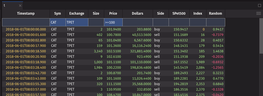
Quick filters
Quick filters are an easy way to filter the table while also showing the user what filters are currently applied. These filters are applied on the server via request from the client, so users may change the filters without affecting other users. Unlike a where statement to filter a table on the server, quick filters can be easily changed by the user.
Quick filters may be preferred if you have multiple servers or workers hosting your data. If, for example, the table is on another Deephaven instance, performing a where operation on the table may require copying all of the data from the host server into the server running Deephaven UI. With a quick filter, the filter can instead be applied directly on the server hosting the table.
Quick filters can be added to the table using the quick_filters prop. The quick_filters prop takes a dictionary where the key is the column and the value is the filter to apply.
The quick filter bar can be expanded by default with the show_quick_filters prop.
Reverse
The table can be displayed in reverse order using the reverse prop. Using the reverse prop visually indicates to the user that the table is reversed via a colored bar under the column headers. Users can disable the reverse with the column header context menu or via a shortcut. The reverse is applied on the server via request from the client.
API Reference
Table
Customization to how a table is displayed, how it behaves, and listen to UI events.
Returns: None The rendered Table.
| Parameters | Type | Default | Description |
|---|---|---|---|
| table | Table | UriElement | str | The table to wrap. May be a UriElement or URI string. | |
| format_ | TableFormat | list[TableFormat] | None | None | A formatting rule or list of formatting rules for the table. |
| always_fetch_columns | str | list[str] | bool | None | None | The columns to always fetch from the server regardless of if they are in the viewport. If True, all columns will always be fetched. This may make tables with many columns slow. |
| quick_filters | dict[str, str] | None | None | The quick filters to apply to the table. Dictionary of column name to filter value. |
| show_quick_filters | bool | False | Whether to show the quick filter bar by default. |
| aggregations | TableAgg | list[TableAgg] | None | None | An aggregation or list of aggregations to apply to the table. These will be shown as a floating row at the bottom of the table by default. |
| aggregations_position | Literal['bottom', 'top'] | None | None | The position to show the aggregations. One of "top" or "bottom". "bottom" by default. |
| show_grouping_column | bool | True | Whether to show the grouping column by default for rollup tables. |
| show_search | bool | False | Whether to show the search bar by default. |
| reverse | bool | False | Whether to reverse the table rows. Applied after any sorts. |
| front_columns | list[str] | None | None | The columns to pin to the front of the table. These will not be movable by the user. |
| back_columns | list[str] | None | None | The columns to pin to the back of the table. These will not be movable by the user. |
| frozen_columns | list[str] | None | None | The columns to freeze by default at the front of the table. These will always be visible regardless of horizontal scrolling. The user may unfreeze columns or freeze additional columns. |
| hidden_columns | list[str] | None | None | The columns to hide by default. Users may show the columns by expanding them. |
| column_groups | list[ColumnGroup] | None | None | Columns to group together by default. The groups will be shown in the table header. Group names must be unique within the column and group names. Groups may be nested by providing the group name as a child of another group. |
| column_display_names | dict[str, str] | None | None | A dictionary of column names to an alternate display name. E.g. {"column1": "Column 1", "column2": "C2"}. |
| density | Literal['compact', 'regular', 'spacious'] | None | None | The density of the data displayed in the table. One of "compact", "regular", or "spacious". If not provided, the app default will be used. |
| context_menu | ContextMenuActionItem | ContextMenuSubmenuItem | Callable[[ContextMenuActionParams], ContextMenuActionItem | ContextMenuSubmenuItem | List[ContextMenuActionItem | ContextMenuSubmenuItem] | None] | list[ContextMenuActionItem | ContextMenuSubmenuItem | Callable[[ContextMenuActionParams], ContextMenuActionItem | ContextMenuSubmenuItem | List[ContextMenuActionItem | ContextMenuSubmenuItem] | None]] | None | None | The context menu items to show when a cell is right clicked. May contain action items or submenu items. May also be a function that receives the cell data and returns the context menu items or None. |
| context_header_menu | ContextMenuActionItem | ContextMenuSubmenuItem | Callable[[ContextMenuActionParams], ContextMenuActionItem | ContextMenuSubmenuItem | List[ContextMenuActionItem | ContextMenuSubmenuItem] | None] | list[ContextMenuActionItem | ContextMenuSubmenuItem | Callable[[ContextMenuActionParams], ContextMenuActionItem | ContextMenuSubmenuItem | List[ContextMenuActionItem | ContextMenuSubmenuItem] | None]] | None | None | The context menu items to show when a column header is right clicked. May contain action items or submenu items. May also be a function that receives the column header data and returns the context menu items or None. |
| key | str | None | None | A unique identifier used by React to render elements in a list. |
TableAgg
An aggregation for a table.
Returns: None The TableAgg configuration.
| Parameters | Type | Default | Description |
|---|---|---|---|
| agg | Literal['AbsSum', 'Avg', 'Count', 'CountDistinct', 'Distinct', 'First', 'Last', 'Max', 'Min', 'Std', 'Sum', 'Unique', 'Var'] | The name of the aggregation to apply. | |
| cols | str | list[str] | None | None | The columns to aggregate. If None, the aggregation will apply to all applicable columns not in ignore_cols. Can only be used if ignore_cols is not specified. |
| ignore_cols | str | list[str] | None | None | The columns to ignore when aggregating. Can only be used if cols is not specified. |
TableFormat
A formatting rule for a table.
Returns: None The TableFormat.
| Parameters | Type | Default | Description |
|---|---|---|---|
| cols | str | list[str] | None | None | The columns to format. If None, the format will apply to the entire row. Required when using mode=TableDatabar() |
| if_ | str | None | None | Deephaven expression to filter which rows should be formatted. Must resolve to a boolean. |
| value | str | None | None | Format string for the cell value. E.g. "0.00%" to format as a percentage with two decimal places. |
| mode | TableDatabar | None | None | The cell rendering mode. Currently only databar is supported as an alternate rendering mode. |
TableDatabar
A databar configuration for a table.
Returns: None The TableDatabar.
| Parameters | Type | Default | Description |
|---|---|---|---|
| value_column | str | None | None | Name of the column to use as the value for the databar. If not provided, the databar will use the column value.This can be useful if you want to display a databar with a log scale, but display the actual value in the cell. In this case, the value_column would be the log of the actual value. |
| min | str | float | None | None | Minimum value for the databar. Defaults to the minimum value in the column.If a column name is provided, the minimum value will be the value in that column. If a constant is provided, the minimum value will be that constant. |
| max | str | float | None | None | Maximum value for the databar. Defaults to the maximum value in the column.If a column name is provided, the maximum value will be the value in that column. If a constant is provided, the maximum value will be that constant. |
| axis | Literal['proportional', 'middle', 'directional'] | None | None | Whether the databar 0 value should be proportional to the min and max values, in the middle of the cell, or on one side of the databar based on direction. |
| direction | Literal['LTR', 'RTL'] | None | None | The direction of the databar. |
| value_placement | Literal['beside', 'overlap', 'hide'] | None | None | Placement of the value relative to the databar. |
| markers | list[dict[str, Any]] | None | None | List of marker lines to display on the databar. |