Real-time tables in Jupyter. Finally.
Enhance your Jupyter experiences with the Deephaven widget
August 12 2022


Jupyter is a ubiquitous tool for data scientists and Python analysts. Its workflows for exploration, linear development, and sharing are intuitive and powerful. Further, packages like matplotlib, seaborn, ggplot and others turn their notebooks into visual tools.
But what if data is streaming? What if output on the screen changes in real time?
No problem. You can now see ticking, updating, and other dynamic data in a widget in Jupyter. Crypto prices, system performance metrics, clickstream analytics, and IoT output in real time!
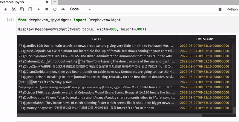
For example, below is a real-time table sourced from Twitter's API, producing an updating count of particular words:
Note
Free access to the Twitter API is no longer available. However, the code and concepts in this blog are still valid for users with a paid developer account.
Sounds awesome. But how?
Building ticking tables is very easy and requires just a few lines of code!
First of all, we need to install deephaven-server and deephaven-ipywidgets:
Now we can launch the JupyterLab application and start the Deephaven server by running the following code in a cell:
Then, we need to create a table to store our dynamic data. For this application, we'll use DynamicTableWriter.
Now, let's pull some live data using Twitter streaming API and fill our table tweet_table with tweets:
Click to see the code!
Using the Deephaven table widget, you can easily view this live data right in your Jupyter notebook! All you need is just to pass the table name into a DeephavenWidget:
Optionally, you can also pass in the width and height you'd like the widget to be:
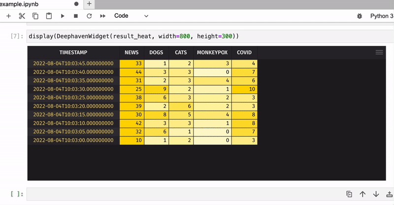
Now let's count the total number of keyword occurrences in tweets for five-second windows and apply color formatting to see the most popular keywords:
Click to see the code!
That was just an example of how to use Deephaven's table widget in JupyterLab - what you will do with your real-time data is totally up to you!
Please contact us on Slack if you have any questions or feedback.