

If you’ve ever worked with large volumes of raw data, you’ve likely dealt with annoying outliers and crowded graphs. This noise can make analysis challenging and obscure trends in data. Some of these problems can be avoided by cleaning your data. One of my favorite ways to do so is by using deciles. A decile is just a simple method of splitting up a ranked set of data into 10 equally large subsections. This categorizes large sets of ordered data into smaller subsections that can be analyzed independently.
To then summarize your data, all you have to do is average over each subsection. This results in 10 data points that nicely represent your data trends. These averaged deciles can be plotted, transforming graphs into ones that are much simpler and easier to interpret.
Reducing noise with a few lines of code
There are a few easy steps to calculate this type of decile analysis.
- First, sort the data on the independent variable (x-axis).
- Then, separate your values into 10 equally sized groups, which will be your deciles.
- Then, average all the x- and y-values that fall into the same decile
- Finally, plot those 10 averaged values.
In Deephaven, you only need a few lines of code:
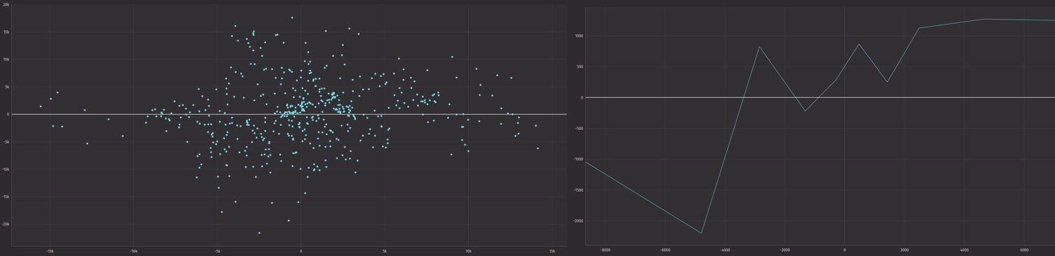
In my current project, I’m looking at cryptocurrencies and their momentums. I want to see if a common momentum trading strategy applies in the crypto world. Consequently, I’ve acquired a lot of raw financial data. A simple scatter plot of momentum signal vs future price change looked like this:
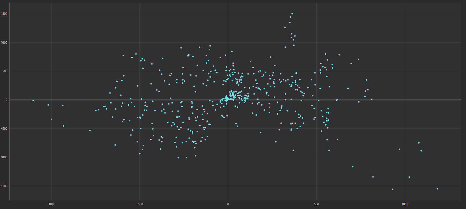
As you can see, this graph was quite unhelpful. There is just too much noise, and it’s hard to see any reasonable trends. So, to clean up this data, I made a decile plot. Using the decile code above, I made average deciles easily.
Then, with my 10 averaged decile data points, all I had to do was simply graph it.
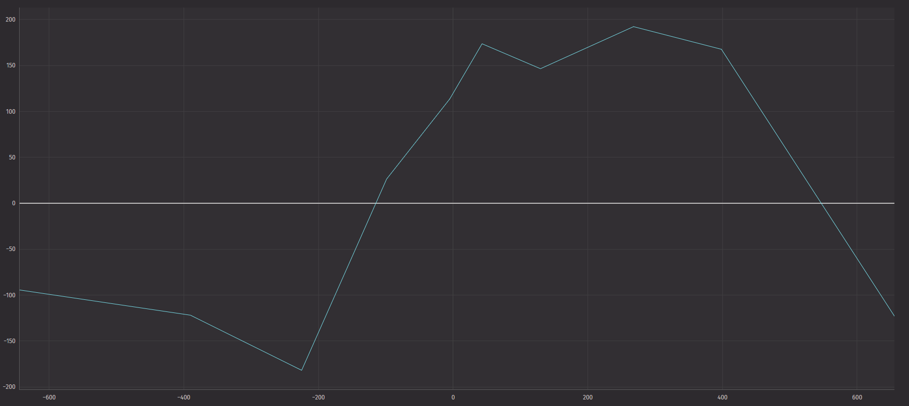
This graph is much better for human analysis than my original raw graph.
Averaging over the deciles reduces noise in the trends. Interpreting the data is instantly more manageable.
While this does sacrifice a large volume of data points, you can see general trends that would otherwise be hard to see. This is only one example of the utility of deciles when working with raw, noisy data. No matter your project, deciles as an analysis tool can be vital to discovering new trends. So, if you want to analyze large amounts of data efficiently, look no further than Deephaven and its vast toolset.