deephaven.ui
A Python web framework for building real-time data-focused apps
deephaven.ui is a plugin for Deephaven that combines a reactive UI framework and a library of pre-built real-time data-focused components for creating data apps. Write scripts entirely in Python – no front-end engineering Javascript or CSS required. It uses a React-like approach to building components and rendering them in the UI, allowing for the creation of reactive components that can be re-used and composed together, as well as reacting to user input from the UI.
Key Features
- Components: Create user interfaces from components defined entirely with Python.
- Live dataframe aware: Components are live dataframe aware and can use Deephaven tables as a data source.
- Reactive: UI components automatically update when the underlying Python data changes.
- Declarative: Describe the UI as a function of the data and let the framework handle the rest.
- Composable: Combine and re-use components to build complex interfaces.
- Wide range of components: From simple text fields to complex tables and plots, the library has a wide range of components to build your app.
Getting Started
You can run the example Docker container with either of the following commands, depending on your Deephaven version:
You’ll need to find the link to open the UI in the Docker logs:

Using components
Get started by importing the deephaven.ui package as ui:
The ui package contains many components, which you can display in the UI:
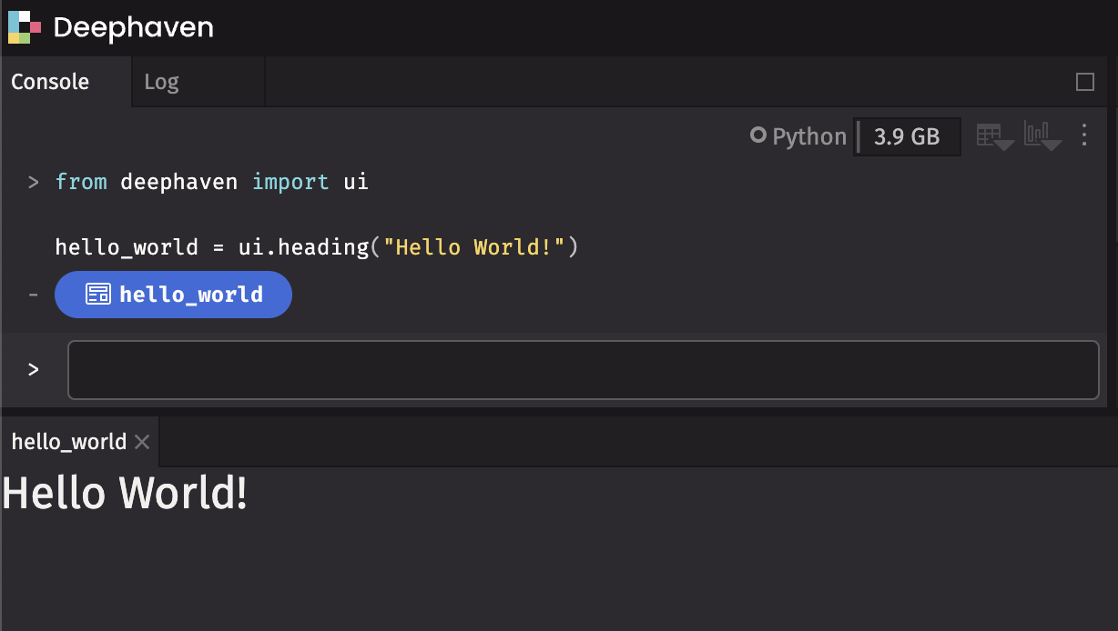
By assigning the component to the hello_world variable, it displays in the UI in a panel named hello_world.
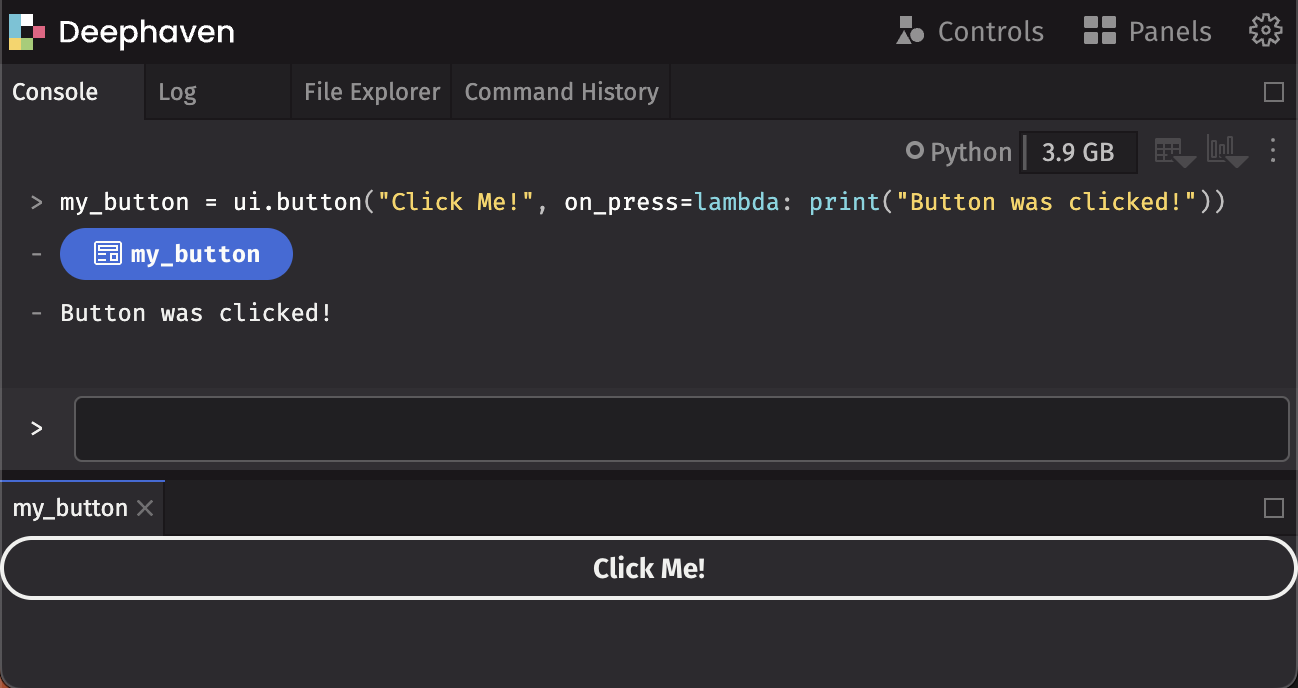
Handling events
Write functions to handle events. To write a button that will print event details to the console when clicked:
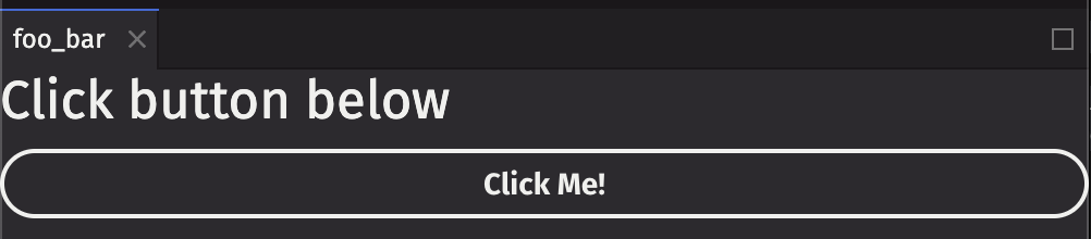
Creating components
Use the @ui.component decorator to create your own custom components. This decorator wraps the function provided as a Deephaven component. For more details on the architecture, see Architecture documentation.
We can display a heading above a button as our custom component:
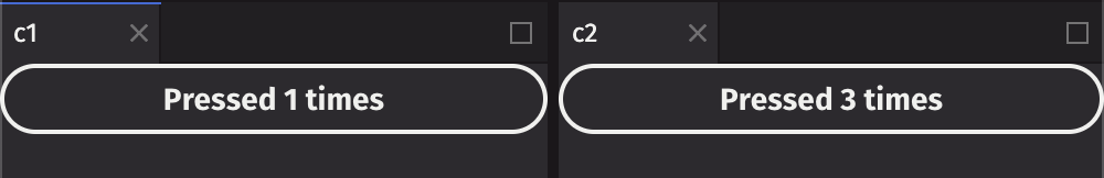
Using state
Often, you’ll want to react to the button presses and update the display. For example, to count the number of times a button has been pressed, use ui.use_state to introduce a state variable in your custom component:
Returned from ui.use_state is a tuple with two values: the current state (count), and a function to update that state (set_count).
The first time the button is displayed, the count will be 0 because that is the initial value passed into ui.use_state. Call set_count to update the state:
When state is updated, deephaven.ui will call your component again to re-render with the new value. After clicking once, it will re-render with count set to 1, then set to 2, and so on.
Each individual component has its own state:
Note
Functions prefixed with use_ are called hooks. use_state is built-in to deephaven.ui, and there are other hooks built-in shown below. You can also create your own hooks.
Hooks are special functions. They must only be used at the top of a @ui.component or another hook. If you want to use one in a conditional or a loop, extract that logic to a new component and put it there.
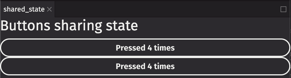
Sharing state
In the previous example, the two buttons incremented their counter independently. State was stored within the counter components:
What if we wanted to have two buttons share the same count? To do this, move the state count upward to a parent component:
In the example below, we create a parent component ui_shared_state that contains the state, and then passes the state down into two ui_controlled_counter components. Now the buttons will always be in sync:
Examples
Below are some examples building custom components using deephaven.ui.
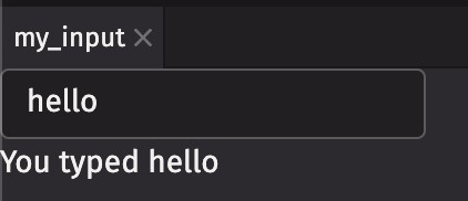
Text field (string)
You can create a TextField that takes input from the user. You can also use a Flex component to display multiple components in a row (or column, depending on the direction argument).
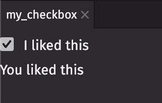
Checkbox (boolean)
You can use a checkbox to get a boolean value from the user.
ActionGroup (string values)
An ActionGroup is a grouping of ActionButtons that are related to one another.
ActionMenu (string values)
ActionMenu combines an ActionButton with a Menu for simple “more actions” use cases.
ButtonGroup
ButtonGroup handles overflow for a grouping of buttons whose actions are related to each other.
RadioGroup
Radio buttons allow users to select a single option from a list of mutually exclusive options. All possible options are exposed up front for users to compare.
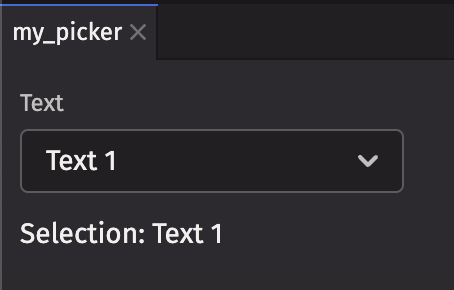
Picker (string values)
The ui.picker component can be used to select from a list of items. Here’s a basic example for selecting from a list of string values and displaying the selected key in a text field.
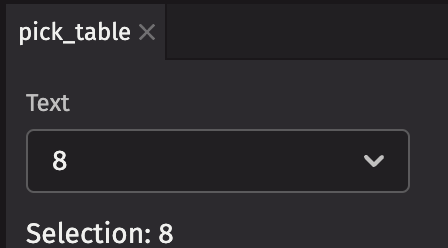
Picker (table)
A picker can also take a Table. It will use the first column as the key and label by default.
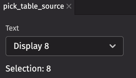
Picker (item table source)
A picker can also take an item_table_source. It will use the columns specified.
ComboBox (string values)
The ui.combo_box component can be used to select from a list of items. It also provides a search field to filter available results. Note that the search behavior differs slightly for different data types.
- Numeric types - only support exact match
- Text-based data types - support partial search matching
- Date types support searching by different date parts (e.g.
2024,2024-01,2024-01-02,2024-01-02 00,2024-07-06 00:43,2024-07-06 00:43:14,2024-07-06 00:43:14.247)
Here’s a basic example for selecting from a list of string values and displaying the selected key in a text field.
ComboBox (item table source)
A combo_box can also take an item_table_source. It will use the columns specified.
ListView (string values)
A list view that can be used to create a list of selectable items. Here’s a basic example for selecting from a list of string values and displaying the selected key in a text field.
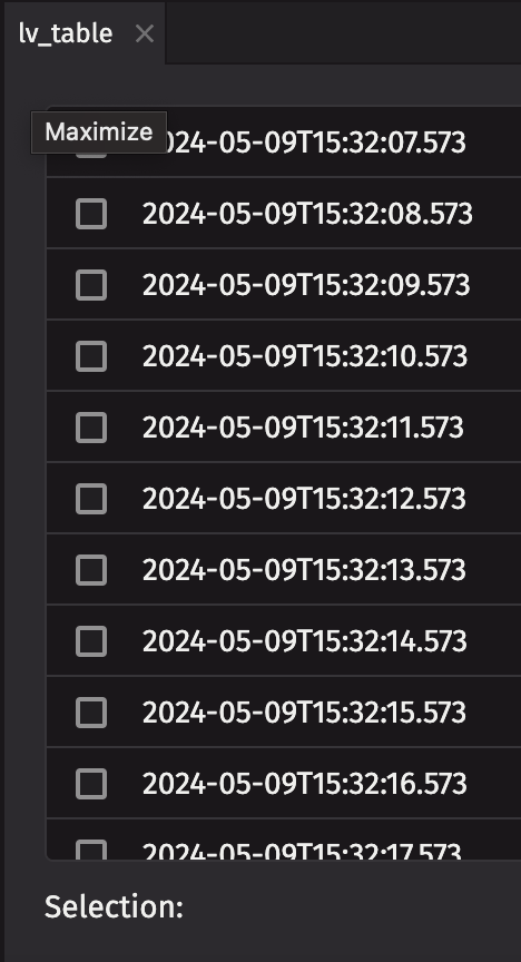
ListView (table)
A ListView can also take a Table. By default, it uses the first column as the key and label.
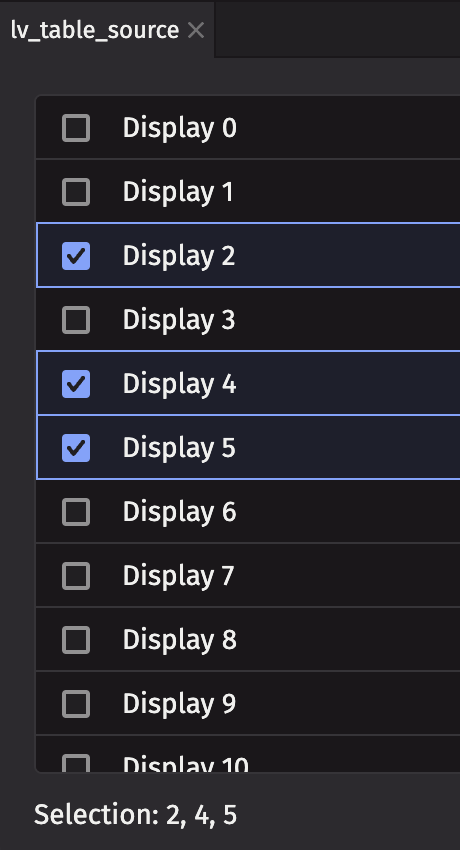
ListView (item table source)
A list view can also take an item_table_source. It will use the columns specified.
ListView (list action group)
A list view can take a list_action_group as its actions prop.
ListView (list action menu)
A list view can take a list_action_menu as its actions prop.
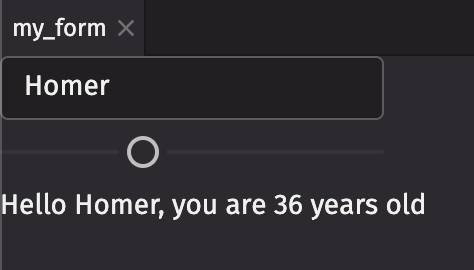
Form (two variables)
You can have state with multiple different variables in one component. This example creates a text field and a slider, and we display the values of both of them.
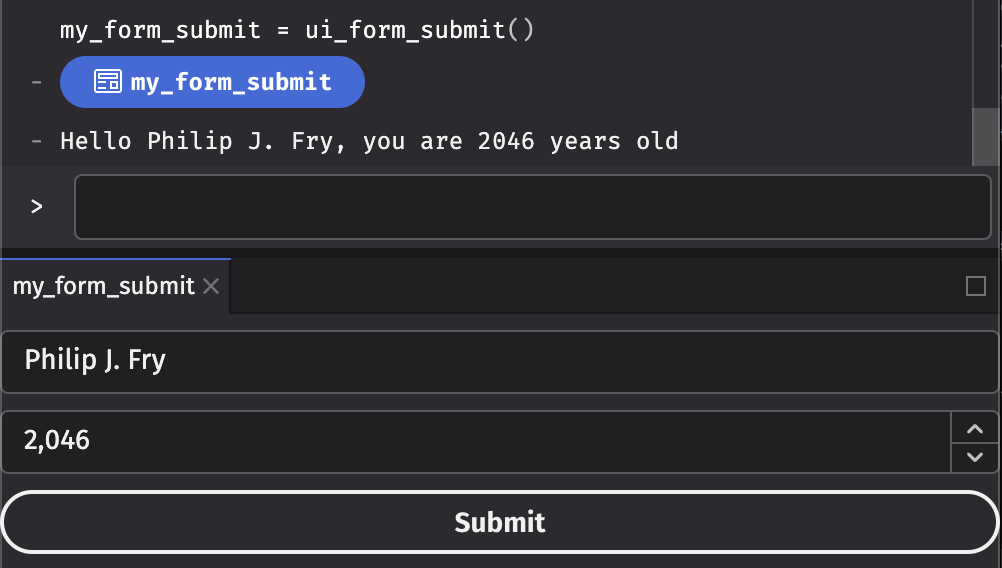
Form with submit
You can also create a form on which the user can click Submit and react to that on a specified callback. In this example, we create a Form that takes a name and age, and when the user clicks Submit, the values entered in the form are sent to the user on the form’s on_submit callback.
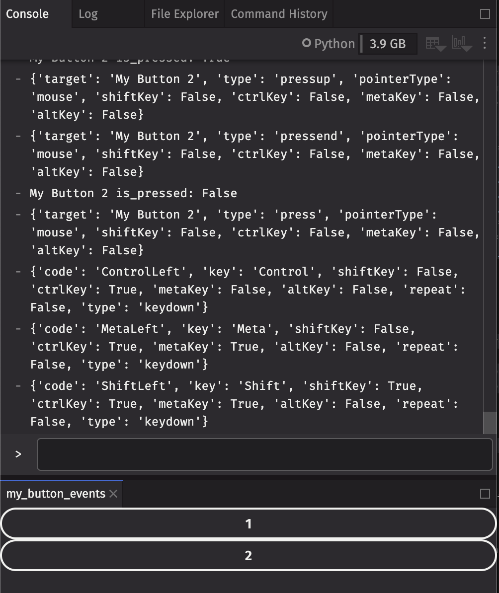
Button events
Included with events are many details about the action itself, e.g. modifier keys held down, or the name of the target element. In this example, we create a custom component that prints all press, key, and focus events to the console, and add two of them to a panel to show interaction with both of them (e.g. when focus switches from one button to another):
Data Examples
Many of the examples below use the stocks table provided by deephaven.plot.express package:
Table with input filter
User input can filter a table using the where method. In this example, a text field takes input from the user, and we filter the table based on the input. Simply returning the table t from the component will display it in the UI (as if we had set it to a variable name).
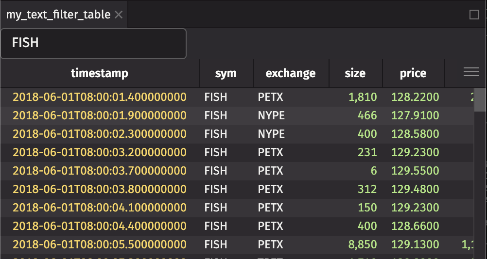
Table with range filter
You can also filter a table based on a range. In this example, a range slider takes input from the user, and we filter the table by price based on the input. Simply returning the table t from the component will display it in the UI (as if we had set it to a variable name).
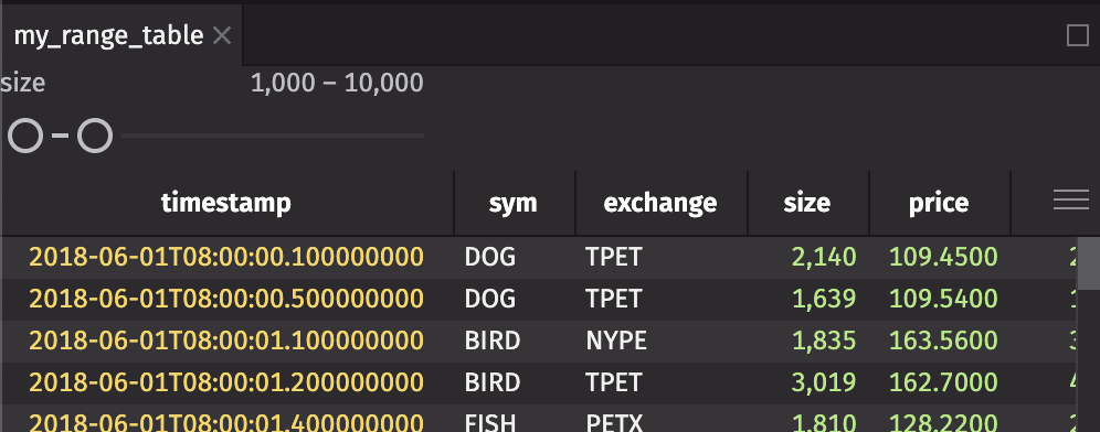
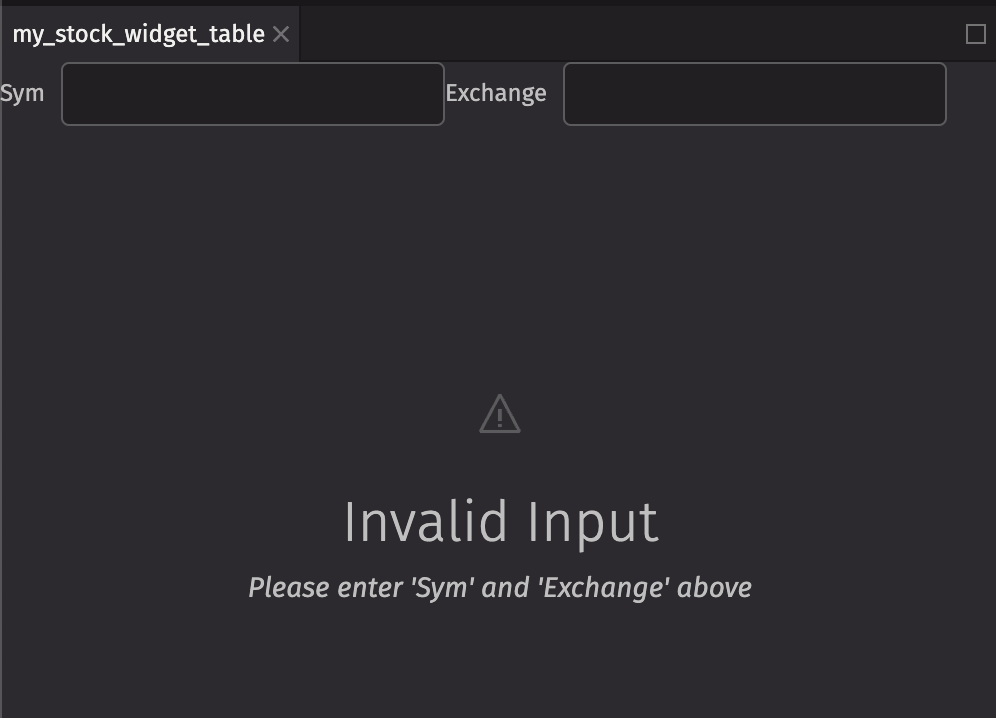
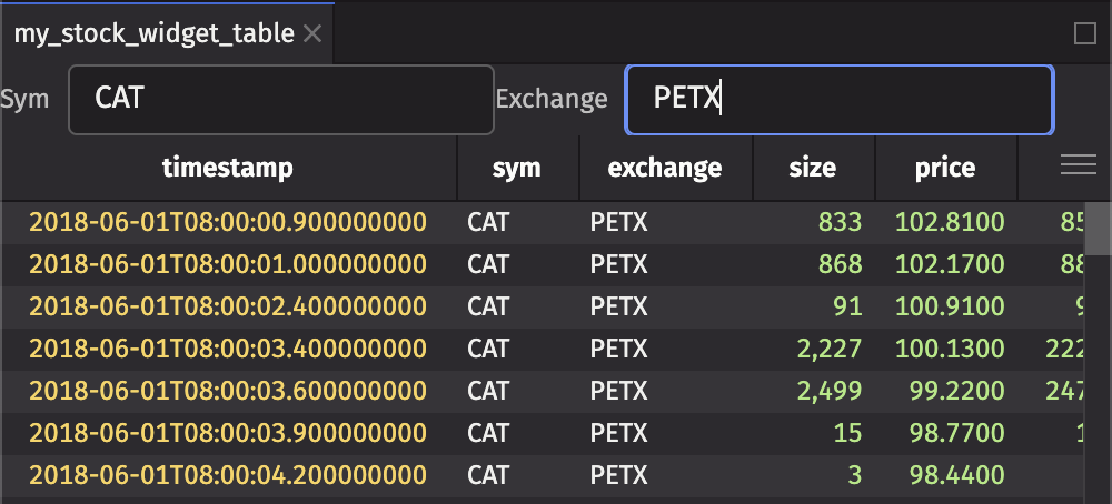
Table with required filters
In the previous example, we took a user’s input. Nothing was displayed if the user didn’t enter any text. Instead, we can display a different message prompting the user for input. We use a few new components in this example:
- IllustratedMessage (ui.illustrated_message): A component that displays an icon, heading, and content. In this case, we display a warning icon, a heading, and some content.
- Icon (ui.icon): A component that displays an icon. In this case, we display the warning icon, and set the font size to 48px so it appears large in the UI.
- Flex (ui.flex): A component that displays its children in a row. In this case, we display the input text fields beside eachother in a row.
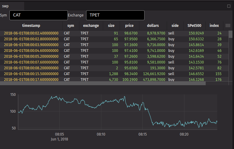
Plot with filters
You can also do plots as you would expect.
Dashboard Examples
In addition to creating components, you can also create dashboards that display many components laid out how you prefer.
Dashboard Layout Elements
The dashboard layout elements available are:
ui.dashboard: Create a dashboard to contain other layout elements.ui.column: Create a column of elements stacked vertically.ui.row: Create a row of elements laid out horizontally.ui.stack: Create a stack of panels on top of each other. You can use the panel tab to switch between panels in the stack. Only one panel in a stack is visible at a time.ui.panel: Create a panel to wrap an element. Panels can be moved around a dashboard manually by dragging the panel tab.
ui.dashboard
A dashboard should only contain 1 root layout element. If the component for the dashboard returns an array of elements, they will be wrapped in a single root element. If there are multiple child elements of a dashboard, they will be wrapped as follows:
- If there are any rows, they will be wrapped in a column.
- If there are no rows and any columns, they will be wrapped in a row.
- If there are no rows or columns, they will be wrapped in a column.
ui.row and ui.column
Rows and columns typically contain other rows and columns or stacks. If a row or column contains no other rows or columns, each element will be wrapped in a stack if needed. For example, if you create a row with two panels, those panels will be laid out side by side in their own stacks.
ui.stack
Stacks are used to create a stack of panels on top of each other. Any elements in a stack will be wrapped in a panel if needed. It is recommended to provide the panels with a title because the automatically wrapped panels will receive a title of “Untitled”.
Basic Dashboard
Putting that all together, we can create a dashboard with two tables across the top and one plot across the bottom:
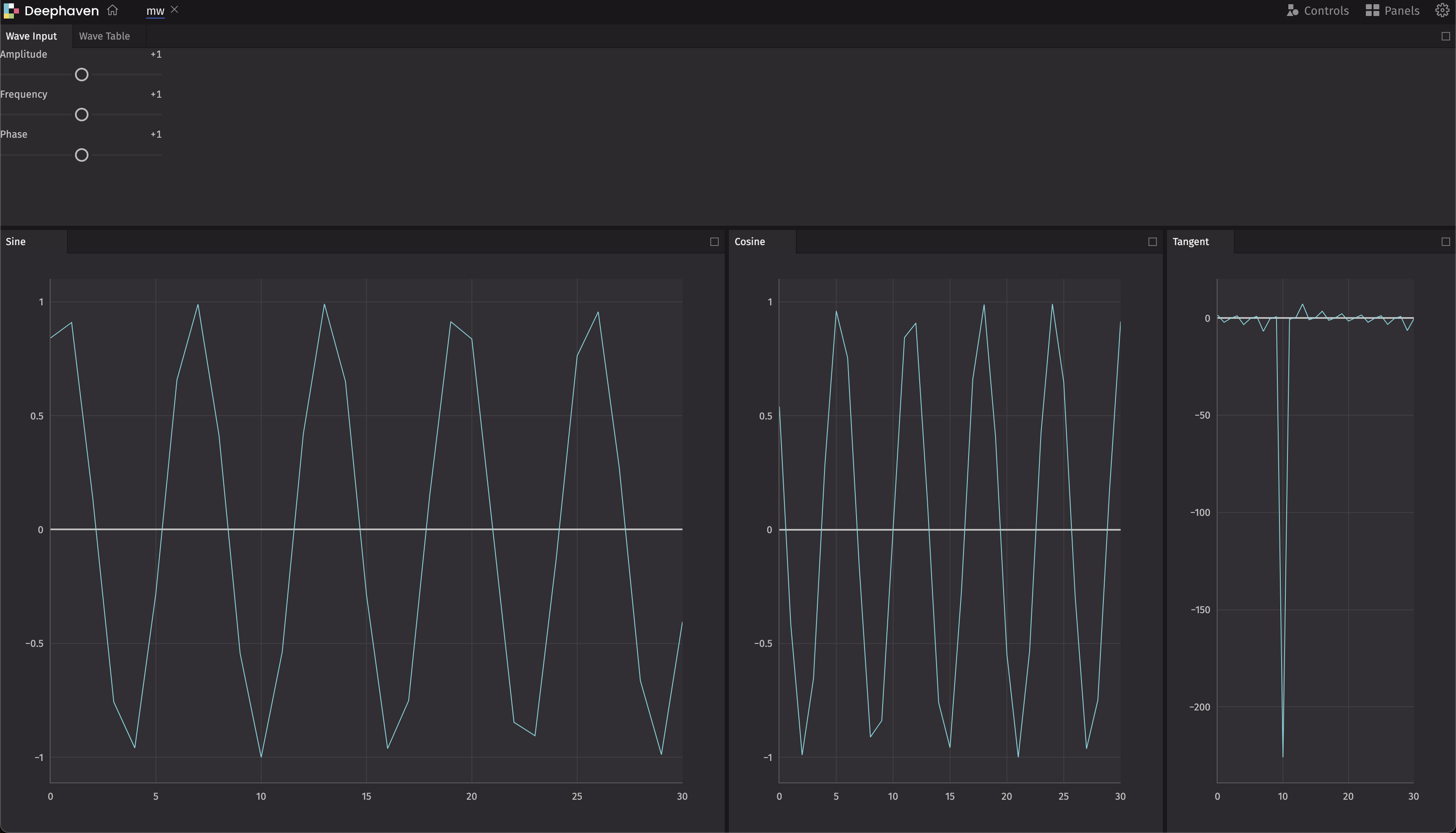
Custom Components Dashboard
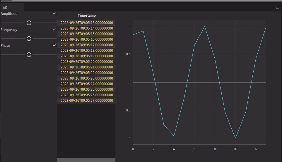
We can also create our own components and add them to a dashboard. In this example, we create one panel that will be used as the control input for selecting the phase, frequency, and amplitude of a wave. We then display multiple plots to show the different types of waves:
Other Examples
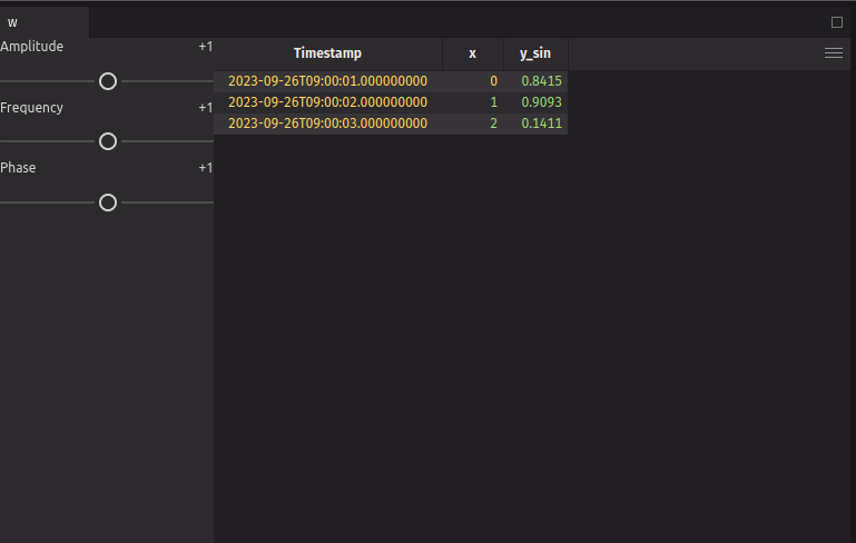
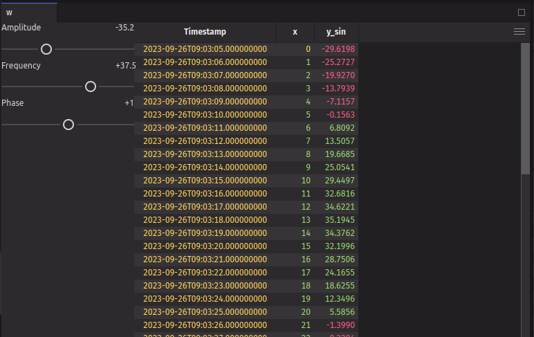
Memoization
We can use the use_memo hook to memoize a value. This is useful if you have a value that is expensive to compute and you only want to compute it when the inputs change. In this example, we create a time table with a new column, y_sin, which is a sine wave. We use use_memo to memoize the time table, so that it is only re-computed when the inputs to the use_memo function change (in this case, the function is a lambda that takes no arguments, so it will only re-compute when the dependencies change, which is never). We then use the update method to update the table with the new column, based on the values inputted on the sliders.
Custom hook
We can write custom hooks that can be re-used. In this example, we create a custom hook that creates an input panel that controls the amplitude, frequency, and phase for a wave. We then use this custom hook in our waves component.
We can then re-use that hook to make a component that displays a plot as well:
Using Panels
When you return an array of elements, they automatically get created as individual panels. You can use the ui.panel component to name the panel.
Re-using components
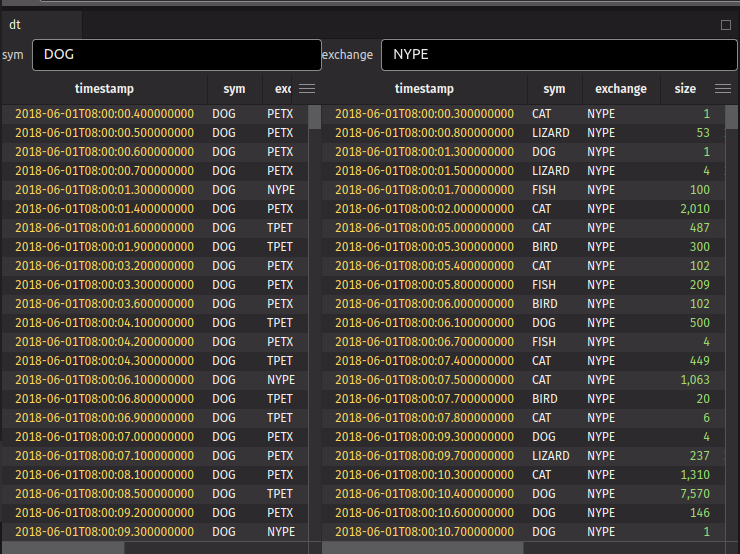
In a previous example, we created a text_filter_table component. We can re-use that component, and display two tables with an input filter side-by-side:
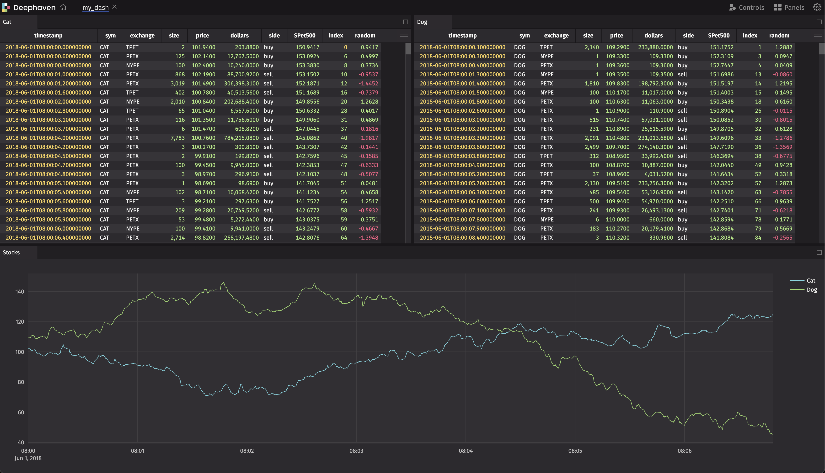
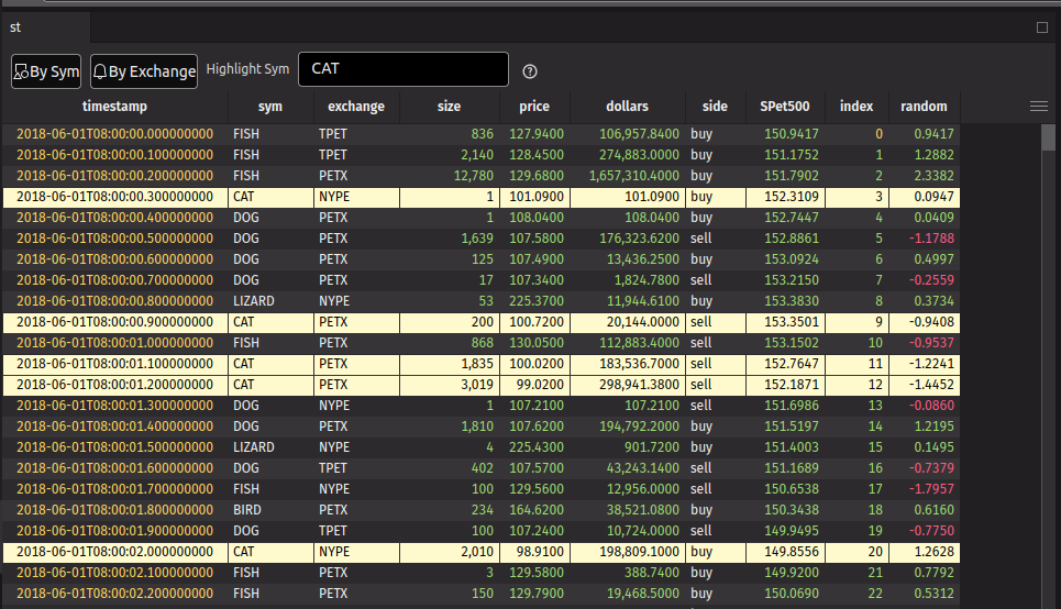
Stock rollup
You can use the rollup method to create a rollup table. In this example, we create a rollup table that shows the average price of each stock and/or exchange. You can toggle the rollup by clicking on the ToggleButton. You can also highlight a specific stock by entering the symbol in the text field, but only when a rollup option isn’t selected. We wrap the highlight input field with a ui.fragment that is conditionally used so that it doesn’t appear when the rollup is selected. We also use the ui.contextual_help component to display a help message when you hover over the help icon.
Tabs using ui.tab
You can add Tabs within a panel by using the ui.tabs method. In this example, we create a panel with two tabs by passing in two instances of ui.tab as children.
When specifying tabs with this format, the following must be noted:
- The
titleprop has to be unique, if not, thekeyprop has to be unique - The
text_valueprop is an optional accessibility improvement prop
Tabs using ui.tab_panels and ui.tab_list
You can add Tabs within a panel by using the ui.tabs method. In this example, we create a tabbed panel with multiple tabs by passing in the ui.tab_panels and ui.tab_list as children:
tab_list is the container of tab headers. It expects children of ui.item that have a unique key. text_value may be added for accessibility, but by default the key will be used for accessibility.
tab_panels is the content of the tabs. It expects children of ui.item which have a matching key with an item in the tab_list.
Multi-threading
State updates must be called from the render thread. All callbacks are automatically called from the render thread, but sometimes you will need to do some long-running operations asynchronously. You can use the use_render_queue hook to run a callback on the render thread. In this example, we create a form that takes a URL as input, and loads the CSV file from another thread before updating the state on the current thread.