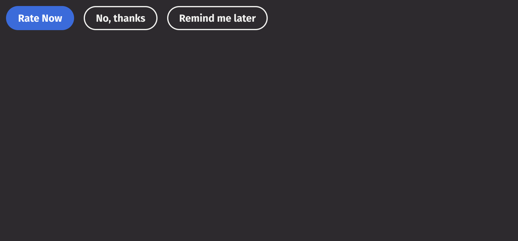
Button Group
A button group is a UI component that groups buttons with related actions together and will automatically handle layout overflow nicely. Only buttons can be used within button groups.
Example

UI Recommendations
Recommendations for creating button groups:
- The most critical action in a button group should use an accent, or negative button style, while other actions should be primary outline buttons.
- Button groups should be left-aligned to follow content such as blocks of text, center-aligned in empty states, and right-aligned in container components like dialogs, popovers, or cards.
- Button priority should match text alignment: for left-aligned text, the most critical button is on the left; for right- or center-aligned text, the most critical button is on the right.
- Icons should be used for higher-priority actions if used in the button group. If the most critical action does not have an icon, avoid using icons for the other lower-priority actions.
Consider using an action_group to allow the user to select from a list of actions.
Content
A button group is used to handle button overflow and, thus, expects buttons as children. It switches to a vertical layout when horizontal space is limited.
Orientation
Setting the orientation prop to “vertical” will prevent any spacing-related dynamic orientation changes.
The button group will remain in the orientation regardless of the width.
Alignment
By default, button groups are start-aligned to accord with content, but they can be set to have a different alignment using the alignment prop.
Disabled state
The is_disabled prop disables the button group to prevent user interaction. This is useful when the button group should be visible but not available for selection.
API Reference
A button group is a grouping of button whose actions are related to each other.
Returns: Element The rendered button group element.
| Parameters | Type | Default | Description |
|---|---|---|---|
| *children | Any | The children of the button group. | |
| is_disabled | bool | None | None | Whether the button group is disabled. |
| orientation | Literal['horizontal', 'vertical'] | 'horizontal' | The axis the ButtonGroup should align with. Setting this to 'vertical' will prevent any switching behaviours between 'vertical' and horizontal'. |
| align | Literal['start', 'center', 'end'] | 'start' | The alignment of the buttons within the ButtonGroup. |
| key | str | None | None | A unique identifier used by React to render elements in a list. |