Checkbox Group
Checkbox group areas allow the selection of one or more items from a list of choices, represented by checkboxes.
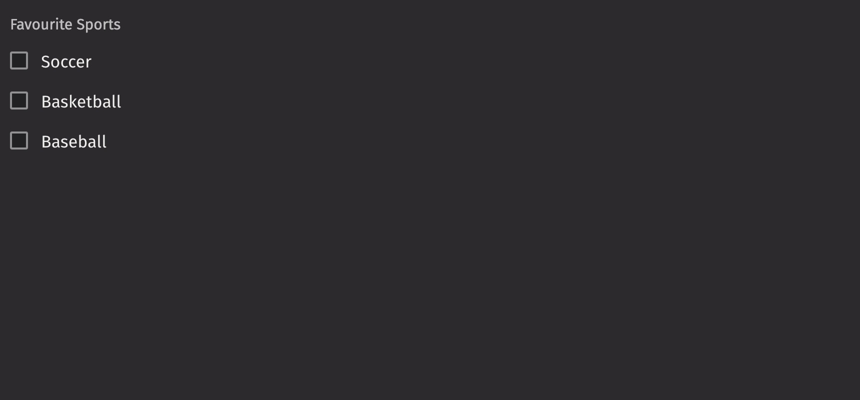
Example
UI Recommendations
Recommendations for creating checkbox groups:
- Every checkbox group should have a label specified. Without one, the checkbox group is ambiguous. In the rare case that context is sufficient, the label is unnecessary; you must still include an aria-label via the
aria_labelprop. - While labels can be placed either on top or on the side of the checkbox groups, top labels are the default recommendation. Top labels work better with longer copy, localization, and responsive layouts. Side labels are more useful when vertical space is limited.
- Checkbox groups can be either horizontal or vertical. By default, they are vertical; the orientation should only be horizontal if vertical space is limited.
- Checkbox groups can be marked as optional or required, with required groups indicated by either a “(required)” label or an asterisk icon, which should be accompanied by help text.
- Checkbox groups should use help text for error messaging and descriptions, providing context for why a selection is required or clarifying the options.
Consider using checkbox_group to select or mark a single item as selected.
Content
Checkbox groups accept checkboxes and primitive types as children. Checkboxes accept a child, which is rendered as the checkbox’s label.
Value
Checkbox groups allow selecting zero or more items, with initial values set via default_value or controlled values via value.
HTML Forms
Checkbox groups can support a name prop for integration with HTML forms, allowing for easy identification of a value on form submission.
Labeling
The checkbox group can be labeled using the label prop, and if no label is provided, an aria_label must be provided to identify the control for accessibility purposes.
The is_required prop and the necessity_indicator props can be used to show whether selecting an option in the checked group is required or optional.
When the necessity_indicator prop is set to “label”, a localized string will be generated for “(required)” or “(optional)” automatically.
Events
Checkbox groups accept an on_change prop, triggered whenever a checkbox within the group is clicked.
To require specific checkboxes to be checked, set the is_required prop at the Checkbox level, not the Checkbox Group.
Orientation
While aligned vertically by default, the axis with which the checkboxes align can be changed via the orientation prop.
Label position
By default, the position of a checkbox group’s label is above the checkbox group, but it can be changed to the side using the label_position prop.
Help text
A checkbox group can have both a description and an error_message. The error message should offer specific guidance on how to correct the input.
The is_invalid prop can be used to set whether the current checkbox group state is valid or invalid.
Contextual Help
Using the contextual_help prop, a ui.contextual_help can be placed next to the label to provide additional information about the checkbox group.
Disabled state
The is_disabled prop disables a checkbox group to prevent user interaction. This is useful when the checkbox group should be visible but not available for selection.
Read only
The is_read_only prop makes checkbox groups read-only to prevent user interaction. This is different from setting the is_disabled prop since the checkbox group remains focusable and its options remain visible.
Emphasized
The is_emphasized prop makes the selected checkbox the user’s accent color, adding a visual prominence to the selection.
API Reference
A grouping of checkbox's that are related to each other.
Returns: Element The rendered checkbox group element.
| Parameters | Type | Default | Description |
|---|---|---|---|
| *children | Any | The children of the checkbox group. | |
| orientation | Literal['horizontal', 'vertical'] | 'vertical' | The axis the CheckboxGroup should align with. |
| is_emphasized | bool | None | None | Whether the checkbox's should be displayed with emphasized style. |
| value | Sequence[str | int | float | bool] | None | None | The selected checkbox within the checkbox group (controlled). |
| default_value | Sequence[str | int | float | bool] | None | None | The default selected checkbox within the checkbox group (uncontrolled). |
| is_disabled | bool | None | None | Whether the checkbox group is disabled. |
| is_read_only | bool | None | None | Whether the checkbox group is read only. |
| name | str | None | None | The name of the input element, used when submitting an HTML form. |
| label | Any | None | None | The label of the checkbox group. |
| description | Any | None | None | A description for the checkbox group. Provides a hint such as specific requirements for what to choose. |
| error_message | Any | None | None | An error message to be displayed when the checkbox group is an errored state. |
| is_required | bool | None | None | Whether user input is required on the input before form submission. |
| is_invalid | bool | None | None | Whether the checkbox group is in an invalid state. |
| validation_behavior | Literal['aria', 'native'] | None | 'aria' | Whether to use native HTML form validation to prevent form submission when the value is missing or invalid, or mark the field as required or invalid via ARIA. |
| label_position | Literal['top', 'side'] | None | None | The label's overall position relative to the element it is labeling. |
| label_align | Literal['start', 'end'] | None | None | The label's horizontal alignment relative to the element it is labeling. |
| necessity_indicator | str | None | None | Whether the required state should be shown as an icon or text. |
| contextual_help | Any | None | None | A ContextualHelp element to place next to the label. |
| show_error_icon | bool | None | None | Whether an error icon is rendered. |