Combo Box
Combo boxes combine a text input field with a picker menu, enabling users to filter and select from longer lists based on their query.
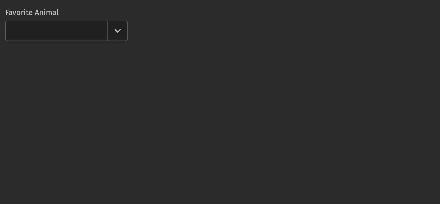
Example
UI Recommendations
Recommendations for creating clear and effective combo boxes:
- The combo box’s text input simplifies searching through large lists. For lists with fewer than 6 items, use radio buttons. For lists with more than 6 items, assess if the list is complex enough to need searching and filtering, and if not, use a picker instead.
- Every combo box should have a label specified. Without one, the combo box is ambiguous and not accessible.
- Options in the combo box should be kept short and concise; multiple lines are strongly discouraged. If more than one line is needed, consider using a description to add context to the option.
- Choose a
widthfor your combo boxes that can accommodate most of the available options. - The field labels, menu items, and placeholder text should all be in sentence case.
- Identify which combo boxes are required or optional, and use the
is_requiredfield or thenecessity_indicatorto mark them accordingly. - A combo box’s help text should provide actionable guidance on what to select and how to select it, offering additional context without repeating the placeholder text.
- When an error occurs, the help text specified in a combo box is replaced by error text; thus, ensure both help and error text convey the same essential information to maintain consistent messaging and prevent loss of critical details.
- Write error messages in a clear, concise, and helpful manner, guiding users to resolve the issue without ambiguity; ideally, they should be 1-2 short, complete sentences.
Data sources
For combo boxes, we can use a Deephaven table as a data source to populate the options. When using a table, it automatically uses the first column as both the key and label. If there are any duplicate keys, an error will be thrown; to avoid this, a select_distinct can be used on the table prior to using it as a combo box data source.
Item table sources
If you wish to manually specify the keys and labels, use a ui.item_table_source to dynamically derive the options from a table.
Custom Value
By default, when a combo box loses focus, it resets its input value to match the selected option’s text or clears the input if no option is selected. To allow users to enter a custom value, use the allows_custom_value prop to override this behavior.
HTML Forms
Combo boxes can support a name prop for integration with HTML forms, allowing for easy identification of a value on form submission. The form_value prop determines whether the text or key of the selected item is submitted in an HTML form; if allows_custom_value is true, only the text is submitted.
Labeling
The combo box can be labeled using the label prop, and if no label is provided, an aria_label must be provided to identify the control for accessibility purposes.
The is_required prop and the necessity_indicator props can be used to show whether selecting an option in the combo box is required or optional.
When the necessity_indicator prop is set to “label”, a localized string will be generated for “(required)” or “(optional)” automatically.
Selection
In a combo box, the default_selected_key or selected_key props set a selected option.
The default_selected_key is useful for simpler scenarios where you don’t need to control the state externally. The selected_key is used for scenarios where the state should be managed by the parent component, providing control and flexibility over the selection of the combo box.
Sections
Combo boxes support sections to group options. Sections can be used by wrapping groups of items in a Section element. Each Section takes a title and key prop.
Note that, when searching for options, searching by section will not result in the respective options within that section appearing.
Also, sections can only be used directly, not from a table data source.
Events
Combo boxes support selection via mouse, keyboard, and touch. You can handle all these via the on_change prop, which receives the selected key as an argument. Additionally, combo boxes accept an on_input_change prop, which is triggered whenever the search value is edited by the user, whether through typing or option selection.
Each interaction done in the combo box will trigger its associated event handler. For instance, typing in the input field will only trigger the on_input_change, not the on_change.
Note, this is not the case for selections; when a selection is made, both the on_change and on_input_change are triggered.
Complex items
Items within a combo box can include additional content to better convey options. You can add icons, avatars, and descriptions to the children of an ui.item. When adding a description, set the slot prop to “description” to differentiate between the text elements.
Validation
The is_required prop ensures that the user selects an option. The related validation_behaviour prop allows the user to specify aria or native verification.
When the prop is set to “native”, the validation errors block form submission and are displayed as help text automatically.
Trigger Options
By default, the combo box’s menu opens when the user types into the input field (“input”). This behavior can be changed to open on focus (“focus”) or only when the field button is clicked (“manual”) using the menu_trigger prop.
Label position
By default, the position of a combo box’s label is above the combo box, but it can be moved to the side using the label_position prop.
Quiet State
The is_quiet prop makes a combo box “quiet”. This can be useful when the combo box and its corresponding styling should not distract users from surrounding content.
Disabled State
The is_disabled prop disables a combo box to prevent user interaction. This is useful when the combo box should be visible but unavailable for selection.
Read-only State
The is_read_only prop prevents user input in a combo box, but the selected option should be visible.
Help text
A combo box can have both a description and an error_message. The description remains visible at all times. Use the error message to offer specific guidance on how to correct the input.
Contextual Help
Using the contextual_help prop, a ui.contextual_help can be placed next to the label to provide additional information about the combo box.
Custom width
The width prop adjusts the width of a combo box, and the max_width prop enforces a maximum width.
Align and Direction
The align prop sets the text alignment of the options in the combo box, while the direction prop specifies which direction the menu will open.
API Reference
A combo box that can be used to search or select from a list. Children should be one of five types:
Returns: BaseElement The rendered ComboBox.
| Parameters | Type | Default | Description |
|---|---|---|---|
| *children | str | int | float | bool | BaseElement | Element | Table | PartitionedTable | ItemTableSource | The options to render within the combo box. | |
| menu_trigger | Literal['focus', 'input', 'manual'] | None | 'input' | The interaction required to display the ComboBox menu. |
| is_quiet | bool | None | None | Whether the ComboBox should be displayed with a quiet style. |
| align | Literal['start', 'end'] | None | 'end' | Alignment of the menu relative to the input target. |
| direction | Literal['bottom', 'top'] | None | 'bottom' | Direction the menu will render relative to the ComboBox. |
| loading_state | Literal['loading', 'sorting', 'loadingMore', 'error', 'idle', 'filtering'] | None | None | The current loading state of the ComboBox. Determines whether or not the progress circle should be shown. |
| should_flip | bool | True | Whether the menu should automatically flip direction when space is limited. |
| menu_width | str | float | None | None | Width of the menu. By default, matches width of the combobox. Note that the minimum width of the dropdown is always equal to the combobox's width. |
| form_value | Literal['key', 'text'] | None | 'text' | Whether the text or key of the selected item is submitted as part of an HTML form. When allowsCustomValue is true, this option does not apply and the text is always submitted. |
| should_focus_wrap | bool | None | None | Whether keyboard navigation is circular. |
| input_value | str | None | None | The value of the search input (controlled). |
| default_input_value | str | None | None | The default value of the search input (uncontrolled). |
| allows_custom_value | bool | None | None | Whether the ComboBox allows a non-item matching input value to be set. |
| disabled_keys | list[str | int | float | bool] | None | None | The item keys that are disabled. These items cannot be selected, focused, or otherwise interacted with. |
| selected_key | str | int | float | bool | None | UndefinedType | <deephaven.ui.types.types.UndefinedType object> | The currently selected key in the collection (controlled). |
| default_selected_key | str | int | float | bool | None | None | The initial selected key in the collection (uncontrolled). |
| is_disabled | bool | None | None | Whether the input is disabled. |
| is_read_only | bool | None | None | Whether the input can be selected but not changed by the user. |
| is_required | bool | None | None | Whether user input is required on the input before form submission. |
| validation_behavior | Literal['aria', 'native'] | 'aria' | Whether to use native HTML form validation to prevent form submission when the value is missing or invalid, or mark the field as required or invalid via ARIA. |
| auto_focus | bool | None | None | Whether the element should receive focus on render. |
| label | None | bool | int | str | Element | List[NodeType] | None | The content to display as the label. |
| description | Element | None | None | A description for the field. Provides a hint such as specific requirements for what to choose. |
| error_message | Element | None | None | An error message for the field. |
| name | str | None | None | The name of the input element, used when submitting an HTML form. |
| validation_state | Literal['valid', 'invalid'] | None | None | Whether the input should display its "valid" or "invalid" visual styling. |
| label_position | Literal['top', 'side'] | 'top' | The label's overall position relative to the element it is labeling. |
| label_align | Literal['start', 'end'] | None | None | The label's horizontal alignment relative to the element it is labeling. |
| necessity_indicator | Literal['icon', 'label'] | None | None | Whether the required state should be shown as an icon or text. |
| contextual_help | Element | None | None | A ContextualHelp element to place next to the label. |
| key | str | None | None | A unique identifier used by React to render elements in a list. |