Dashboard
Dashboards allow you to create a page layout containing a collection of components. The user can move and resize panels within the dashboard.
Example
Rules
- Dashboards must be a child of the root script and not nested inside a
@ui.component. Otherwise, the application cannot correctly determine the type of the component. - Dashboards must have one and only one child, typically a row or column.
- Height and width of panels are summed to 100% within a row or column.
Key Components
Four main children make up a dashboard: row, column, stack, and panels.
- Row: A container used to group elements horizontally. Each element is placed to the right of the previous one.
- Column: A container used to group elements vertically. Each element is placed below the previous one.
- Stack: A container used to group elements into a stack of tabs. Each element gets its own tab, with only one element visible at a time.
- Panel: A container used to group and label elements.
Layout Hierarchy
Top-Level
Your dashboard must start with a row or column, which is the “top” of the layout tree. Columns should go inside rows and rows should go inside columns
Note: Nesting rows within rows or columns within columns will sub-divide the row or column.
Bottom-Level
Stacks and panels are considered the “bottom” of the layout tree. Once added, the layout in that section is considered complete. You can’t further nest stacks within panels. For layouts within a panel, see tabs, flex, and grid.
Automatic Wrapping
Children are implicitly wrapped when necessary, so the entire layout does not need to be explicitly defined.
End to end example: dashboard([t1, t2]) would become dashboard(column(stack(panel(t1)), stack(panel(t2)))).
Automatic wrapping is applied by the following rules:
- Dashboard: wrap in row/column if no single node is the default (e.g.,
[t1, t2]as the child to the dashboard would becomerow(t1, t2)). - Row/Column:
- If there are children that are rows/columns, wrap the non-wrapped children with the same element (e.g.,
row(col(t1), t2)becomesrow(col(t1), col(t2))). - If none of the children are wrapped by rows/columns, they are wrapped in stacks (e.g.,
row(col(t1), col(t2))from above becomesrow(col(stack(t1)), col(stack(t2)))).
- If there are children that are rows/columns, wrap the non-wrapped children with the same element (e.g.,
- Stacks: wrap non-panel children in panels (e.g.,
row(col(stack(t1)), col(stack(t2)))becomesrow(col(stack(panel(t1))), col(stack(panel(t2))))).
Varying dimensions
Rows can have a specified height, while columns can have a specified width.
Stacks directly within a column can have a height or a width if they are within a row. Setting the other dimension will be ignored.
Varying row heights
Varying column widths
Varying stack widths
Varying stack heights
Layout Examples
Row split (2x1)
Column split (1x2)
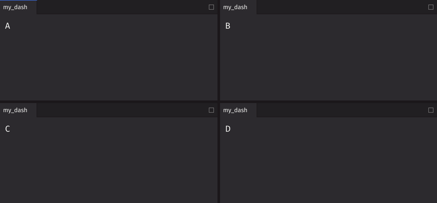
2x2
3x1
Basic stack
Stack with nested tabs
Stack in a layout
Holy Grail
Stateful Example
By hoisting state management to the dashboard component, interacting and sharing data between the child components is much easier to maintain and debug.
Simple
Complex
API Reference
A dashboard is the container for an entire layout.
Returns: DashboardElement The rendered dashboard.
| Parameters | Type | Default | Description |
|---|---|---|---|
| element | FunctionElement | Element to render as the dashboard. The element should render a layout that contains 1 root column or row. |
Row API Reference
A row is a container that can be used to group elements. Each element will be placed to the right of its prior sibling.
Returns: Element The rendered row element.
| Parameters | Type | Default | Description |
|---|---|---|---|
| *children | Any | Elements to render in the row. | |
| key | str | None | None | A unique identifier used by React to render elements in a list. |
Column API Reference
A column is a container that can be used to group elements. Each element will be placed below its prior sibling.
Returns: Element The rendered column element.
| Parameters | Type | Default | Description |
|---|---|---|---|
| *children | Any | Elements to render in the column. | |
| key | str | None | None | A unique identifier used by React to render elements in a list. |
Stack API Reference
A stack is a container that can be used to group elements which creates a set of tabs. Each element will get a tab and only one element can be visible at a time.
Returns: Element The rendered stack element.
| Parameters | Type | Default | Description |
|---|---|---|---|
| *children | Any | Elements to render in the row. | |
| active_item_index | int | None | None | The index of the active item in the stack. |
| key | str | None | None | A unique identifier used by React to render elements in a list. |