Form
Forms allow users to enter data that can be submitted while providing alignment and styling for form fields.
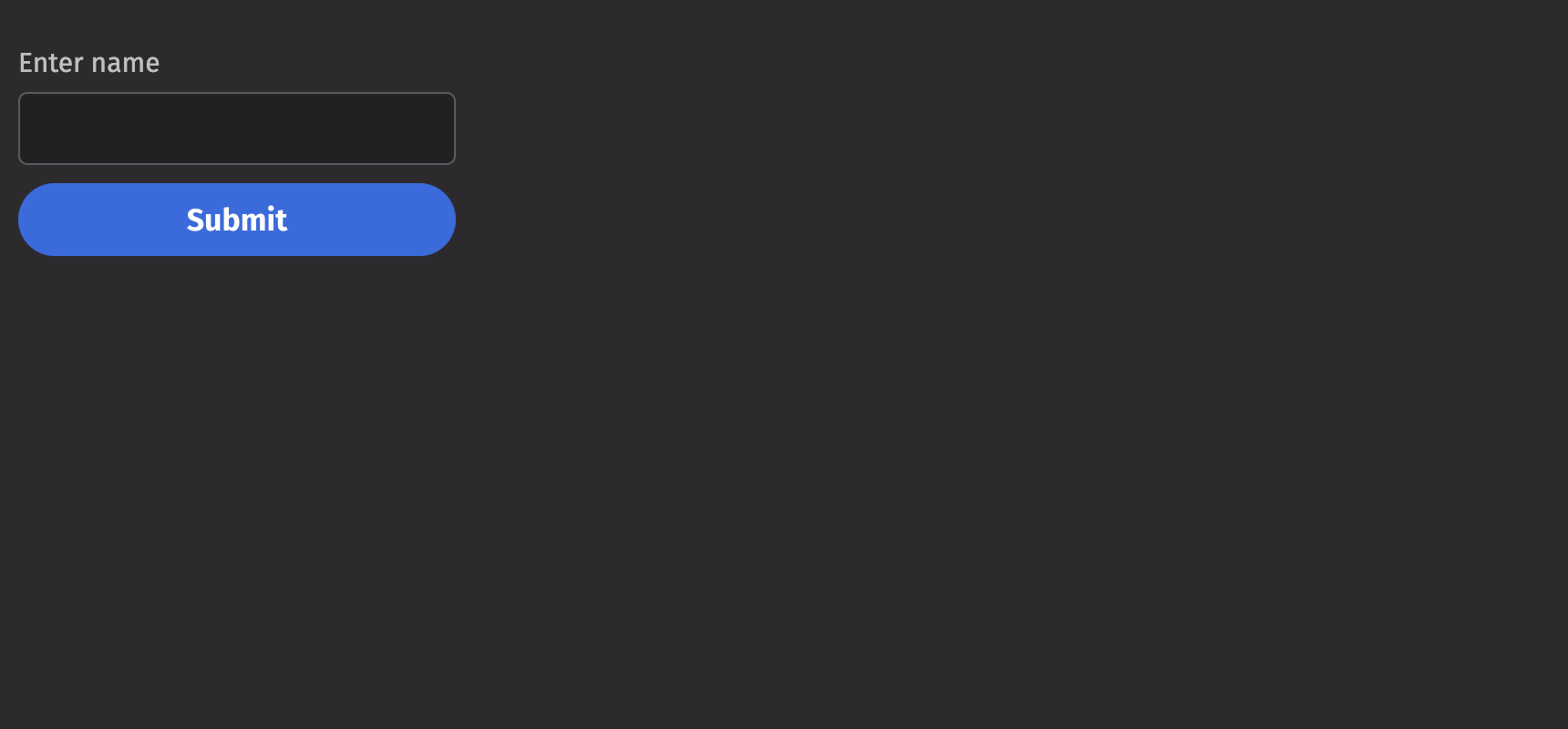
Example
Events
Forms can handle three events:
- Submit: Triggered when the form is submitted. Users can define a callback function to handle the form data upon submission.
- Reset: Triggered when the form is reset. This event can be used to clear the form fields or reset them to their initial values.
- Invalid: Triggered when the form validation fails. This event allows users to handle validation errors and provide feedback.
Submit
Reset
Invalid
Action
The action prop enables forms to be sent to a URL. The example below communicates with a 3rd party server and displays the content received from the form.
Validation Behavior
By default, validation errors will be displayed in real-time as the fields are edited, but form submission is not blocked. To enable this and native HTML form validation, set validation_behavior to “native”.
Quiet
The is_quiet prop makes form fields “quiet”. This can be useful when its corresponding styling should not distract users from surrounding content.
Emphasized
The is_emphasized prop adds visual prominence to the form fields. This can be useful when its corresponding styling should catch the user’s attention.
Disabled
The is_disabled prop disables form fields to prevent user interaction. This is useful when the fields should be visible but not available for input.
Necessity Indicator
The necessity_indicator prop dictates whether form labels will use an icon or a label to outline which form fields are required. The default is “icon”.
Read only
The is_read_only prop makes form fields read-only to prevent user interaction. This is different than setting the is_disabled prop since the fields remains focusable, and the contents of the fields remain visible.
API Reference
Forms allow users to enter data that can be submitted while providing alignment and styling for form fields
Returns: Element The rendered form element.
| Parameters | Type | Default | Description |
|---|---|---|---|
| *children | Any | The content to render within the container. | |
| is_quiet | bool | None | None | Whether the form should be quiet. |
| is_emphasized | bool | None | None | Whether the form should be emphasized. |
| is_disabled | bool | None | None | Whether the form should be disabled. |
| is_required | bool | None | None | Whether the form should be required. |
| is_read_only | bool | None | None | Whether the form should be read only. |
| validation_state | Literal['valid', 'invalid'] | None | None | Whether the Form elements should display their "valid" or "invalid" visual styling. |
| validation_behavior | Literal['aria', 'native'] | None | 'aria' | Whether to use native HTML form validation to prevent form submission when a field value is missing or invalid, or mark fields as required or invalid via ARIA. |
| validation_errors | Dict[str, str | List[str]] | None | None | The validation errors for the form. |
| action | str | None | None | The URL to submit the form data to. |
| enc_type | Literal['application/x-www-form-urlencoded', 'multipart/form-data', 'text/plain'] | None | None | The enctype attribute specifies how the form-data should be encoded when submitting it to the server. |
| method | Literal['get', 'post', 'dialog'] | None | None | The HTTP method of the form. |
| target | Literal['_self', '_blank', '_parent', '_top'] | None | None | The target attribute specifies a name or a keyword that indicates where to display the response that is received after submitting the form. |
| auto_complete | Literal['on', 'off'] | None | None | Indicates whether input elements can by default have their values automatically completed by the browser. |
| auto_capitalize | Literal['off', 'none', 'on', 'sentences', 'words', 'characters'] | None | None | Controls whether inputted text is automatically capitalized and, if so, in what manner. |
| label_position | Literal['top', 'side'] | 'top' | The label's overall position relative to the element it is labeling. |
| label_align | Literal['start', 'end'] | None | None | The label's horizontal alignment relative to the element it is labeling. |
| necessity_indicator | Literal['icon', 'label'] | None | None | Whether the required state should be shown as an icon or text. |
| key | str | None | None | A unique identifier used by React to render elements in a list. |