Link
Links allow users to navigate to a specified location.
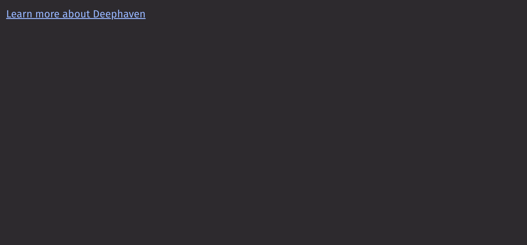
Example
Content
The link component accepts other components, such as text and icon, as children.
Variants
Links can have different styles to indicate their purpose.
Over background
Links can be placed over a background to add a visual prominence to the link.
Quiet State
The is_quiet prop makes the link “quiet”. This can be useful when the link and its corresponding styling should not distract users from surrounding content.
API Reference
A link is used for navigating between locations.
Returns: Element The rendered link element.
| Parameters | Type | Default | Description |
|---|---|---|---|
| *children | Any | The content to display in the link. | |
| variant | Literal['primary', 'secondary', 'over_background'] | None | 'primary' | The background color of the link. |
| is_quiet | bool | None | None | Whether the link should be displayed with a quiet style. |
| auto_focus | bool | None | None | Whether the element should receive focus on render. |
| href | str | None | None | A URL to link to. |
| target | Literal['_self', '_blank', '_parent', '_top'] | None | None | The target window for the link. |
| rel | str | None | None | The relationship between the linked resource and the current page. |
| ping | str | None | None | A space-separated list of URLs to ping when the link is followed. |
| download | str | None | None | Causes the browser to download the linked URL. |
| href_lang | str | None | None | Hints at the human language of the linked URL. |
| referrer_policy | str | None | None | How much of the referrer to send when following the link. |