List View
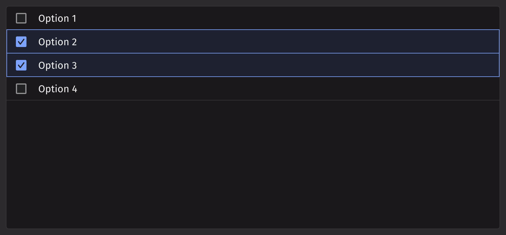
List view displays a list of interactive items, and allows a user to navigate, select, or perform an action. It offers greater flexibility in the contents it can render and can distinguish between row selection and actions performed on a row. This makes list view an ideal component for turning table columns into interactive lists.
Example

Table Source Example
List view items can also be generated from a table directly or using item_table_source.
Passing Table Directly
This method is ideal for quickly displaying a static dataset. By default, the first column is used as the key and label.
Using item_table_source
item_table_source is used to create complex items from a table (ie., defining which columns are the keys/labels of the data).
Selection
The selection_mode prop can be used to configure how ui.list_view handles item selection. The options are 'MULTIPLE' (the default value), 'SINGLE', or 'NONE'.
Set selection_mode='SINGLE' to constrain selection to a single item.
Set selection_mode=None or selection_mode='NONE' to disable selection.
selection_mode can be explicitly set to MULTIPLE for cases where it is dynamically defined. For example, a ui.radio can be used to change the selection mode.
Events
List view accepts an action that can be triggered when a user performs an action on an item.
List view can also accept a handler that is called when the selection is changed.
Disabled Options
To disable certain rows in the ListView component, use the disabled_keys prop. By setting this prop with an array of keys, you can prevent interaction with those rows, providing greater control and customization options for the ListView behavior.
Quiet State
Modifying Density
To adjust the vertical padding of each row in the list view, use the density prop.
Overflow Mode
The default behavior is to truncate content that overflows its row. Text can be wrapped instead by adding wrap to the overflow_mode prop.
Note: Currently not supported if a table source is used.
API reference
A list view that can be used to create a list of items. Children should be one of three types:
Returns: Element The rendered ListView.
| Parameters | Type | Default | Description |
|---|---|---|---|
| *children | str | int | float | bool | BaseElement | Table | ItemTableSource | The options to render within the list_view. | |
| density | Literal['COMPACT', 'NORMAL', 'SPACIOUS'] | None | 'COMPACT' | Sets the amount of vertical padding within each cell. |
| is_quiet | bool | None | None | Whether the ListView should use the quiet style. |
| loading_state | Literal['loading', 'sorting', 'loadingMore', 'error', 'idle', 'filtering'] | None | None | The loading state of the ListView. Determines whether to show a loading spinner. |
| overflow_mode | Literal['truncate', 'wrap'] | 'truncate' | The behaviour of the text when it overflows the cell. |
| render_empty_state | Element | None | None | Sets what the list_view should render when there is no content to display. |
| disabled_behavior | Literal['selection', 'all'] | None | None | Whether disabled_keys applies to all interactions or just selection. |
| disabled_keys | Sequence[str | int | float | bool] | None | None | The keys that should be disabled. These cannot be selected, focused, or interacted with. |
| selection_mode | Literal['SINGLE', 'MULTIPLE'] | None | 'MULTIPLE' | By default "MULTIPLE", which allows multiple selection. May also be "SINGLE" to allow only single selection, or "None"/None to allow no selection. |
| disallow_empty_selection | bool | None | None | Whether the ListView should disallow empty selection. |
| selected_keys | Sequence[str | int | float | bool] | None | None | The currently selected keys in the collection (controlled). |
| default_selected_keys | Sequence[str | int | float | bool] | None | None | The initial selected keys in the collection (uncontrolled). |
| selection_style | Literal['checkbox', 'highlight'] | None | None | How the selection should be displayed. |
| key | str | None | None | A unique identifier used by React to render elements in a list. |
Item Table Source API reference
An item table source wraps a Table or PartitionedTable to provide additional information for creating complex items from a table. A PartitionedTable is only supported if the component itself supports a PartitionedTable as a child. A PartitionedTable passed here will lead to the same behavior as passing the PartitionedTable directly to a component, such as creating sections from the partitions in the case of a Picker.
Returns: ItemTableSource The item table source to pass as a child to a component that supports it.
| Parameters | Type | Default | Description |
|---|---|---|---|
| table | Table | PartitionedTable | The table to use as the source of items. | |
| key_column | str | None | None | The column of values to use as item keys. Defaults to the first column. |
| label_column | str | None | None | The column of values to display as primary text. Defaults to the key_column value. |
| description_column | str | None | None | The column of values to display as descriptions. |
| icon_column | str | None | None | The column of values to map to icons. |
| title_column | str | None | None | Only valid if table is of type PartitionedTable. The column of values to display as section names. Should be the same for all values in the constituent Table. If not specified, the section titles will be created from the key_columns of the PartitionedTable. |
| actions | Element | None | None | The action group or menus to render for all elements within the component, if supported. |
| key | str | None | None | A unique identifier used by React to render elements in a list. |