Search Field
Search fields are specialized text fields designed for searching.
Example
Value
A search field’s value is empty by default, but the default_value prop can set an initial, uncontrolled value, or a controlled value can be set via the value prop.
HTML Forms
Search fields can support a name prop for integration with HTML forms, allowing for easy identification of a value on form submission.
Labeling
To provide a visual label for the search field, use the label prop. To indicate that the search field is mandatory, use the is_required prop.
By setting is_required to True, the necessity_indicator is set to “icon” by default. This can be changed with the necessity_indicator prop, which can be used independently to indicate that the search field is optional.
When necessity_indicator is set to “label,” a localized string will be automatically generated for “(required)” or “(optional).”
Events
The on_change property is triggered whenever the value in the search field is edited.
The on_submit property is triggered whenever the value in the search field is submitted.
The on_clear property is triggered whenever the value in the search field is cleared.
Input Types
The type prop changes the type of search field that is rendered to suit different input requirements.
Quiet State
The is_quiet prop makes search fields “quiet”. This can be useful when the text area and its corresponding styling should not distract users from surrounding content.
Disabled State
The is_disabled prop disables search fields to prevent user interaction. This is useful when the search field should be visible but not available for input.
Read only
The is_read_only prop makes search fields read-only to prevent user interaction. This is different than setting the is_disabled prop since the search field remains focusable, and the contents of the search field remain visible.
Label position
By default, the position of a search field’s label is above the search field, but it can be changed to the side using the label_position prop.
While labels can be placed either on top or on the side of the search field, top labels are the default recommendation. Top labels work better with longer copy, localization, and responsive layouts. Side labels are more useful when vertical space is limited.
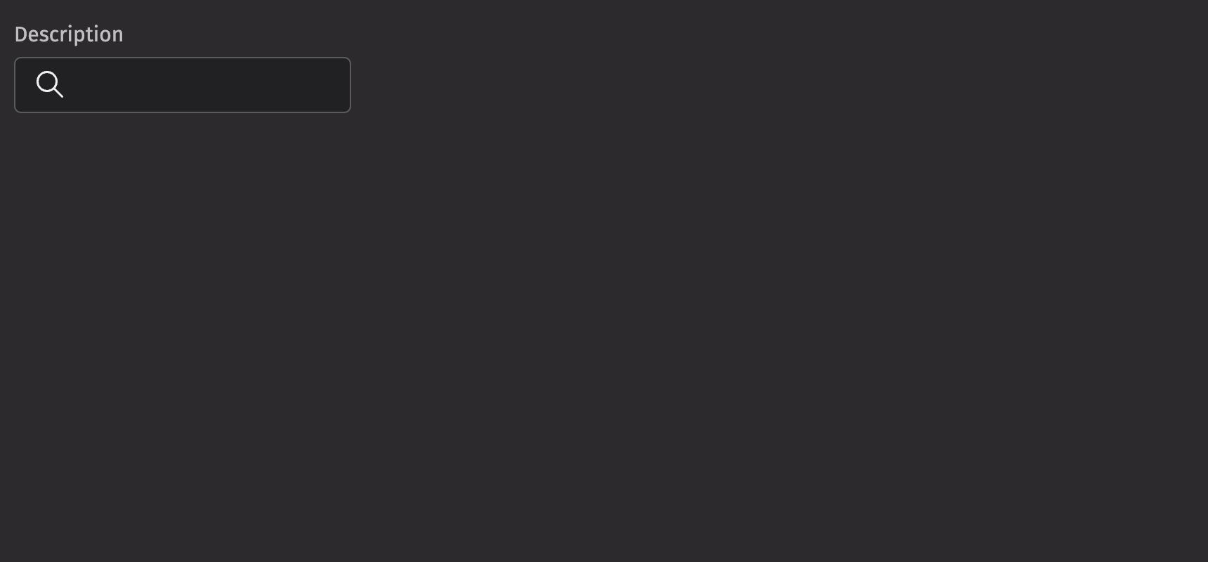
Help text
A search field can have both a description and an error_message. The description remains visible at all times, except when the validation_state is set to “invalid” and an error message is present. Use the error message to offer specific guidance on how to correct the input.
Contextual Help
The contextual_help prop places a ui.contextual_help next to the label to provide additional information about the search field.
Custom width
The width prop adjusts the width of a search field, and the max_width prop enforces a maximum width.
Custom icon
The icon prop changes the icon within the search field. This can quickly indicate to the user what the field is for. The complete list of icons can be found in icon.
API Reference
SearchFields are specialized text inputs designed for searching.
Returns: Element The rendered search field element.
| Parameters | Type | Default | Description |
|---|---|---|---|
| icon | Element | None | None | An icon to display at the start of the input. |
| is_quiet | bool | None | None | Whether the input should be displayed with a quiet style. |
| is_disabled | bool | None | None | Whether the input should be disabled. |
| is_read_only | bool | None | None | Whether the input can be selected but not changed by the user. |
| is_required | bool | None | None | Whether the input is required before form submission. |
| description | Any | None | None | A description for the field. Provides a hint such as specific requirements for what to choose. |
| error_message | Any | None | None | An error message to display when the field is invalid. |
| auto_focus | bool | None | None | Whether the input should be focused on page load. |
| value | str | None | None | The current value of the input. |
| default_value | str | None | None | The default value of the input. |
| label | Any | None | None | The label for the input. |
| auto_complete | str | None | None | Describes the type of autocomplete functionality the input should provide. |
| max_length | int | None | None | The maximum number of characters the input can accept. |
| min_length | int | None | None | The minimum number of characters the input can accept. |
| pattern | str | None | None | A regular expression that the input's value must match to be valid. |
| type | Literal['text', 'search', 'url', 'tel', 'email', 'password'] | None | 'search' | The type of input to display (defaults to "search"). |
| input_mode | Literal['none', 'text', 'decimal', 'numeric', 'tel', 'search', 'email', 'url'] | None | None | Hints at the type of data that might be entered by the user while editing the element or its contents. |
| name | str | None | None | The name of the input, used when submitting an HTML form. |
| validation_state | Literal['valid', 'invalid'] | None | None | Whether the input should display its "valid" or "invalid" state. |
| label_position | Literal['top', 'side'] | 'top' | The position of the label relative to the input. |
| label_align | Literal['start', 'end'] | None | None | The alignment of the label relative to the input. |
| necessity_indicator | Literal['icon', 'label'] | None | None | Whether the required state should be shown as an icon or text. |
| contextual_help | Any | None | None | A ContextualHelp element to place next to the label. |
| key | str | None | None | A unique identifier used by React to render elements in a list. |