Tabs
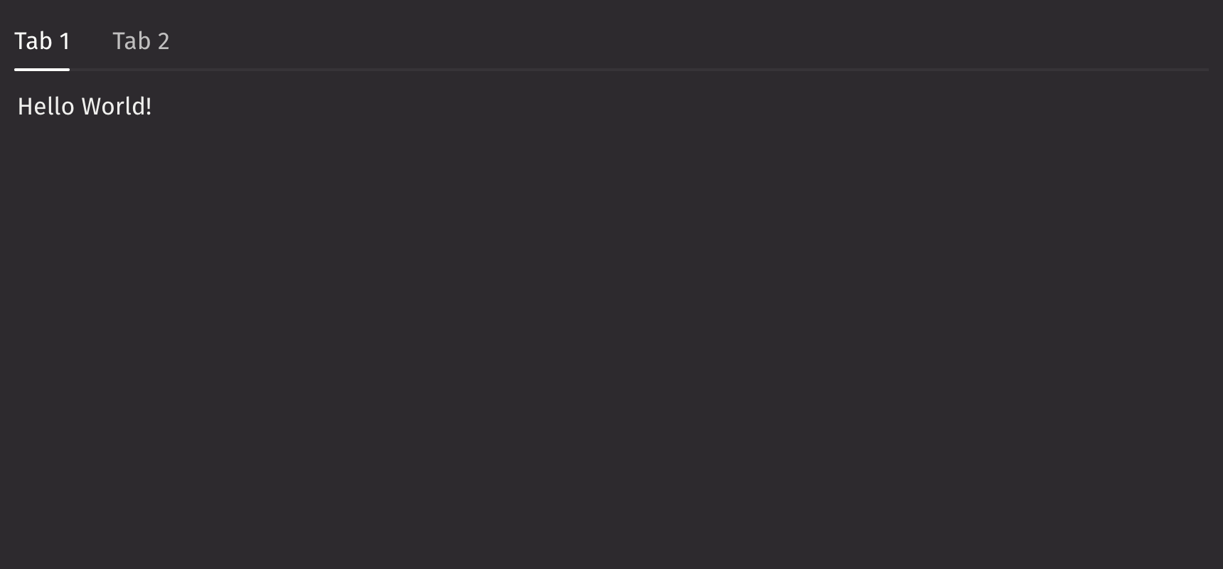
Tabs organize related content into sections within panels, allowing users to navigate between them.
Example

UI Recommendations
- Use tabs to organize sections of equal importance. Avoid using tabs for content with varying levels of importance.
- Use a vertical tabs layout when displaying shortcuts to sections of content on a single page.
- Avoid nesting tabs more than two levels deep, as it can become overly complicated.
Content
Tabs can be created using ui.tab, or using ui.tab_list and ui.tab_panels, but not the two options combined.
If you want a default tab layout with minimal customization for tab appearance, tabs should be created by passing in ui.tab to ui.tabs.
Note that the ui.tab component can only be used within ui.tabs.
For more control over the layout, types, and styling of the tabs, create them with ui.tab_list and ui.tab_panels with ui.tabs.
The ui.tab_list specifies the titles of the tabs, while the ui.tab_panels specify the content within each of the tab panels.
When specifying tabs using ui.tab_list and ui.tab_panels, keys must be provided that match each of the respective tabs.
Note that both the ui.tab_list and ui.tab_panels components can also only be used within ui.tabs.
Selection
With tabs, the default_selected_key or selected_key props can be set to have a selected tab.
Events
The on_change property is triggered whenever the currently selected tab changes.
Keyboard activation
By default, pressing the arrow keys while currently focused on a tab will automatically switch selection to the adjacent tab in that key’s direction.
To prevent this automatic selection change, the keyboard_activation prop can be set to “manual”.
Density
By default, the density of the tab list is “compact”. To change this, the density prop can be set to “regular”.
Quiet State
The is_quiet prop makes tabs “quiet” by removing the line separating the tab titles and panel contents. This can be useful when the tabs should not distract users from surrounding content.
Disabled state
The is_disabled prop disables the tabs component to prevent user interaction. This is useful when tabs should be visible but not available for selection.
Orientation
By default, tabs are horizontally oriented. To change the tabs’ orientation, set the orientation prop to “vertical”.
Overflow behaviour
If there isn’t enough horizontal space to render all tabs on a single line, the component will automatically collapse all tabs into a Picker.
Note that this only occurs when tabs are horizontally oriented; when tabs are vertically oriented, the list continues to extend downwards.
Emphasized
The is_emphasized prop makes the line underneath the selected tab the user’s accent color, adding a visual prominence to the selection.
API Reference
Python implementation for the Adobe React Spectrum Tabs component. https://react-spectrum.adobe.com/react-spectrum/Tabs.html
Returns: BaseElement The rendered tabs component.
| Parameters | Type | Default | Description |
|---|---|---|---|
| *children | Any | The children of the tabs component outline how the tabs will be created, they can be either: ui.tab: A tab item that is a shorthand way to create a tab item. ui.tab_list & ui.tab_panels: A tab list and tab panels allow for more customization when creating tabs. | |
| disabled_keys | Iterable[str | int | float | bool] | None | None | The keys of the tabs that are disabled. These tabs cannot be selected, focused, or otherwise interacted with. |
| is_disabled | bool | None | None | Whether the Tabs are disabled. |
| is_quiet | bool | None | None | Whether the tabs are displayed in a quiet style. |
| is_emphasized | bool | None | None | Whether the tabs are displayed in an emphasized style. |
| density | Literal['compact', 'regular'] | None | 'compact' | The amount of space between the tabs. |
| keyboard_activation | Literal['automatic', 'manual'] | None | 'automatic' | Whether tabs are activated automatically on focus or manually. |
| orientation | Literal['horizontal', 'vertical'] | None | 'horizontal' | The orientation of the tabs. |
| disallow_empty_selection | bool | None | None | Whether the collection allows empty selection. |
| selected_key | str | int | float | bool | None | UndefinedType | <deephaven.ui.types.types.UndefinedType object> | The currently selected key in the collection (controlled). |
| default_selected_key | str | int | float | bool | None | None | The initial selected key in the collection (uncontrolled). |
| key | str | None | None | A unique identifier used by React to render elements in a list. |