Working with plots
Deephaven makes it easy to visualize your data. Users can plot data using the Deephaven query language, or directly in the user interface. This section focuses on the Chart Builder feature.
Note
See To learn more about plotting query methods, see Plotting.
Chart Builder
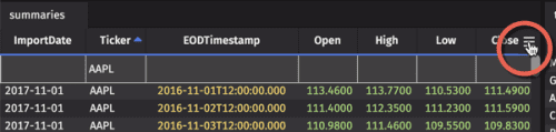
The Chart Builder can be accessed by clicking the Table Options menu icon at the right of any table (circled in the screenshot below) and selecting Chart Builder from the drop-down.
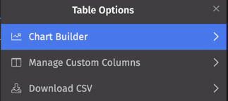
The Chart Builder allows you to create applicable charts from the table data. The configuration options will change to reflect the available chart types, and each field is automatically populated with the column values in the table from which you opened the menu. You can choose from four different chart types:
The selected chart type will be outlined in blue, as shown below.
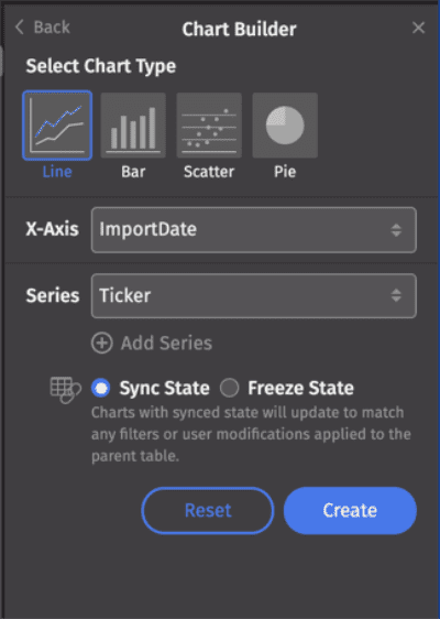
In this example, Line is selected, so the Chart Builder presents the appropriate configuration options: X-Axis and Series values. Each option is discussed below.
Next, choose to sync or freeze the chart when filters are applied to source data:
- Sync State: When selected, the chart will update to match any filters (e.g., in the Quick Filters bar or triggered by Input Filters) or other user modifications made to the parent table.
- Freeze State: When selected, the chart will not update regardless of any changes made to the parent table.
Once you make your selections, click Create. The plot will open as a new panel in your workspace. The chart title will be generated automatically based on your selections.
The plot will be created based on the current table data and any active filters. If no filters are applied, all of the data will be plotted.
The Chart Builder will remain open. To create another plot from the same data, click the Reset button to clear your selections and start again. Any additional plots created using the Chart Builder will open as new panels.
Caution
Currently, existing plot configurations cannot be edited. After making changes in the Chart Builder, you will need to create a new plot.
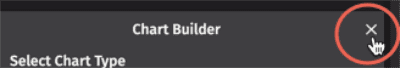
To close the Chart Builder, click the "✕" at the top right of the menu.
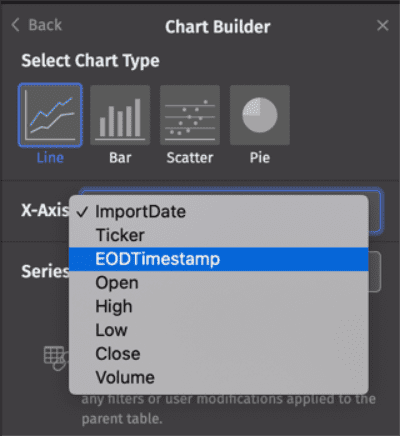
Line, Bar, and Scatter
For Line, Bar, and Scatter plots, you will be prompted to select an X-Axis value and a Series value. Clicking in each field reveals the available column values in that table:
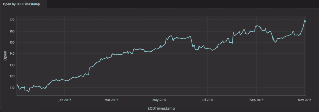
Once you make your selections, click Create to generate a single series plot.
The plot will open as a new panel in your workspace. The chart title will be generated automatically based on your selections. In the example below, the chart is titled "Open by EODTimestamp", which are the names used for the Series and X-Axis columns, respectively.
You can also create a multiple series plot using the Add Series option:
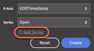
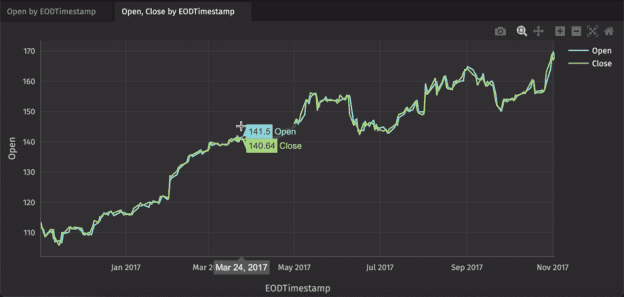
An additional Series field will appear. In the following example, the Open and Close series are plotted:
Series can be removed from the dialog by clicking the trash can ( ) icon to the right of the Series value. Note that this will not affect a plot already created.
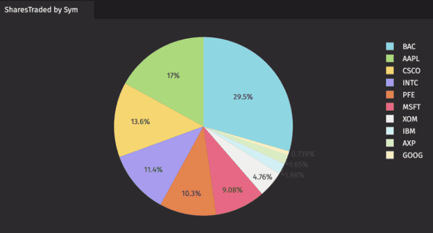
Pie
If Pie is selected as the chart type, you will be prompted to select the column names to use for Labels and Values, as shown below.
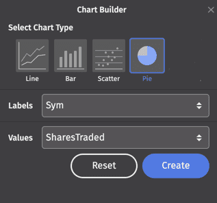
Clicking in each field reveals the available column names in the table. Once you have made your selections, click Create. The plot will open in a new panel.
Plot Hover Menu
Hovering your cursor over most charts (all except Pie charts) produces a menu bar with the following options, in order from left to right:

- Downsampling - This button will appear when a chart is downsampled (note that downsampling is automatic for any plot with over 20,000 items). Click this button to disable downsampling and get the full range of data. Download plot as PNG - Selecting this saves the plot locally as a PNG file.
- Zoom - After selecting zoom, use the cursor to "draw" the portion of the chart you want to magnify. Double-click on the chart to return the image to its original view.
- Pan - Selecting this option allows you to click and drag the plot to move other areas of the chart into view. Double-click on the chart to return the image to its original view.
- Zoom In - Selecting this zooms in on the plot.
- Zoom Out - Selecting this zooms out on the plot.
- AutoScale - Selecting this enables the chart to be sized automatically in the panel.
- Reset Axes - Selecting this resets the chart to its original ranges.
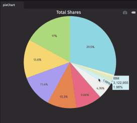
Hovering your cursor over a pie plot produces a menu bar with the following two options:

- Download plot as PNG - Selecting this saves the pie chart locally as a PNG file.
- Toggle show closest data on hover (on/off) - When enabled, your cursor tooltip shows the data for the slice of the pie chart under the cursor.
Tooltips
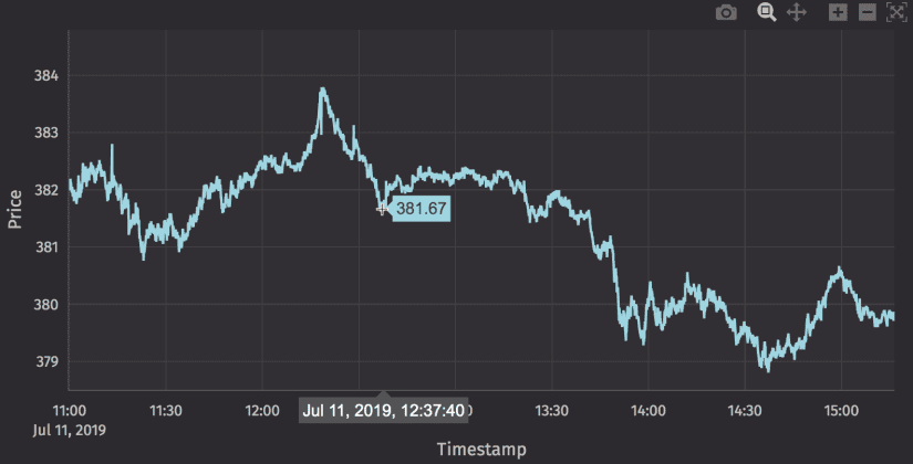
If you hover your cursor over the data shown in a plot, a tooltip will be presented with detailed information about that portion of the data. In the example below, the cursor tooltip shows the exact value over which it is positioned, while the timestamp value appears in a pop-up along the x-axis.
Note
This option must be enabled for use in pie charts by selecting Toggle show closest data on hover (on/off) in the Plot Hover Menu.
Toggling Series Visibility
When multiple series are presented in a plot, it may be useful to temporarily hide one or more of the series. Clicking once on the series name in the plot legend of the plot hides the series; clicking again shows the series.
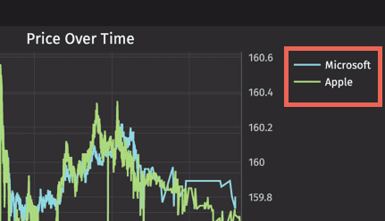
For example, the Apple series has been hidden in the chart below, and the series name has been dimmed in the legend.
Double-clicking on a series name will make only that series visible; double-clicking again restores all series.
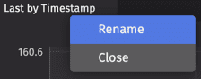
Renaming plots
You can rename any plot by right-clicking its tab: