Plot data

We've shown in detail how to get, manipulate, decorate, calculate, and join data. That's only half the journey to uncovering effective insights. When working with data, especially big data, the ability to visualize relationships is paramount.

Deephaven provides you with the tools you need to graphically render your data: seven chart types, multiple plot styles, and options for labeling and visual formatting.

img

Plotting via the Deephaven Query Language boils down to three basic steps:

  1. Selecting your data,
  2. Building the chart,
  3. And showing the chart.

XY Series & Multiple Series

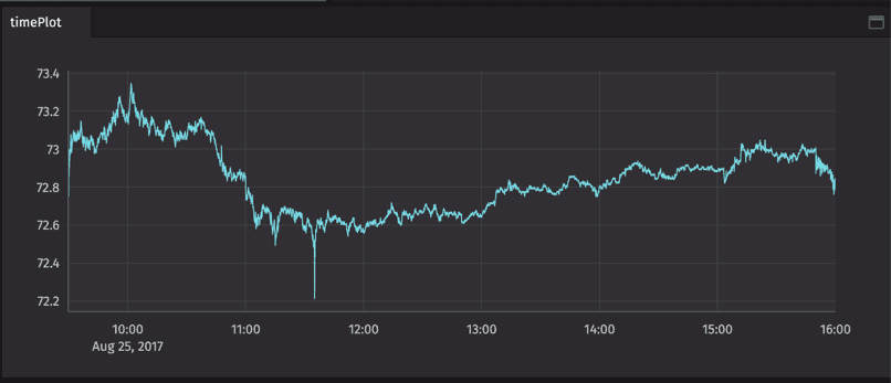
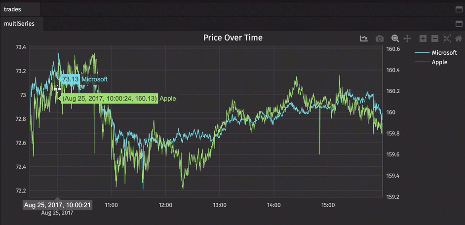
Here are two short examples that produce 1) an XY series chart of Microsoft prices, and 2) a multiple series plot comparing Microsoft and Apple prices.

First, source your data:

# select your data

trades = db.t("LearnDeephaven", "StockTrades")\
 .where("Date=`2017-08-25`")\
 .view("Sym", "Last", "Size", "ExchangeTimestamp")

# constrain the data to NYSE business time

import deephaven.Calendars as Calendars
cal = Calendars.calendar("USNYSE")
trades = trades.where("cal.isBusinessTime(ExchangeTimestamp)")

Important

Note that we've imported the Python Calendars module, which allows us to constrain the trades table to NYSE business time. When plotting in a Python console, you also need to import the Plot module.

XY Series

from deephaven import Plot

# build and show an XY series plot

timePlot = Plot.plot("Microsoft", trades.where("Sym=`MSFT`"), "ExchangeTimestamp", "Last")\
 .show()

img

Multiple Series

# build and show a multiple series plot

multiSeries = Plot.plot("Microsoft", trades.where("Sym=`MSFT`").sort(“ExchangeTimestamp”), "ExchangeTimestamp", "Last")\
 .twinX()\
 .plot("Apple", trades.where("Sym=`AAPL`").sort(“ExchangeTimestamp”), "ExchangeTimestamp", "Last")\
 .chartTitle("Price Over Time")\
 .xBusinessTime()\
 .show()

img

Tip

This query includes the xBusinessTime() method. Although we already constrained our data to business time in the source trades table itself, this accomplishes the same.
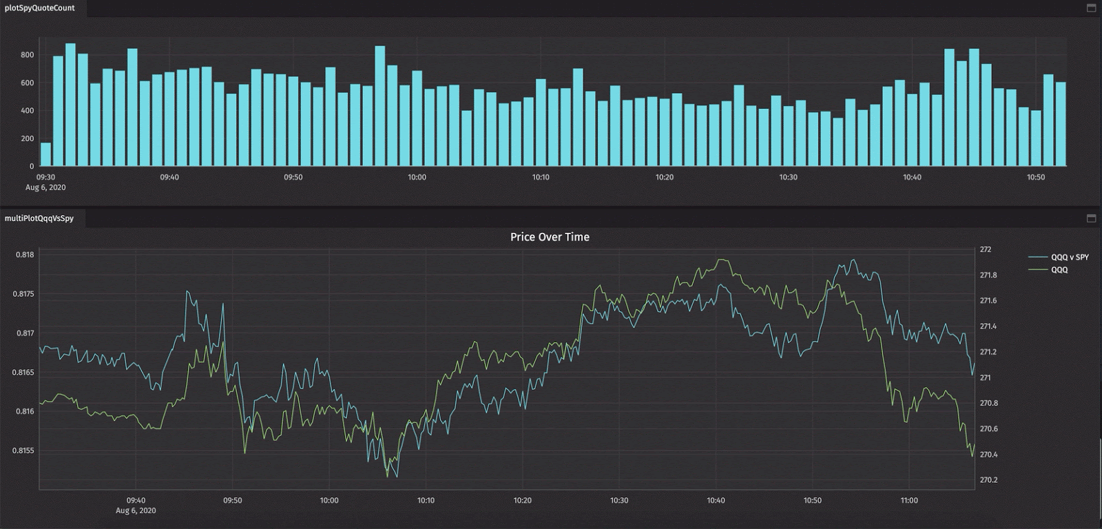
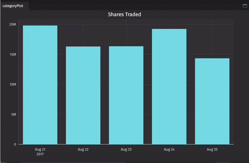
Bar

Several chart types are built into Deephaven, including category plots. The next query creates a simple bar chart of Microsoft shares traded during a specific timeframe.

from deephaven import Plot

# source the data

trades2 = db.t("LearnDeephaven", "StockTrades") \
 .where("Date > `2017-08-20`", "USym = `MSFT`") \
 .view("Date", "USym", "Last", "Size", "ExchangeTimestamp")
totalSharesByUSym = trades2.view("Date", "USym", "SharesTraded=Size") \
 .sumBy("Date", "USym")

# build the plot

categoryPlot = Plot.catPlot("MSFT", totalSharesByUSym.where("USym = `MSFT`"), "Date", "SharesTraded") \
 .chartTitle("Shares Traded") \
 .show()

img

Tip

As you can see in the query, use the chartTitle() method to give your title to your plots.

To learn more about other chart types, including histograms, pie charts, OHLC charts, and error bar charts, see our Plotting guide.

Plot Styles

In addition to chart types, plot styles offer users more control over the look and components of their plots:

.plotStyle("Style")

Options include:

  • Bar
  • Stacked_Bar
  • Line
  • Area
  • Stacked_Area
  • Scatter
  • Step

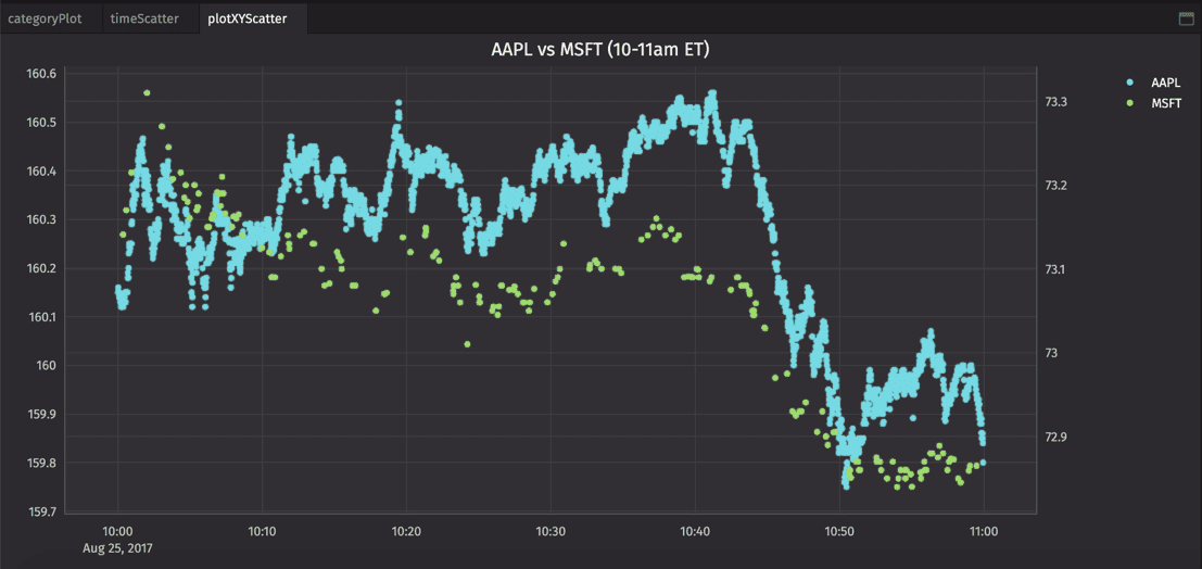
You can learn about all the options in our Plot Component documentation, but see below for a quick example of a scatter plot.

Scatter

from deephaven import Plot

trades3 = db.t("LearnDeephaven", "StockTrades")\
 .where("Date = `2017-08-25`", "USym in `AAPL`, `GOOG`, `MSFT`")\
 .update("TimeBin = lowerBin(Timestamp, SECOND)")\
 .firstBy("TimeBin")\
 .where("TimeBin > '2017-08-25T10:00 NY' && TimeBin < '2017-08-25T11:00 NY'")

plotXYScatter = Plot.plot("AAPL", trades3.where("USym = `AAPL`"), "Timestamp", "Last")\
 .plotStyle("scatter")\
 .twinX()\
 .plot("MSFT", trades3.where("USym = `MSFT`"), "Timestamp", "Last")\
 .plotStyle("scatter")\
 .chartTitle("AAPL vs MSFT (10-11am ET)")\
 .show()

img