Category
Category plots display data values from different discrete categories.
Data Sourcing
Category plots can be created using data from tables and arrays.
Creating a Category Plot using Data from a Table
When data is sourced from a table, the following syntax can be used to create a category:
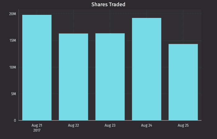
.catPlot("SeriesName", source, "CategoryCol", "ValueCol").show()
catPlot
is the method used to create a category plot."SeriesName"
is the name (string) you want to use to identify the series on the plot itself.source
is the table that holds the data you want to plot."CategoryCol"
is the name of the column (as a string) to be used for the categories."ValueCol"
is the name of the column (as a string) to be used for the values.show
tells Deephaven to draw the plot in the console.
//source the data
t1c = db.t("LearnDeephaven", "StockTrades")
.where("Date > `2017-08-20`", "USym = `MSFT`")
.view("Date", "USym", "Last", "Size", "ExchangeTimestamp")
totalSharesByUSym = t1c.view("Date", "USym", "SharesTraded=Size")
.sumBy("Date", "USym")
//build the plot
categoryPlot = catPlot("MSFT", totalSharesByUSym.where("USym = `MSFT`"), "Date", "SharesTraded")
.chartTitle("Shares Traded")
.show()
from deephaven import Plot
# source the data
t1c = db.t("LearnDeephaven", "StockTrades") \
.where("Date > `2017-08-20`", "USym = `MSFT`") \
.view("Date", "USym", "Last", "Size", "ExchangeTimestamp")
totalSharesByUSym = t1c.view("Date", "USym", "SharesTraded=Size") \
.sumBy("Date", "USym")
# build the plot
categoryPlot = Plot.catPlot("MSFT", totalSharesByUSym.where("USym = `MSFT`"), "Date", "SharesTraded") \
.chartTitle("Shares Traded") \
.show()
Creating a Category Plot using Data from Arrays
When data is sourced from a array, the following syntax can be used to create a category:
.catPlot("SeriesName", [category], [values]).show()
catPlot
is the method used to create a category plot."SeriesName"
is the name (as a string) you want to use to identify the series on the chart itself.[category]
is the array containing the data to be used for the X values.[values]
is the array containing the data to be used for the Y values.show
tells Deephaven to draw the plot in the console.
Categories with Shared Axes
You can also compare multiple categories over the same period of time by creating a category plot with shared axes. In the following example, a second category plot has been added to the previous example, thereby creating bar graphs on the same chart:
t2c = db.t("LearnDeephaven", "StockTrades")
.where("Date > `2017-08-20`", "USym in `AAPL`, `MSFT`")
.view("Date", "USym", "Last", "Size", "ExchangeTimestamp")
totalSharesByUSym2 = t2c.view("Date", "USym", "SharesTraded=Size").sumBy("Date", "USym")
categoryPlot2 = catPlot("MSFT", totalSharesByUSym2.where("USym = `MSFT`"), "Date", "SharesTraded")
.catPlot("AAPL", totalSharesByUSym2.where("USym = `AAPL`"), "Date", "SharesTraded")
.chartTitle("Shares Traded")
.show()
from deephaven import Plot
t2c = db.t("LearnDeephaven", "StockTrades") \
.where("Date > `2017-08-20`", "USym in `AAPL`, `MSFT`") \
.view("Date", "USym", "Last", "Size", "ExchangeTimestamp")
totalSharesByUSym2 = t2c.view("Date", "USym", "SharesTraded=Size").sumBy("Date", "USym")
categoryPlot2 = Plot.catPlot("MSFT", totalSharesByUSym2.where("USym = `MSFT`"), "Date", "SharesTraded") \
.catPlot("AAPL", totalSharesByUSym2.where("USym = `AAPL`"), "Date", "SharesTraded") \
.chartTitle("Shares Traded") \
.show()
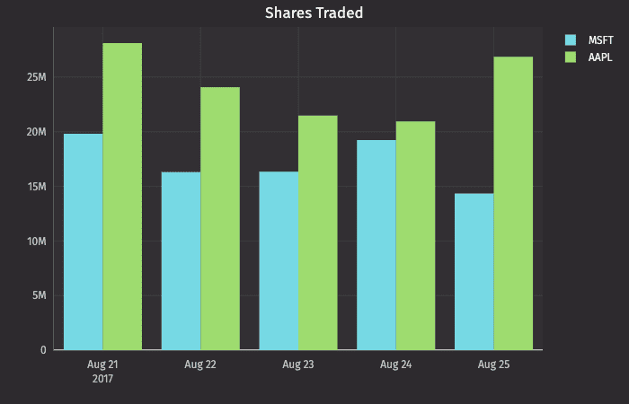
Subsequent categories can be added to the chart by adding additional catPlot() methods to the query. However, the plotBy()
method can also be used to do this.
Note
See
plotBy(./)
Plot Styles
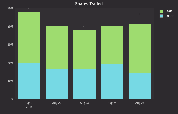
By default, values are presented as vertical bars. However, by using Deephaven's plotStyle()
method, the data can be represented as a bar, a stacked bar, a line, an area or a stacked area.
In any of the examples below, you can simply swap out the .plotStyle()
argument with the appropriate name; e.g., ("Area")
, ("stacked_area")
, etc.
Note
See Plot Styles
Category Plot with Stacked Bar
t2c = db.t("LearnDeephaven", "StockTrades")
.where("Date >`2017-08-20`", "USym in `AAPL`, `MSFT`")
.view("Date", "USym", "Last", "Size", "ExchangeTimestamp")
totalSharesByUSym2 = t2c.view("Date", "USym", "SharesTraded=Size").sumBy("Date", "USym")
categoryPlotStacked = catPlot("MSFT", totalSharesByUSym2.where("USym = `MSFT`"), "Date", "SharesTraded")
.catPlot("AAPL", totalSharesByUSym2.where("USym = `AAPL`"), "Date", "SharesTraded")
.plotStyle("stacked_bar")
.chartTitle("Shares Traded")
.show()
from deephaven import Plot
t2c = db.t("LearnDeephaven", "StockTrades") \
.where("Date >`2017-08-20`", "USym in `AAPL`, `MSFT`") \
.view("Date", "USym", "Last", "Size", "ExchangeTimestamp")
totalSharesByUSym2 = t2c.view("Date", "USym", "SharesTraded=Size").sumBy("Date", "USym")
categoryPlotStacked = Plot.catPlot("MSFT", totalSharesByUSym2.where("USym = `MSFT`"), "Date", "SharesTraded") \
.catPlot("AAPL", totalSharesByUSym2.where("USym = `AAPL`"), "Date", "SharesTraded") \
.plotStyle("stacked_bar") \
.chartTitle("Shares Traded") \
.show()
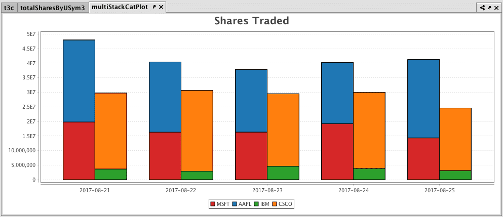
Multiple Sets of Stacked Category Plots
Note
This feature is currently available in Deephaven Classic, and will be coming to the web soon.
Multiple sets of stacked category plots can be created by assigning each category to a group and then applying a plot style:
t3c = db.t("LearnDeephaven", "StockTrades")
.where("Date > `2017-08-20`", "USym in `AAPL`, `MSFT`, `IBM`, `CSCO`")
.view("Date", "USym", "Last", "Size", "ExchangeTimestamp")
totalSharesByUSym3 = t3c.view("Date", "USym", "SharesTraded=Size").sumBy("Date", "USym")
multiStackCatPlot = catPlot("MSFT", totalSharesByUSym3.where("USym = `MSFT`"), "Date", "SharesTraded")
.group(1)
.catPlot("AAPL", totalSharesByUSym3.where("USym = `AAPL`"), "Date", "SharesTraded")
.group(1)
//the two series above are assigned to group 1
.catPlot("IBM", totalSharesByUSym3.where("USym = `IBM`"), "Date", "SharesTraded")
.group(2)
.catPlot("CSCO", totalSharesByUSym3.where("USym = `CSCO`"), "Date", "SharesTraded")
.group(2)
//the two series above are assigned to group 2
.plotStyle("stacked_bar")
.chartTitle("Shares Traded")
.show()
from deephaven import Plot
t3c = db.t("LearnDeephaven", "StockTrades") \
.where("Date > `2017-08-20`", "USym in `AAPL`, `MSFT`, `IBM`, `CSCO`") \
.view("Date", "USym", "Last", "Size", "ExchangeTimestamp")
totalSharesByUSym3 = t3c.view("Date", "USym", "SharesTraded=Size").sumBy("Date", "USym")
multiStackCatPlot = Plot.catPlot("MSFT", totalSharesByUSym3.where("USym = `MSFT`"), "Date", "SharesTraded") \
.group(1) \
.catPlot("AAPL", totalSharesByUSym3.where("USym = `AAPL`"), "Date", "SharesTraded") \
.group(1)\
.catPlot("IBM", totalSharesByUSym3.where("USym = `IBM`"), "Date", "SharesTraded") \
.group(2) \
.catPlot("CSCO", totalSharesByUSym3.where("USym = `CSCO`"), "Date", "SharesTraded") \
.group(2)\
.plotStyle("stacked_bar") \
.chartTitle("Shares Traded") \
.show()