Error Bars
Error bar plots, which visually indicate the uncertainties in a dataset, are useful in determining whether the variability in your data is statistically significant. For instance, if your plot shows average values, a short error bar shows that the average value is more certain because the values are concentrated, while a long error bar shows a greater amount of uncertainty because the values are spread out, and thus less reliable. The error bars typically represent standard deviation or a particular confidence interval.
Error bar plotting is available for:
XY Series Plots with Error Bars
XY Series plots with error bars can be created from data sourced from a table or an array. There are three methods available:
errorBarX()is used to create an XY series plot with error bars drawn in the same direction as the X axis (horizontally).errorBarY()is used to create an XY series plot with error bars drawn in the same direction as the Y axis (vertically).errorBarXY()is used to create an XY series plot with error bars drawn both horizontal and vertically.
errorBarX()
Sourced from a table
When creating an errorBarX plot using data sourced from a table, the following syntax can be used:
.errorBarX("SeriesName", source, "x", "y", "xLow", "xHigh").show()
errorBarXis the method used to create an errorBarX plot."SeriesName"is the name (as a string) you want to use to identify the series on the plot itself.sourceis the table that holds the data to be used for the plot."x"is the name of the column of data to be used for the X value."y"is the name of the column of data to be used for the Y value."xLow"is the name of the column of data to be used for the low error value on the X axis."xHigh"is the name of the column of data to be used for the high error value on the X axis.showtells Deephaven to draw the plot in the console.
Sourced from an array
When creating an errorBarX plot using data sourced from an array, the following syntax can be used:
.errorBarX("SeriesName", [x], [y], [xLow], [xHigh]).show
errorBarXis the method used to create an errorBarX chart."SeriesName"is the name (as a string) you want to use to identify the series on the chart itself."[x]"is the array containing the data to be used for the X value."[y]"is the array containing the data to be used for the Y value."[xLow]"is the array containing the data to be used for the low error value on the X axis."[xHigh]"is the array containing the data to be used for the high error value on the X axis.showtells Deephaven to draw the plot in the console.
errorBarY()
Sourced from a table
When creating an errorBarY plot using data sourced from a table, the following syntax can be used:
.errorBarY("SeriesName", source, "x", "y", "yLow", "yHigh").show()
errorBarYis the method used to create an errorBarY plot."SeriesName"is the name (as a string) you want to use to identify the series on the plot itself.sourceis the table that holds the data to be used for the plot."x"is the name of the column of data to be used for the X value."y"is the name of the column of data to be used for the Y value."yLow"is the name of the column of data to be used for the low error value on the Y axis."yHigh"is the name of the column of data to be used for the high error value on the Y axis.showtells Deephaven to draw the plot in the console.
Sourced from an array
When creating an errorBarY plot using data sourced from an array, the following syntax can be used:
.errorBarY("SeriesName", [x], [y], [yLow], [yHigh]).show()
errorBarYis the method used to create an errorBarY plot."SeriesName"is the name (as a string) you want to use to identify the series on the chart itself."[x]"is the array containing the data to be used for the X value."[y]"is the array containing the data to be used for the Y value."[yLow]"is the array containing the data to be used for the low error value on the Y axis."[yHigh]"is the array containing the data to be used for the high error value on the Y axis.showtells Deephaven to draw the plot in the console.
Example
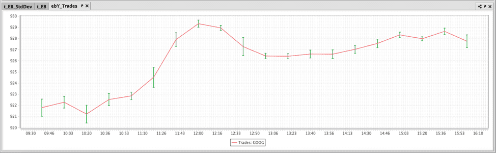
The query shown in the example below will plot the standard deviation in the value of Google trades every 20 minutes. The resulting plot will be plotted as a line graph with error bars running vertically.
Note
The Python query imports both the Plot and ComboAggregateFactory modules.
The first code block:
- accesses the StockTrades table in the LearnDeephaven namespace;
- filters it to include only the data for August 23, 2017, and only when the USym is GOOG;
- downsamples (bins) the data for 20-minute intervals;
- and filters again to include only the data that occurs within business hours.
The second code block:
- calculates the average of the values in the Last column and the standard deviation of the values in the Last column,
- and stores these results in new columns, AvgPrice and StdPrice respectively.
The third code block:
- creates an errorBarY plot named ebY_Trades,
- names the series "Trades: GOOG",
- sources the data from the t_EB_StdDev table,
- creates two columns in that table using the
updatemethod:- AvgPriceLow is calculated by subtracting the standard deviation of the price from the average.
- AvgPriceHigh is calculated by adding the average price to the standard deviation.
- uses data from the TimeBin column for the X value,
- uses data from the AvgPrice column as the Y value,
- uses data from the AvgPriceLow column for the low error value on the Y axis,
- uses data from the AvgPriceHigh column for the high error value on the Y axis,
- and finally, the
showmethod tells Deephaven to present the plot in the Deephaven console.
errorBarXY()
Sourced from a table
When creating an errorBarXY plot using data sourced from a table, the following syntax can be used:
.errorBarXY("SeriesName", source, "x", "xLow", "xHigh", "y", "yLow", "yHigh").show()
errorBarXYis the method used to create an errorBarXY plot."SeriesName"is the name (as a string) you want to use to identify the series on the plot itself.sourceis the table that holds the data to be used for the plot."x"is the name of the column of data to be used for the X value."xLow"is the name of the column of data to be used for the low error value on the X axis."xHigh"is the name of the column of data to be used for the high error value on the X axis."y"is the name of the column of data to be used for the Y value."yLow"is the name of the column of data to be used for the low error value on the Y axis."yHigh"is the name of the column of data to be used for the high error value on the Y axis.showtells Deephaven to draw the plot in the console.
Sourced from an array
When creating an errorBarX Plot using data sourced from an array, the following syntax can be used:
.errorBarXY("SeriesName", "[x]", [xLow], [xHigh], "[y]", [yLow], [yHigh]).show()
errorBarXis the method used to create an errorBarX chart."SeriesName"is the name (as a string) you want to use to identify the series on the chart itself."[x]"is the array containing the data to be used for the X value."[xLow]"is the array containing the data to be used for low error value on the X axis."[xHigh]"is the array containing the data to be used for high error value on the X axis."[y]"is the array containing the data to be used for the Y value."[yLow]"is the array containing the data to be used for the low error value on the Y axis."[yHigh]"is the array containing the data to be used for the high error value on the Y axisshowtells Deephaven to draw the plot in the console.
Customize Error Bar Color
Users can choose a specific color for Error Bars using the errorBarColor method.
Note
At this time, this feature is only supported in Deephaven Classic.
The following query produces green error bars in a Deephaven Classic (Swing) console:
Note
Category Plots with Error Bars
Category plots with error bars can be created from data sourced from a table or an array. The method is:
catErrorBar()
This creates a Category Plot with the discrete values on the X axis, numerical values on the Y axis. Error bars can only run vertically.
catErrorBar
Sourced from a table
When data is sourced from a table, the following syntax can be used:
.catErrorBar("SeriesName", source, "x", "y", "yLow", "yHigh").show()
catErrorBarXis the method used to create a category plot with vertical error bars."SeriesName"is the name (as a string) you want to use to identify the series on the plot itself.sourceis the table that holds the data you want to plot."x"is the name of the column of data to be used for the X value."y"is the name of the column of data to be used for the Y value."yLow"is the name of the column of data to be used for the low error value."yHigh"is the name of the column of data to be used for the high error value.showtells Deephaven to draw the plot in the console.
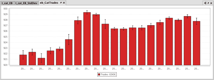
The query shown in the example below will plot the standard deviation in the value of Google trades every 20 minutes:
The first code block:
- gathers the data for the plot from the StockTrades table in the LearnDeephaven namespace,
- filters it to include only the data for August 23, 2017, and only when the USym is GOOG,
- downsamples (bins) the data for 20 minute intervals,
- then filters again to include only the data that occurs within business hours.
The second code block:
- calculates the average of the values in the Last column and the standard deviation of the values in the Last column,
- and stores the results will appear in new columns, AvgPrice and StdPrice respectively.
The third code block:
- creates a category error bar plot named eb_CatTrades,
- names the series "Trades: GOOG",
- creates two columns using the
updatemethod:- AvgPriceLow is calculated by subtracting the standard deviation of the price from the average.
- AvgPriceHigh is calculated by adding the average price to the standard deviation.
- uses data from the TimeBin column for the X value,
- uses data from the AvgPrice column as the Y value,
- uses data from the AvgPriceLow column for the low error value on the Y axis,
- uses data from the AvgPriceHigh column for the high error value on the Y axis,
- and finally the
showmethod tells Deephaven to present the plot in the Deephaven console.
Sourced from an array
When data is sourced from an array, the following syntax can be used:
.catErrorBar("SeriesName", [x], [y], [yLow], [yHigh]).show()
catErrorBarXis the method used to create a category plot with vertical error bars."SeriesName"is the name (as a string) you want to use to identify the series on the plot itself."[x]"is the name of the column of data to be used for the X value."[y]"is the name of the column of data to be used for the Y value."[yLow]"is the name of the column of data to be used for the low error value on the Y axis."[yHigh]is the name of the column of data to be used for the high error value on the Y axis.showtells Deephaven to draw the plot in the console.