Open, High, Low, Close (OHLC)
The Open, High, Low and Close (OHLC) plot typically shows four prices of a security or commodity per time slice: the open and close of the time slice, and the highest and lowest values reached during the time slice.
This plotting method requires a dataset that includes one column containing the values for the X axis (time), and one column for each of the corresponding four values (open, high, low, close).
Data Sourcing
Open, High, Low and Close Plots can be created using data from tables or arrays.
Creating a OHLC Plot using Data from a Table
When data is sourced from a table, the following syntax can be used:
.ohlcPlot("SeriesName", source, "Time", "Open", "High", "Low", "Close").show()
ohlcPlotis the method used to create an OHLC chart."SeriesName"is the name (as a string) you want to use to identify the series on the chart itself.sourceis the table that holds the data you want to plot."Time"is the name (as a string) of the column to be used for the X axis."Open"is the name of the column (as a string) holding the opening price."High"is the name of the column (as a string) holding the highest price."Low"is the name of the column (as a string) holding the lowest price."Close"is the name of the column (as a string) holding the closing price.showtells Deephaven to draw the plot in the console.
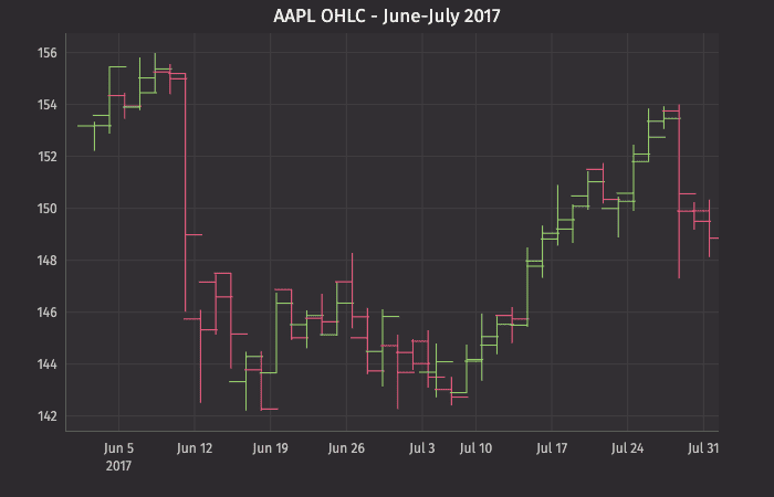
This query plots the OHLC chart as follows:
plotOHLCis the name of the variable that will hold the chart.ohlcPlotis the method."AAPL"is the name of the series to be used in the chart.tOHLCis the table from which our data is being pulled.EODTimestampis the name of the column to be used for the X axis."Open","High","Low", and"Close", are the names of the columns containing the four respective data points to be plotted on the Y axis.xBusinessTime()limits the date to business days only.lineStyle()andchartTitle()provide component formatting to the table.2refers to line width.
Creating an OHLC Plot using Data from an Array
When data is sourced from an array, the following syntax can be used:
.ohlcPlot("SeriesName",[Time], [Open], [High], [Low], [Close]).show()
ohlcPlotis the method used to create an OHLC chart."SeriesName"is the name (as a string) you want to use to identify the series on the chart itself.[Time]is the array containing the data to be used for the X axis.[Open]is the array containing the data to be used for the opening price.[High]is the array containing the data to be used for the highest price.[Low]is the array containing the data to be used for the lowest price.[Close]is the array containing the data to be used for the closing price.showtells Deephaven to draw the plot in the console.
OHLC Plots with Shared Axes
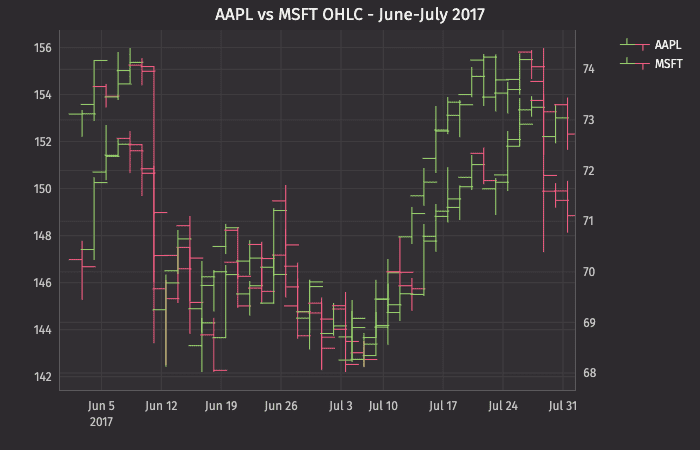
Just like XY series plots, the Open, High, Low and Close plot can also be used to present multiple series on the same chart, including the use of multiple X or Y axes. An example of this follows:
This query plots the OHLC chart as follows:
plotOHLC2is the name of the variable that will hold the chart.ohlcPlotplots the first series."AAPL"is the name of the first series to be used in the chart.t2OHLCis the table from which the data is being pulled.where("Ticker=`AAPL`")filters the table to only the AAPL Ticker.EODTimestampis the name of the column to be used for the X axis."Open","High", "Low", and"Close", are the names of the columns containing the four respective data points to be plotted on the Y axis.- The
lineStyle()method needs to be assigned to each series, so this reference only applies to the first series.
twinXis used to show different Y axes.ohlcPlotplots the second series."MSFT"is the name of the second series to be used in the chart.t2OHLCis the table from which the data is being pulled.where("Ticker=`MSFT`")filters the table to only the MSFT Ticker.EODTimestampis the name of the column to be used for the X axis."Open","High","Low", and"Close", are the names of the columns containing the four respective data points to be plotted on the Y axis.lineStyle()applies only to the second series.
xBusinessTime()limits the date to business days only.chartTitle()provides the title for the chart.
In this plot, the opening, high, low and closing price of AAPL and MSFT are plotted. The twinX() method is used to show the value scale for AAPL on the left Y axis and the value scale for MSFT on the right Y axis.