Working with plots
Users can create charts in Deephaven by using a Deephaven query, or directly in the user interface. The following documentation discusses how to create and edit plots in the Deephaven user interface.
Note
To create plots using query language, see: Plotting
After a plot has been created in the console, right-click shortcuts are available that can help you manipulate content in the plot. Some options include saving and printing the chart, while others provide the means to change aspects within the displayed chart.
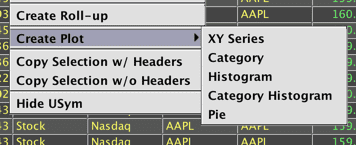
Create Plot
Users can create plots directly in the user interface using the Create Plot option in the right-click table data menu.
Plots created using this option will not appear in the Show Widget menu. However, these plots can be saved as part of your workspace and will reappear when you open a saved workspace.
There are five chart types available:
Each type will be discussed below.
XY series
Single series
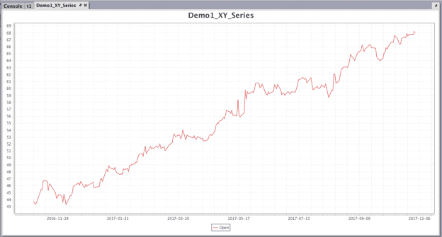
We will create a single series XY plot from the "EODTrades" table created by the following query:
Right-click anywhere in the table to access the Create Plot menu, then select XY Series. The Create Plot editor opens, as shown below:
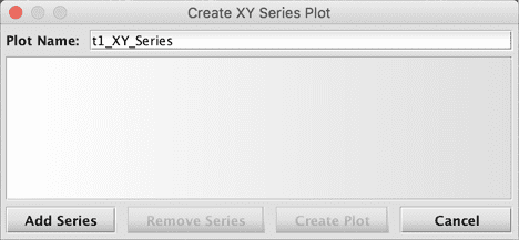
To configure the data in your plot, select Add Series.
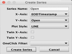
For all chart types, users can type a new name for the series in the first field.
Options specific to an XY Series chart follow: X-Axis, Y-Axis, and Plot Style. Users can set these values using the drop-down menus in each field.
In this example, we are going to:
- name the series "Open"
- select EODTimestamp for the X-Axis
- select Open for the Y-Axis
- select LINE (the default) from the Plot Style drop-down menu
Note
See: Plot Styles
Click Create Series. The selections are recorded in the Create Plot dialog, where you can type in a name for your plot.
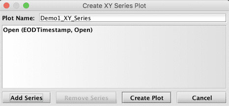
If you want to remove a series that you have already added, select the series and click Remove Series. Otherwise, click Create Plot to render the chart.
Tip
Note: In order to edit your selections in a series, you must remove it and re-add that series with your desired changes.
Multiple series
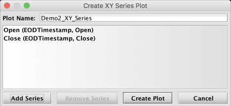
It is possible to plot multiple series in the same chart. At this time, users cannot edit a chart already created, so we will need to create a new plot if we want to add another series.
We're going to create the first series in this new chart using the same query and process used for Demo1_XY_Series. However, before we select Create Plot, we're going to click Add Series to create a second series in the chart.
For this example we'll:
- name the second series "Close"
- select EODTimestamp for the X-Axis
- select Close for the Y-Axis
- select LINE from the Plot Style drop-down menu
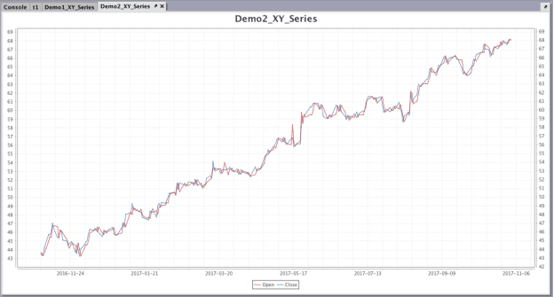
Then, click Create Series. Both series and their respective selections are now recorded in the Create Plot dialog:
Once we click Create Plot, Demo2_XY_Series opens in the console.
OneClick series
You can pair OneClick filters with any plot created in the user interface if you configure the OneClick Filter field in the Create Series editor.
Note
See: OneClick filtering
In the first two examples our initial query filtered the "EODTrades" table to the Ticker A. Normally, to include other symbols for plotting, you would need to rewrite the underlying query. However, when creating plots in the user interface, this can be accomplished by pairing your plot with a OneClick filter in the console. Similarly, if you wanted to see the price of a single security over time, without creating a new plot each time, you could use a OneClick filter to change the table data for each Sym.
For this example, we will use the following query to create our initial table using data from "StockTrades":
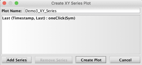
First, create a new OneClick panel by clicking the OneClick button at the top of the Deephaven console. The column option defaults to USym. For this example, we will change this to Sym by typing our own value in the field.
Right-click within table "t2" to open the Create Plot editor:
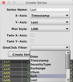
Select:
- Timestamp as the X-Axis value
- Last as the Y-Axis value
- LINE as the Plot Style
- Sym from the OneClick Filter drop-down menu
Note
The filter selected in the Create Series editor must match the Column entry in the OneClick panel.
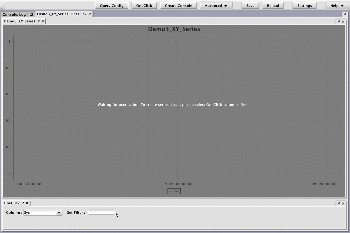
Click Create Series. The selections are recorded in the Create Plot dialog.
Click Create Plot. You will need to nest the new plot into the same panel as your OneClick filter. To see a chart for a particular Sym, type the appropriate value into the Set Filter field and press Return or Enter. If you nest multiple plots in the same OneClick panel, all plots will filter accordingly. You can also nest a plot in a different OneClick panel to have it filter uniquely.
Multiple axes
It is possible to twin either the X or Y axis to accommodate a large range of values. For example, part of a series would be plotted on a Y axis with its values on the left of the graph, and the other part of the series would be plotted on a Y axis with its value on the right of the graph, while sharing the share X axis.
For this example, we will plot two series on their own Y axis, using the following query to create our initial table:
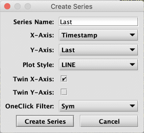
In the first series, select:
- Timestamp as our X-Axis value
- Last as our Y-Axis value
- LINE as the Plot Style.
- the OneClick Filter, set to Sym
- the Twin X-Axis checkbox
Click Create Series, then repeat the process select:
- Size as the Y-Axis value
- the Twin X-Axis checkbox
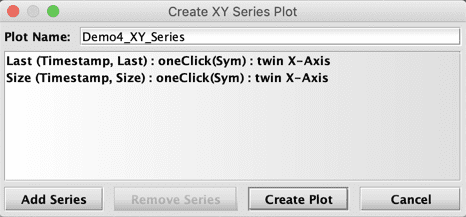
After clicking Create Plot, the plot window for DemoPlot4_XY_Series will be created in the console, but will need to be paired with a OneClick filter. At this time you cannot create multiple series for individual Syms, so we will use the OneClick to filter the table to one Sym at a time.
Once the panels are nested together, you can specify which Sym to plot.
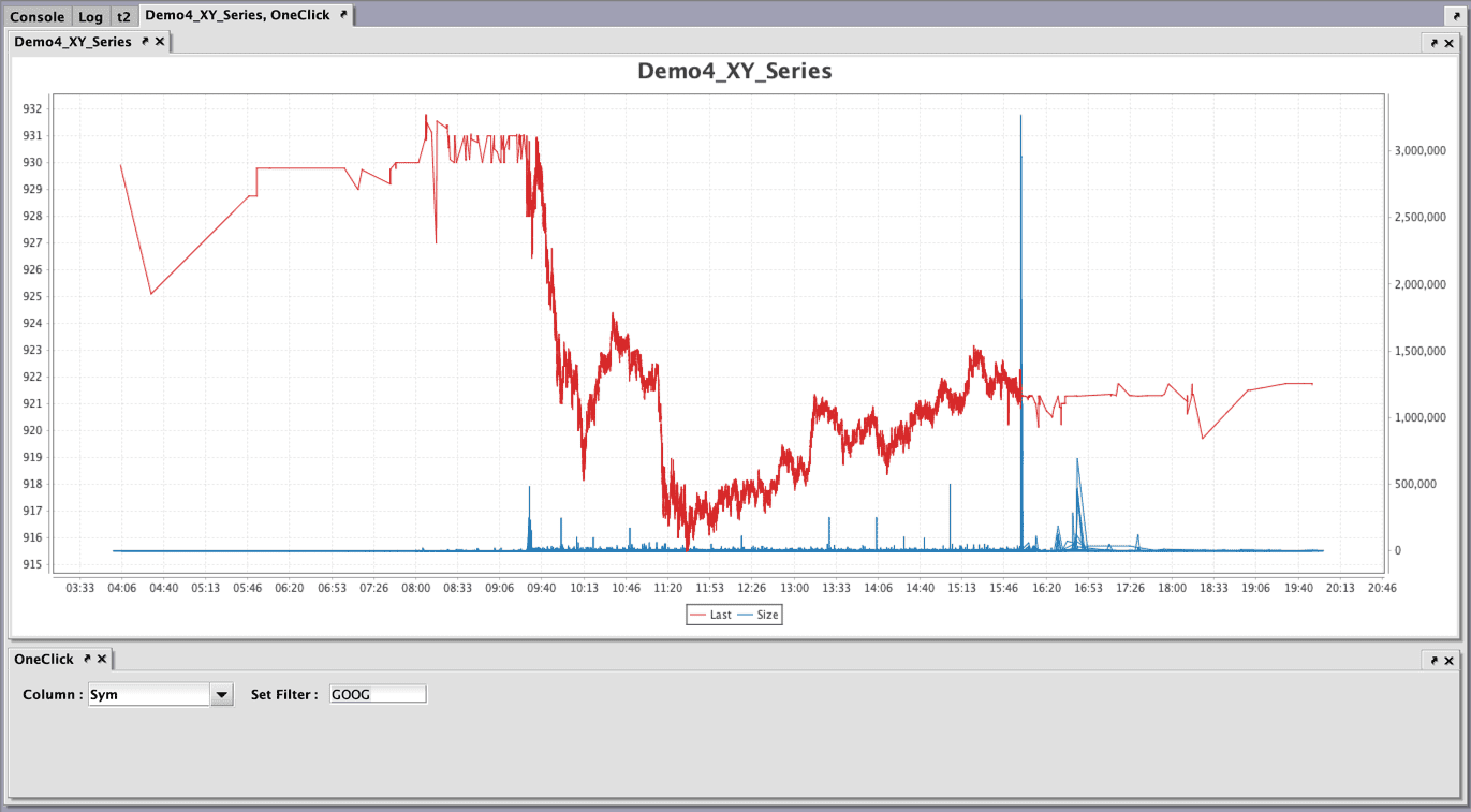
Both series, Last and Size, share the same X axis. The Y-axis to the left displays the values for the Last series, while the Y-axis to the right displays the values for the Size series.
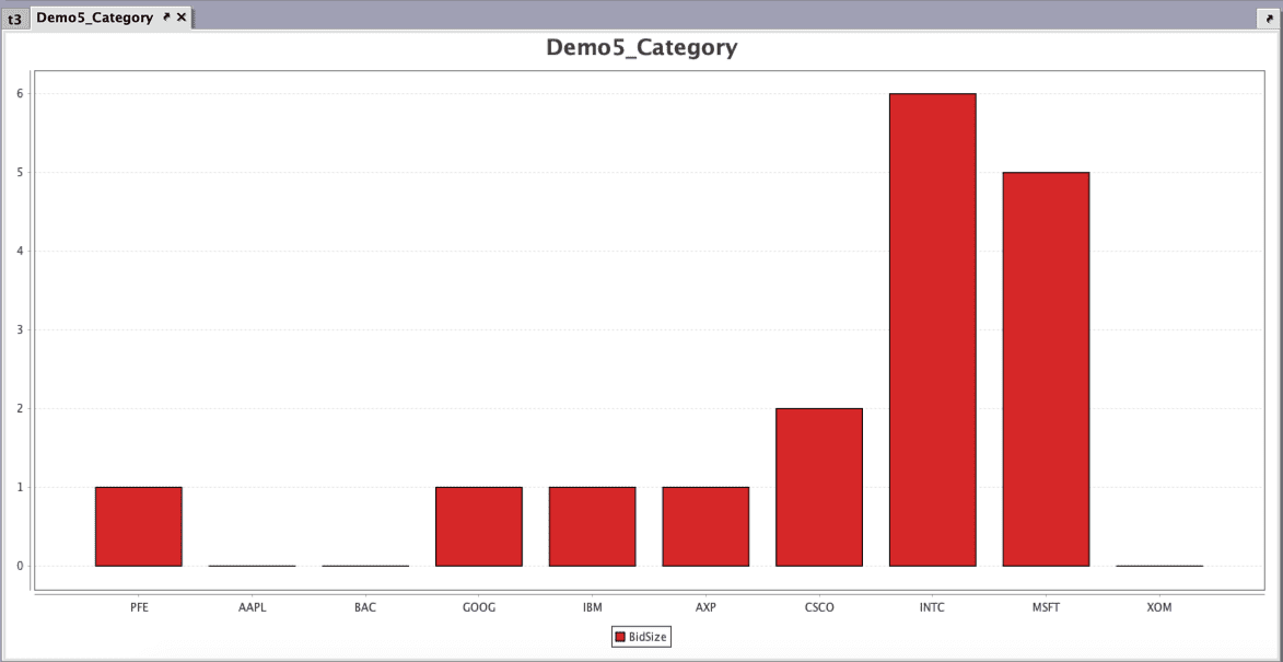
Category
For our Category chart, we will use the following query to create a table from "StockQuotes" data:
Select Category from the Create Plot menu. The Create Series editor includes fields for Category and Value columns, in addition to the universal options, Series Name and OneClick Filter.
We'll name our series "BidSize," then select:
- USym from the Category Column drop-down menu
- BidSize from the Value Column drop-down menu
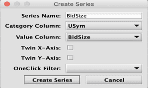
Click Create Series.
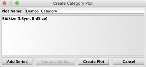
Click Create Plot.
Histogram
In this example, we will create a Histogram paired with a OneClick filter.
For our histogram, we will use the following query to create a table from "StockTrades" data:
Right click in the table, select Create Plot, and then select Histogram.
The Create Series editor now includes a Value Column field with a drop-down menu, and a Bins field with arrows to increase or decrease the number of intervals to use in the chart.
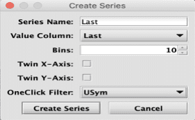
In this example, we will name the series "Last", then:
- select Last as the Value Column
- enter 10 in the Bins field to include 10 intervals in the histogram.
- select USym from the OneClick Filter drop-down menu
Click Create Series.
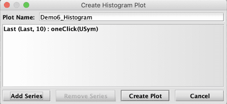
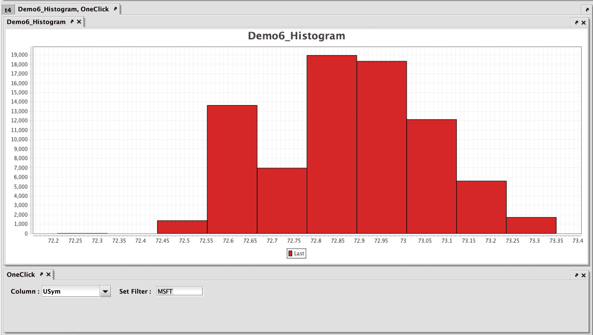
Click Create Plot. You will need to pair the new plot with a OneClick filter on the USym column.
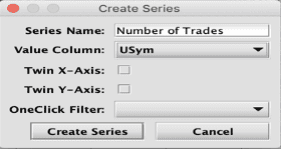
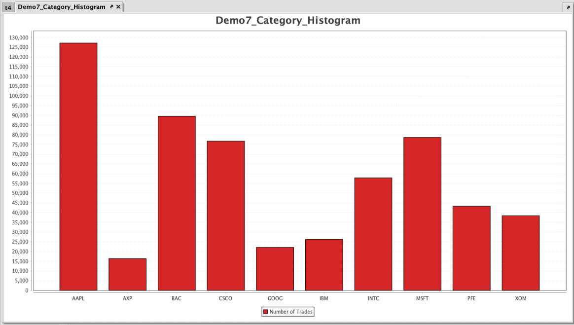
Category Histogram
In this example, we will create a Category Histogram, starting with the following query to create a table from "StockTrades" data:
Right click in the table, select Create Plot and then select Category Histogram. The Create Series editor only presents a Value Column field in addition to the universal options, Series Name and OneClick Filter. For this plot, we will create one series called "Number of Trades" using USym as the Value Column.
Click Create Series.
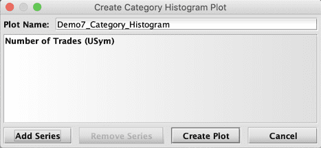
Click Create Plot.
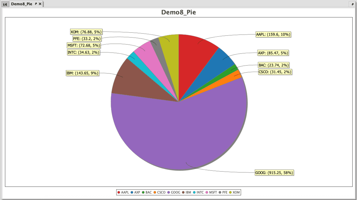
Pie
In this example, we will create a Pie chart from a table created from the following query:
Right click in the table, select Create Plot and then select Pie. The Create Series editor includes options for Category and Value Columns.
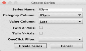
Select:
- USym as the Category Column
- Last as the Value Column
Click Create Series.
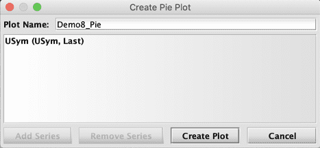
When creating a pie chart, you can only add one series. Once the first series is created, the Add Series button becomes unavailable.
Click Create Plot.
Right-click Shortcuts
After a plot has been created by a query or with Create Plot in the user interface, right-click shortcuts are available that can help you manipulate content in the plot. Some options include saving and printing the chart, while others provide the means to change aspects within the displayed chart. For example, users can choose to change background colors, fonts/color, the range of data displayed and/or zoom in/out.
While the appearance of the chart can be changed, the manipulations performed after the plot has been generated by the query only impact the presentation of the original table in the Deephaven console. These alterations do not change any of the underlying values created by the original query. If you rerun the query, any manual changes previously made to the original chart presentation through the right-click menus will be discarded, even if you save the workspace.
Properties
When Properties is selected, the following dialog window is generated:
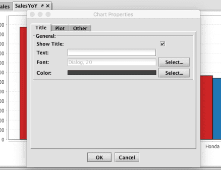
Three tabs are available:
Title
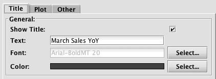
The Title tab provides options for adding (or editing) a title to your chart.
- If your original query for this chart did not include the creation of a chart title, you can add a title now by selecting the check box for Show Title, and then typing the chart title into Text field. You can also adjust the font and the font color for the title.
- If your original query included the creation of a chart title, you can use the options in this window to edit or hide the title.
Plot
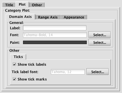
The content shown in the Plot tab enables you to add/edit items related to the plot of your chart. As such, the options shown will vary based on the type of plot performed. The example shown above presents the options for a category plot, which includes properties for each of the axes' labels and tick labels/marks, as well as the Appearance of the entire plot, including background color. Another option shown on the Appearance tab for category plots is an orientation setting that allows you to orient the bars vertically or horizontally.
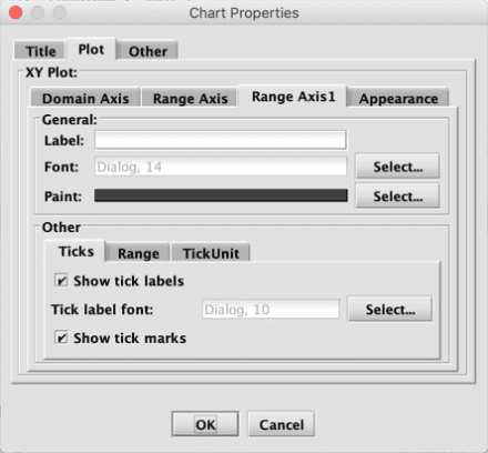
Since the options shown on the Plot tab are dependent upon the type of chart you are plotting, the options available will vary. For example, an XY series chart with multiple Y axes will include an additional tab:
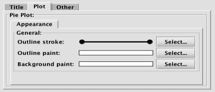
The Plot tab for a pie chart will only show values pertaining to Appearance:
Other
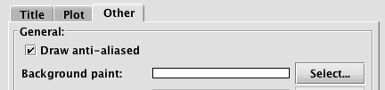
The Other tab presents options for drawing the chart with anti-aliasing turned on or off, and for changing the background paint of the chart.
Copy
This copies the entire chart to your system's clipboard. You can then paste the graphic into another application as needed.
Save as
Selecting Save as will open a dialog window and prompt you for the location on your system to save the chart as a PNG file.
Selecting Prting will open a dialog window and prompt you to review options for Page Setup. After reviewing or making any changes, select OK to bring up the Print dialog window. Select the appropriate options in that dialog window and then click Print.
Zoom In
Selecting Zoom In provides three options. You can zoom in on the chart based on:
- both axes
- the domain axis (X)
- the range axis (Y)
Note: The options available are dependent upon the type of chart being used. For example, a line chart can zoom in/out on both axes, a category chart can zoom in/out only on the range (Y) axis, and a pie chart will not be able to zoom at all.
Zoom Out
Selecting Zoom Out provides up to three options. You can zoom out on the chart based on:
- both axes
- the domain axis (X)
- the range axis (Y)
Note: The options available are dependent upon the type of chart being used. For example, a line chart can zoom in/out on both axes, a category chart can zoom in/out only on the range (Y) axis, and a pie chart will not be able to zoom at all.
Auto Range
Selecting Auto Range enables Deephaven to automatically reset the entire range for one or more axes.
Click-and-Drag Zooming
The click-and-drag method zooms in on a particular area of a plot. Click-and-drag to draw a box with your mouse cursor over the area you want to enlarge.
For example, if we click and drag over the lower area of the chart between 12 and 22, a light purple box will show the area to be enlarged as shown below:
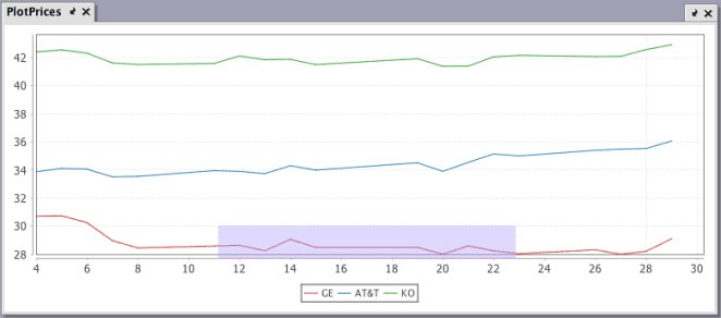
When the mouse button is released, the range of the chart will change to reflect only that area:
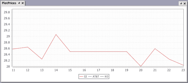
You can keep using this method to zoom closer and closer to a specific point on the chart.
You can return the chart to its normal size and range by right-clicking on the chart and selecting Auto Range > Both Axes.
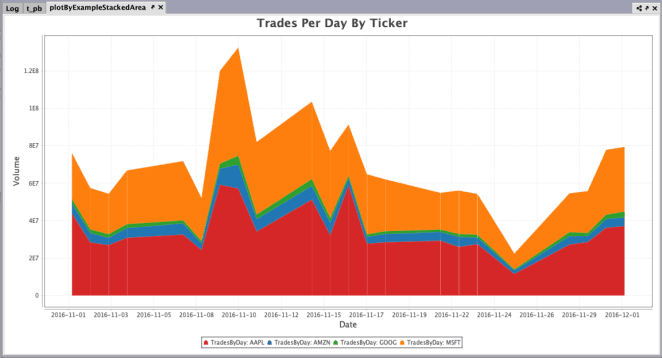
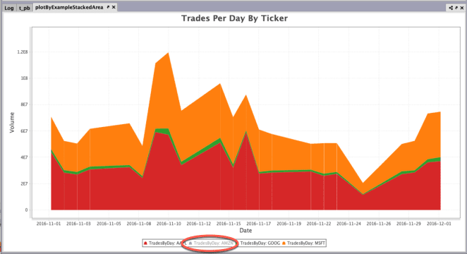
Toggling Series Visibility
When multiple series are presented in plot, users can temporarily hide one or more of the series in the plot. The visibility of any series in a plot can be toggled by clicking on the series name in the legend of the plot.
- Clicking one time hides the series; clicking again shows the series.
- Double-clicking a series hides the others; double-clicking again restores all series.
Original
One click
Double click
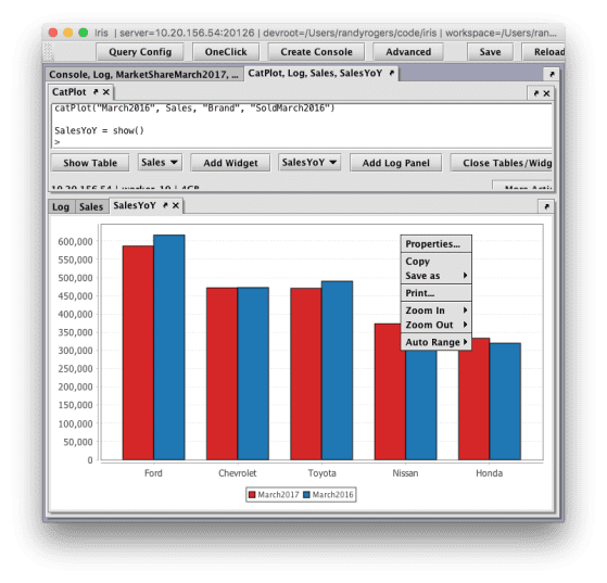
Linking plots
Linked Views is a feature in Deephaven that enables a user to interactively filter the content in one Deephaven table or plot based on the content selected in another Deephaven table.
To use Linked Views among tables or plots in the Deephaven console, the objects must first be "associated" to each other. One table is the source table and the other table is the target table or plot. When linking tables, a filter is applied to define the column in each table that should be linked. When a row in the source table is double clicked, the respective columns in the target table are filtered according to the filter parameters assigned during the linking process. Similarly, when a plot becomes the target of a link, the plot will instantly rechart its data according to the row clicked in the source table.
Any OneClick dataset can be linked to a table in the Deephaven Console. In addition to being able to pair the plot with a OneClick panel, a OneClick plot can act as the "target table" in a Linked Views pair.
Make Link To / From
Once both the source and target objects are open in your workspace, Linked Views can be initiated using the right-click table data menu. They can be in different panels or in multiple tabbed panel sets, but they must be open and available in the console.
Note: The examples shown below use data from the LearnDeephaven namespace. The following query can be used to recreate these tables in your own console:
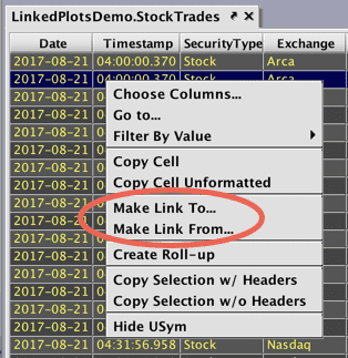
To initiate the linking process, right-click anywhere within the body of the table or plot. The drop-down menu on the source table presents options for Make Link To... and Make Link From...:
Note
The right-click menu on the target plot will only present the option to Make Link From... as plots can only function as a target.
When the Make Link To... option is selected, the table initially selected becomes the "source" table and the cursor will change to a link icon with a down arrow ( ).
).
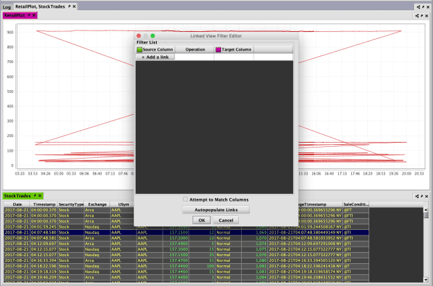
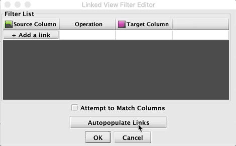
Click anywhere within the plot to designate it as the "target". The Linked View Filter Editor will open as shown below. The background colors of the table and plot's tabs will change to signify the source and the target.
As with linking tables, it is possible to possible to link one target plot to multiple source tables. However, you can only apply one filter from one source at a time.
Filter Editor
Once both the source and target are selected, the Filter Editor window is used to assign the columns that should be linked and how they should be filtered.
Click the + button located at the bottom left corner of the window to create a new filter. A new row will be added to the panel.
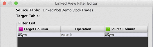
- When linking plots, the only Target Column(s) available are those specified in the query. In this example, the USym column automatically becomes the Target Column and no other options are available.
- The Operation will be "equals" by default: this cannot be changed, as linking plots only supports equals.
- Double-click Source Column to see a list of the columns in the source table.
Caution
The Filter Editor allows you to choose any column, however, you must choose a meaningful value or the filter operation will throw an error or result in a blank plot. You can also add multiple source columns, but the plot will load as blank unless the columns have duplicate data.
Functional parameters are shown below.
The following matching features may be turned on or off using the Attempt to Match Columns checkbox:
- Link Column Matching - When you create a new link, the dialog will attempt to set the pull down menus so that the Source column is the same as the first match in the Target columns. If no match is found, they default to the first value of each.
- Match Source Column to Target Column/Match Target Column to Source Column - When you change the Source or Target column, the dialog will attempt to set the corresponding column to match. In other words, if the Source is set to USym, the Target column will automatically change to USym, and vice versa. If no match is found, it is left alone.
Your on/off selection is saved in the workspace, and all dialogs that open in a new Deephaven session with remain in the last used state.
The Autopopulate Links button will populate the Linked View Filter Editor with matching sets of source and target columns:
Filtering the target plot
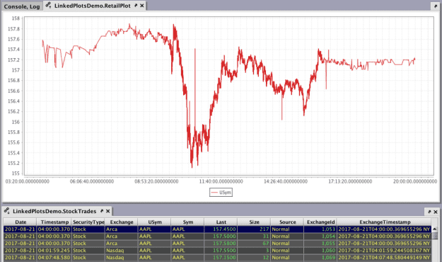
When a row in the source table is double-clicked, the target plot is filtered based on the parameters specified and the value(s) in the row of the source table that was double-clicked.
For example, the highlighted row in the StockTrades (source) table contains AAPL as the USym value. The plot immediately charts the data, and will be the same when any row with AAPL is clicked.
Edit or Remove Links
When a table is linked to a plot, right-clicking in the source table presents additional options in the context menu:
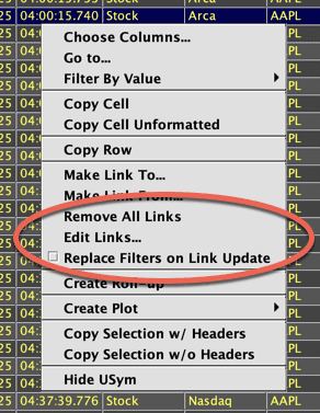
- Remove All Links removes all links between the source and target objects. Removing the links will not alter the current plot. Closing either the table or plot in the console also automatically removes any links.
- Edit Links... opens a dialog window that presents the filter parameters associated with the object selected. Filter parameters can be changed, added or deleted, although as explained above only certain parameters will meaningfully filter the plot.
- Replace Filters on Link Update checkbox will clear all existing filters on Link Targets before applying applying filters from a link update. For example, let's say you have two sources linked to one target, and each source has different filter parameters configured. Filters from a previous link event from Source 1 would be cleared from the target before applying filters from a link event from Source 2.
Saving Linked Views
Saving linked views in your workspace is possible only if the source table and target table/plot are generated from a persistent query. Once you have established your links and set the filter parameters, click Save at the top of Deephaven console.
Linked views generated from persistent queries will remain linked and will reestablish themselves if queries are restarted for any reason or after closing and reopening Deephaven.
Visual Formatting
Almost any aspect of a chart or figure can be visually formatted to suit your needs. Visual formatting starts with themes, which provide a predetermined set of fonts, colors and other formatting styles you can use with any available chart type. Even though a theme is always in use, individual aspects of the chart formatting can be customized, including the following:
- Fonts used for titles or labels, including the font face, style, size, etc.
- Lines, including line styles (single, double, etc.), line thickness, dash patterns, and start/end/join styles.
- Point markers, including visibility and shapes.
- The color of lines, shapes, points, axis, gridlines, etc. Heatmaps are also available.
Themes
A theme can be viewed as a predetermined set of fonts, colors and other formatting you can use with any available chart type. Themes are applied at the figure level in Deephaven.
Deephaven comes with three core themes, which are named for the background brightness in each: Light, Medium and Dark. There are four additional themes (Pastel, Forte, Neon and BlackLight) available for further color variations.
Note
To see the color variations used in all seven themes, download the Theme Color Palettes PDF file.
You can also build and save your own themes (see: Creating custom themes). Even with the use of themes, each chart component is fully customizable.
Light is the default theme. However, you can change the default theme used in your console by clicking Settings at the top of the Deephaven console.
You can also set the default value by running the following in the Deephaven console:
To specify the theme to be used for a figure without changing the default settings, you can apply the theme method to the figure object. For example, the following code instructs Deephaven to change the default theme for this figure (and only this figure) to Dark:
Creating custom themes
In addition to the preinstalled themes in Deephaven, you can also create your own custom themes to apply to your figures.
Themes are stored in files that use XML formatting to specify the characteristics of various elements in a chart. The root element of the XML file is <Theme>, and there are three required children elements:
<Name>is the name of the theme<Text>provides the formatting of various text elements<PlotElements>provides information about the formatting of plotting elements
Name
In the following example, Sample is the name of the theme.
Text
There are seven <Text> elements that can be assigned:
FigureTextFont- This is the default text element for the theme. IfFigureTextFontis not configured, all of the other six text elements must be configured. If any of the other six text elements is not configured,FigureTextFontwill be used.FigureTitleFont- Sets the font used for the Figure titleChartTitleFont- Sets the font used for the Chart title.AxisTitleFont- Sets the font used for the Axis titles.TickValuesFont- Sets the font used for the Axis tick labels.LegendFont- Sets the font used for the Legend text.PointLabelFont- Sets the font used for the Point Labels.
Each text element has the following four components:
NameStyleSizeColor
The syntax used to format the components is shown in the sample below. All four components must be set or the element will be ignored.
PlotElements
PlotElements describe the colors used for the following four components used in a plot:
- Background - Color of the chart background
- Grid - Color of the grid shown in front of the the background
- Axis - Color of the lines that form the axis
- Series - Collection of colors used to plot the data
Each of the first three elements are defined with only one color, which is specified using RGB notation.
The Series element is defined using the following three methods:
ColorPaletteAlgo- Deephaven includes two color palettes that are determined by algorithms. Options include:TRIAD_MIXINGGOLDEN
ColorPaletteArray- Deephaven includes two color palettes that are defined in arrays. Options include:JAVAFXMATLABMATPLOTLIB
- A list of color elements defined by their respective RGB properties
The following examples show how to specify each of the color palettes used in a theme:
Saving your custom themes
Once a theme is created, it needs to be saved with its respective name followed by the suffix .theme; e.g., sample.theme. Theme names are case insensitive. Therefore you should be careful when saving new themes to ensure you don't overwrite existing themes.
Example custom plotting theme
Installing a new custom plotting theme
Once you create a new custom plotting theme, you will need to ask your system administrator to load the XML file(s) to the server(s) where Deephaven is installed for your enterprise. Instructions for the system administrator are included in the Installing Custom Calendars and Custom Plotting Themes.
Fonts
There are three font attributes you can use in plotting:
Font family
Font family represents the names of the fonts used in your system such as Arial, Courier, Times New Roman, Verdana, etc. The default font family is Arial. If Arial is not available, the next available sans serif font (as specified in Java) will be used. To find the font families available on your system, click Settings at the top of the Deephaven interface and then select Font Chooser.
Font style
There are four options for different font styles. The default font style is Plain.
| Style | Nomenclature (case insensitive) |
|---|---|
| Plain | Plain or P |
| Bold | Bold or B |
| Italic | Italic or I |
| Bold Italic | Bold_Italic or BI or IB |
Font Size
The font size is specified using an integer value. The default font size depends on the location in which the font is used.
| Font Use | Default Style | Default Size |
|---|---|---|
| Figure Title | Bold | 28 |
| Chart Title | Bold | 20 |
| Axis Titles | Plain | 14 |
| Tick Values | Plain | 10 |
| Point Labels | Plain | 10 |
| Legend | Plain | 10 |
To change the font family, style and/or size for a given chart component, you need to apply the appropriate font method to that component, and then insert the appropriate values for each attribute into the argument. See examples below:
Line Formatting
The lineStyle method must be called on the plot object. For example:
plot("SeriesName", source, "xCol", "yCol").lineStyle(lineStyle(20))
In addition to its color, there are four available aspects for formatting a line in Deephaven, and each can be adjusted by inserting arguments to the lineStyle method.
Line width
The line width represents the line's thickness. The default value is 1. The line width can be changed by inserting a numeric primitive (i.e., int, long, float, double) into the argument for the lineStyle method. For example, the following will increase the line width to 8:
lineStyle(lineStyle(8))
End style and Join style
The end style of a line refers to the shape at either end of a line. There are three options:

Both ends of the line have the same style.
The join style of a line refers to the type of intersection made when two lines meet each other. There are three options:
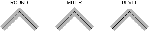
The default for both the end style and the join style is ROUND. To assign a different join style or end style to a line, you must assign values to each. For example, you cannot assign a specific end style without also assigning a specific join style.
To specify the end and join styles for a given line, you add the pair of string values into the argument for the lineStyle method as shown below:
lineStyle(lineStyle(String endStyle, String joinStyle))
For example, the following line will create a line with an end style of ROUND and a join style of MITER:
lineStyle(lineStyle("ROUND", "MITER"))
Dash pattern
By default, lines will not contain dashes. However, a dashed line can be used to provide distinctions between different lines in a chart. The pattern used for dashed lines is based on the length of the dash followed by the length of the gap after the dash. These dash/gap patterns are specified by the values presented in an array, which is then used as an argument to the lineStyle method. For example:
.lineStyle(lineStyle([30,10]))
The array [30,10] creates a pattern with a dash length of 30 and a gap length of 10 that continues for the length of the line:

- If only one value is included in the array, the dash and the gap after the dash will be the same.
- If more than one value is used in the array, the first value of the array represents the length of the first dash in the line. The next value in the array represents the length of the gap between it and the next dash.
- Additional values can be added into the array for subsequent dash/gap combinations.
- Numeric primitives (i.e., int, long, float, double) can be used in the array to specify the sequential and repeating dash/space pattern to use.
| Example | Dash Pattern |
|---|---|
lineStyle(lineStyle([20,5])) |  |
lineStyle(lineStyle([40,5])) |  |
lineStyle(lineStyle([20,4,6,4])) |  |
The following three aspects of using dash patterns are important to keep in mind:
- The unit of measure used in dash patterns is dependent upon your system. If you assign a dash pattern to a line and it does not appear in the console as you might anticipate, try increasing the values in the array.
- The dash pattern is applied between data points within the series – not over the entire series. Therefore, the dash pattern restarts at each subsequent data point.
- When plotting using a function, there are no specific data points being plotted. Rather the data is plotted over a mathematical continuum. Because dash patterns are plotted between data points, they will not appear on line plots that are based on functions.
You can assign any one of the lineStyle attributes individually. For example, you can assign only the line width, only the end style/join style, or only the dash pattern.
You can also assign a combination of line width and the dash pattern.
Finally, you can assign all three attributes at the same time. However, you cannot currently assign the end style/join style attributes with any other single attribute.
To assign multiple attributes, their respective arguments must be in the correct order. Available options follow, including the order required for each of the arguments:
Point formatting
The "point" is a specifically shaped symbol used in a line chart to notate an exact point of data. In Deephaven, there are 10 different shapes used for points, which are shown in the table below. (Note: The colors used in the table are for example only.)
| Point Shape | Shape Name |
|---|---|
 | SQUARE |
 | CIRCLE |
 | UP_TRIANGLE |
 | DIAMOND |
 | HORIZONTAL_RECTANGLE |
 | DOWN_TRIANGLE |
 | ELLIPSE |
 | RIGHT_TRIANGLE |
 | VERTICAL_RECTANGLE |
 | LEFT_TRIANGLE |
Deephaven automatically selects the point shapes in the order shown above.
However, you can designate point shapes by using the pointShape() method in your query.
Note
The pointShape() method can only be used in 2D plotting.
Point Shape
The pointShape method can be applied to XY Series plots and Category plots:
XY Series
.plot(...).pointShape("right_triangle").pointsVisible(true).show()
When applying the pointShape method to XY Series plots, the pointsVisible method must also be used and set to true.
XY Series - Scatter Plot
plot(...).plotStyle("scatter").pointShape("ellipse").show()
The pointsVisible method is not required when using a plot styles [e.g., plotStyle("scatter")]. However, the pointShape method may still be used to override the default shape.
Category Plot
.catPlot(...).pointShape("diamond").show()
In the examples above, the name of the shape is used as a string in the argument for the pointShape method, so the name of the shape needs to be enclosed in quotes. The string value for shape name can be uppercase, lowercase or mixed case. However, when using the more strict Java implementation method, the shape name needs to remain in uppercase.
For example, the following two queries will produce the same plot:
The pointShape method can also be used in conjunction with the plotBy group of methods, where multiple series are plotted in the same chart:
Note
The pointShape method can only be used in 2D plotting.
Point Size
In addition to changing the shape of a point, the pointSize method can be used to change the point's size:
.plot(...).pointSize(2)
- The value entered as an argument increases (or decreases) the point size by that factor; for example, 2 doubles the default size; 0.5 decreases the point size by half.
- The numeric values entered as the argument can be primitives of the types int, long or doubles.
- Point size can also be assigned to individual points based on
- array; e.g.,
pointSize([1,2,3] as int[]) - or table columns; e.g.,
pointSize(t,"Size")
- array; e.g.,
Caution
Take care when using large point sizes in plotting as they can cause the console to become very slow.
Grid Lines
The background grid used in a plot is visible by default. However, grid lines can be turned off:
gridLineVisible(boolean)- Toggles all grid lines.xGridLinesVisible(boolean)- Toggles only the X axis gridlines.yGridLinesVisible(boolean)- Toggles only the Y axis gridlines.
Color Formatting
Many individual components in Deephaven can be assigned specific colors using the standard color methods in Deephaven.
Note
See For more information about Deephaven Color methods, please refer to Color Formatting.
The following methods can then be used to assign specific colors to individual plot components:
figureTitleColor- e.g.,figureTitleColor("SkyBlue")chartTitleColor- e.g.,chartTitleColor(colorRGB(159,159,159))errorBarColorlegendColorxColor- This also changes the X axis label color.yColor- This also changes the Y axis label color.axisColor- This also changes the axis label color.seriesColorlineColor- e.g.,lineColor(colorHSL(0,0,204))pointColor- e.g.,pointColor("#ff0000")