Plot Component Formatting
Any aspect of the figure can be manipulated by calling specific methods on the respective object (e.g., figure, chart, axes, axis). Each method used must be applied to the appropriate object, as defined in the Plotting API. For example, the figureTitle method cannot be called in the query before the figure is created.
Note
See also The following are representative samples for customizing various components of figures and charts created in Deephaven. For the complete list of options, refer to the Pydoc or the Javadoc.
Plot Styles
Plot Styles are methods you can use to change the "style" of XY Series charts and Category charts. For example, an XY Series plot uses lines as a default to show the values being plotted. However, you can easily change that to a different style of chart by applying the plotStyle method. Arguments include the following:
BarStacked_BarLineAreaStacked_AreaScatterStep
Tip
Argument capitalization does not matter.
Examples of the syntax needed when using the plotStyle method follow:
plot(series, t, "x", "y").plotStyle("Area")- changes an XY series plot to present as an area plot instead of a line.plot(series, t, "x", "y").plotStyle("Step")- changes an XY series plot to present as a step plot instead of a line.catPlot(series, t, "x", "y").plotStyle("Line")- changes a category plot to present as a line plot instead of a column.
Examples
Plot Titles and Labels
Static Chart Titles and Labels
Titles and labels are not automatically generated when plots are created in Deephaven. However, they can easily be added:
figureTitle("Figure 5.1")- adds a figure titlechartTitle("My Chart")- adds a chart titlexLabel("Time")- adds an X axis labelyLabel("Dollars")- adds a Y axis label
Dynamic Chart Titles
As described above, the 'chartTitle' method can be used to manually add titles to the plots you create in Deephaven. However, chart titles can also be dynamically generated based on the content of the data you are plotting.
Note
OneClick plots paired with an Input Filter on the web will automatically include the applied Input (e.g., "AAPL" for a plot filtered to the AAPL USym); however, the methods and further options discussed below are available in Deephaven Classic.
Dynamic Chart Titles Using OneClick
Dynamic chart titles can also be created using data from a table that is being filtered with an Input (OneClick) Filter. In this case, the dynamic chart title updates when the underlying source updates.
Note
On the web, OneClick plot chart titles will automatically update to reflect the Input Filter applied. The methods below will work for queries run in Deephaven Classic.
Dynamic chart titles using table data
Note
The table column argument for chartTitle is only available in Deephaven Classic (Swing).
To create a dynamic chart title using a value from the data you are plotting, the following syntax may be used:
.chartTitle(tableName, "colName")
For example, the following code sample will dynamically create a chart title using data from the Ticker column:
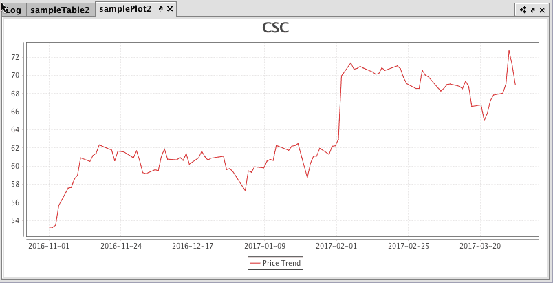
As shown above, the source table was filtered to show only CSC as the Ticker, so the chart title was dynamically created to match that value (CSC). If the source table was subsequently filtered to show only MSFT as the Ticker value, the chart title would update to show MSFT.
Configuration options for Dynamic Chart titles
Values shown for each column
The number of values/rows shown for each column in the chart title can be configured in the following ways:
Plot.chartTitle.maxRowsInTitleproperty:3rows by default, if not otherwise set iniris-defaults.prop; applicable to all charts.maxRowsInTitle(int)method changes the max rows for a specific chart.
Note the following when setting the maxRowsInTitle property:
- If
maxRowsInTitle = 0, only the first value from the title column will be shown. - If
maxRowsInTitle > 0: If the number of values/rows in a column is more thanmaxRowsInTitle, then the values will be shown as comma-separated values followed by an ellipsis (...). Otherwise, only comma-separated values will be shown without an ellipsis. - If
maxRowsInTitle < 0: All values/rows in the column will be shown in the title and separated by commas.
Example >0
As shown above, the first four values are shown in the title. Since the column for the title (Exchange) has 10 values (more than four), the title string has an ellipsis.
Example <0
The above example shows all the values in the title column because we are passing -1 (<0) in maxRowsInTitle().
Format of the title string
By default just the comma-separated values/rows according to the maxRowsInTitle for each column are shown in the title string. This format can be customized to include column names or any other custom text along with the values.
To include the table's column names, the following syntax is used:
.chartTitle(boolean showColumnNamesInTitle, Table t, String... titleColumns)
The first argument is a boolean value which determines whether to show column names in the title.
For example, the following query places column names along with the values in the chart title. As shown below, true has been passed as the first argument and hence the chart title will include the column names along with the values.
Example of column names and values
In addition to that, title format can be customized to include text along with the place holders for the column values. The basic syntax for this version of the chartTitle function follows:
.chartTitle(String titleFormat, Table t, String... titleColumns)
Example of title format

Troubleshooting Dynamic Chart Titles for Python
Depending on the installation of the Python wheel files associated with this release, the user may find the following exceptions:
The above exception indicates the Python wheel files associated with this release (a) are not installed or (b) are installed but are missing some JPY JVM flags. To eliminate this exception, you need to (a) ensure the Python wheel file associated with this release is correctly installed, and (b) pass the following JVM arguments while running your Python console:
Axis Formatting
Setting Axis Ranges and Ticks
| Method | Description |
|---|---|
xRange(0, 100) | Adjusts the range of the X axis. |
yMin(15.5) | Sets the minimum value on the Y axis. |
yMax(100) | Sets the maximum value on the Y axis. |
.plot(...).twinX().plot(...) | Adds a shared axis. The first .plot argument uses the left Y axis; the second uses the right Y axis. |
xTickLabelAngle(45.0) | Changes the angle of the tick labels on the X axis. |
| Sets gap between major ticks on the Y or X axis. |
| Turns off minor ticks on both axes. |
Setting Axis Time Formatting
| Method | Description | Formatted Examples |
|---|---|---|
xFormatPattern("yyyy-MM-dd") | Changes the format used on the X axis to show the year, month and day. | 2017-03-08 |
xFormatPattern("HH:mm") | Changes the format used on the X axis to include only hours and minutes based on a 24-hour clock. | 14:45 |
xFormatPattern("hh:mm a") | Changes the format used on the X axis to include only hours and minutes based on a 12-hour clock with a.m./p.m notation. | 02:45 p.m. |
xFormatPattern("HH:mm:ss") | Changes the format used on the X axis to include hours, minutes and seconds. | 14:45:59 |
xFormatPattern("yyyy-MM-dd'T'HH:mm:ss") | Changes the format used on the X axis to show the year, month, day, hour, minute and second. | 2017-03-08T 14:45:59 |
Note
The plotting of time is accurate to approximately 250 nanoseconds. If greater precision is desired, please contact Deephaven Customer Support for guidance.
Setting Axis Decimal Formatting
A numerical axis can be formatted using Java DecimalFormat strings. See the table below for some of the more common examples.
| Method | Description | Formatted Examples |
|---|---|---|
yFormatPattern("###,###.00") | Changes the format of the Y axis and round to two mandatory decimal places. |
|
yFormatPattern("\$###,###.00") | Changes the decimal format of the Y axis to dollars and cents. |
|
yFormatPattern("\$###,###.00 Million") | Changes the decimal format of the Y axis to dollars and cents, and then add further text to the value. |
|
yFormatPattern("###.00%") | Changes the Y axis to reflect percentage with two mandatory decimal places. |
|
yFormatPattern("0.00E00") | Changes the Y axis to reflect the value in scientific notation with two decimal places and one exponent. |
|
yFormatPattern("##0.00E00") | Changes the Y axis to reflect the value in engineering notation with two decimal places and one exponent. |
|
Axis Transforms
Axis value ranges can be transformed to specific types with the following methods:
| Method | Description |
|---|---|
xLog() | Converts the scale of the X axis to a logarithmic scale. |
xBusinessTime() | Converts the scale of the X axis to a business calendar. |
Plot Orientation
The plotOrientation method enables you to transpose the X and Y axes for the chart object.
The default orientation of a chart is vertical – meaning the Y axis of the chart is displayed vertically. The syntax used to transpose the chart axes is shown below:
plotOrientation("H")plotOrientation("HoRiz")plotOrientation("horizontal")plotOrientation(PlotOrientation.VERTICAL)
Note
The string used as the argument can be any subset of the beginning of the words "horizontal" or "vertical."