Visual Formatting
Almost any aspect of a chart or figure can be visually formatted to suit your needs. Visual formatting starts with themes, which provide a predetermined set of fonts, colors and other formatting styles you can use with any available chart type. Even though a theme is always in use, individual aspects of the chart formatting can be customized, including the following:
- Lines, including line styles (single, double, etc.), line thickness, dash patterns, and start/end/join styles.
- Point markers, including visibility and shapes.
- The color of lines, shapes, points, axis, gridlines, etc. Heatmaps are also available.
Line Formatting
The lineStyle(lineStyle(...)) method can be used to adjust line color, width, end and join styles, and dash pattern.
The lineStyle method must be called on the plot object. For example,
.plot("SeriesName", source, "xCol", "yCol").lineStyle(lineStyle(20))
Line Width
The line width represents the line's thickness. The default value is 1. The line width can be changed by inserting a numeric primitive (i.e., int, long, float, double) into the argument for the lineStyle method. For example, the following will increase the line width to 8:
.lineStyle(lineStyle(8))
End Style and Join Style
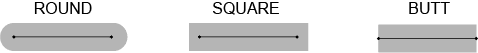
The end style of a line refers to the shape at either end of a line. There are three options: ROUND, SQUARE and BUTT. Both ends of the line have the same style.
The join style of a line refers to the type of intersection made when two lines meet each other. There are three options: ROUND, MITER, and BEVEL. Examples of each are shown below.
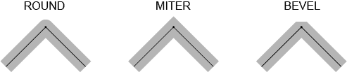
The default for both the end style and the join style is ROUND. To assign a different join style or end style to a line, you must assign values to each. For example, you cannot assign a specific end style without also assigning a specific join style:
lineStyle(lineStyle(String endStyle, String joinStyle))
For example, the following line will create a line with an end style of ROUND and a join style of MITER:
.lineStyle(lineStyle("ROUND", "MITER"))
Point Formatting
The "point" is a specifically shaped symbol used in a line chart to notate an exact point of data. In Deephaven, there are 10 different shapes used for points, which are shown in the table below. (Note: The colors used in the table are for example only.)
| Point Shape | Shape Name |
|---|---|
 | SQUARE |
 | CIRCLE |
 | UP_TRIANGLE |
 | DIAMOND |
 | HORIZONTAL_RECTANGLE |
 | DOWN_TRIANGLE |
 | ELLIPSE |
 | RIGHT_TRIANGLE |
 | VERTICAL_RECTANGLE |
 | LEFT_TRIANGLE |
Deephaven automatically selects the point shapes in the order shown above. However, you can designate point shapes in your query using the pointShape method, described below. You can also change the color of a point by using the pointColor() method, which is explained in the section Color Formatting.
Point Shape
The pointShape method can be applied to XY Series plots and Category plots:
XY Series
.plot(...).pointShape("right_triangle").pointsVisible(true).show()
When applying the pointShape method to XY Series plots, the pointsVisible method must also be used and set to true.
XY Series - Scatter Plot
plot(...).plotStyle("scatter").pointShape("ellipse").show()
The pointsVisible method is not required when using a plot styles [e.g., plotStyle("scatter")]. However, the pointShape method may still be used to override the default shape.
Category Plot
.catPlot(...).pointShape("diamond").show()
In the examples above, the name of the shape is used as a string in the argument for the pointShape method, so the name of the shape needs to be enclosed in quotes. The string value for shape name can be uppercase, lowercase or mixed case. However, when using the more strict Java implementation method, the shape name needs to remain in uppercase.
For example, the following two queries will produce the same plot:
The pointShape method can also be used in conjunction with the plotBy group of methods, where multiple series are plotted in the same chart:
Note
The pointShape method can only be used in 2D plotting.
Point Size
In addition to changing the shape of a point, the pointSize method can be used to change the point's size:
.plot(...).pointSize(2)
- The value entered as an argument increases (or decreases) the point size by that factor; for example, 2 doubles the default size; 0.5 decreases the point size by half.
- The numeric values entered as the argument can be primitives of the types int, long or doubles.
- Point size can also be assigned to individual points based on
- array; e.g.,
pointSize([1,2,3] as int[]) - or table columns; e.g.,
pointSize(t,"Size")
- array; e.g.,
Caution
Take care when using large point sizes in plotting as they can cause the console to become very slow.
Grid Lines
The background grid used in a plot is visible by default. However, grid lines can be turned off:
gridLineVisible(boolean)- Toggles all grid lines.xGridLinesVisible(boolean)- Toggles only the X axis gridlines.yGridLinesVisible(boolean)- Toggles only the Y axis gridlines.
Color Formatting
Many individual components in Deephaven can be assigned specific colors using the standard color methods in Deephaven.
Note
See For more information about Deephaven Color methods, please refer to Color Formatting.
The following methods can then be used to assign specific colors to individual plot components:
figureTitleColor- e.g.,figureTitleColor("SkyBlue")chartTitleColor- e.g.,chartTitleColor(colorRGB(159,159,159))errorBarColorlegendColorxColor- This also changes the X axis label color.yColor- This also changes the Y axis label color.axisColor- This also changes the axis label color.seriesColorlineColor- e.g.,lineColor(colorHSL(0,0,204))pointColor- e.g.,pointColor("#ff0000")