XY Series
An XY series plot is generally used to show values over a continuum, such as time. XY Series plots can be represented as a line, a bar, an area or as a collection of points. The X axis is used to show the domain, while the Y axis shows the related values at specific points in the range.
Data Sourcing
XY Series plots can be created using data from tables, arrays and functions.
Creating an XY Series Plot using Data from a Table
When data is sourced from a table, the following syntax can be used to create an XY Series plot:
.plot("SeriesName", source, "xCol", "yCol").show()
plotis the method used to create an XY series plot."SeriesName"is the name (as a string) you want to use to identify the series on the plot itself.sourceis the table that holds the data you want to plot."xCol"is the name of the column of data to be used for the X value."yCol"is the name of the column of data to be used for the Y value.showtells Deephaven to draw the plot in the console.
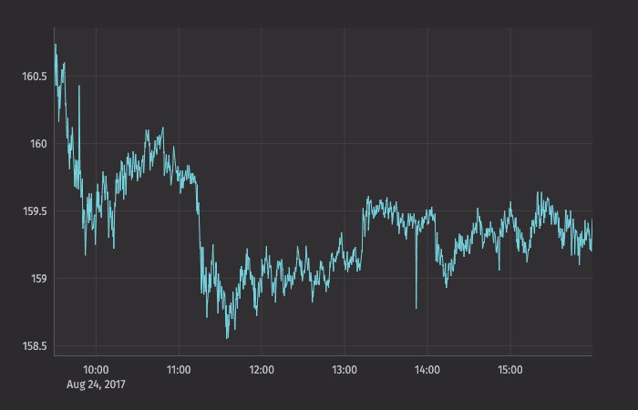
The example query below will create an XY series plot that shows the price of a single security (AAPL) over time.
Note
Python users must import the appropriate module: from deephaven import Plot or from deephaven import Plot as plt
Tip
The xBusinessTime method limits the data to actual business hours.
Creating an XY Series Plot using Data from an Array
When data is sourced from an array, the following syntax can be used to create an XY Series plot:
.plot("SeriesName", [x], [y]).show()
plotis the method used to create an XY series plot."SeriesName"is the name (as a string) you want to use to identify the series on the plot itself.[x]is the array containing the data to be used for the X value.[y]is the array containing the data to be used for the Y value.showtells Deephaven to draw the plot in the console.
Creating an XY Series Plot using Data from a Function
When data is sourced from a function, the following syntax can be used to create an XY Series plot:
.plot("SeriesName", function).show()
plotis the method used to create an XY series plot."SeriesName"is the name (as a string) you want to use to identify the series on the plot itself.functionis a mathematical operation that maps one value to another. Examples of Groovy functions and their formatting follow:{x->x+100}adds 100 to the value of x.{x->x*x}squares the value of x.{x->1/x}uses the inverse of x.{x->x*9/5+32}Fahrenheit to Celsius conversion.
showtells Deephaven to draw the plot in the console.
Special Considerations When Plotting from a Function
If you are plotting a function in a plot by itself, consider applying a range for the function using the funcRange or xRange method. Otherwise, the default value ([0,1]) will be used, which may not meet your requirements:
.plot("Function", {x->x*x} ).funcRange(0,10).show()
If the function is being plotted with other data series, the funcRange method is not needed, and the range will be obtained from the other data series.
When using a function plot, you may also want to increase or decrease the granularity of the plot by declaring the number of points to include in the range. This is configurable using the funcNPoints method:
.plot("Function", {x->x*x} ).funcRange(0,10).funcNPoints(55).show()
XY Series with Shared Axes
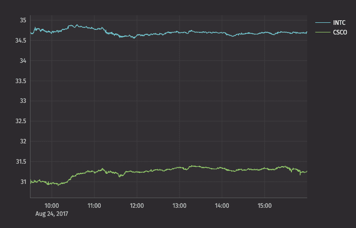
You can compare multiple series over the same period of time by creating an XY series plot with shared axes. In the following example, two series are plotted, thereby creating two line graphs on the same plot.
Subsequent series can be added to the plot by adding additional plot() methods to the query. However, the plotBy() method can also be used to do this.
Note
See
plotBy(./)
XY Series with Multiple X or Y Axes
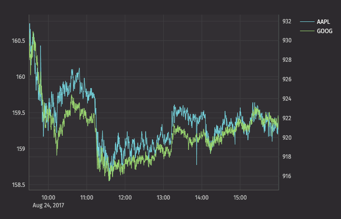
When plotting multiple series in a single plot, the range of the Y axis is an important factor to watch. In the previous example, both securities had values within in a relatively narrow range (31 to 35). Therefore, any change in values was easy to visualize. However, as the range of the Y axis increases, those changes become harder to assess.
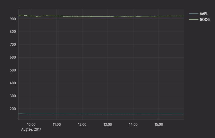
To demonstrate this, let's plot AAPL and GOOG on the same chart:
Now, the scale of the Y axis needs to cover a much wider range (from 150 to 950), which results in relatively flat lines with barely distinguishable differences in values or trend.
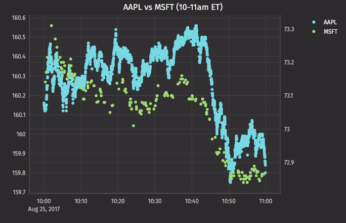
This issue can be easily remedied by adding a second Y axis to the plot via the twinX() method.
twinX
The twinX() method enables you to use one Y axis for some of the series being plotted and a second Y axis for the others, while sharing the same X axis:
PlotName = figure().plot(...).twinX().plot(...).show()
- The plot(s) for the series placed before the
twinX()method share a common Y axis (on the left). - The plot(s) for the series listed after the
twinX()method share a common Y axis (on the right). - All plots share the same X axis.
For example, we can create an improved chart for AAPL and GOOG together:
The value range for AAPL is shown on the left axis and the value range for GOOG is shown on the right axis:
twinY
The twinY() method enables you to use one X axis for one set of the values being plotted and a second X axis for another, while sharing the same Y axis:
PlotName = figure().plot(...).twinY().plot(...).show()
- The plot(s) for the series placed before the
twinY()method use the lower X axis. - The plot(s) for the series listed after the
twinY()method use the upper X axis.
Plot Styles
The XY series plot in Deephaven defaults to a line plot. However, Deephaven's plotStyle() method can be used to format XY series plots as area charts, stacked area charts, bar charts, stacked bar charts, scatter charts and step charts.
In any of the examples below, you can simply swap out the .plotStyle() argument with the appropriate name; e.g., ("area"), ("stacked_area"), ("step"), etc.
Note
See Plot Styles
XY Series as a Stacked Area Plot
XY Series as a Scatter Plot
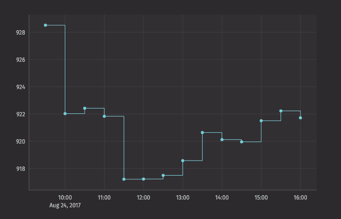
XY Series as a Step Plot