Histogram
Note
For Core+ workers, see Community Core documentation for histograms.
The histogram is used to show how frequently different data values occur. The data is divided into logical intervals (or bins) , which are then aggregated and charted with vertical bars. Unlike bar charts (category plots), bars in histograms do not have spaces between them unless there is a gap in the data.
Data Sourcing
Histograms can be plotted using data from tables or arrays.
Creating a Histogram Plot using Data from a Table
When data is sourced from a table, the following syntax can be used:
.histPlot("seriesName", source, "ValueCol", nbins).show()
histPlotis the method used to create a histogram."SeriesName"is the name (as a string) you want to use to identify the series on the chart itself.sourceis the table that holds the data you want to plot."ValueCol"is the name of the column (as a string) of data to be used for the X values.nbinsis the number of intervals to use in the chart.showtells Deephaven to draw the plot in the console.
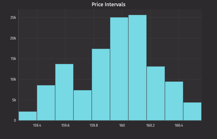
This query plots the histogram as follows:
plotPriceIntervalsis the name of the variable that will hold the chart.histPlotis the method."AAPL"is the name of the series to use in the chart.trades.where("Sym=`AAPL`")is the source data filtered to AAPL.Lastis table column that contains the values we want to plot, and10is the number of intervals we want to use to divide up the sales.
The histPlot method assumes you want to plot the entire range of values in the dataset. However, you can also set the minimum and maximum values of the range using rangeMin and rangeMax respectively:
.histPlot("seriesName", source, "ValueCol", rangeMin, rangeMax, nbins).show()
histPlotis the method used to create a histogram."SeriesName"is the name (as a string) you want to use to identify the series on the chart itself.sourceis the table that holds the data you want to plot."ValueCol"is the name of the column (as a string) of data to be used for the X values.rangeMinis the minimum value (as a double) of the range to be included.rangeMaxis the maximum value (as a double) of the range to be included.nbinsis the number of intervals to use in the chart.showtells Deephaven to draw the plot in the console.
Creating a Histogram Plot using Data from an Array
When data is sourced from an array, the following syntax can be used:
.histPlot("SeriesName", [x], nbins).show()
histPlotis the method used to create a histogram."SeriesName"is the name (as a string) you want to use to identify the series on the chart itself.[x]is the array containing the data to be used for the X values.nbinsis the number of intervals to use in the chart.showtells Deephaven to draw the plot in the console.
The histPlot method assumes you want to plot the entire range of values in the dataset. However, you can also set the minimum and maximum values of the range using rangeMin and rangeMax respectively:
.histPlot("SeriesName", [x], rangeMin, rangeMax, nbins).show()
histPlotis the method used to create a histogram."SeriesName"is the name (as a string) you want to use to identify the series on the chart itself.[x]is the array containing the data to be used for the X values.rangeMinis the minimum value (as a double) of the range to be included.rangeMaxis the maximum value (as a double) of the range to be included.nbinsis the number of the intervals to use in the chart.showtells Deephaven to draw the plot in the console.