Sell in May and go away? Testing the adage with 50 years of data
S&P 500 seasonal patterns, sector breakdowns, and risk-adjusted returns, by the numbers
May 8 2026


Every spring, the same advice circulates: "Sell in May and go away." Stocks historically underperform from May through October compared to the November through April half of the year. Investors who exit before summer and return in November supposedly capture better returns with less stress.
But is it real? With 50+ years of daily S&P 500 data and Deephaven's aggregation tools, we can test it directly — across decades, sectors, and asset classes. We'll also check whether the pattern has faded as more traders have tried to exploit it, and whether "lower summer returns" also means "lower summer risk." The same analysis pipeline works identically on a live price feed, so once you've built it on historical data, pointing it at real-time quotes requires no rewrites.
Note
This post is for educational and analytical purposes only. Seasonal patterns in historical data do not guarantee future performance, and this is not financial or investment advice.
The data
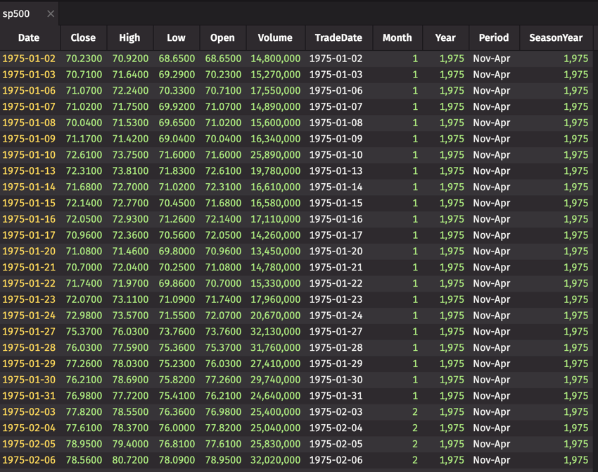
We'll pull daily closing prices from Yahoo Finance using yfinance. The S&P 500 composite index (^GSPC) has reliable data back to 1927. We start in 1975 to capture the modern market era, after the shift away from fixed commissions and the rise of institutional trading.
Note
The code in this post runs in a Deephaven console. If you don't have Deephaven running yet, see the Quickstart guide to get up and running in under five minutes. Once Deephaven is running, install the additional dependencies:
For each seasonal period, we capture the starting and ending closing price, then compute the total return. Deephaven's agg.first and agg.last pick up the chronologically first and last rows within each group when the table is sorted by date:
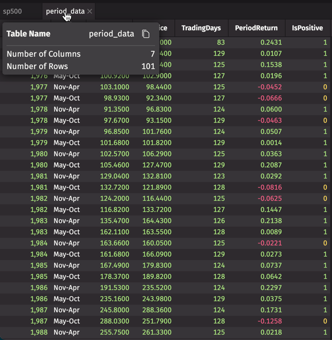
That gives us roughly 100 rows: 50 May-Oct periods and 50 Nov-Apr periods, each with its own return.
update_view adds formula columns without materializing a copy of the data — values compute on demand. Swap sp500 for a ticking table and period_data and every downstream table recalculates automatically as new closes arrive.
The gap is real
The core aggregation rolls those 100 period returns into a seasonal summary. We group by Period and compute the average return, standard deviation, count, and win rate:
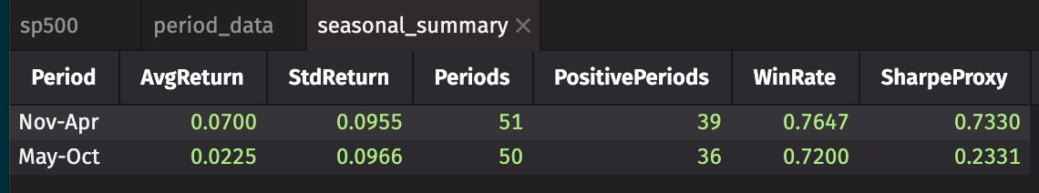
Look at seasonal_summary. The AvgReturn and WinRate columns make the case — roughly three times the return for the winter half, from the same market in the same calendar year.
You can run the core aggregation in the browser demo right now without installing anything:
Before acting on a pattern, it's worth asking: could this be noise? With 50 observations per group, we can run a Welch's t-test. Is the mean difference large enough relative to the year-to-year variability to rule out chance?
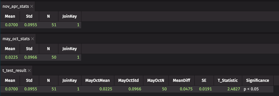
Check T_Statistic and Significance in t_test_result. A t-statistic of 2.48 clears p < 0.05. The gap isn't noise.
Of course, while it may not be noise, it's also not a complete picture — statistical significance and economic significance aren't the same thing. Transaction costs, tax drag, and the occasional strong summer (2023's rally, for instance) all eat into what a mechanical rotation strategy actually captures.
p < 0.05 over the full 50-year sample. The pattern is real — but "real" and "exploitable" are different questions.It's weakened — but it hasn't disappeared
A common criticism of the "Sell in May" theory is that once a pattern becomes widely known, arbitrage should erode it. If every hedge fund runs the same seasonal trade, the edge disappears. Let's check by adding a Decade label and re-aggregating:
The gap has been present since 1975 and was most pronounced through the 1990s. It narrows in the 2000s and 2010s but doesn't disappear. The 2020s are a short sample and nearly equal — but that's five years, not a verdict.
The effect has weakened, but it hasn't arbitraged away. Something structural like lower summer trading volume, reduced institutional activity, or both keeps the gap open.
Where it lives — and where it doesn't
Not all sectors follow the same seasonal rhythm. Energy stocks are tied to summer driving demand, but technology companies don't care what month it is. Let's pull the S&P 500 sector ETFs and run the same analysis for each:
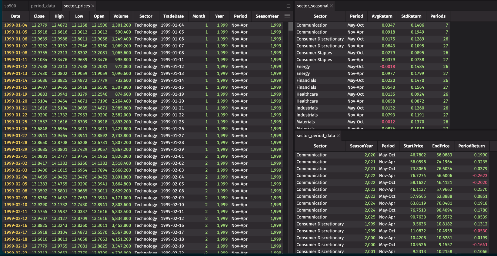
The pattern doesn't affect all sectors equally:
- Energy (XLE) shows the sharpest May-Oct weakness. Energy demand peaks in summer driving season, but refinery margins and OPEC supply dynamics often weigh on prices through late summer.
- Materials (XLB) and Industrials (XLI) follow a similar pattern — economically cyclical sectors tend to drift through the summer months.
- Utilities (XLU) and Consumer Staples (XLP) show much weaker seasonality. These defensive sectors don't follow the same growth-driven cycle.
- Technology (XLK) is the outlier. The tech sector has delivered reasonably strong summer returns in recent decades, driven by product cycles and earnings surprises that don't respect the calendar. If you're concentrated in tech, the "Sell in May" trade is a much weaker argument.
Lower returns might just mean lower risk. If summer markets are genuinely calmer, the risk-adjusted return (Sharpe proxy) could close the gap. Or you might be carrying the same risk for fewer gains:
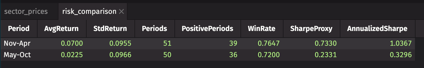
Summer markets are quieter — institutional desks thin out, volume drops, volatility falls. But the volatility discount isn't large enough to close the return gap. The winter Sharpe wins.
If you're weighing whether to act on the seasonal pattern, that's the number to focus on. A systematic seasonal rotation beats a passive hold on a Sharpe basis, even after accounting for the calmer summers.
Beyond U.S. equities
Does the seasonal pattern extend beyond U.S. equities? Let's add bonds, gold, commodities, and international stocks:
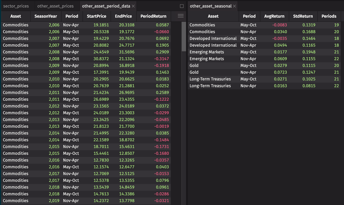
Cross-asset, the pattern is surprisingly consistent. Bonds are the outlier:
- Long-Term Treasuries (TLT): May-Oct slightly outperforms Nov-Apr. Bond returns are driven by Fed policy and inflation expectations, not equity calendar effects. If you're rotating out of equities for the summer, bonds aren't a clean hedge.
- Gold (GLD) follows the same seasonal direction as equities, averaging around 7% in Nov-Apr versus 3% in May-Oct. If you're rotating out of stocks for the summer, gold won't hedge the move — it'll amplify it.
- Commodities (DBC) show a clear Nov-Apr advantage with negative May-Oct average returns. The seasonal pattern is as strong here as in equities.
- Developed international (VEA) tracks U.S. equities closely: May-Oct negative, Nov-Apr around 5%. When U.S. markets sell off in summer, international markets tend to follow.
- Emerging markets (EEM) also show the Nov-Apr premium, though with higher volatility. Country-specific factors add noise but don't eliminate the pattern.
Monitoring the pattern live
You've confirmed the seasonal gap, tested it across sectors and asset classes, and established it's statistically significant. The question now is how to keep a ticking table up to date as prices arrive — continuous monitoring instead of a once-a-year rerun.
In production, you'd replace to_table with a ticking table from your data provider — a Kafka consumer, a broker WebSocket feed, or any source that pushes rows as they arrive. Deephaven's table operations don't distinguish between static and live sources: once your data is in a ticking table, every update_view, agg_by, and where downstream updates automatically as new rows land.
function_generated_table is a stand-in for that connection. It polls a function on a schedule and wraps the result in a ticking table. It's useful for prototyping or for sources that only expose a polling interface:
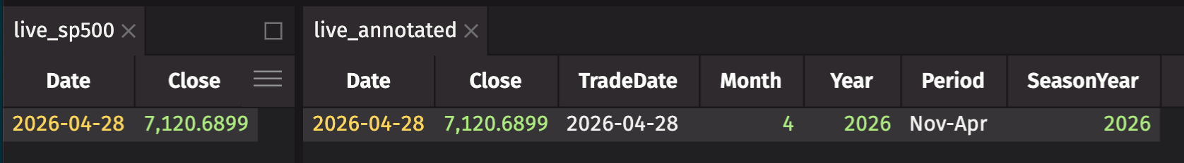
As new closes arrive, live_annotated updates automatically. Stack any of the aggregations from the analysis above onto this table and you have a live seasonal monitor — no reruns required.
Tip
Integer columns like Year and SeasonYear display with a thousands separator by default (e.g., 2,024). To remove it, right-click the column header and choose Number Format → Custom Format, then enter ####.
The bottom line
The data has a clear answer:
- The S&P 500 seasonal gap is real. The November-through-April half-year has consistently outperformed May-through-October in both absolute and risk-adjusted terms — and the difference is statistically significant, not a fluke of a few bad summers.
- The effect has weakened but persists. The gap has been present since 1975 and was most pronounced through the 1990s. It has narrowed since, but hasn't closed.
- Sectors change the calculation. Energy, Materials, and Industrials show the pattern most clearly. Tech largely ignores it. If your portfolio is heavy on tech, the trade weakens considerably.
- Bonds are the exception. Treasuries show a slight May-Oct edge, driven by Fed policy rather than calendar effects. If you're rotating out of equities for the summer, bonds aren't the clean hedge you might expect.
The adage survives the data. Whether it survives your tax situation, your transaction costs, and the risk of missing the next strong summer is a different question, and one the data can't answer for you.
Try it yourself
To try the core aggregation without installing anything, paste the demo block above into the browser demo. For the full 50-year analysis:
- Follow the Quickstart to get Deephaven running locally.
- Install dependencies —
pip install yfinance pandasin your Deephaven environment. - Extend the analysis — swap
^GSPCfor any ticker with long history:^DJI,^NDX,BTC-USD, or individual stocks to test whether your holdings follow the seasonal pattern.
Have a question about seasonal analysis or something you found surprising in your own data? Come talk to us in the Deephaven Community Slack.