

In a previous post, we built a comprehensive real-time trading dashboard in under 100 lines of Python - complete with market data simulation, technical indicators (SMA, EMA, VWAP), portfolio P&L tracking, risk monitoring with VaR calculations, market microstructure analysis, and automated alerts.
That code created the engine. Now let's see how effortless it is to actually use. No refresh buttons. No event handlers. No custom UI code. The Deephaven interface gives you everything you need to monitor your portfolio through a full trading day.
This guide follows a trader's workflow from market open to close, showing how Deephaven's UI makes interacting with your live dashboard natural and intuitive.
9:30 AM - Market open: Your first look
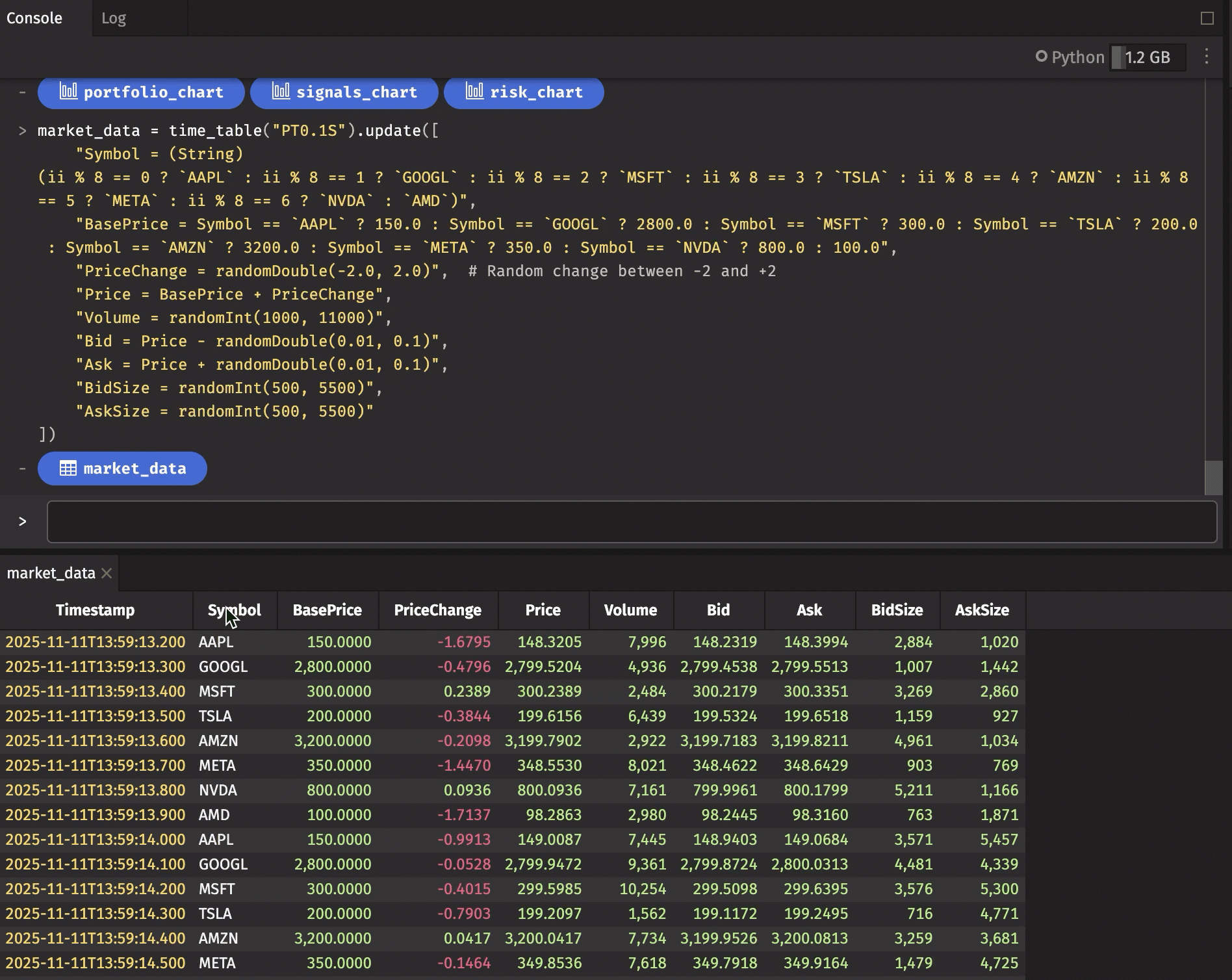
You've run the complete dashboard code from the previous post. Markets just opened. Several tables appear below the Deephaven console, including:
market_data: Raw market data ticking every 100ms.trading_signals: Prices with technical indicators and signals.portfolio_pnl: Your positions with real-time P&L.portfolio_summary: Aggregate portfolio metrics.risk_metrics: Position-level risk calculations.risk_alerts: Filtered alerts for risk thresholds.spread_analysis: Bid-ask spread data.market_quality: Market quality metrics by symbol.price_alerts: Significant price movement notifications.
Note
This guide uses the simulated market data from our real-time trading dashboard post, which generates realistic tick data for 8 stocks updating every 100ms. This makes it perfect for learning the UI without needing real market data access. All the interactions, workflows, and features work identically with real production data.
Where do you look first? Click portfolio_summary to check your overnight position. One click, no loading screen — the table opens instantly with your current total value, P&L, and exposure metrics updating in real-time.
Watching the data flow
Curious how the raw data looks? Open market_data. You'll immediately notice:
- New rows appear automatically at the bottom — no refresh button.
- The timestamp column shows progression every 100ms.
- Ticks appear for symbols
AAPL,GOOGL,MSFT,TSLA,AMZN,META,NVDA,AMD. - Prices fluctuate randomly within realistic ranges.
This is Deephaven's real-time engine in action. Data flows in, the table updates, and you just watch.
Tip
Click the blue button in the console to open a table quickly rather than finding its tab in the panels. Use Reverse Table to see the data in reverse order - new rows will stream in from the top.
9:40 AM - Setting up your workspace
You need eyes on multiple things at once: your P&L, any risk alerts, and price movements. The UI makes this trivial.
Create your trading layout:
- Click
portfolio_pnlto open it. - Drag the
portfolio_pnltab to the left half of your workspace — the screen splits. - Click
risk_alertsand drag it to the top right. - Click
price_alertsand drag it to the bottom right.
You now have a three-panel layout:
- Left: Your money (
portfolio_pnl). - Top right: Your warnings (
risk_alerts). - Bottom right: Market events (
price_alerts).
Everything updates automatically. No refresh buttons. No polling. Just live data flowing into all three panels simultaneously.
Tip
Basic navigation you'll use all day:
- Drag column borders to resize.
- Drag column headers to reorder.
- Scroll through data with mousewheel.
- Click rows to select (Shift for ranges, Cmd/Ctrl for multiple).
- Right-click column headers and select Hide column to declutter your view.
10:00 AM - Which positions are moving?
Markets have been open for 30 minutes. You want to see what's working and what's not. Click the UnrealizedPnL column header in your portfolio_pnl panel.
Instantly, positions resort by P&L. Click again — now it's reversed. Your biggest winners and losers are immediately visible, and the values keep updating as prices tick.
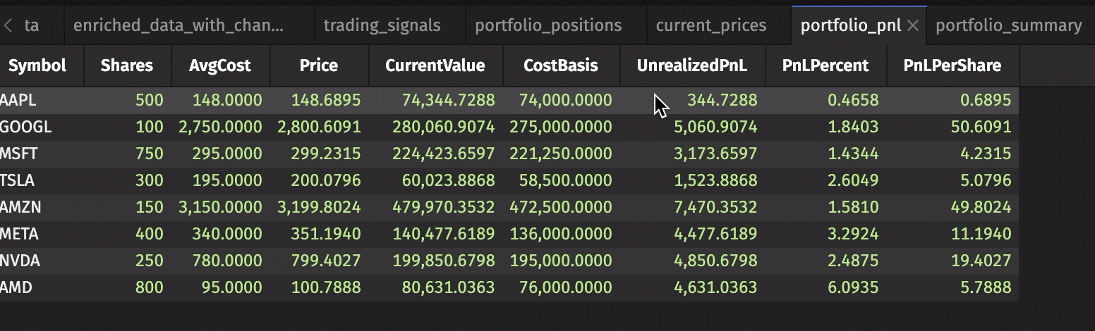
No code required. One click, instant insight.
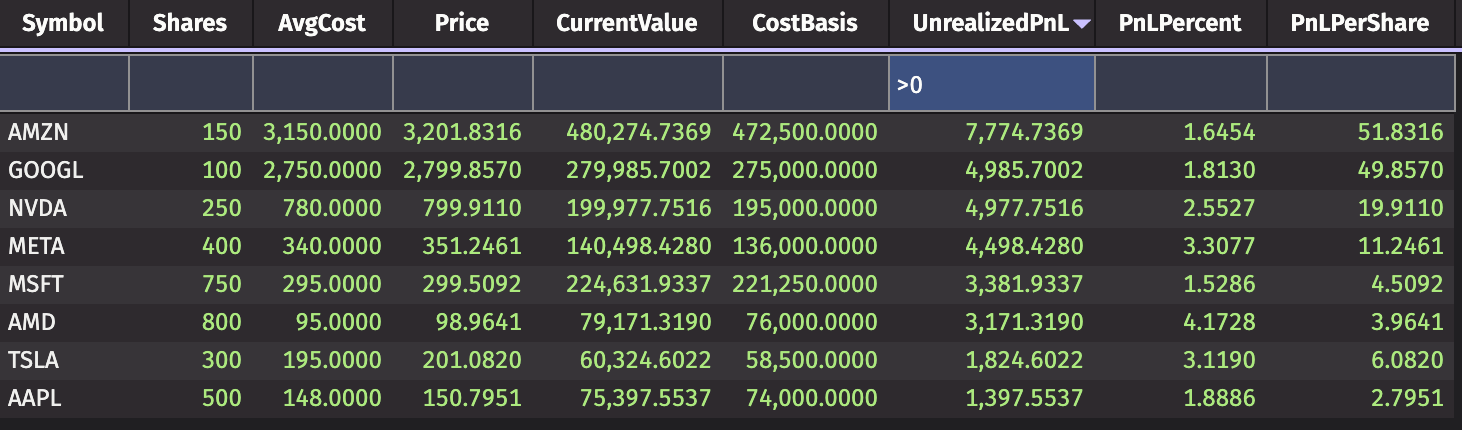
10:15 AM - Focus on what matters
You only want to see profitable positions right now. Right-click the UnrealizedPnL column header and select Quick Filters. Type > 0 in the search box.
Every losing position disappears. Only winners remain — and they're still updating in real-time as prices change.
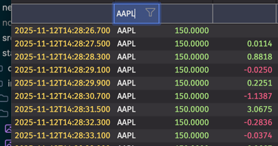
Want to zoom in on one stock? Open trading_signals, right-click the Symbol column header, select Quick Filters, and type 'AAPL'. Now you're watching just Apple's price, moving averages, VWAP, volatility, and trading signals — all updating live.
The UI does the work. You focus on trading decisions.
11:00 AM - A price alert fires
Your price_alerts panel updates — AAPL just dropped 3% in 5 minutes. The alert appears automatically. No polling. No manual refresh. The dashboard caught it.
Now what? You need context. Is this a risky position? What do technical indicators show?
- Open
risk_metrics. Right-click theSymbolcolumn and use a Quick Filter for'AAPL'. Instantly you seeAAPL's VaR, volatility, and position size. - Switch to your
trading_signalspanel (still filtered toAAPL). Price is below the 20-daySMA.VWAPis higher than current price. TheSignalcolumn showsHOLD.
Every table updates as new ticks arrive. You're watching the situation unfold in real-time across multiple dimensions — price, risk, technicals — without writing a single line of code to coordinate these views.
12:30 PM - Lunch analysis: Spotting patterns
Markets settle down mid-day. Time to dig deeper. You suspect your high-return positions might also be your highest-risk ones. The UI filters showed you each dimension separately. Now you want them combined.
Write a query in the console to create a new view:
The new risk_return table is added to your workspace. It's not a static snapshot — it's a live table that updates as prices tick, P&L changes, and volatility recalculates.
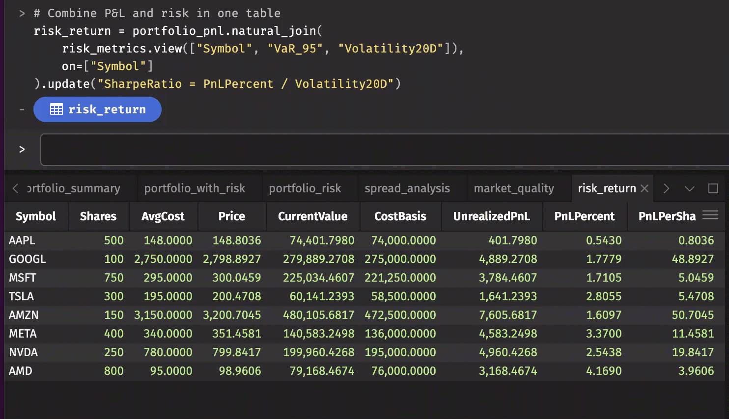
Now use the UI to explore:
- Sort by
VaR_95descending to see highest-risk positions. - Quick Filter
PnLPercent > 5to see if high returns justify high risk. - Click the
RiskReturncolumn to see risk-adjusted performance.
You wrote two lines of Python. The UI handles everything else — real-time updates, sorting, filtering, multi-column analysis. This is the power of combining Deephaven's computational engine with its UI: create sophisticated views with minimal code, then explore them effortlessly.
1:00 PM - Looking for opportunities
The AAPL situation is under control. Now you want to scan for new trading opportunities. Your trading_signals table has been calculating technical indicators all morning — moving averages, VWAP, volatility, buy/sell signals.
Open trading_signals. Click the Signal column header to sort. All the BUY signals group together at the top.
But you want to be careful. You only want to consider stocks trading above their VWAP. The UI filters can't compare two columns directly, but you can create a custom column. Click the Table Options menu, select Custom Columns, and add:
- Column name:
PriceAboveVWAP. - Expression:
Price > VWAP.
The new column appears instantly, updating in real-time as prices cross above and below VWAP. Now use a Quick Filter for PriceAboveVWAP = true and Signal = 'BUY'.
You're looking at a filtered, sorted, custom view of live market data — all created through the UI without writing analysis code.
2:00 PM - A risk alert fires
Your risk_alerts panel, quiet all morning, suddenly shows a new row. NVDA's VaR_95 just exceeded $50,000. The position is up 8% today, but volatility spiked and now the risk threshold is breached.
The alert table already has everything you need — it's built from risk_metrics, which includes both P&L and risk data:
- P&L columns:
UnrealizedPnL,PnLPercent,CurrentValue - Risk columns:
VaR_95,Volatility20D,PositionSize - Alert metadata:
AlertType,AlertMessage
Check the AlertMessage: "VaR exceeds threshold". Look at PnLPercent: +8.2%. Look at VaR_95: $52,341.
Decision time: do those returns justify that risk?
Finding high-risk, high-reward positions
You want to dig deeper. Which positions have both high VaR (over $5,000) AND strong returns (over 3%)? Advanced Filters let you combine multiple conditions.
- Open
risk_metrics. Right-click theVaR_95column header and select Advanced Filters. Entergreater than5000. - Now right-click the
PnLPercentcolumn header, select Advanced Filters, and entergreater than or equal to3.0.
Both filters apply simultaneously. You're now looking at only positions that meet both criteria — high risk AND high returns. The table updates in real-time as volatility and P&L change, with positions appearing or disappearing as they cross your thresholds.
But you want risk and P&L together in one table for easier comparison. Write another query in the console:
The new table appears. Open it. Sort by VaR_95 descending. Now you see risk right next to PnLPercent in the same row. Add a Quick Filter: VaR_95 > 50000 and PnLPercent < 5 to find high-risk, low-return positions that might need trimming.
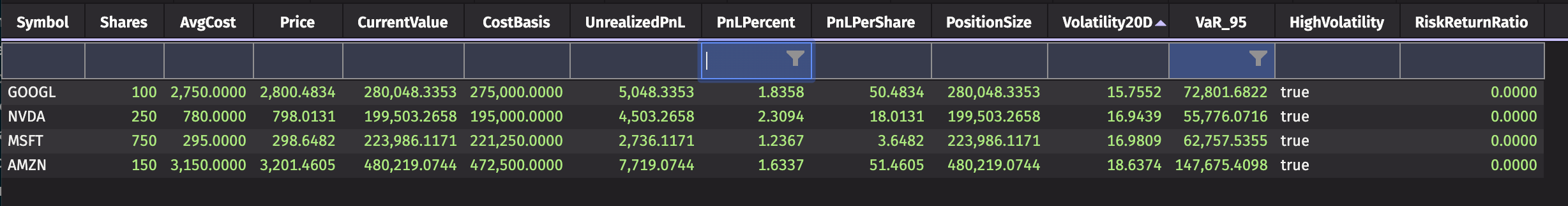
One line of code, infinite exploration through the UI.
2:15 PM - Checking market conditions before trading
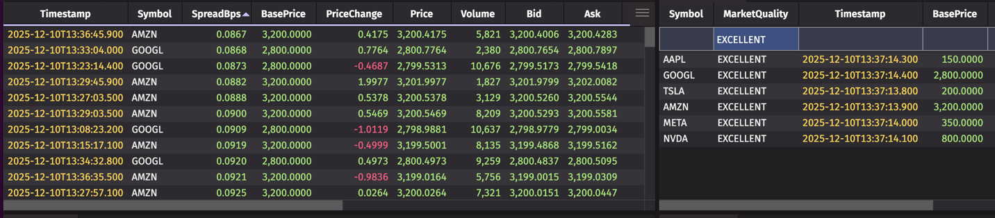
You're considering a trade. But market quality matters — wide spreads mean you pay more to get in and out. Open spread_analysis.
Sort by SpreadBps ascending. AAPL and MSFT show tight spreads (5-7 bps). TSLA is wider at 15 bps. The ImbalanceRatio column shows whether the market is balanced — values near 0.5 are good, meaning buy and sell pressure are equal.
Want a quick summary? Open market_quality. This table scored each symbol based on spread and liquidity. Quick Filter for MarketQuality = 'EXCELLENT' to see which stocks have optimal trading conditions right now.
All of this analysis happened automatically in your dashboard. You're just using the UI to explore it.
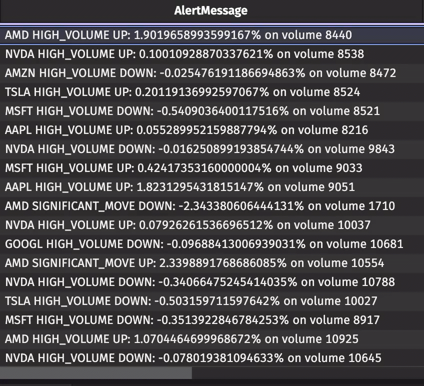
3:00 PM - Monitoring the afternoon session
Markets can get volatile heading into the close. Your price_alerts panel has been catching significant moves all day — any price change over 2%, any volume spike over 8,000.
Sort by Timestamp descending to see the most recent first. Each alert shows the symbol, the alert type (MAJOR_MOVE, SIGNIFICANT_MOVE, HIGH_VOLUME), and the specifics.
META just fired a SIGNIFICANT_MOVE alert. The row shows exactly when it happened and what triggered it. Want to see META's current position? Quick Filter any other table to 'META' and you're looking at its P&L, risk metrics, or technical indicators in seconds.
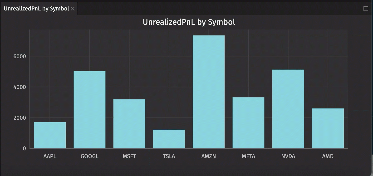
3:45 PM - Visualizing your day
Numbers are great. But sometimes you want to see the picture. Deephaven's UI includes built-in charting — no code required.
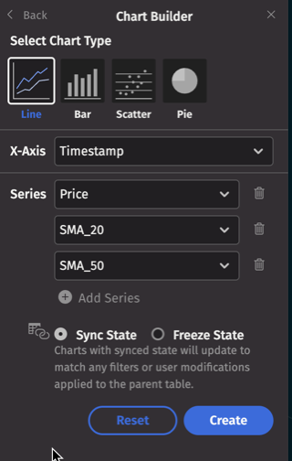
Open portfolio_pnl. Click Table Options > Chart Builder:
- Chart type: Bar chart.
- X-axis:
Symbol. - Y-axis:
UnrealizedPnL. - Sync state: Check this box.
- Click Create.
A bar chart appears in a new panel. It's not a static image — the bars update in real-time as P&L changes. You're watching your portfolio move visually.
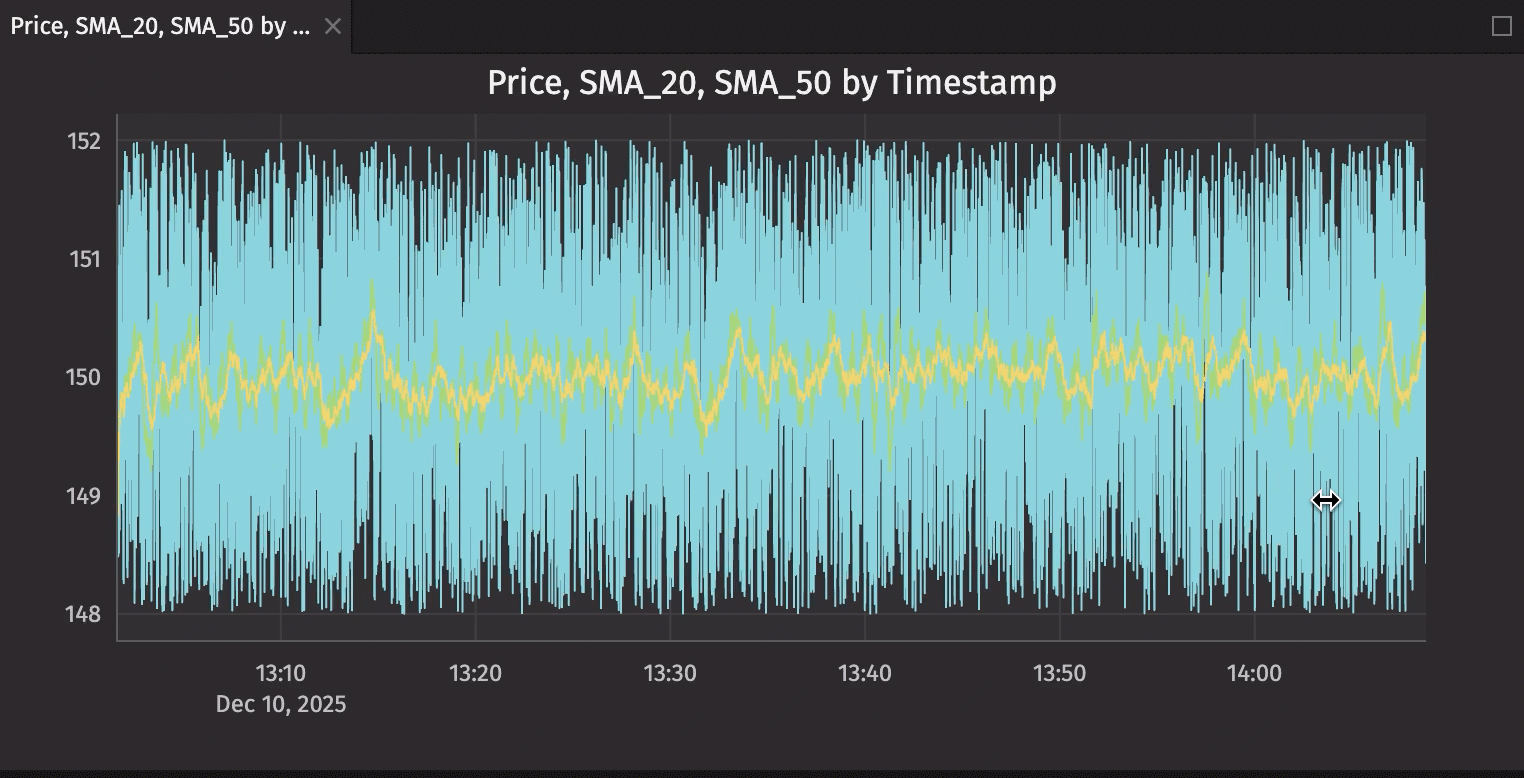
Want to see technical indicators? Filter trading_signals to AAPL, then create a line chart with Timestamp on X-axis and Price, SMA_20, SMA_50 on Y-axis. Watch the moving averages cross in real-time.
Drag the chart panels into your workspace layout. Click chart elements to highlight related data. Export with one click.
Note
For advanced programmatic visualizations with custom styling, subplots, and complex layouts, check out Deephaven Express, our Plotly Express integration.
For even more data visualization options, see the next blog in the series, Building custom trading visualizations with Plotly Express.
4:00 PM - Market close: Wrapping up
Markets closed. Time to capture the day for your records.
- Right-click
portfolio_pnland select Download CSV. Your end-of-day positions export instantly. - Take a final look at
price_alertsfiltered to today. Sort byTimestamp. Every significant move is documented — when it happened, which symbol, what triggered it. - Your
risk_metricstable shows final risk exposure. Export that too for your records.
Remember: these CSVs are snapshots. Tomorrow when markets open, re-run your code and your live dashboard picks up where it left off, updating automatically.
What makes this workflow effortless
You just monitored a live trading dashboard through an entire market session. You:
- Sorted and filtered positions in real-time.
- Responded to alerts as they fired.
- Created custom views with minimal code.
- Compared risk and returns across multiple dimensions.
- Visualized portfolio performance dynamically.
- Exported snapshots for recordkeeping.
What you didn't do:
- Write event handlers.
- Build refresh logic.
- Coordinate multiple data sources.
- Create custom UI components.
- Debug timing issues.
- Handle data synchronization.
The dashboard code from our previous post created the computational engine. Deephaven's UI made it effortless to use. That's the power of this platform: sophisticated real-time analysis becomes accessible through simple, intuitive interactions.
Keyboard shortcuts for speed
As you use the UI more, these shortcuts make navigation faster:
Cmd/Ctrl + F: Focus search box.Arrow keys: Navigate cells.Space: Select/deselect row.Cmd/Ctrl + A: Select all rows.
Get started with Deephaven
This guide showed you how to use the Deephaven UI to interact with the real-time trading dashboard we built in our previous post. The dashboard runs continuously, calculating technical indicators, tracking P&L, monitoring risk, and firing alerts — all without your intervention. The UI gives you the tools to explore, filter, visualize, and act on that live data effortlessly.
The combination of real-time computation and intuitive UI makes Deephaven a platform that grows with your needs. Start simple, explore through the UI, and add sophistication as you discover what you want to analyze.
New to Deephaven? You can build your own real-time dashboards in minutes. Our Crash Course walks you through the fundamentals — from creating your first table to building live, updating queries. Every example runs in your browser, no installation required.
Want to connect with our community? Join our Slack community where thousands of developers are building real-time applications for trading, IoT, data science, and more. Ask questions, share your projects, and learn from others using Deephaven in production.
Whether you're analyzing market data, monitoring IoT sensors, or processing live event streams, Deephaven makes real-time data effortless. Start building today.