Chart Builder
Deephaven makes it easy to visualize your data. Users can plot data using the Deephaven Query Language, or directly in the Deephaven IDE user interface. This guide focuses on the Chart Builder feature.
Chart Builder
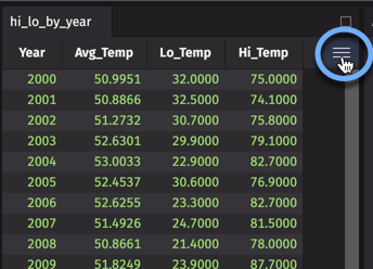
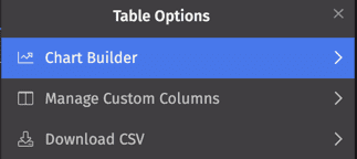
Access the Chart Builder by clicking the Table Options menu icon at the right of any table (circled in the screenshot below) and selecting Chart Builder from the drop-down.
The Chart Builder allows you to create applicable charts from that table's data. These configuration options change to reflect relevant chart types, and each field is automatically populated with the column values in the table from which you opened the menu.
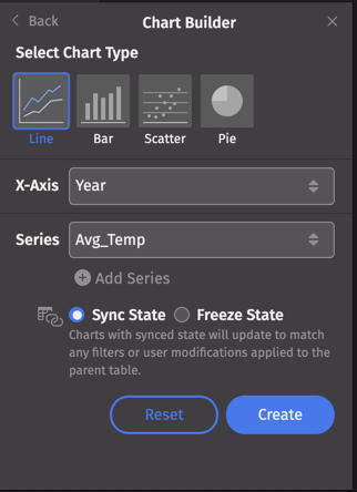
You can choose from four different chart types:
Above, Line is selected, so the Chart Builder presents the appropriate configuration options: X-Axis and Series values.
Plots are created based on the current table data and any active filters. (If no filters are applied, all of the data will be plotted.) The next selections determine how your plot will respond to new filters applied to the source data:
- Sync State: When selected, the chart will update to match any filters or other user modifications made to the parent table.
- Freeze State: When selected, the chart will not update regardless of any changes made to the parent table.
Once you make your selections, click Create. The plot will open as a new panel in your workspace with an automatically generated title. Any additional plots created using the Chart Builder will open as new panels.
Caution
Currently, existing plot configurations cannot be edited. If you make changes in the Chart Builder, you'll need to create a new plot.
In the next sections, we'll show you examples of each chart type using two tables of weather data. Run this script if you'd like to follow along:
Line, Bar, and Scatter
For Line, Bar, and Scatter plots, select an X-Axis value and a Series value. Clicking in each field reveals the available column values in that table:
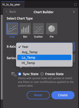
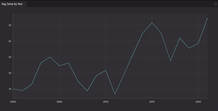
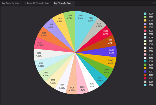
From the hi_lo_by_year table, let's chart the average temperature for each year. Click Create to generate a single series plot.
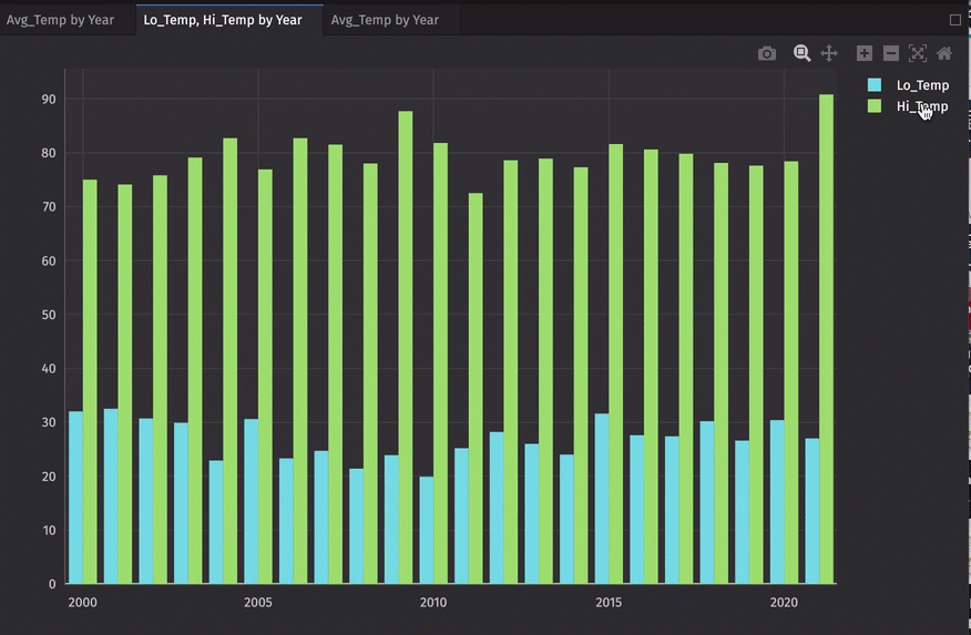
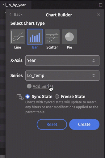
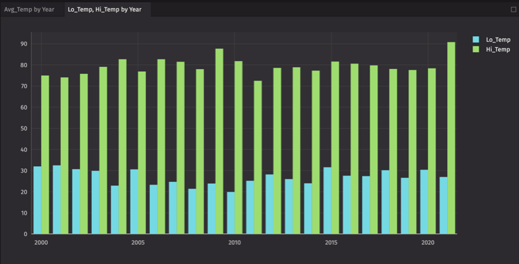
Let's make a multiple series bar chart. This time, we'll select the Lo_Temp column for our first series, then click Add Series and select Hi_Temp:
Series can be removed from the dialog by clicking the trash can icon to the right of the Series value. Note that this will not affect a plot already created.
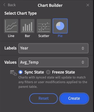
Pie
For Pie charts, select the column names to use for Labels and Values.
Plot hover menu
Hovering your cursor over a chart brings up the following menu:
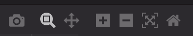
- Download plot as PNG - Save the plot locally as a PNG file.
- Zoom - Use the cursor to "draw" the portion of the chart you want to magnify. Double-click on the chart to return the image to its original view.
- Pan - Click and drag the plot to move other areas of the chart into view. Double-click on the chart to return the image to its original view.
- Zoom In - Zoom in on the plot.
- Zoom Out - Zoom out on the plot.
- AutoScale - Enables the chart to be sized automatically in the panel.
- Reset Axes - Resets the chart to its original ranges.
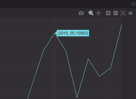
Tooltips
If you hover your cursor over the data shown in a plot, a tooltip displays detailed information about that portion of the data. In the example below, the cursor tooltip shows the exact value over which it is positioned.
Toggling series visibility
When multiple series are plotted, you might want to temporarily hide one or more of the series. Clicking once on the series name in the plot legend of the plot hides the series; clicking again shows the series.