Format tables in the UI
This guide shows you how to format tables in Deephaven. This includes reordering and hiding columns, creating custom aggregation columns, applying color formatting to specific cells or rows, and more. All of Deephaven's tools for formatting tables can be accessed by using the column header context menu and the Table Options menu.
Note
The deephaven.ui Python package provides a streamlined, programmatic way to format tables. With deephaven.ui, you can:
Column header menu
The column header menu can be accessed for any table by right-clicking on a column header.
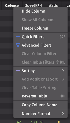
Hide Column
Any column in a table can be hidden by right-clicking that column's header and choosing Hide Columns.
If any columns are hidden, the Show All Columns option becomes accessible and can be used to restore the original display.
Freeze Column
The Freeze Column option locks a column in place so that as you horizontally scroll through a table, that column always remains in view.
If a column is already frozen, the Unfreeze Column option becomes accessible in its column header menu.
Quick Filters
The Quick Filters features adds a filter row above the header of a table. Type a value in the filter field above any column and it will filter accordingly.
Quick filters can be added in a table's option menu, or by right-clicking a column header:
Tip
You can also open or close the Quick Filters bar using the keyboard shortcut Ctrl+F or ⌘F, as well as in the Table Options menu.
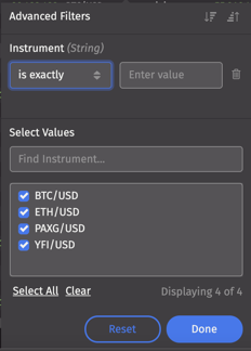
Advanced Filters
As the name implies, the Advanced Filters feature provides advanced options to filter data in a table. They can be accessed by right-clicking a column header, or by clicking on a column's funnel icon within the Quick Filters bar:
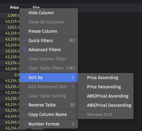
Sort by
Columns may be sorted in ascending or descending order, and also using absolute values if preferred.
Reverse table
This Reverse table option reverses the row order of the entire table, with the same result that the reverse method would have. For example, if you reverse a ticking table, you will see new rows appended to the top of your table.
Number Format
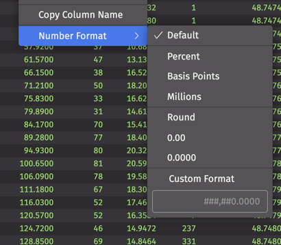
For columns containing numerical data, the Number Format option allows you to change how the data in that column is displayed.
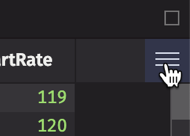
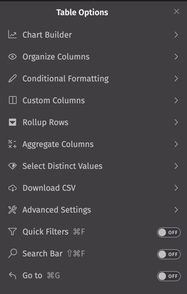
Table Options menu
The Table Options menu offers several options to customize, manipulate, and download your table data. It can be accessed by clicking on the hamburger icon to the right of a table's column headers.
Note
See the guide on the Chart Builder for information on plotting options in the UI.
Organize Columns
The Organize Columns option allows you to easily drag-and-drop columns in the order you wish them to appear, as well to hide certain columns from your table by clicking the eye icon next to its name.
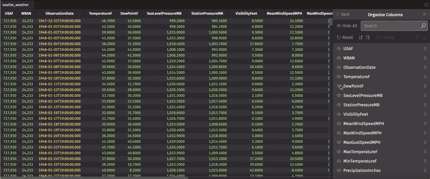
At the top of the dialog, there are shortcuts to reset the columns to their original display, as well as to sort all columns in ascending or descending order.
Group Columns
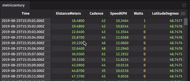
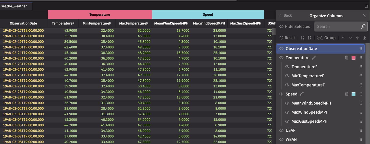
You can also create one or more column groups in your table. This is useful for organizing columns into logical groups. In the example below, we organize the weather data related to speed into a single group. Simply click Group, then drag-and-drop the columns you wish to include. After you name the group, click the Check icon to save:
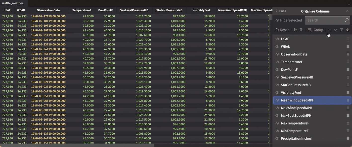
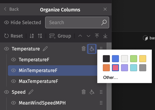
You can also choose a color for your column group using the paint can icon. The table below now includes two groups with distinct colors:
As with single columns, you can drag the group to determine the order in which it appears in your table. The Reset button removes any groups from your table.
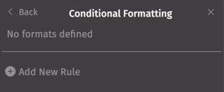
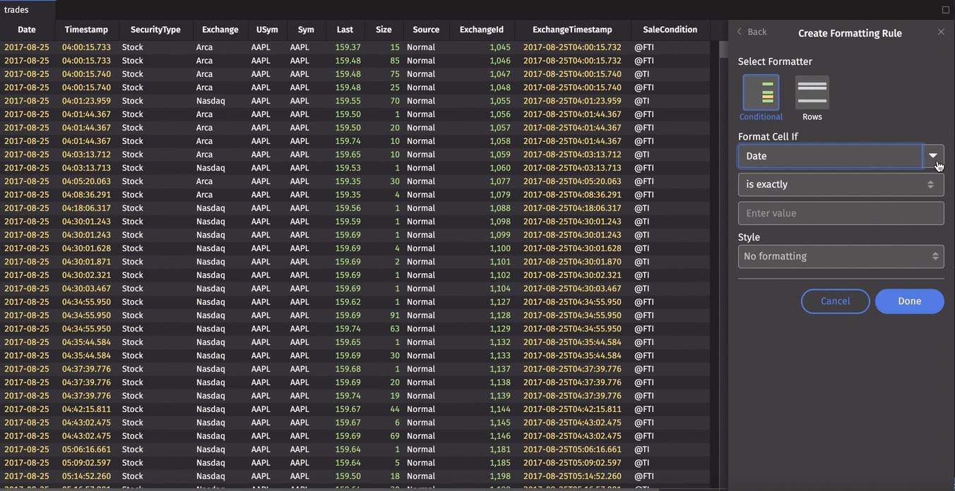
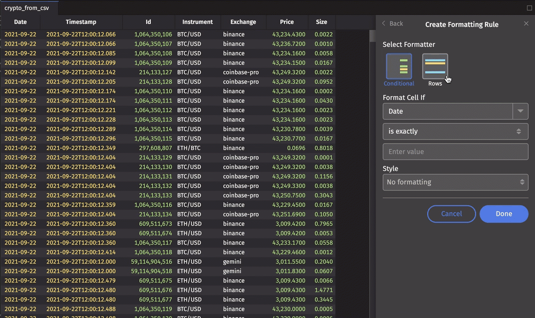
Conditional Formatting
The Conditonal Formatting feature allows you to define conditional formatting of cells or rows by creating new rules.
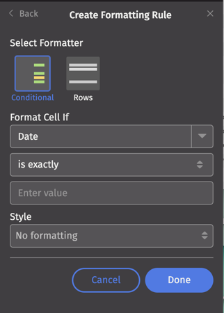
Select Add New Rule, then choose Conditional to format individual cells or Row to format specific rows.
-
Choose a column from the dropdown list provided.
-
Select the desired condition, such as "is exactly", "contains", "starts with", etc..
-
Select a style:
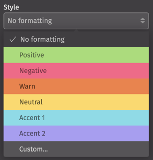
Note that six colors are available by default. The "Custom" option allows you to define your own color.
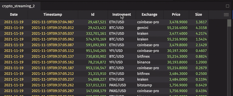
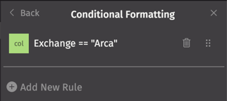
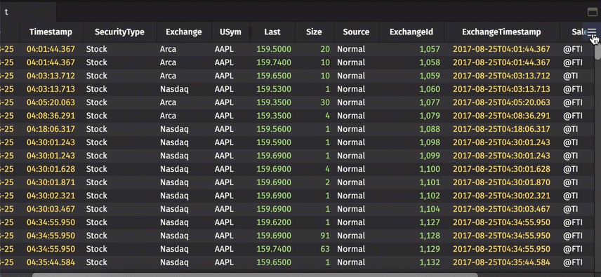
In the example below, all cells in the Exchange column containing the value "Arca" will be colored in the "Positive" style:
Likewise, this tool can be used to format rows:
Your new rules can be deleted or re-ordered by returning to the Conditional Formatting dialog.
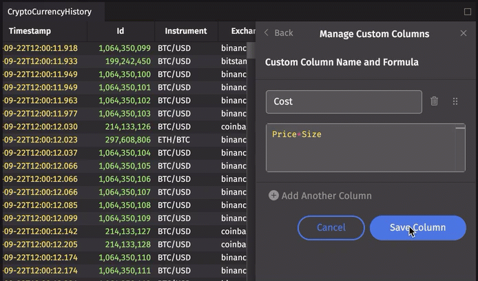
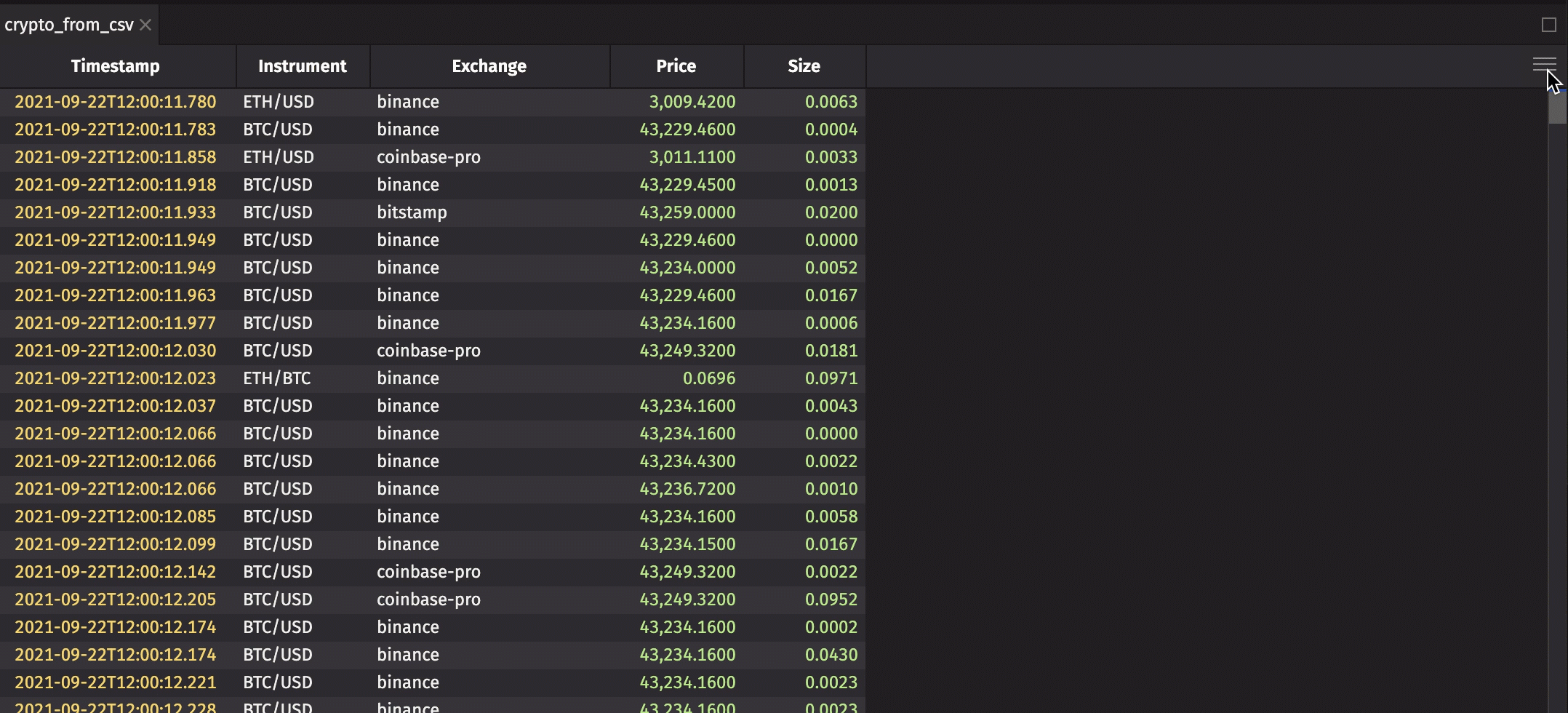
Custom Columns
The Custom Columns feature allows you to ad one or more calculated columns to your table.
Choose a name for your new column, then specify the formula in the field below. Click Save and close the dialog to see the new column in the table.
If you've added several custom columns, these can be re-ordered in the Custom Columns dialog by dragging-and-dropping each item into the order you wish.
Re-open the dialog to edit your formulas or delete columns.
Rollup rows
Note
To learn how to create rollup tables via queries, see How to create a hierarchical rollup table programmatically.
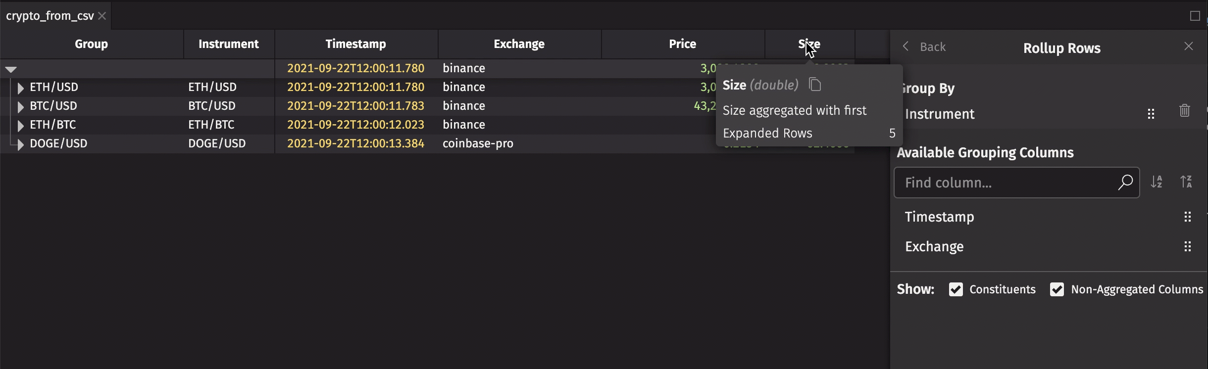
Simply drag the column by which you want to group the table into the Group By section of the dialog:
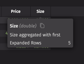
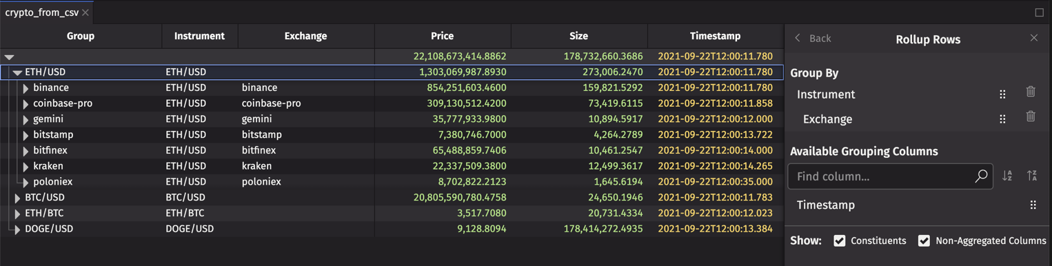
In the result table, only the first and second levels are initially expanded. Levels can be expanded by clicking on the right-facing arrow in a corresponding by column. Hover over a column header for details. For example, we can see that the "Size" column is aggregated by "First" by default:
To change the aggregation, go back to the Table Options menu and select a different aggregation from the Aggregations dropdown:
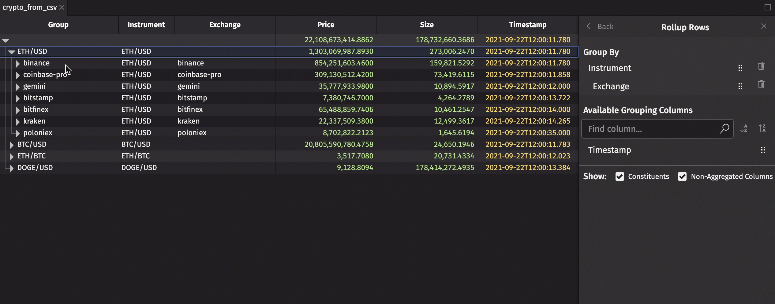
Selecting multiple grouping columms will create a multi-level rollup table. In the example below, the table is grouped by "Exchange" and "Instrument".
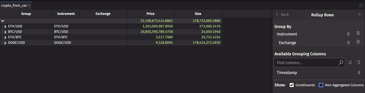
When the Consitituents box is unchecked, the rows from the original table that were aggregated are hidden:
Similarly, all the original columns in the table are shown by default. To hide the non-aggregrated columns, uncheck the Non-Aggregated Columns box:
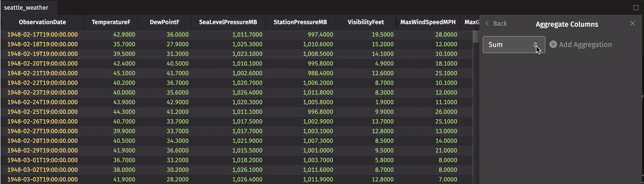
Aggregate Columns
The Aggregate Columns feature allows you to add a row to the top or bottom of your table that aggregates column data using the operation of your choice. This is useful for quickly calculating the sum, average, or other aggregate of a column.
In the example below, we add an Average row and a Minimum row to the top of the table:
These Aggregations can be re-ordered, edited, or deleted from the Aggregate Columns dialog.
Select Distinct Values
The Select Distinct Values feature modifies a table to show unique values from a selected column. This produces the same result as the query method select_distinct. A Select Distinct table is often used to trigger filters on other tables in a workspace.
From the options menu of the table you'd like to reduce, choose Select Distinct Values. Pick a column from which to display unique values.
- Filters previously applied to the table will be reset.
- You can add additional columns.
- Delete your selections using the trash icon to the right of its name. Deleting all selection restores the table to its original state.
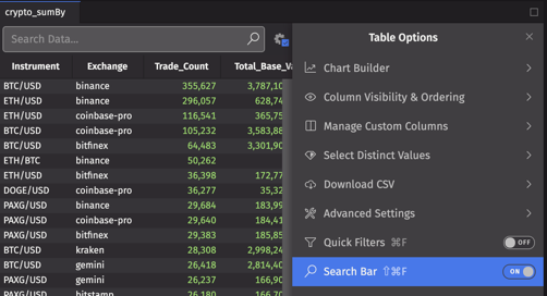
Search bar
When the Search Bar button is set to On in a table's Options menu, a search bar will be added to that table:
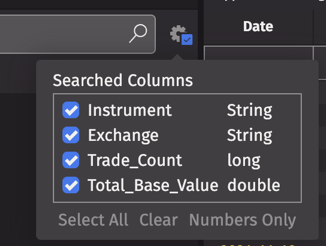
By default, all columns will be searched for your term. You can configure cross-column search using the Settings dialog at the right of the search bar:
Tip
You can also open or close the search bar using the keyboard shortcut Ctrl+S or ⌘S.
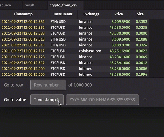
Go to value
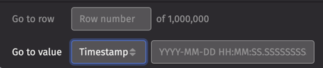
The Go to value feature allows you to go to a specified value in the table, with options determined by a column's data type. For example, when a Timestamp column is selected, the search field accepts DateTime values, while the Instrument column includes options for case-sensitive searches.
Go to row number
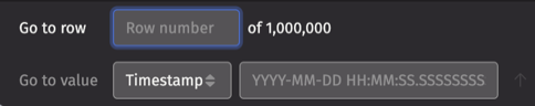
The Go to row feature allows you to go to a specified row number in your table.