
Real-time Data in R

· 15 min read
Firefly: A pile of small colorful cubes, with the letter R emerging made of cubes, dark blue background
Alex Peters
Running complex queries on ticking tables from RStudio

Previously, we introduced the Deephaven R client - a brand new, first-in-class R package that marries Deephaven's real-time power with R's vast ecosystem of data analysis tools. Since then, we've put a ton of effort into expanding the API to bring you all the power of real-time table operations.

You can now create and execute queries on live Deephaven tables with a comfortable syntax. R has many packages that provide table operations, but only the Deephaven R client works on real-time data.

In this blog, you'll learn how to create ticking tables from RStudio and manipulate them with common table operations. Then, we'll create some snapshot-based real-time plots with ggplot2, one of R's most popular plotting libraries.

Deephaven Table Operations

Simple table operations like subsetting rows and columns, computing summary statistics, and joining multiple tables are the basis of any data toolkit. These operations enable you to manipulate data into a form that is easy to visualize, summarize, model, and present. R has many packages that provide such table operations, but none are made to work on real-time tables except for the Deephaven R client. We've minimized the work required to write complex queries by composing table operations for real-time data, such that all of the resulting downstream tables are still real-time, and update in lock-step with the parent tables. So, summary statistics of columns will update when the original columns receive more data, joined tables will grow when more data rolls into the parent tables, and so on. This makes advanced analysis on ticking data intuitive, all the while ensuring that your results always stay up-to-date. Let's look at a simple example.

An example of live table operations

We'll break this example down into five steps:

  1. Installing the R client and starting a Deephaven server.
  2. Connecting to the server.
  3. Creating a ticking table on the server.
  4. Applying aggregations and formulae to live data.
  5. Real-time plots with popular libraries.

Installing the R client and starting a Deephaven server

To get started, you'll need to install the Deephaven R client. The source code and installation instructions can be found in the GitHub repo. The current client must be built from source. While the RStudio IDE is recommended for this tutorial, you can use any appropriate IDE. You will also need a running Deephaven server. We'll assume that your server is running on localhost:10000 for the remainder of this post.

Then, fire up an R IDE and import the Deephaven client, called rdeephaven. We'll also import ggplot2 and ggpubr for plotting.

library(rdeephaven)
library(ggplot2)
library(ggpubr)

Connecting to the server

The Deephaven client uses a Client object to establish and maintain a server connection. A Client object can be instantiated by calling new() with the arguments needed to connect to the server. Deephaven servers, by default, use pre-shared key authentication, so we need to call Client$new() with the appropriate authentication arguments. The Deephaven server can be started with any custom authentication key, and we will set that key to "Deeph@ven12345!". So, I will connect to the server as follows:

client <- Client$new(target="localhost:10000", auth_type="psk", auth_token="Deeph@ven12345!")

Creating a ticking table on the server

Now, we're going to use the time_table method from the R client to create ticking tables on the server. time_table takes an ISO-formatted string for the period of the ticking table, and an optional ISO-formatted string for the start time, which otherwise defaults to current system time. For this example, we will create a table that adds a new row every second.

Next, we'll use some of Deephaven's built-in Java methods to generate random samples from normal distributions. First, we randomly sample a mean μi\mu_i from a list of three possible means, 00, 1010, and 2020. Then, we will use that mean to construct σi\sigma_i for each group with σi=μi+1\sigma_i = \sqrt{\mu_i + 1}. Finally, we will draw a random sample xix_i from N(μi,σi)\mathcal{N}(\mu_i, \sigma_i), and save it in a column called X. Here is the code:

normal_samples <- client$time_table("PT1s")$
update(c("MEAN = 10*randomInt(0, 3)",
"SD = round(sqrt(MEAN + 1))",
"X = randomGaussian(MEAN, SD)"))

# this pulls a snapshot of the table from the server to R for display
as.data.frame(head(normal_samples, 10))
             Timestamp MEAN SD         X
1 2023-09-01 16:41:48 20 5 32.669799
2 2023-09-01 16:41:49 10 3 14.149335
3 2023-09-01 16:41:50 10 3 8.715698
4 2023-09-01 16:41:51 0 1 -1.361366
5 2023-09-01 16:41:52 20 5 21.738956
6 2023-09-01 16:41:53 10 3 7.551251
7 2023-09-01 16:41:54 0 1 1.097968
8 2023-09-01 16:41:55 10 3 9.832655
9 2023-09-01 16:41:56 10 3 9.193637
10 2023-09-01 16:41:57 20 5 16.126158

normal_samples is a Deephaven TableHandle that references a ticking table on the server, so we can use it to demonstrate some of Deephaven's new ticking table operations.

Applying aggregations and formulae to live data

First, let's use Deephaven's update_by() method to perform rolling aggregations for each group. We can compute the rolling average of X grouped by the three different means with the uby_rolling_avg_tick() function. We'll use the previous 10 observations to compute the rolling average at each point, and name the resulting column XAvg10. When the rolling average has fewer than 10 observations to use, as with the first 10 rows of the table, it will use all previous observations. Then, we'll use the new rolling average to compute the relative Z-score for each observation, and save those results in a column called Z.

# add rolling average and relative Z scores
normal_samples <- normal_samples$
update_by(uby_rolling_avg_tick("XAvg10 = X", 10), by = "MEAN")$
update("Z = (X - XAvg10) / SD")
             Timestamp MEAN SD         X   XAvg10           Z
1 2023-09-01 16:41:48 20 5 32.669799 32.6697995 0.00000000
2 2023-09-01 16:41:49 10 3 14.149335 14.1493353 0.00000000
3 2023-09-01 16:41:50 10 3 8.715698 11.4325164 -0.90560629
4 2023-09-01 16:41:51 0 1 -1.361366 -1.3613656 0.00000000
5 2023-09-01 16:41:52 20 5 21.738956 27.2043778 -1.09308434
6 2023-09-01 16:41:53 10 3 7.551251 10.1387614 -0.86250334
7 2023-09-01 16:41:54 0 1 1.097968 -0.1316988 1.22966685
8 2023-09-01 16:41:55 10 3 9.832655 10.0622347 -0.07652664
9 2023-09-01 16:41:56 10 3 9.193637 9.8885151 -0.23162613
10 2023-09-01 16:41:57 20 5 16.126158 23.5116379 -1.47709597

In addition to the rolling average, let's compute the cumulative average. Doing so is as simple as counting the total number of observations in each group and dividing the group-wise cumulative sum by that count. Having the number of observations in each group also enables us to compute the cumulative standard error of the sample mean, so we will do that here as well.

# add cumulative average and standard error
normal_samples <- normal_samples$
update("currentCount = 1")$
update_by(uby_cum_sum(c("N = currentCount", "XCumSum = X")), by = "MEAN")$
update(c("XCumAvg = XCumSum / N", "SE = SD / sqrt(N)"))$
drop_columns(c("currentCount", "XCumSum"))
             Timestamp MEAN SD         X   XAvg10           Z N  XCumAvg        SE
1 2023-09-01 16:41:48 20 5 32.669799 32.6697995 0.00000000 1 32.6697995 5.0000000
2 2023-09-01 16:41:49 10 3 14.149335 14.1493353 0.00000000 1 14.1493353 3.0000000
3 2023-09-01 16:41:50 10 3 8.715698 11.4325164 -0.90560629 2 11.4325164 2.1213203
4 2023-09-01 16:41:51 0 1 -1.361366 -1.3613656 0.00000000 1 -1.3613656 1.0000000
5 2023-09-01 16:41:52 20 5 21.738956 27.2043778 -1.09308434 2 27.2043778 3.5355339
6 2023-09-01 16:41:53 10 3 7.551251 10.1387614 -0.86250334 3 10.1387614 1.7320508
7 2023-09-01 16:41:54 0 1 1.097968 -0.1316988 1.22966685 2 -0.1316988 0.7071068
8 2023-09-01 16:41:55 10 3 9.832655 10.0622347 -0.07652664 4 10.0622347 1.5000000
9 2023-09-01 16:41:56 10 3 9.193637 9.8885151 -0.23162613 5 9.8885151 1.3416408
10 2023-09-01 16:41:57 20 5 16.126158 23.5116379 -1.47709597 3 23.5116379 2.8867513

Hopefully you can see how easy it is to perform complex table operations on ticking data with Deephaven. Now that we've calculated all of these statistics, let's do some real-time data visualization!

Deephaven TableHandles are references to ticking tables on the server that can easily be converted to R data frames. Deriving data frames from Deephaven tables in this way ensures that the data frames will have the most up-to-date data from the server when they're created. Since all of R's plotting libraries use data frames to create their plots, and data frames derived from TableHandles represent the latest snapshot of available data when they're created, we get snapshot-based real-time plotting for free, with zero additional syntax needed to handle the real-time case. Let's see this in action.

We use ggplot2 to create three plots that allow us to visualize the data and all of the summary statistics we've computed. The three code blocks are shown first, followed by all three plots. First, we create a custom theme to use with all of our plots to reduce code repetition. This is not a necessary step, but yields the aesthetics we were looking for.

custom_theme <- theme(plot.title = element_text(hjust = 0.5, colour="grey95"),
legend.title = element_blank(),
panel.background = element_rect(fill = "grey50"),
panel.grid.major = element_line(linewidth = 0.25, colour = "grey20"),
panel.grid.minor = element_line(linewidth = 0.1, colour = "grey20"),
plot.background = element_rect(fill = "grey30", color = "grey30"),
legend.background = element_rect(fill = "grey30"),
legend.key = element_rect(fill = "grey50", color = NA),
legend.text = element_text(colour="grey95"),
axis.text = element_text(colour="grey70"),
axis.title = element_text(colour="grey95"))

First, let's plot kernel density estimates for each group of data. We have three groups defined by three unique values of μ\mu, so we group everything by MEAN and call the corresponding groups Group A, Group B, and Group C. We also include three dashed lines to visualize the three unique values of μ\mu.

# multiple density plot
p1 <- ggplot(data = as.data.frame(normal_samples), aes(x=X, group=MEAN, fill=factor(MEAN))) +
geom_vline(xintercept = 0, linetype = "dashed", color = "yellow") +
geom_vline(xintercept = 10, linetype = "dashed", color = "green") +
geom_vline(xintercept = 20, linetype = "dashed", color = "cyan") +

geom_density(bw=1, alpha=.75, color = "black") +
xlim(-10, 40) +
scale_fill_manual(breaks = c(0, 10, 20),
values = c("gold1","darkolivegreen3", "darkslategray2"),
labels = c("Group A", "Group B", "Group C")) +
labs(title = "Density Estimates by Group", x = "Value", y = "Density") +
custom_theme

Next, we make a scatter plot of the data for each group, and overlay a line to indicate the 10-sample rolling average.

# multiple rolling average plot
p2 <- ggplot(data = as.data.frame(table), aes(x = Timestamp, y = X, color = factor(MEAN))) +
geom_hline(yintercept = 0, linetype = "dashed", color = "yellow") +
geom_hline(yintercept = 10, linetype = "dashed", color = "green") +
geom_hline(yintercept = 20, linetype = "dashed", color = "cyan") +

geom_point(aes(group = factor(MEAN), alpha = 1 - pnorm(abs(Z))), fill="grey", size = 2.5, show.legend = FALSE) +
geom_line(aes(y = XAvg10, group = factor(MEAN)), linewidth = 2, color = "black") +
geom_line(aes(y = XAvg10, color = factor(MEAN)), linewidth = 1) +
ylim(-5, 35) +
scale_color_manual(breaks = c(0, 10, 20),
values = c("gold1","darkolivegreen3", "darkslategray2"),
labels = c("Group A", "Group B", "Group C")) +
labs(title = "Samples with 10-sample Rolling Average", y = "Value") +
custom_theme

Finally, we plot the cumulative average for each group, and use the calculated standard error to create cumulative 95% confidence bands. By the law of large numbers, the cumulative average lines will converge to the true mean value for that group.

# multiple cumulative average plot
p3 <- ggplot(data = as.data.frame(table), aes(x = Timestamp, y = XCumAvg, color = factor(MEAN))) +
geom_hline(yintercept = 0, linetype = "dashed", color = "yellow") +
geom_hline(yintercept = 10, linetype = "dashed", color = "green") +
geom_hline(yintercept = 20, linetype = "dashed", color = "cyan") +

geom_line(linewidth = 2, aes(group = factor(MEAN)), color = "black") +
geom_line(linewidth = 1) +
ylim(-5, 35) +
geom_ribbon(aes(ymin = XCumAvg - 1.96*SE, ymax = XCumAvg + 1.96*SE,
fill = factor(MEAN)), alpha = 0.2, show.legend = FALSE) +
scale_color_manual(breaks = c(0, 10, 20),
values = c("gold1","darkolivegreen3", "darkslategray2"),
labels = c("Group A", "Group B", "Group C")) +
labs(title = "Cumulative Average with 95% CIs", y = "Cumulative Average") +
custom_theme

We can use the ggarrange() function from the ggpubr library to collect these plots into one plot.

combined_plot <- ggarrange(p1, p2, p3, ncol=3, common.legend = TRUE) +
bgcolor("grey30")

Here are the results:
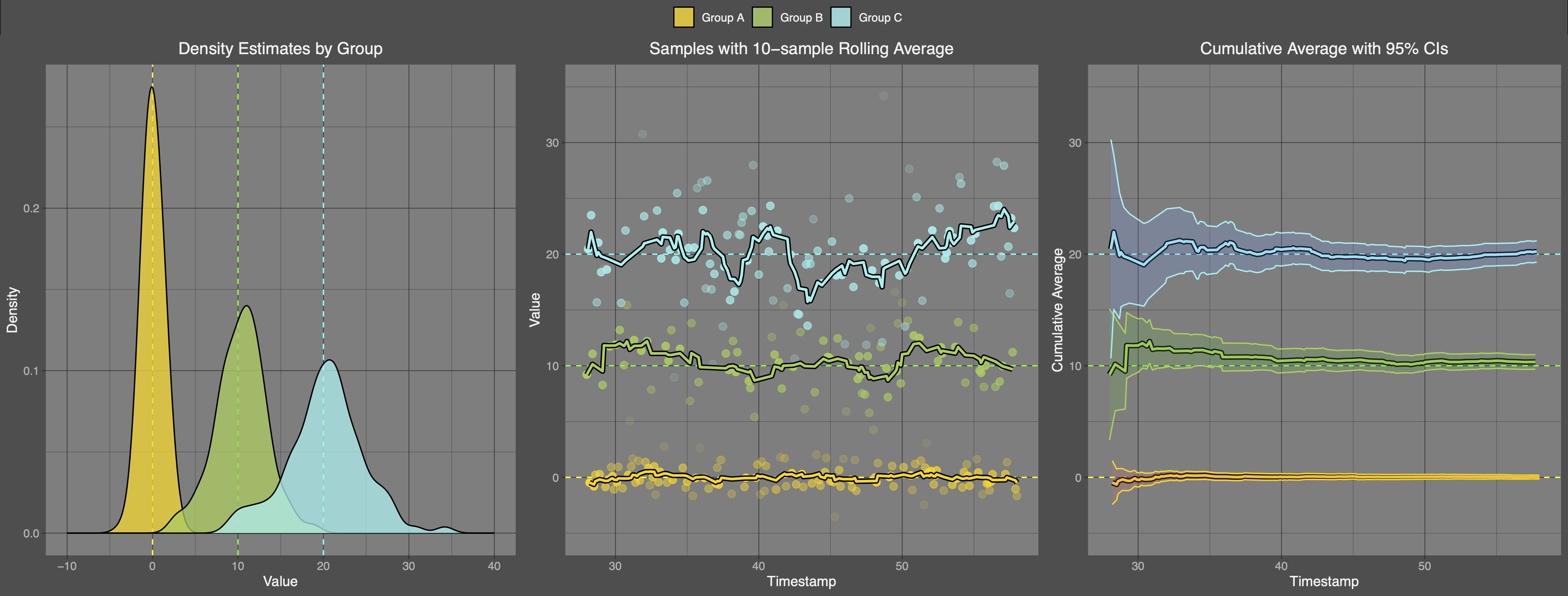
img

Beautiful!

The coolest part about this is that all of the plotting code is completely Deephaven-free, and the plots know nothing about the fact that the tables they're created from are ticking. So, you don't need to learn a special new syntax to make them work; you can use whatever library you're comfortable with.

If you collect the plot creation into a function and call it several times, you will see that each time these plots are created, they provide a snapshot of the most up-to-date data from the server. Of course, the table operations can also be collected into a single call, so here is a script that ties everything together, and makes three calls to our plots at the end to demonstrate their keeping up with server data.

Expand for the full code block
library(rdeephaven)
library(ggplot2)
library(ggpubr)

client <- Client$new(target="localhost:10000", auth_type="psk", auth_token="Deeph@ven12345!")

# create normal samples

normal_samples <- client$time_table("PT0.1s")$
update(c("MEAN = 10*randomInt(0, 3)",
"SD = round(sqrt(MEAN + 1))",
"X = randomGaussian(MEAN, SD)"))$
update_by(uby_rolling_avg_tick("XAvg10 = X", 10), by = "MEAN")$
update(c("Z = (X - XAvg10) / SD", "currentCount = 1"))$
update_by(uby_cum_sum(c("N = currentCount", "XCumAvg = X")), by = "MEAN")$
update(c("XCumAvg = XCumAvg / N", "SE = SD / sqrt(N)"))$
drop_columns("currentCount")

plot_normal_samples <- function(table) {

custom_theme <- theme(plot.title = element_text(hjust = 0.5, colour="grey95"),
legend.title = element_blank(),
panel.background = element_rect(fill = "grey50"),
panel.grid.major = element_line(linewidth = 0.25, colour = "grey20"),
panel.grid.minor = element_line(linewidth = 0.1, colour = "grey20"),
plot.background = element_rect(fill = "grey30", color = "grey30"),
legend.background = element_rect(fill = "grey30"),
legend.key = element_rect(fill = "grey50", color = NA),
legend.text = element_text(colour="grey95"),
axis.text = element_text(colour="grey70"),
axis.title = element_text(colour="grey95"))

# multiple density plot

p1 <- ggplot(data = as.data.frame(table), aes(x=X, group=MEAN, fill=factor(MEAN))) +
geom_vline(xintercept = 0, linetype = "dashed", color = "yellow") +
geom_vline(xintercept = 10, linetype = "dashed", color = "green") +
geom_vline(xintercept = 20, linetype = "dashed", color = "cyan") +

geom_density(bw=1, alpha=.75, color = "black") +
xlim(-10, 40) +
scale_fill_manual(breaks = c(0, 10, 20),
values = c("gold1","darkolivegreen3", "darkslategray2"),
labels = c("Group A", "Group B", "Group C")) +
labs(title = "Density Estimates by Group", x = "Value", y = "Density") +
custom_theme

# multiple rolling average plot

p2 <- ggplot(data = as.data.frame(table), aes(x = Timestamp, y = X, color = factor(MEAN))) +
geom_hline(yintercept = 0, linetype = "dashed", color = "yellow") +
geom_hline(yintercept = 10, linetype = "dashed", color = "green") +
geom_hline(yintercept = 20, linetype = "dashed", color = "cyan") +

geom_point(aes(group = factor(MEAN), alpha = 1 - pnorm(abs(Z))), fill="grey", size = 2.5, show.legend = FALSE) +
geom_line(aes(y = XAvg10, group = factor(MEAN)), linewidth = 2, color = "black") +
geom_line(aes(y = XAvg10, color = factor(MEAN)), linewidth = 1) +
ylim(-5, 35) +
scale_color_manual(breaks = c(0, 10, 20),
values = c("gold1","darkolivegreen3", "darkslategray2"),
labels = c("Group A", "Group B", "Group C")) +
labs(title = "Samples with 10-sample Rolling Average", y = "Value") +
custom_theme

# multiple cumulative average plot

p3 <- ggplot(data = as.data.frame(table), aes(x = Timestamp, y = XCumAvg, color = factor(MEAN))) +
geom_hline(yintercept = 0, linetype = "dashed", color = "yellow") +
geom_hline(yintercept = 10, linetype = "dashed", color = "green") +
geom_hline(yintercept = 20, linetype = "dashed", color = "cyan") +

geom_line(linewidth = 2, aes(group = factor(MEAN)), color = "black") +
geom_line(linewidth = 1) +
ylim(-5, 35) +
geom_ribbon(aes(ymin = XCumAvg - 1.96*SE, ymax = XCumAvg + 1.96*SE,
fill = factor(MEAN)), alpha = 0.2, show.legend = FALSE) +
scale_color_manual(breaks = c(0, 10, 20),
values = c("gold1","darkolivegreen3", "darkslategray2"),
labels = c("Group A", "Group B", "Group C")) +
labs(title = "Cumulative Average with 95% CIs", y = "Cumulative Average") +
custom_theme

combined_plot <- ggarrange(p1, p2, p3, ncol=3, common.legend = TRUE) +
bgcolor("grey30")

return(combined_plot)

}

Sys.sleep(5)
for (i in 1:30) {
Sys.sleep(2)
print(plot_normal_samples(normal_samples))
}

client$close()

Running this script produces the following plot (sped up 3x for effect):

img

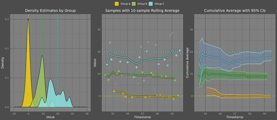
This gives us a great way to watch our data evolve in real time, without the need for additional infrastructure around creating the plots. Note that this is not an automatically updating plot, but the data that the plot is derived from does automatically update. So, simply calling the plotting code in a loop is sufficient to give the impression of ticking data, even though the R client can only ever retrieve snapshots of the latest server updates and convert them to static R objects.

Takeaways

The Deephaven R client provides a unique and robust solution for seamlessly integrating real-time data into your R workflows. By offering a straightforward way to interface with static and ticking tables and perform complex table operations, it empowers data scientists and analysts to harness the power of real-time data without leaving their familiar R environment. Whether you need to analyze financial data, monitor IoT devices, or visualize live metrics, the Deephaven R client has you covered.

Try the Deephaven R Client

To get started using the Deephaven R client, visit the R Client README, and feel free to reach out to us on our community Slack if you have any questions. Start leveraging the full potential of real-time data in R today!