Building custom trading visualizations with Plotly Express
December 18 2025

In our previous posts, we built a real-time trading dashboard with live P&L tracking, risk monitoring, and automated alerts. We explored it through Deephaven's UI with filtering, sorting, and point-and-click charts.
Now you have harder questions. Not just "Am I making money?" but "Are my winners worth the risk?" Not just "What's moving?" but "Which movers have good liquidity?"
Those questions need custom visualizations. Plotly Express gives you the power to combine multiple data dimensions in a single view — risk vs return, price vs volume vs signal, P&L vs volatility — all updating in real-time as market data flows in.
Note
This post demonstrates visualization techniques using simplified trading concepts. The financial calculations and risk metrics shown are for educational purposes only and should not be used for actual trading decisions. Real-world trading systems require significantly more sophisticated analysis, proper risk management, regulatory compliance, and professional financial advice. This is not financial or investment advice.
What makes Deephaven Plotly Express different
Deephaven Plotly Express (deephaven.plot.express) is built on top of standard Plotly Express but adds powerful capabilities specifically designed for real-time data:
- Real-time updates: Charts automatically refresh as underlying Deephaven tables update. No polling, no manual refreshes, no websocket management.
- Automatic downsampling: Visualize millions of data points with pixel-accurate automatic downsampling. The system intelligently reduces points to match your screen resolution.
- Server-side processing: Data aggregation and grouping happen in Deephaven's query engine before reaching the browser, enabling analysis of massive datasets without network overhead.
- Familiar API: In most cases, you can directly swap
px(standard Plotly Express) fordx(Deephaven Plotly Express). If you know Plotly Express, you already know this library.
Tip
If you've used the built-in UI charting from part 2, this guide shows you how to go further with programmatic control, custom styling, and complex multi-chart layouts.
Setting up
The examples below use tables from the trading dashboard in part 1 (market_data, trading_signals, portfolio_pnl, risk_metrics, etc.). If you haven't set those up yet, expand the details below for the complete setup code.
Click to expand: Complete setup code from Part 1
Tip
Dark mode for trading
Many traders prefer dark themes. Add template="plotly_dark" to any chart for an instant professional dark mode. Other built-in templates include "plotly_white", "seaborn", "ggplot2", and "simple_white".
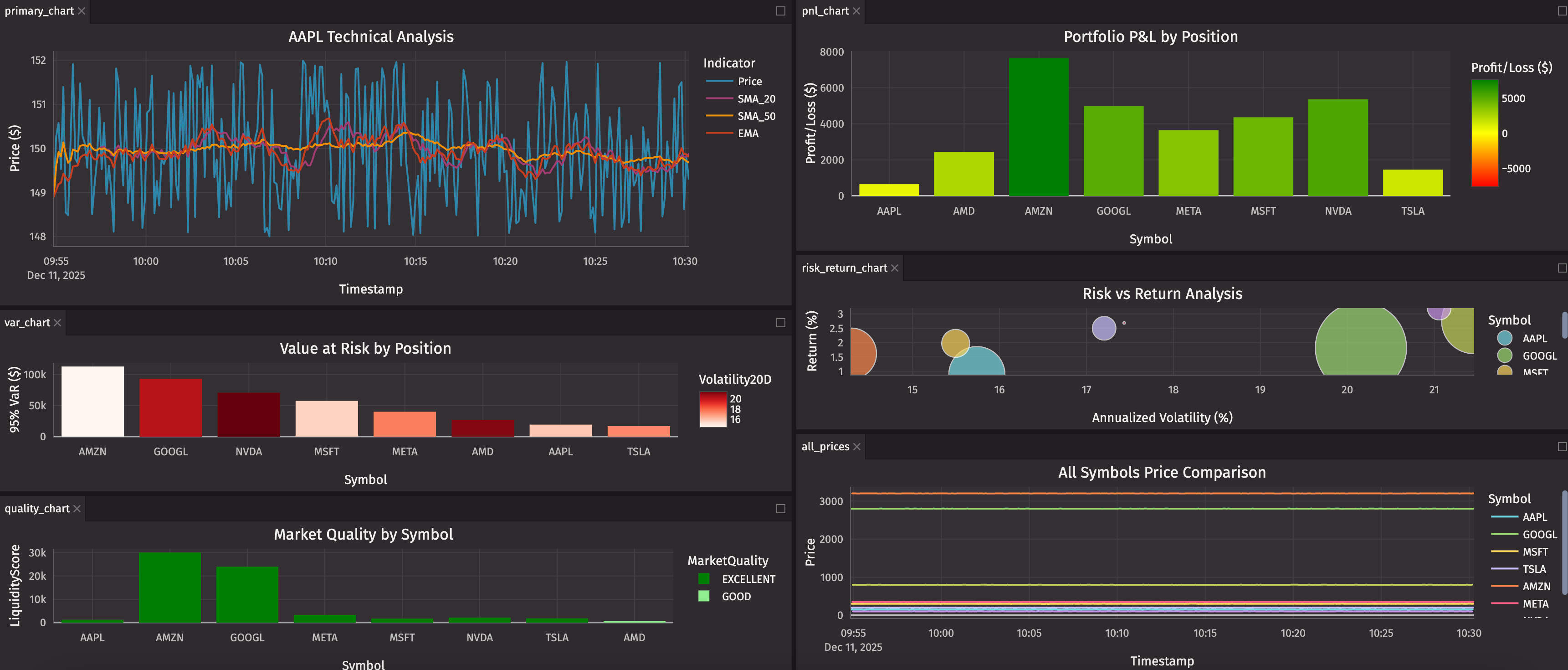
One chart, five dimensions
You've been trading for an hour. You want to know: Are my winners worth the risk?
Here's the entire answer in one chart:
That's it. A live-updating bubble chart showing:
- X-axis: Annualized volatility (risk)
- Y-axis: Return percentage
- Bubble size: Position value
- Color: Symbol
- Hover: VaR and current value
Large bubbles in the top-left quadrant? High return, low risk — exactly where you want to be. Large bubbles in the bottom-right? High risk, losing money — time to adjust.
What just happened:
dx.scatter()creates a scatter plot from yourrisk_metricstable.- The chart automatically subscribes to table updates — as
risk_metricschanges, the chart redraws. size="PositionSize"maps the bubble size to your position value.by="Symbol"creates separate colored series for each symbol.- Everything is interactive: zoom, pan, hover, click legend items to hide/show symbols.
The chart updates automatically as prices tick. Watch positions migrate across the chart in real-time. See volatility spike. Watch returns change. All without writing event handlers, polling logic, or refresh code.
Simple questions first
Before we build that six-panel trading desk, let's start with basic questions that need visual answers.
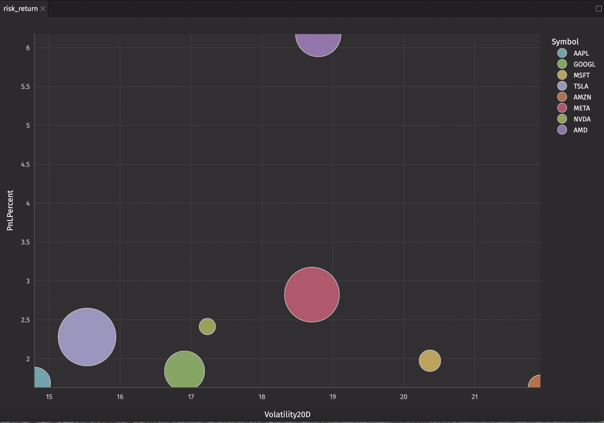
Question: "Which positions are making money?"
Your dashboard has 8 positions. You need the answer instantly.
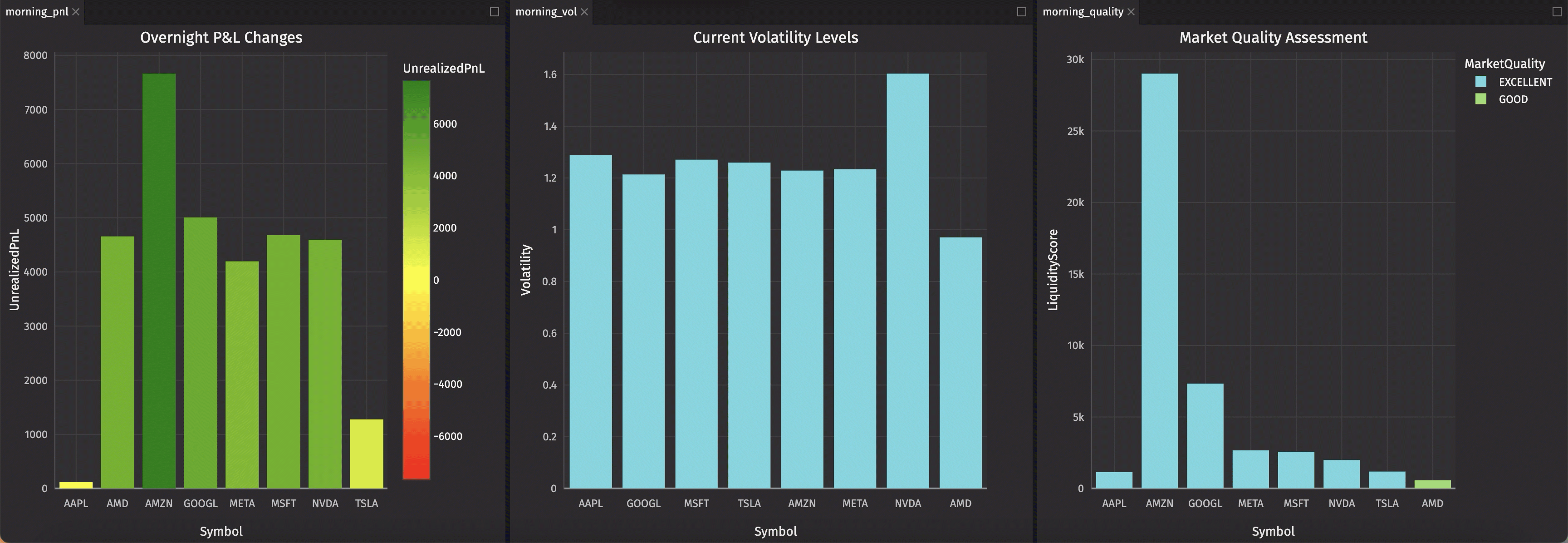
Green bars = winners. Red bars = losers. The height tells you how much. Watch bars grow and shrink as prices tick.
How this works:
dx.bar()creates a bar chart from your table.color="UnrealizedPnL"maps bar colors to P&L values.color_continuous_scaledefines the gradient: red → yellow → green.color_continuous_midpoint=0centers yellow at zero P&L.- Deephaven automatically recalculates the color mapping as values change.
The power of continuous color scales: You don't write if PnL > 0: color = green. The color parameter handles the entire mapping automatically, and it updates in real-time.
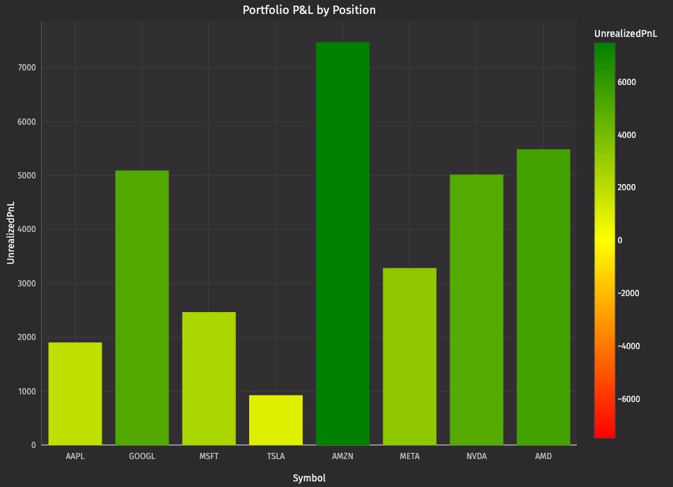
Question: "What's the price trend?"
You're watching AAPL. You want to see price with moving averages to spot crossovers.
With just a list of column names, you get four distinctly colored lines, an automatic legend, and real-time updates.
How multi-series works:
- Pass a list of column names to
y:["Price", "SMA_20", "SMA_50", "EMA"]. dx.line()creates a separate line for each column.- Each series gets a unique color from
color_discrete_sequence. - The legend shows all four series — click to hide/show individual lines.
- All four series update together as the table ticks.
This is what makes Plotly Express powerful: Overlaying multiple series is just a list parameter: no loops, no manual color assignment, and no managing multiple traces.
Question: "Where's my capital allocated?"
You want to see portfolio concentration at a glance.
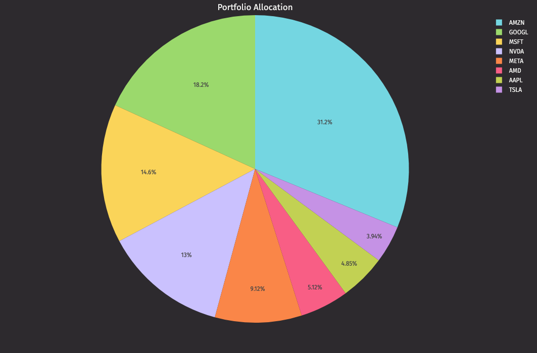
One line creates a live-updating pie chart that instantly reveals portfolio concentration.
Better questions: Adding dimensions
Simple questions have simple answers, but trading isn't simple. You need to see relationships between multiple factors simultaneously.
Question: "Which positions have high risk?"
Not just which are risky, but how risky compared to each other.
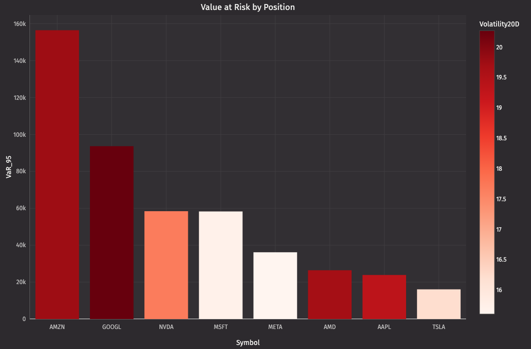
Sorted by VaR. Color intensity shows volatility. Darker red = higher volatility. The tallest bars aren't always the darkest — some positions have high VaR due to size, not volatility.
This is where dimensions matter. You're not just showing VaR. You're showing VaR (height) + volatility intensity (color gradient) + symbol order (sort). Three dimensions in one chart.
Question: "How do all my symbols compare?"
You have 8 positions. You want to see all 8 price trends simultaneously.
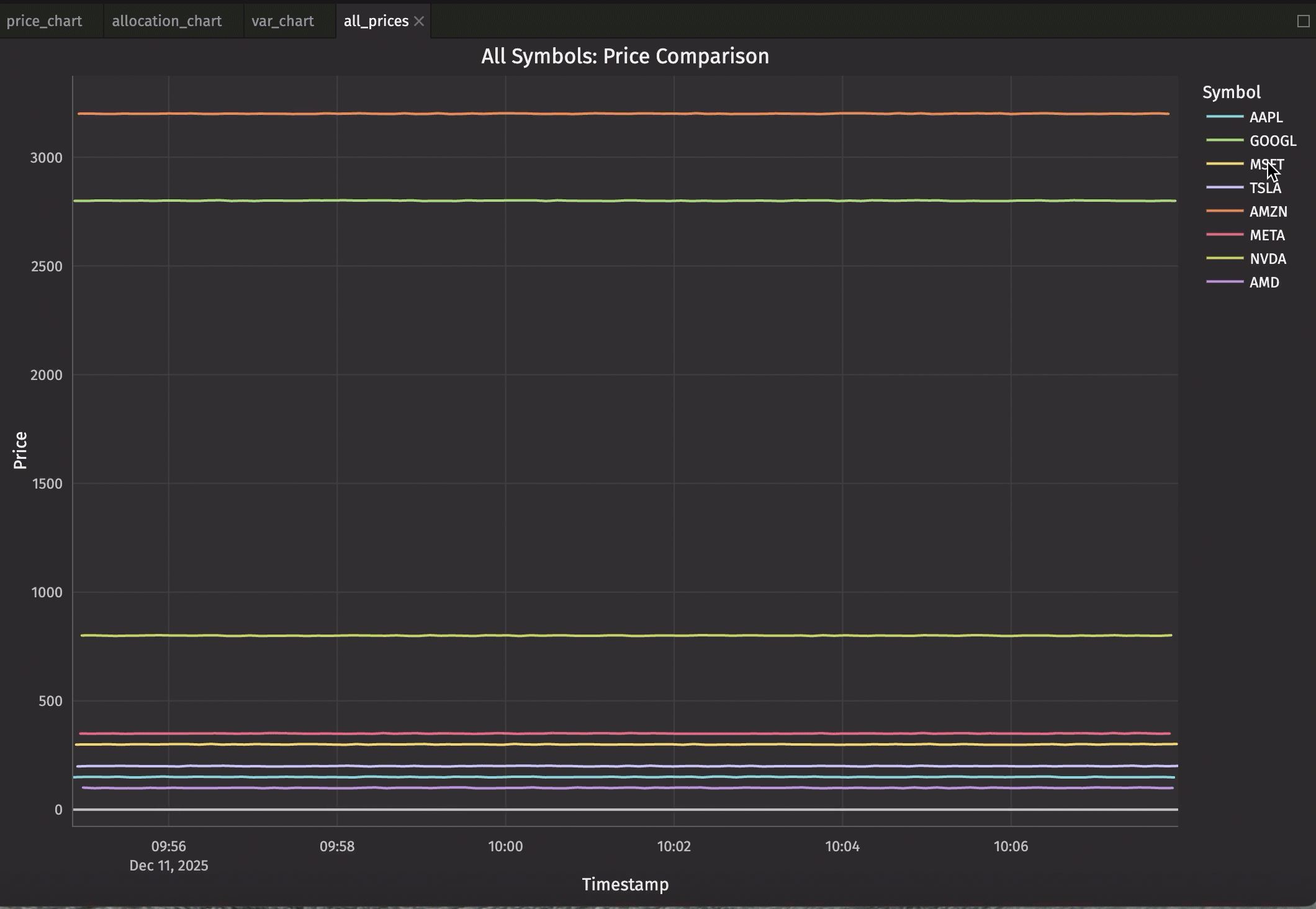
The by parameter is magic. One line creates eight separate series, each with its own color and legend entry. Click a legend item to hide that symbol. Double-click to isolate it. All interactive. All automatic.
How by works:
by="Symbol"groups the data by theSymbolcolumn.- Plotly Express creates a separate line for each unique value (AAPL, GOOGL, etc.).
- Each group gets a unique color automatically.
- The legend shows all symbols.
- Interactive filtering: click legend items to show/hide specific series.
This is grouping made visual: The same by concept from Deephaven table operations (update_by, agg_by) now creates visual groups in your chart.
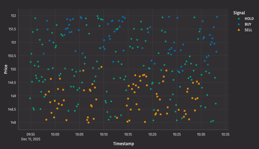
Question: "Which symbols have good liquidity right now?"
Tight spreads mean better execution. You need to see market quality across all symbols.
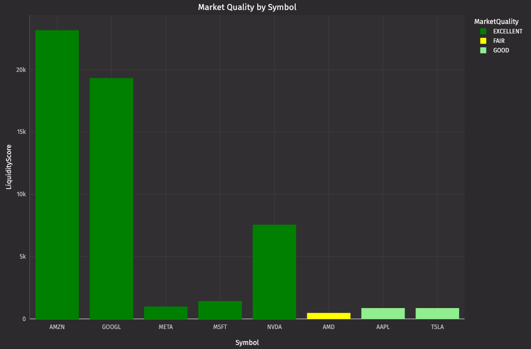
The color-coded bars create an instant visual hierarchy. Green bars = trade freely. Red bars = widen your limits.
Note
This example uses simulated market data, which may only show a subset of the quality levels (e.g., three colors instead of four). With real trading data showing actual bid-ask spreads and order book depth, you'd see the full range of market conditions and all color categories throughout the trading day.
Question: "What patterns am I seeing in price action?"
Raw ticks don't show patterns. Candlesticks do. You need OHLC data.
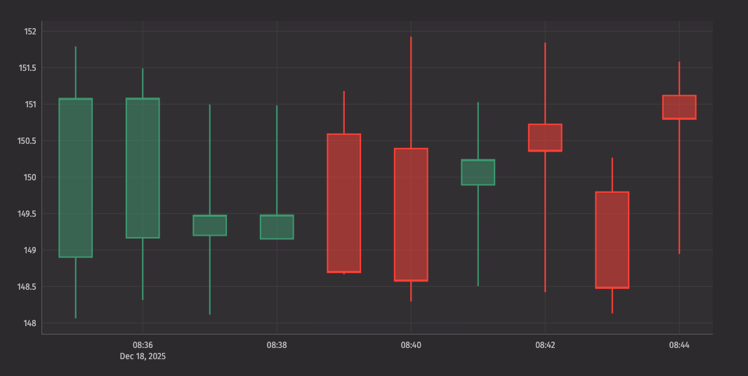
Now you can spot dojis, hammers, engulfing patterns — all the candlestick patterns that signal reversals or continuations. The chart updates as new candles form.
Learn more: See the complete candlestick documentation for additional customization options.
The complete picture: See everything simultaneously
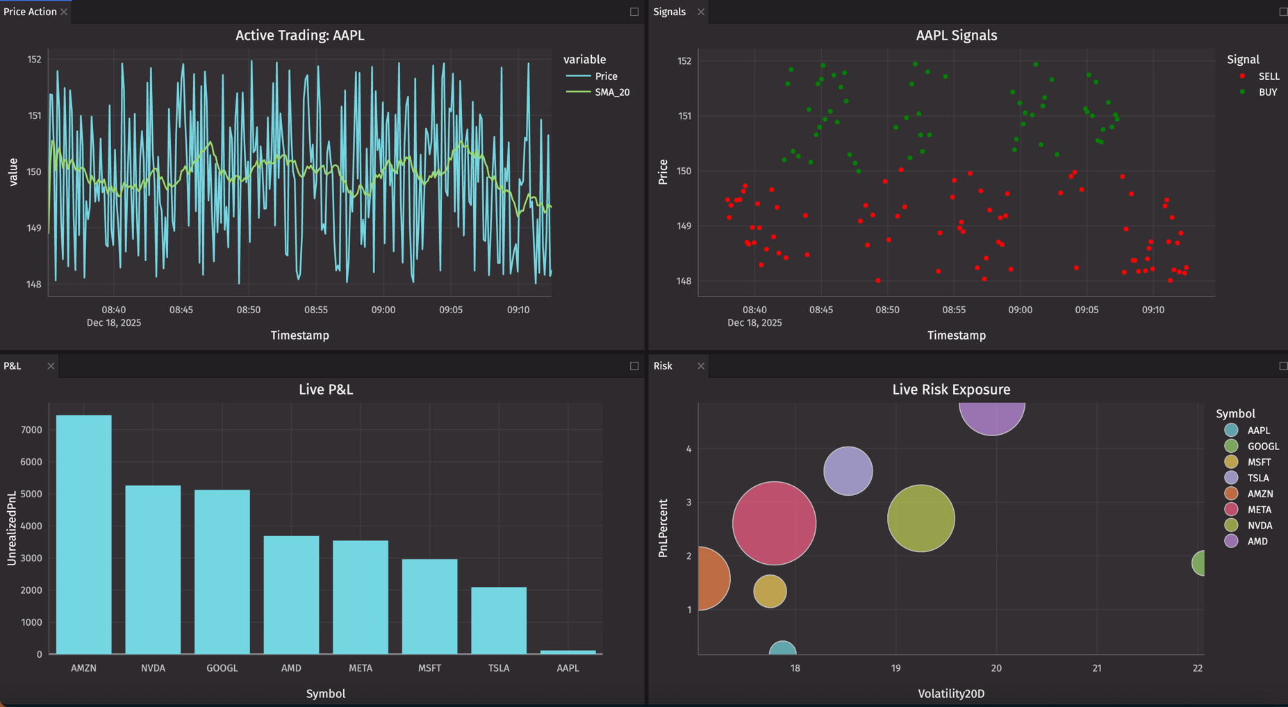
You've built individual charts. But you can't trade watching one chart at a time. You need multiple views visible simultaneously — price action, P&L, risk, liquidity — all updating together.
Here's a complete six-panel trading desk (note: we've focused on dynamic monitoring charts here — the allocation pie chart is useful for portfolio review but less critical for active trading):
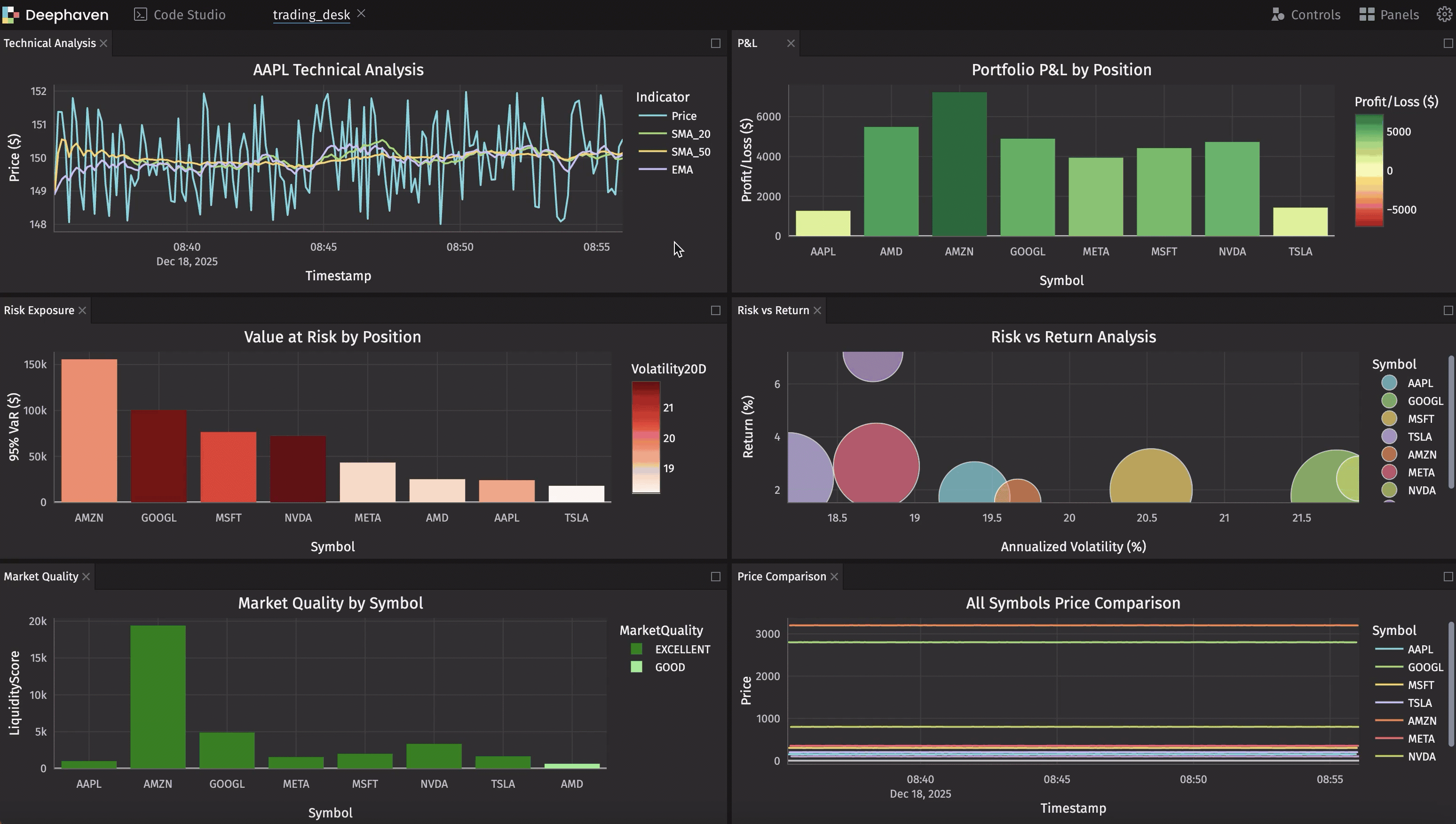
You can move and arrange these charts however you want manually in your workspace, or arrange them programmatically with deephaven.ui. The programmatic approach gives you the same layout every session — no re-dragging panels each morning. Use height parameters to control relative panel sizes.
Power user techniques
Once you're comfortable with the basics, these patterns will help you build more sophisticated visualizations.
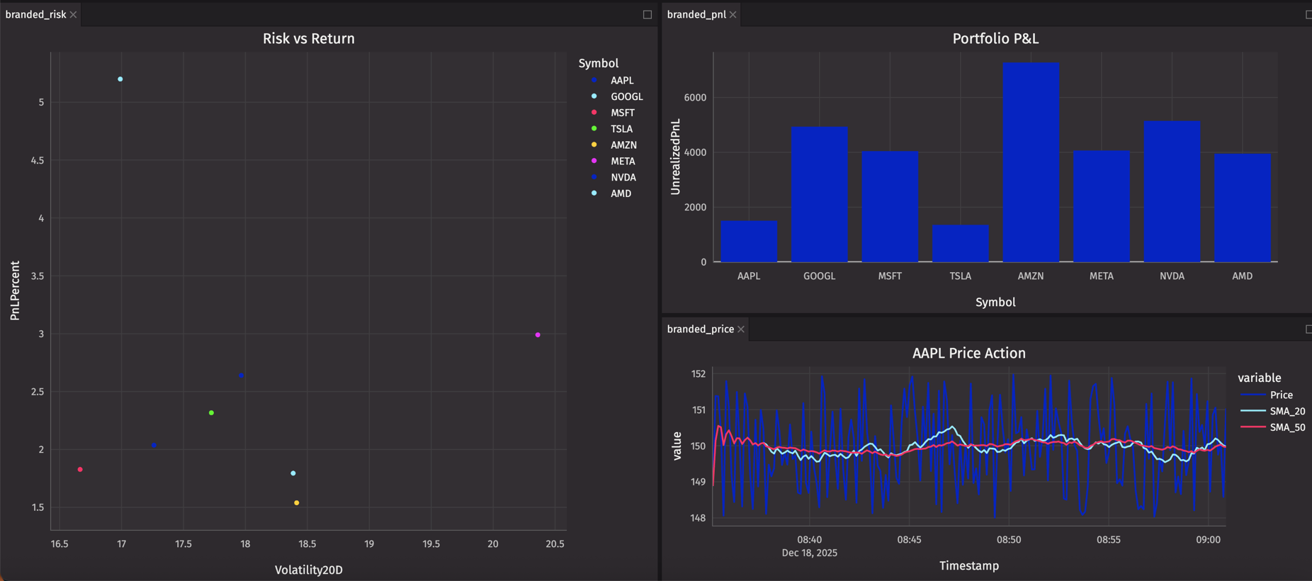
Combining data from multiple tables
Time-based aggregations
Consistent branding with custom themes
All three charts now share the same color palette and dark theme, creating a cohesive, professional dashboard.
Color accessibility
When choosing colors for trading signals or risk indicators, consider colorblind-friendly palettes:
Best practices:
- For continuous scales: Use
"viridis","cividis", or"plasma"instead of red-green gradients. - For discrete categories: Use Tol bright palette:
["#0173B2", "#DE8F05", "#029E73"]. - Add redundancy: Use both
colorandsymbolparameters to encode the same information.
Interactive symbol selector
Use deephaven.ui to create a combo box that dynamically filters your chart:
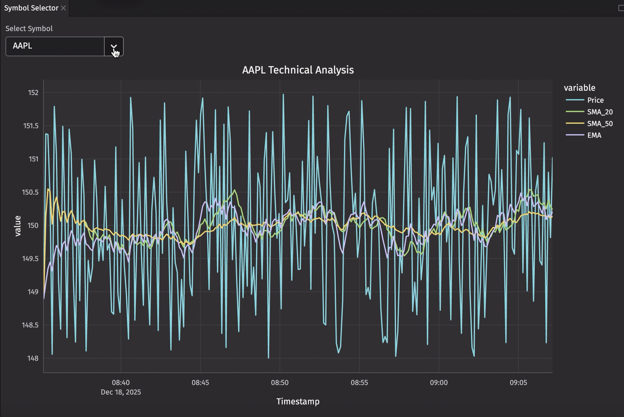
Now you have a dropdown that lets you switch between symbols instantly. The chart updates in real-time as the selected symbol's data ticks, and you can switch to any symbol with a single click.
Performance optimization
For production systems with high-frequency data, consider these optimizations:
Filter before plotting:
Use last_by for current state:
Reuse aggregations across charts:
If multiple charts need the same aggregated data, compute it once and reuse it:
This avoids redundant computation and ensures all charts stay synchronized to the same aggregated data source.
Leverage automatic downsampling (line charts only):
Deephaven Plotly Express automatically downsamples line charts to match screen resolution. On a 1080p display, it won't send more data points than your screen can actually render. This happens automatically — you don't need to do anything.
Interactive features
Deephaven Plotly Express charts are fully interactive, just like standard Plotly:
Zoom and pan:
- Click and drag to zoom into a time range.
- Double-click to reset zoom.
- Use scroll wheel to zoom in/out.
- Pan by dragging while zoomed.
Legend interactions:
- Click legend items to show/hide series.
- Double-click to isolate a single series.
- Perfect for comparing specific symbols.
Hover details:
- Hover over any point to see detailed data.
- Default tooltips show x, y, and any grouping columns.
- Click and hold to persist tooltip.
Real-world use cases
Morning market overview dashboard
Start your day with key metrics:
Active trading desk
For intraday trading, focus on real-time price action:
End-of-day analysis
After the market closes, switch to exploratory mode. This is where the UI chart builder shines — you're no longer monitoring real-time data, you're investigating what happened.
Open your portfolio_pnl table and use the chart builder to explore:
- Create a grouped bar chart comparing
UnrealizedPnLandPnLPerSharebySymbol. - Try different chart types to see which tells the story best.
- Filter and sort interactively to find outliers.
- Export charts for your trading journal.
For volume analysis, aggregate first:
Then use the chart builder on daily_volume to visualize the day's trading activity.
Why UI charts for end-of-day? You're exploring and asking ad-hoc questions, not running a pre-defined dashboard. The UI builder lets you iterate quickly without writing code. Mix and match: use Plotly Express for your live monitoring dashboards, UI charts for post-market exploration.
Going further
When to use Plotly Express vs UI charts
Deephaven offers two ways to visualize your data. Here's when to use each:
Use UI charts when:
- Exploring data for the first time.
- You need a quick view without coding.
- Standard chart types meet your needs.
- Collaborating with non-programmers.
- You want the fastest path from table to chart.
Use Plotly Express when:
- You need precise control over styling and layout.
- Combining data from multiple tables in one chart.
- Creating reusable dashboard templates.
- Building complex visualizations (bubble charts, risk-return scatter plots, etc.).
- You want to programmatically generate many similar charts.
- Customizing hover data, colors, and annotations.
The best approach: Start with UI charts for exploration, then graduate to Plotly Express when you know exactly what you want to build.
Troubleshooting common issues
Chart not updating? Verify the source table is ticking with your_table.is_refreshing.
Too many points causing lag? Use where to filter time ranges: trading_signals.where("Timestamp >= now() - 'PT1H'")
Colors not working? Check that column values match your color_discrete_map keys exactly (case-sensitive).
Need current state only? Use last_by for snapshots: trading_signals.last_by("Symbol") gives you one row per symbol.
Complete code example
Here's the complete six-panel trading desk in one copy-pastable block. This assumes you've already run the trading dashboard setup code from part 1.
Complete Six-Panel Trading Desk Code
Reference
Chart types
Here's a quick reference of chart types available for trading analysis:
Basic charts:
dx.line- Time series, price trends, indicator overlays.dx.scatter- Correlation analysis, signal visualization with volume.dx.bar- P&L comparison, volume analysis, risk metrics.dx.area- Cumulative metrics, filled trend visualization.dx.pie- Portfolio allocation, sector exposure.
Distribution charts:
dx.histogram- Return distribution, volume frequency, price ranges.dx.box- Volatility comparison, outlier detection, range analysis.dx.violin- Distribution shape with density curves.
Financial charts:
dx.candlestick- OHLC price action, pattern recognition.dx.ohlc- Simpler bar representation of OHLC data.
Advanced charts:
dx.scatter_3d- Three-dimensional risk analysis.dx.timeline- Position duration, trade execution tracking (Gantt-style).dx.heatmap- Correlation matrices, time-based patterns.dx.indicator- Single metric displays with optional gauges.
Each chart type automatically updates as underlying data changes, making them perfect for live trading dashboards. See complete documentation with examples for all chart types.
Wrapping up
What you've built
We built a production-grade visual trading platform with:
- Real-time market data processing 8 symbols updating every second.
- Technical analysis calculating multiple indicators per symbol.
- Portfolio tracking with live P&L updates.
- Risk monitoring with VaR and volatility metrics.
- Six interactive charts updating automatically.
- All in ~150 lines of Python.
No microservices. No message queues. No complex orchestration. Just tables, operations, and charts. Deephaven's unified platform handles the real-time updates automatically.
Beyond visualization: Building interactive applications
This series focused on data visualization — creating charts to analyze your trading data. If you need to build interactive applications with custom user interfaces, explore deephaven.ui.
When to use deephaven.ui:
- Building user-facing dashboards with buttons, dropdowns, and input fields.
- Creating multi-page applications with navigation.
- Developing tools for non-technical stakeholders.
- Managing complex application state and user interactions.
Plotly Express excels at visualization. deephaven.ui excels at building complete applications. Choose the tool that matches your use case.
The combination of Deephaven's real-time table engine and its visualization/UI tools creates a platform where you can build, analyze, and visualize trading systems faster than you ever thought possible.
Additional resources
Plotly documentation:
- Deephaven Plotly Express - Complete documentation with all chart types and features.
- Plotly Express API - Standard Plotly Express reference.
Color resources:
- Plotly color scales - Built-in color palettes.
Deephaven Community table operations:
- Core documentation - Complete Deephaven guide.
Next steps
Ready to build your own trading visualizations?
- Start with the basics: Follow our getting started guide.
- Build the dashboard: Work through part 1 of this series.
- Explore Plotly Express: Check out the complete documentation.
- Join the community: Connect with other users on Slack or GitHub Discussions.