Create custom themes
This guide will show you how to create a custom theme for the Deephaven UI. Themes work by providing a set of CSS variables that override either the default dark or light theme. This document creates a custom theme that emulates the look of the Financial Times website.
Development setup
To design and preview your theme during development, you will need a running Deephaven server, and to clone and install the Deephaven plugins and Deephaven web-client-ui repositories.
Note
This setup is for development only. Once your theme is complete, you install it like any other JS plugin — see Install and use plugins. The plugin server and web-client-ui dev server described below provide hot-reloading during development so you can iterate quickly.
-
A Deephaven server.
- Start a deephaven-core server on port 10000. You can follow the instructions here in the Quickstart.
-
A plugin development server. This server proxies your plugins during development, allowing you to iterate on your theme without reinstalling the plugin after every change.
- Clone the deephaven-plugins project.
- Open a separate terminal from where you are running deephaven-core. From the deephaven-plugins project repository root directory, run:
- Once the plugin is installed:
- Copy the
example-themedirectory to a new directory and rename it to your plugin name. - Rename the
example-themereferences in the./<your-theme>/src/js/package.jsonand./<your-theme>/src/js/src/index.tsto your plugin name in your theme folder. - Add your plugin's name to the
manifest.jsonfile in the repository root directory to enable your plugin in development previews. - You should also update the
namekey in the./<your-theme>/src/js/src/index.tsfile with a unique name that will appear in the theme selector in the Deephaven UI.
- Copy the
-
A development version of the web-client-ui server.
- Clone the deephaven/web-client-ui repository.
- Add the following line to the file
./packages/code-studio/.env.development.localin web-client-ui (note: you will need to create this file if it does not already exist): - Open a new terminal, and from the web-client-ui project repository root directory, run:
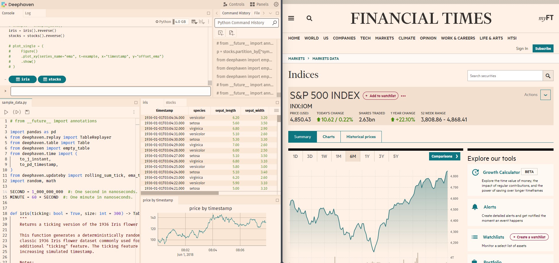
Visit http://localhost:4000 to preview your theme in the Deephaven UI. You can change the theme in the Settings menu:
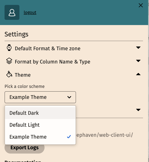
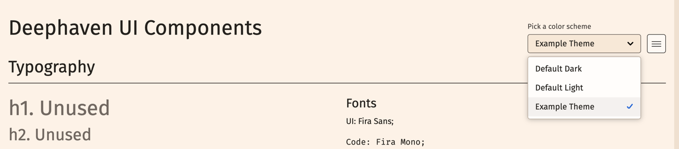
Alternatively, visit http://localhost:4000/ide/styleguide for a preview of all the components in the web-client-ui library. You can change the theme by clicking on the theme selector in the top right corner of the style guide:
Note
If you change your styles, you will need to refresh the page to see the changes.
Creating your theme
The general steps for creating a theme are as follows:
- Inherit a base theme (either
darkorlight). - Create your color palette (gray, red, orange, etc)
- Override any semantic colors with colors from your palette as desired (accent, positive, negative, etc)
- Override component-specific colors with semantic colors or colors from your palette as desired (grid colors, plot, etc.)
Inherit a base theme
To create your theme, first decide whether your theme is light or dark. For example, if your desired background color is black or purple, inherit the dark. If it's white or yellow, inherit light. Inheriting from either dark or light significantly reduces the amount of work required to create a custom theme. You may choose to override just one variable or all of them.
In the ./<your-theme>/src/js/src/index.ts file, set the baseTheme to either dark or light:
Next, you'll want to override colors and other variables to create your custom theme in the ./<your-theme>/src/js/src/theme.css file. This file already includes variables for the entire theme, and you only need to override the variables you want to change.
See the entire example-theme .css file.
The web-client-ui repository includes a list of all the variables you can override in the Default Dark or Default Light, organized into files by usage. You can also inspect elements in the browser to discover the class or variable names you may need to override. For example, to create the example theme above, we only need to override a few colors, mostly from the palette files listed above.
Caution
Use selector-based styling sparingly, as these are not guaranteed to be stable across releases. Most themes will start by overriding a few colors and then add additional variables as needed.
In the sections below, we'll show you how we modified the .css file to create the example theme. We'll start by overriding the background colors, accent colors, positive and negative colors, and then a few additional colors specific to grids and plots.
The web-client-ui theme provider converts your colors to HEX internally via JavaScript for display in some non-traditional dom-elements (canvas-based grids, monaco code editors, svg/webgl plots).
We also mix in an alpha channel to create transparent colors for you via color-mix in srgb space.
Use color generators and define your palette
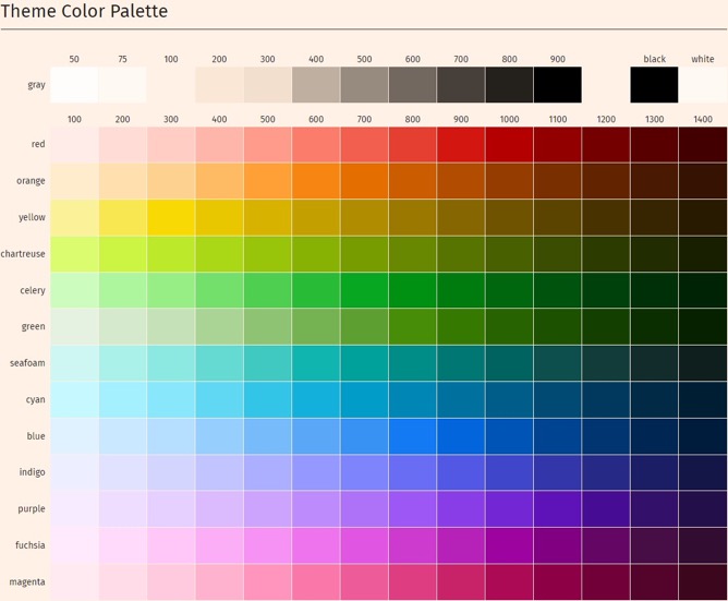
The Deephaven design system is based on the Adobe spectrum color system. It is set up to use a palette consisting of:
- 11 shades of a "gray" palette used for background colors
- 13 shades of each of the 12 colors in the "color" palette: Red, Orange, Yellow, Chartreuse, Celery, Green, Seafoam, Cyan, Blue, Indigo, Purple, Fuschia and Magenta
You can create color palettes with shades for each color using tools like Adobe's Leonardo color tool (recommended), or Coolors. You may already have an existing brand guide at your company that gives you full palettes. Leonardo is a great tool for creating color ramps, and has an "Export as CSS" feature to get the HEX values for each color in the ramp.
Note
Colors must be in the sRGB color space. Here we use HSL values, but you can use any supported color format. These include #HEX, rgb(), rgba(), hsl(), hwb(), color(srgb) or a named color. Other color spaces such as LAB, OKLAB, P3, etc, are not supported.
The background colors are defined using a set of 11 colors, ranging from light to dark for light themes, and inverted from dark to light for dark themes. The 50, 75, and 100 colors are closer together, and 100-900 are a more equal distribution. The other colors are more evenly distributed across lightness. You can see this reflected in the image of our full color palette below.
Our example theme used a background color inspired by the Financial Times site to create a palette using Leonardo. The example theme uses the following palette for the "gray" background colors:
We also override a "red" palette, a "green" palette and a "seafoam" palette based on the colors inspired by the Financial Times site. You will inherit any color from your chosen base theme you do not define.
Here is the full palette we used for our example theme:
Use your palette for semantic colors
Depending on how much you want to customize, you may choose to stop after just setting the palette and inherit the rest of the theme from the default theme. Or you may choose to override additional variables to customize the theme further. For example, we also override the accent variables used for things like buttons from blue to seafoam. positive and negative already default to red and green -- updating red and green palettes will change these variables. They could also be changed independently if you prefer a different color associated with positive or negative values or actions. Refer to the files labeled as "semantic" in the default theme for exposed variables.
Use your palette for component-specific semantic colors
You may find that after overriding the palette and semantic colors, you want even further customization within specific components. In our example, we also override the default grid header color, row stripes, and date colors, as well as the plot colorway.
Additional customization
You may also override specific components using CSS selectors and setting your own variables and properties. This is not recommended as it may break in future updates to the web-client-ui library. If you find yourself needing to do this, please consider opening an issue to request additional variables to be exposed in the default themes, or contact us in the Deephaven Community Slack #web-client-ui channel.