Action Group

An action group is a UI component that groups multiple actions together.

Example
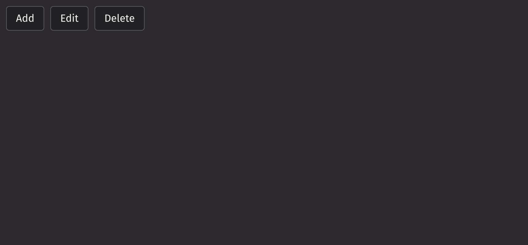
from deephaven import ui


my_action_group_basic = ui.action_group(
    ui.item("Add"),
    ui.item("Edit"),
    ui.item("Delete"),
)

Action Group Basic Example

UI recommendations

Consider using a button_group to align multiple buttons that do not necessarily correspond to an action.

Icons

Icons can be added to action group items by wrapping the label in a ui.text element and adding a ui.icon as a sibling component.

from deephaven import ui


my_action_group_icon_example = ui.action_group(
    ui.item(ui.icon("edit"), ui.text("Edit")),
    ui.item(ui.icon("copy"), ui.text("Copy")),
    ui.item(ui.icon("trash"), ui.text("Delete")),
)

The button_label_behavior prop can be set to “hide” label text within buttons and show it in a tooltip on hover.

from deephaven import ui


my_action_group_button_label_behavior_example = ui.action_group(
    ui.item(ui.icon("edit"), ui.text("Edit")),
    ui.item(ui.icon("copy"), ui.text("Copy")),
    ui.item(ui.icon("trash"), ui.text("Delete")),
    button_label_behavior="hide",
)

Selection

Action groups support multiple selection modes, which are configurable via the selection_mode prop.

The default_selected_keys can be used for uncontrolled default selections.

from deephaven import ui


my_action_group_default_selected_keys_example = ui.action_group(
    ui.item("Grid view", key="grid"),
    ui.item("List view", key="list"),
    ui.item("Gallery view", key="gallery"),
    selection_mode="single",
    default_selected_keys=["list"],
)

The selected_keys prop can be used for controlled selections.

from deephaven import ui


@ui.component
def ui_action_group_selected_keys_example():
    selected, set_selected = ui.use_state([])
    return [
        ui.action_group(
            ui.item("Grid view", key="grid"),
            ui.item("List view", key="list"),
            ui.item("Gallery view", key="gallery"),
            selection_mode="multiple",
            selected_keys=selected,
            on_change=set_selected,
        ),
        ui.text(f"Current selection (controlled): {selected}"),
    ]


my_action_group_selected_keys_example = ui_action_group_selected_keys_example()

Events

The on_selection_change property is triggered whenever the value in the action group selection changes.

from deephaven import ui


@ui.component
def ui_action_group_on_change_example():
    selected_option, set_selected_option = ui.use_state("")
    return [
        ui.action_group(
            ui.item("Grid view", key="grid"),
            ui.item("List view", key="list"),
            ui.item("Gallery view", key="gallery"),
            selection_mode="single",
            on_selection_change=set_selected_option,
        ),
        ui.text(f"You have selected: {selected_option}"),
    ]


my_action_group_on_change_example = ui_action_group_on_change_example()

Collapsing Behavior

By default, the items of an action group wrap to a new line when space is limited. To keep them in a single line, set the overflow_mode prop to “collapse”, which collapses the items into a menu.

from deephaven import ui


my_action_group_overflow_example = ui.action_group(
    ui.item(ui.icon("edit"), ui.text("Edit")),
    ui.item(ui.icon("copy"), ui.text("Copy")),
    ui.item(ui.icon("trash"), ui.text("Delete")),
    ui.item(ui.icon("move"), ui.text("Move")),
    ui.item(ui.icon("diff_multiple"), ui.text("Duplicate")),
    overflow_mode="collapse",
    max_width=250,
)

When selection is enabled, the action group collapses all items into a menu when space is limited, with a highlighted menu button indicating a selection.

from deephaven import ui

my_action_group_selection_collapsing_example = ui.action_group(
    ui.item(ui.icon("edit"), ui.text("Edit")),
    ui.item(ui.icon("copy"), ui.text("Copy")),
    ui.item(ui.icon("trash"), ui.text("Delete")),
    static_color="white",
    summary_icon=ui.icon("vsSearch"),
    overflow_mode="collapse",
    selection_mode="multiple",
    is_emphasized=True,
    max_width=10,
)

Quiet State

The is_quiet prop makes action groups “quiet”. This can be useful when the action group and its corresponding styling should not distract users from surrounding content.

from deephaven import ui


my_action_group_is_quiet_example = ui.action_group(
    ui.item("Add"),
    ui.item("Edit"),
    ui.item("Delete"),
    is_quiet=True,
)

Emphasized

The is_emphasized prop makes the selected action item the user’s accent color, adding a visual prominence to the selection.

from deephaven import ui


my_action_group_is_emphasized_example = ui.action_group(
    ui.item("Dogs"),
    ui.item("Cats"),
    ui.item("Fish"),
    selected_keys=["Dogs"],
    selection_mode="single",
    is_emphasized=True,
)

Static Color

The static_color prop can be used when the action group is placed over a color background.

from deephaven import ui


my_action_group_static_color_example = ui.view(
    ui.action_group(
        ui.item(ui.icon("edit"), ui.text("Edit")),
        ui.item(ui.icon("copy"), ui.text("Copy")),
        ui.item(ui.icon("trash"), ui.text("Delete")),
        static_color="white",
    ),
    background_color="blue-700",
    padding="size-500",
)

Disabled State

Action groups can be disabled to prevent user interaction. This is useful when the group is not currently available, but the button should still be visible.

from deephaven import ui


my_action_group_is_disabled_example = ui.action_group(
    ui.item("Add"),
    ui.item("Edit"),
    ui.item("Delete"),
    is_disabled=True,
)

Orientation

While aligned horizontally by default, the axis with which the action items align can be changed via the orientation prop.

from deephaven import ui


my_action_group_orientation_example = ui.action_group(
    ui.item("Add"),
    ui.item("Edit"),
    ui.item("Delete"),
    orientation="vertical",
)

Density

The density prop can increase or reduce margins between action buttons. When the is_quiet prop is set to true, margin size is reduced.

from deephaven import ui


@ui.component
def ui_action_group_density_examples():
    return [
        ui.action_group(
            ui.item(ui.icon("edit")),
            ui.item(ui.icon("copy")),
            ui.item(ui.icon("trash")),
            density="compact",
        ),
        ui.action_group(
            ui.item(ui.icon("edit")),
            ui.item(ui.icon("copy")),
            ui.item(ui.icon("trash")),
            is_quiet=True,
            density="compact",
        ),
        ui.action_group(
            ui.item(ui.icon("edit")),
            ui.item(ui.icon("copy")),
            ui.item(ui.icon("trash")),
            density="spacious",
        ),
    ]


my_action_group_density_examples = ui_action_group_density_examples()

Justified

The is_justified prop evenly divides all available horizontal space among the action items.

from deephaven import ui


my_action_group_is_justified_example = ui.flex(
    ui.action_group(
        ui.item(ui.icon("edit")),
        ui.item(ui.icon("copy")),
        ui.item(ui.icon("trash")),
        is_justified=True,
        density="compact",
    ),
    width="size-3000",
    direction="column",
)

API Reference

An action grouping of action items that are related to each other.

Returns: Element The rendered action_group element.

ParametersTypeDefaultDescription
*childrenAnyThe children of the action group.
is_emphasizedbool |
None
NoneWhether the action buttons should be displayed with emphasized style.
densityLiteral['compact', 'regular'] |
None
'regular'Sets the amount of space between buttons.
is_justifiedbool |
None
NoneWhether the ActionButtons should be justified in their container.
is_quietbool |
None
NoneWhether ActionButtons should use the quiet style.
static_colorLiteral['white', 'black'] |
None
NoneThe static color style to apply. Useful when the ActionGroup appears over a color background.
overflow_modeLiteral['wrap', 'collapse'] |
None
'wrap'The behavior of the ActionGroup when the buttons do not fit in the available space.
button_label_behaviorLiteral['show', 'collapse', 'hide'] |
None
'show'Defines when the text within the buttons should be hidden and only the icon should be shown.
summary_iconElement |
None
NoneThe icon displayed in the dropdown menu button when a selectable ActionGroup is collapsed.
orientationLiteral['horizontal', 'vertical'] |
None
'horizontal'The axis the ActionGroup should align with.
disabled_keysIterable[str] |
None
NoneA list of keys to disable.
is_disabledbool |
None
NoneWhether the ActionGroup is disabled. Shows that a selection exists, but is not available in that circumstance.
selection_modeLiteral['SINGLE', 'MULTIPLE'] |
None
NoneThe type of selection that is allowed in the collection.
disallow_empty_selectionbool |
None
NoneWhether the collection allows empty selection.
selected_keysLiteral['all'] |
Iterable[str] |
None
NoneThe currently selected keys in the collection (controlled).
default_selected_keysLiteral['all'] |
Iterable[str] |
None
NoneThe initial selected keys in the collection (uncontrolled).
keystr |
None
NoneA unique identifier used by React to render elements in a list.