Date Range Picker
Date range pickers allow users to select a range dates and times from a pop up calendar.
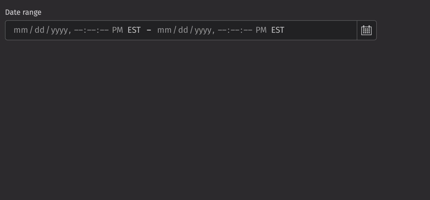
Example
Date types
A date range picker can be used to select a range of dates.
The range is a dictionary with a start date and an end date. e.g. { "start": "2024-01-02", "end": "2024-01-05" }
The date range picker accepts the following date types as inputs:
NoneLocalDateZoneDateTimeInstantintstrdatetime.datetimenumpy.datetime64pandas.Timestamp
The start and end dates should be the same type.
The input will be converted to one of three Java date types:
LocalDate: in the ISO-8601 system, a LocalDate is a date without a time zone, such as “2007-12-03” or “2057-01-28”. This will create a date range picker with a granularity of days.Instant: An Instant represents an unambiguous specific point on the timeline, such as 2021-04-12T14:13:07 UTC. This will create a date range picker with a granularity of seconds in UTC. The time zone will be rendered as the time zone in user settings.ZonedDateTime: A ZonedDateTime represents an unambiguous specific point on the timeline with an associated time zone, such as 2021-04-12T14:13:07 America/New_York. This will create a date range picker with a granularity of seconds in the specified time zone. The time zone will be rendered as the specified time zone.
The start and end inputs are converted according to the following rules:
- If the input is one of the three Java date types, use that type.
- A date string such as “2007-12-03” will parse to a
LocalDate. - A string with a date, time, and time zone such as “2021-04-12T14:13:07 America/New_York” will parse to a
ZonedDateTime - All other types will attempt to convert in this order:
Instant,ZonedDateTime,LocalDate
The format of the date range picker and the type of the value passed to the on_change handler
are determined by the type of the following props in order of precedence:
valuedefault_valueplaceholder_value
If none of these are provided, the on_change handler will be passed a range of Instant.
Value
A date range picker displays a placeholder by default. An initial, uncontrolled value can be provided to the date range picker using the defaultValue prop. Alternatively, a controlled value can be provided using the value prop.
Time zones
Date range picker is time zone aware when ZonedDateTime or Instant objects are provided as the value. In this case, the time zone abbreviation is displayed, and time zone concerns such as daylight saving time are taken into account when the value is manipulated.
In most cases, your data will come from and be sent to a server as an ISO 8601 formatted string.
For ZonedDateTime objects, the date range picker will display the specified time zone.
For Instant objects, the date range picker will display the time zone from the user settings.
Granularity
The granularity prop allows you to control the smallest unit that is displayed by a date range picker. By default, LocalDate values are displayed with “DAY” granularity (year, month, and day), and ZonedDateTime and Instant values are displayed with “SECOND” granularity.
In addition, when a value with a time is provided but you wish to display only the date, you can set the granularity to “DAY”. This has no effect on the actual value (it still has a time component), only on what fields are displayed. In the following example, two date range pickers are synchronized with the same value but display different granularities.
HTML forms
Date range picker supports the start_name and end_name props for integration with HTML forms. The values will be submitted to the server as ISO 8601 formatted strings according to the granularity of the value. For example, if the date range picker allows selecting only dates, then strings such as “2023-02-03” will be submitted, and if it allows selecting times, then strings such as “2023-02-03T08:45:00”
Labeling
A visual label should be provided for the date range picker using the label prop. If the date range picker is required, the is_required and necessity_indicator props can be used to show a required state.
Events
Date range pickers support selection through mouse, keyboard, and touch inputs via the on_change prop, which receives the value as an argument.
Validation
The is_required prop ensures that the user selects a date range. The related validation_behaviour prop allows the user to specify aria or native verification.
When the prop is set to “native”, the validation errors block form submission and are displayed as help text automatically.
Minimum and maximum values
The min_value and max_value props can also be used to ensure the value is within a specific range. Date range picker also validates that the end date is after the start date.
Label position
By default, the position of a date range picker’s label is above the date range picker, but it can be moved to the side using the label_position prop.
Quiet state
The is_quiet prop makes a date range picker “quiet”. This can be useful when the picker and its corresponding styling should not distract users from surrounding content.
Disabled state
The is_disabled prop disables a picker to prevent user interaction. This is useful when the date range picker should be visible but not available for selection.
Help text
A date range picker can have both a description and an error_message. Use the error message to offer specific guidance on how to correct the input.
The validation_state prop can be used to set whether the current date range picker state is valid or invalid.
Contextual help
Using the contextual_help prop, a ui.contextual_help can be placed next to the label to provide additional information about the date range picker.
Custom width
The width prop adjusts the width of a date range picker, and the max_width prop enforces a maximum width.
Maximum visible months
By default, the calendar popover displays a single month. The max_visible_months prop allows displaying up to 3 months at a time, if screen space permits.
Page behavior
By default, when pressing the next or previous buttons, pagination advances by the max_visible_months value. This behavior can be changed to page by single months by setting page_behavior to single.
Hide time zone
The time zone can be hidden using the hide_time_zone option.
Hour cycle
By default, date range picker displays times in either a 12 or 24 hour format depending on the user’s locale. However, this can be overridden using the hour_cycle prop.
Time table filtering
Date range pickers can be used to filter tables with time columns.
API Reference
A date range picker allows the user to select a range of dates.
Returns: Element The date range picker element.
| Parameters | Type | Default | Description |
|---|---|---|---|
| placeholder_value | DType | None | str | date | datetime | datetime64 | Timestamp | int | None | A placeholder date that influences the format of the placeholder shown when no value is selected. Defaults to today at midnight in the user's timezone. |
| value | DateRange | None | UndefinedType | <deephaven.ui.types.types.UndefinedType object> | The current value (controlled). |
| default_value | DateRange | None | UndefinedType | <deephaven.ui.types.types.UndefinedType object> | The default value (uncontrolled). |
| min_value | DType | None | str | date | datetime | datetime64 | Timestamp | int | None | The minimum allowed date that a user may select. |
| max_value | DType | None | str | date | datetime | datetime64 | Timestamp | int | None | The maximum allowed date that a user may select. |
| granularity | Literal['DAY', 'HOUR', 'MINUTE', 'SECOND'] | None | None | Determines the smallest unit that is displayed in the date picker. By default, this is "DAY" for LocalDate, and "SECOND" otherwise. |
| page_behavior | Literal['single', 'visible'] | None | None | Controls the behavior of paging. Pagination either works by advancing the visible page by visibleDuration (default) or one unit of visibleDuration. |
| hour_cycle | Literal[12, 24] | None | None | Whether to display the time in 12 or 24 hour format. By default, this is determined by the user's locale. |
| hide_time_zone | bool | False | Whether to hide the time zone abbreviation. |
| should_force_leading_zeros | bool | None | None | Whether to always show leading zeros in the month, day, and hour fields. By default, this is determined by the user's locale. |
| is_disabled | bool | None | None | Whether the input is disabled. |
| is_read_only | bool | None | None | Whether the input can be selected but not changed by the user. |
| is_required | bool | None | None | Whether user input is required on the input before form submission. |
| validation_behavior | Literal['aria', 'native'] | None | None | Whether to use native HTML form validation to prevent form submission when the value is missing or invalid, or mark the field as required or invalid via ARIA. |
| auto_focus | bool | None | None | Whether the element should receive focus on render. |
| label | None | bool | int | str | Element | List[NodeType] | None | The content to display as the label. |
| description | Element | None | None | A description for the field. Provides a hint such as specific requirements for what to choose. |
| error_message | Element | None | None | An error message for the field. |
| is_open | bool | None | None | Whether the overlay is open by default (controlled). |
| default_open | bool | None | None | Whether the overlay is open by default (uncontrolled). |
| allows_non_contiguous_ranges | bool | None | None | When combined with unavailable_values, determines whether non-contiguous ranges, i.e. ranges containing unavailable dates, may be selected. |
| start_name | str | None | None | The name of the start date input element, used when submitting an HTML form. |
| end_name | str | None | None | The name of the end date input element, used when submitting an HTML form. |
| max_visible_months | int | None | None | The maximum number of months to display at once in the calendar popover, if screen space permits. |
| should_flip | bool | None | None | Whether the calendar popover should automatically flip direction when space is limited. |
| is_quiet | bool | None | None | Whether the date picker should be displayed with a quiet style. |
| show_format_help_text | bool | None | None | Whether to show the localized date format as help text below the field. |
| label_position | Literal['top', 'side'] | None | None | The label's overall position relative to the element it is labeling. |
| label_align | Literal['start', 'end'] | None | None | The label's horizontal alignment relative to the element it is labeling. |
| necessity_indicator | Literal['icon', 'label'] | None | None | Whether the required state should be shown as an icon or text. |
| contextual_help | Element | None | None | A ContextualHelp element to place next to the label. |
| validation_state | Literal['valid', 'invalid'] | None | None | Whether the input should display its "valid" or "invalid" visual styling. |
| key | str | None | None | A unique identifier used by React to render elements in a list. |