Flex

A flexbox-based layout container that utilizes dimension values and supports the gap property for consistent spacing between items.

Tip

The flex component follows the same rules as a browser CSS flexbox. The CSS flexbox layout guide from CSS-Tricks and the Flexbox Froggy game are great resources to learn more about flexbox.
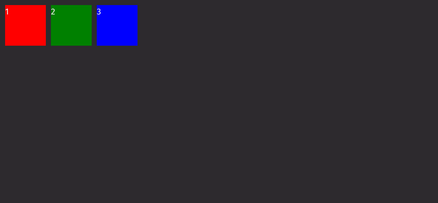
Example

from deephaven import ui


@ui.component
def ui_flex():
    return ui.flex(
        ui.view(1, background_color="red", height="size-800", width="size-800"),
        ui.view(2, background_color="green", height="size-800", width="size-800"),
        ui.view(3, background_color="blue", height="size-800", width="size-800"),
    )


my_flex = ui_flex()

Flex Basic Example

Direction

The direction prop determines the direction in which the flex items are laid out.

Options:

  • row (default): the flex items are arranged horizontally from left to right.
  • column: the flex items are arranged vertically from top to bottom.
  • row-reverse: the flex items are arranged horizontally from right to left.
  • column-reverse: the flex items are arranged vertically from bottom to top.
from deephaven import ui


@ui.component
def ui_flex_direction():
    return [
        'direction="row"',
        ui.flex(
            ui.view(1, background_color="red", height="size-800", width="size-800"),
            ui.view(2, background_color="green", height="size-800", width="size-800"),
            ui.view(3, background_color="blue", height="size-800", width="size-800"),
        ),
        'direction="row-reverse"',
        ui.flex(
            ui.view(1, background_color="red", height="size-800", width="size-800"),
            ui.view(2, background_color="green", height="size-800", width="size-800"),
            ui.view(3, background_color="blue", height="size-800", width="size-800"),
            direction="row-reverse",
        ),
        'direction="column"',
        ui.flex(
            ui.view(1, background_color="red", height="size-800", width="size-800"),
            ui.view(2, background_color="green", height="size-800", width="size-800"),
            ui.view(3, background_color="blue", height="size-800", width="size-800"),
            direction="column",
        ),
        'direction="column-reverse"',
        ui.flex(
            ui.view(1, background_color="red", height="size-800", width="size-800"),
            ui.view(2, background_color="green", height="size-800", width="size-800"),
            ui.view(3, background_color="blue", height="size-800", width="size-800"),
            direction="column-reverse",
        ),
    ]


my_flex_direction = ui_flex_direction()

Nesting

Flexboxes can be nested to create more complicated layouts. By using the flex prop on the children, the flexbox can expand to fill the remaining space.

from deephaven import ui


@ui.component
def ui_flex_nesting():
    return [
        ui.flex(
            ui.view(1, background_color="red", height="size-800"),
            ui.flex(
                ui.view(
                    2, background_color="green", height="size-800", width="size-800"
                ),
                ui.view(
                    3, background_color="blue", height="size-800", width="size-800"
                ),
            ),
            direction="column",
        ),
    ]


my_flex_nesting = ui_flex_nesting()

Wrapping

When enabled, items that overflow wrap into the next row. Resize your browser window to see the items reflow.

from deephaven import ui


@ui.component
def ui_flex_wrap():
    return ui.flex(
        ui.view(1, background_color="red", height="size-800", width="size-800"),
        ui.view(2, background_color="green", height="size-800", width="size-800"),
        ui.view(3, background_color="yellow", height="size-800", width="size-800"),
        ui.view(4, background_color="blue", height="size-800", width="size-800"),
        ui.view(5, background_color="orange", height="size-800", width="size-800"),
        wrap=True,
        width="200px",
        align_content="start",
    )


my_flex_wrap = ui_flex_wrap()

Justification

The justify_content prop is used to align items along the main axis. When the direction is set to “column”, it controls the vertical alignment, and when the direction is set to “row”, it controls the horizontal alignment.

Options:

  • stretch (default): the flex items are stretched to fill the container along the cross-axis.
  • start: the flex items are aligned at the start of the cross-axis.
  • end: the flex items are aligned at the end of the cross-axis.
  • center: the flex items are centered along the cross-axis.
  • left: the flex items are packed toward the left edge of the container.
  • right: the flex items are packed toward the right edge of the container.
  • space-between: the flex items are evenly distributed with the first item at the start and the last item at the end.
  • space-around: the flex items are evenly distributed with equal space around them.
  • space-evenly: the flex items are evenly distributed with equal space between them.
  • baseline: the flex items are aligned based on their baselines.
  • first baseline: the flex items are aligned based on the first baseline of the container.
  • last baseline: the flex items are aligned based on the last baseline of the container.
  • safe center: the flex items are centered along the cross-axis, ensuring they remain within the safe area.
  • unsafe center: the flex items are centered along the cross-axis, without considering the safe area.
from deephaven import ui


@ui.component
def ui_flex_justify():
    start = ui.flex(
        ui.view(1, background_color="red", height="size-800", width="size-400"),
        ui.view(2, background_color="green", height="size-800", width="size-800"),
        ui.view(3, background_color="blue", height="size-800", width="size-200"),
        justify_content="start",
    )
    center = ui.flex(
        ui.view(1, background_color="red", height="size-800", width="size-400"),
        ui.view(2, background_color="green", height="size-800", width="size-800"),
        ui.view(3, background_color="blue", height="size-800", width="size-200"),
        justify_content="center",
    )
    end = ui.flex(
        ui.view(1, background_color="red", height="size-800", width="size-400"),
        ui.view(2, background_color="green", height="size-800", width="size-800"),
        ui.view(3, background_color="blue", height="size-800", width="size-200"),
        justify_content="end",
    )
    space_between = ui.flex(
        ui.view(1, background_color="red", height="size-800", width="size-400"),
        ui.view(2, background_color="green", height="size-800", width="size-800"),
        ui.view(3, background_color="blue", height="size-800", width="size-200"),
        justify_content="space-between",
    )
    space_around = ui.flex(
        ui.view(1, background_color="red", height="size-800", width="size-400"),
        ui.view(2, background_color="green", height="size-800", width="size-800"),
        ui.view(3, background_color="blue", height="size-800", width="size-200"),
        justify_content="space-around",
    )

    return ui.flex(
        'justify_content="start"',
        start,
        'justify_content="center"',
        center,
        'justify_content="end"',
        end,
        'justify_content="space-between"',
        space_between,
        'justify_content="space-around"',
        space_around,
        direction="column",
    )


my_flex_justify = ui_flex_justify()

Alignment

The align_items prop aligns items along the cross-axis. When the direction is set to “column”, it controls horizontal alignment, and when it is set to “row”, it controls vertical alignment.

Options:

  • stretch (default): the flex items are stretched to fill the container along the cross-axis.
  • start: the flex items are aligned at the start of the cross-axis.
  • end: the flex items are aligned at the end of the cross-axis.
  • center: the flex items are centered along the cross-axis.
  • self-start: the flex items are aligned at the start of their container.
  • self-end: the flex items are aligned at the end of their container.
  • baseline: the flex items are aligned based on their baselines.
  • first baseline: the flex items are aligned based on the first baseline of the container.
  • last baseline: the flex items are aligned based on the last baseline of the container.
  • safe center: the flex items are centered along the cross-axis, ensuring they remain within the safe area.
  • unsafe center: the flex items are centered along the cross-axis, without considering the safe area.
from deephaven import ui


@ui.component
def ui_flex_align_vertical():
    vertical = ui.flex(
        ui.flex(
            ui.view(1, background_color="red", height="size-800", width="size-400"),
            ui.view(2, background_color="green", height="size-800", width="size-800"),
            ui.view(3, background_color="blue", height="size-800", width="size-200"),
            direction="column",
            align_items="start",
        ),
        ui.flex(
            ui.view(1, background_color="red", height="size-800", width="size-400"),
            ui.view(2, background_color="green", height="size-800", width="size-800"),
            ui.view(3, background_color="blue", height="size-800", width="size-200"),
            direction="column",
            align_items="center",
        ),
        ui.flex(
            ui.view(1, background_color="red", height="size-800", width="size-400"),
            ui.view(2, background_color="green", height="size-800", width="size-800"),
            ui.view(3, background_color="blue", height="size-800", width="size-200"),
            direction="column",
            align_items="end",
        ),
    )

    return ui.flex(vertical)


my_flex_align_vertical = ui_flex_align_vertical()
from deephaven import ui


@ui.component
def ui_flex_align_horizontal():
    horizontal = ui.flex(
        ui.flex(
            ui.view(1, background_color="red", height="size-800", width="size-400"),
            ui.view(2, background_color="green", height="size-800", width="size-800"),
            ui.view(3, background_color="blue", height="size-800", width="size-200"),
            align_items="start",
        ),
        ui.flex(
            ui.view(1, background_color="red", height="size-800", width="size-400"),
            ui.view(2, background_color="green", height="size-800", width="size-800"),
            ui.view(3, background_color="blue", height="size-800", width="size-200"),
            align_items="center",
        ),
        ui.flex(
            ui.view(1, background_color="red", height="size-800", width="size-400"),
            ui.view(2, background_color="green", height="size-800", width="size-800"),
            ui.view(3, background_color="blue", height="size-800", width="size-200"),
            align_items="end",
        ),
        direction="column",
    )

    return ui.flex(horizontal)


my_flex_align_horizontal = ui_flex_align_horizontal()

API reference

Base Flex component for laying out children in a flexbox.

Returns: Element The rendered flex box.

ParametersTypeDefaultDescription
*childrenAnyElements to render in the flexbox.
directionLiteral['row', 'column', 'row-reverse', 'column-reverse'] |
None
NoneThe direction in which to layout children.
wrapLiteral['wrap', 'nowrap', 'wrap-reverse'] |
None
NoneWhether children should wrap when they exceed the panel's width.
justify_contentLiteral['start', 'end', 'center', 'left', 'right', 'space-between', 'space-around', 'space-evenly', 'stretch', 'baseline', 'first baseline', 'last baseline', 'safe center', 'unsafe center'] |
None
NoneThe distribution of space around items along the main axis.
align_contentLiteral['start', 'end', 'center', 'space-between', 'space-around', 'space-evenly', 'stretch', 'baseline', 'first baseline', 'last baseline', 'safe center', 'unsafe center'] |
None
NoneThe distribution of space between and around items along the cross axis.
align_itemsLiteral['start', 'end', 'center', 'stretch', 'self-start', 'self-end', 'baseline', 'first baseline', 'last baseline', 'safe center', 'unsafe center'] |
None
NoneThe alignment of children within their container.
gapstr |
float |
None
'size-100'The space to display between both rows and columns of children.
column_gapstr |
float |
None
NoneThe space to display between columns of children.
row_gapstr |
float |
None
NoneThe space to display between rows of children.
keystr |
None
NoneA unique identifier used by React to render elements in a list