Grid
ui.grid is a grid-based layout container that can be used to layout its children in two dimensions.
Tip
The ui.grid component follows the same rules as a browser CSS grid. The CSS grid layout guide from CSS-Tricks and the Grid Garden game are great resources to learn more about grid.
The columns and rows props define the layout of the grid. The layout can use the area prop to define grid areas for child components to explicitly place components. Alternatively, an implicit layout can be created using autoColumns, autoRows, and helper functions like repeat.
Similar to flex, a grid can justify and align items.
Examples
Explicit grid
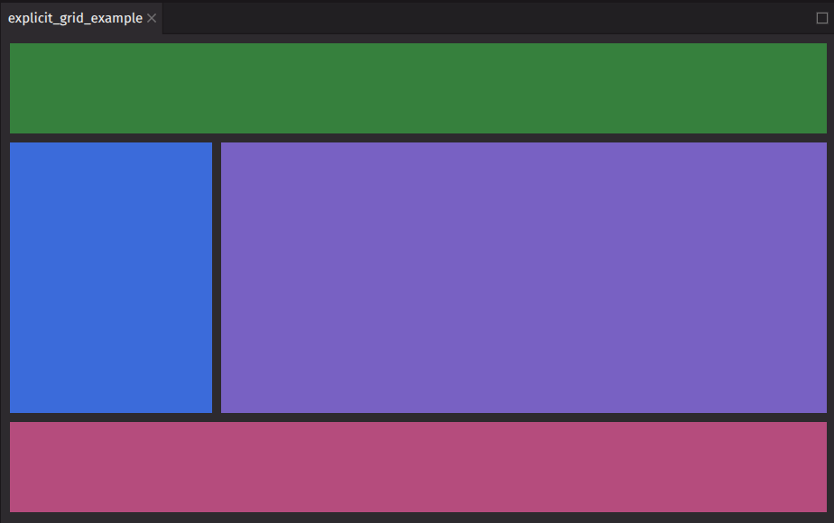
This example demonstrates how to create a typical application layout featuring a header, sidebar, content area, and footer. The areas prop specifies the grid areas, while the columns and rows props define their sizes. Each child component utilizes the grid_area prop to indicate its designated area within the grid.

Implicit grid
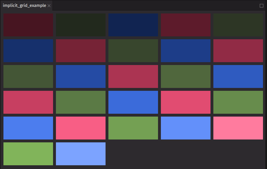
This example creates an implicit grid. It uses the repeat function to generate five columns of equal width automatically. The auto_rows prop sets the height of the rows, and the items are centered horizontally within the container. A gap is also added between the items.

Justification
The justify_content prop is used to align items along the inline axis of a grid.
Options:
stretch(default): the grid items are stretched to fill the container along the block axis.start: the grid items are aligned at the start of the block axis.end: the grid items are aligned at the end of the block axis.center: the grid items are centered along the block axis.left: the grid items are packed toward the left edge of the container.right: the grid items are packed toward the right edge of the container.space-between: the grid items are evenly distributed with the first item at the start and the last item at the end.space-around: the grid items are evenly distributed with equal space around them.space-evenly: the grid items are evenly distributed with equal space between them.baseline: the grid items are aligned based on their baselines.first baseline: the grid items are aligned based on the first baseline of the container.last baseline: the grid items are aligned based on the last baseline of the container.safe center: the grid items are centered along the block axis, ensuring they remain within the safe area.unsafe center: the grid items are centered along the block axis, without considering the safe area.
Alignment
The align_items prop aligns items along the block axis of a grid.
Options:
stretch(default): the grid items are stretched to fill the container along the block axis.start: the grid items are aligned at the start of the block axis.end: the grid items are aligned at the end of the block axis.center: the grid items are centered along the block axis.self-start: the grid items are aligned at the start of their container.self-end: the grid items are aligned at the end of their container.baseline: the grid items are aligned based on their baselines.first baseline: the grid items are aligned based on the first baseline of the container.last baseline: the grid items are aligned based on the last baseline of the container.safe center: the grid items are centered along the block axis, ensuring they remain within the safe area.unsafe center: the grid items are centered along the block axis, without considering the safe area.
API reference
A layout container using CSS grid. Supports Spectrum dimensions as values to ensure consistent and adaptive sizing and spacing.
Returns: Element The rendered grid.
| Parameters | Type | Default | Description |
|---|---|---|---|
| *children | Any | The content to render within the container. | |
| areas | list[str] | None | None | The named grid areas to use for the grid. |
| rows | str | list[str | float] | None | None | The row sizes for the grid. |
| columns | str | list[str | float] | None | None | The column sizes for the grid. |
| auto_columns | str | float | None | None | The size of auto-generated columns. |
| auto_rows | str | float | None | None | The size of auto-generated rows. |
| auto_flow | Literal['row', 'column', 'row dense', 'column dense'] | None | None | The flow direction for auto-generated grid items. |
| justify_items | Literal['auto', 'normal', 'start', 'end', 'center', 'left', 'right', 'stretch', 'self-start', 'self-end', 'baseline', 'first baseline', 'last baseline', 'safe center', 'unsafe center', 'legacy right', 'legacy left', 'legacy center'] | None | None | The defailt justify_self for all items in the grid. |
| justify_content | Literal['start', 'end', 'center', 'left', 'right', 'space-between', 'space-around', 'space-evenly', 'stretch', 'baseline', 'first baseline', 'last baseline', 'safe center', 'unsafe center'] | None | UndefinedType | <deephaven.ui.types.types.UndefinedType object> | The distribution of space around items along the main axis. |
| align_content | Literal['start', 'end', 'center', 'space-between', 'space-around', 'space-evenly', 'stretch', 'baseline', 'first baseline', 'last baseline', 'safe center', 'unsafe center'] | None | UndefinedType | <deephaven.ui.types.types.UndefinedType object> | The distribution of space around items along the cross axis. |
| align_items | Literal['start', 'end', 'center', 'stretch', 'self-start', 'self-end', 'baseline', 'first baseline', 'last baseline', 'safe center', 'unsafe center'] | None | UndefinedType | <deephaven.ui.types.types.UndefinedType object> | The alignment of children within their container. |
| gap | str | float | None | 'size-100' | The gap between rows and columns. |
| column_gap | str | float | None | None | The gap between columns. |
| row_gap | str | float | None | None | The gap between rows. |
| key | str | None | None | A unique identifier used by React to render elements in a list. |