Number Field
Number fields allow users to enter a number and increase or decrease the value using stepper buttons.
Example
Value
A number field’s value is empty by default. The default_value prop can set an initial, uncontrolled value, or the value prop can set a controlled value.
HTML Forms
Number fields can support a name prop for integration with HTML forms, allowing for easy identification of a value on form submission.
Labeling
To provide a visual label for the text field, use the label prop. To indicate that the text field is mandatory, use the is_required prop.
By setting is_required to True, the necessity_indicator is set to “icon” by default, but this can be changed. The necessity_indicator can also be used independently to indicate that the text field is optional.
When the necessity_indicator prop is set to “label”, a localized string will be generated for “(required)” or “(optional)” automatically.
Events
The on_change property is triggered whenever the value in the text field is edited.
Format Options
The format_options prop dictates how the value is displayed and which characters can be inputted. There are 3 styles supported by this parameter: Percentage, Currency, and Units.
Note: This prop is compatible with the option parameter of Intl.NumberFormat.
Percentage
Currency
When the style is set to currency, a specific currency must be defined through the currency prop. Possible values follow the ISO 4217 currency codes. Examples include “USD” for the US dollar or “EUR” for the euro.
Units
When the style is set to unit, a specific unit must be defined through the unit prop. Possible values are defined in UTS #35, Part 2 Section 6. Examples include “degree”, “inch”, or “cup”.
Quiet State
The is_quiet prop makes number fields “quiet”. This can be useful when the input area and its corresponding styling should not distract users from surrounding content.
Disabled State
The is_disabled prop disables text fields to prevent user interaction. This is useful when the number field should be visible but not available for input.
Read only
The is_read_only prop makes number fields read-only to prevent user interaction. This is different than setting the is_disabled prop since the number field remains focusable, and the contents of the number field remain visible.
Label position
By default, the position of a number field’s label is above the number field, but it can be changed to the side using the label_position prop.
While labels can be placed either on top or on the side of the number field, top labels are the default recommendation. Top labels work better with longer copy, localization, and responsive layouts. Side labels are more useful when vertical space is limited.
Help text
A number field can have both a description and an error_message. The description remains visible at all times, except when the validation_state is set to “invalid” and an error message is present. Use the error message to offer specific guidance on how to correct the input.
Contextual Help
Using the contextual_help prop, a ui.contextual_help can be placed next to the label to provide additional information about the number field.
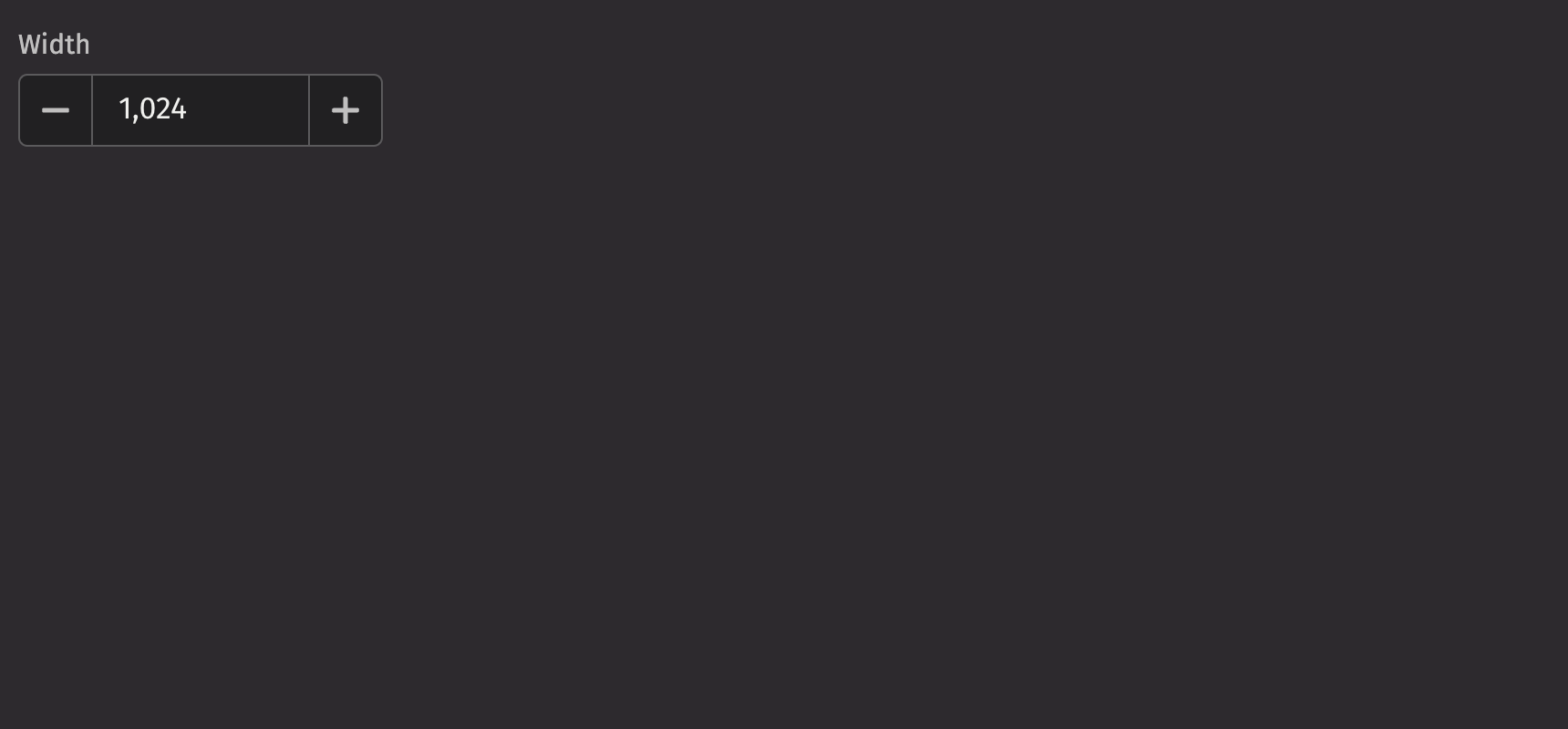
Custom width
The width prop adjusts the width of a number field, and the max_width prop enforces a maximum width.
API Reference
NumberFields allow users to enter a number, and increment or decrement the value using stepper buttons.
Returns: Element The rendered number field element.
| Parameters | Type | Default | Description |
|---|---|---|---|
| is_quiet | bool | None | None | Whether the input should be displayed with a quiet style |
| hide_stepper | bool | None | None | Whether to hide the increment and decrement stepper buttons |
| decrement_aria_label | str | None | None | The aria label for the decrement stepper button. If not provided, the default is "Decrement" |
| increment_aria_label | str | None | None | The aria label for the increment stepper button. If not provided, the default is "Increment" |
| is_wheel_disabled | bool | None | None | Whether the input should change with scroll |
| format_options | NumberFormatOptions | None | None | Options for formatting the displayed value, which also restricts input characters. |
| is_disabled | bool | None | None | Whether the input should be disabled |
| is_read_only | bool | None | None | Whether the input scan be selected but not changed by the user |
| is_required | bool | None | None | Whether the input is required before form submission |
| auto_focus | bool | None | None | Whether the input should be focused on page load |
| value | float | None | None | The current value of the input |
| default_value | float | None | None | The default value of the input |
| min_value | float | None | None | The minimum value of the input |
| max_value | float | None | None | The maximum value of the input |
| step | float | None | None | The step value for the input |
| label | Any | None | None | The label for the input |
| description | Any | None | None | A description for the field. Provides a hint such as specific requirements for what to choose. |
| error_message | Any | None | None | An error message to display when the field is invalid |
| validation_state | Literal['valid', 'invalid'] | None | None | Whether the input should display its "valid" or "invalid" state |
| name | str | None | None | The name of the input, used when submitting an HTML form |
| label_position | Literal['top', 'side'] | 'top' | The position of the label relative to the input |
| label_align | Literal['start', 'end'] | None | None | The alignment of the label relative to the input |
| necessity_indicator | Literal['icon', 'label'] | None | None | Whether the required state should be shown as an icon or text |
| contextual_help | Any | None | None | A ContentualHelp element to place next to the label |
| key | str | None | None | A unique identifier used by React to render elements in a list. |