Range Slider
Range sliders allow users to quickly select a subset range within a fixed range and should be used when the upper and lower bounds of the range are constant.
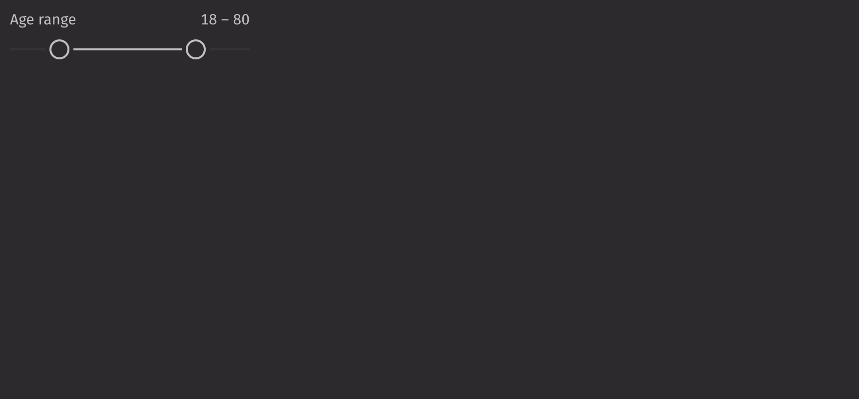
Example
UI recommendations
Recommendations for creating range sliders:
- Every range slider should have a label specified. Without one, the range slider is ambiguous. In the rare case that context is sufficient, the label is unnecessary; you must still include an aria-label via the
aria_labelprop. - The label and contextual help text should be in sentence case.
Consider using a slider instead of a range_slider when users should select a singular value or a number_field when the range is large and sliding between the upper and lower bound is no longer quick.
Value
Sliders are controlled with the value prop and uncontrolled with the default_value prop. This value, consisting of start and end, must fall between the slider’s minimum and maximum values, which by default are 0 and 100 respectively.
Scale
Setting the min_value and max_value props configures a custom scale for the range slider.
The step prop changes the increments in which the range slider changes.
HTML Forms
Range sliders can support a name prop for integration with HTML forms, allowing for easy identification of a value on form submission.
Labeling
Value labels are shown above the range slider by default but can be moved to the side or hidden using the label_position prop.
Note that if the label prop is set, the show_value_label is set to True by default.
Contextual Help
A ui.contextual_help can be passed into the contextual_help prop to provide additional information about the range slider.
Disabled
Setting the is_disabled prop disables the range slider.
API Reference
Sliders allow users to quickly select a value within a range. They should be used when the upper and lower bounds to the range are invariable.
Returns: Element The rendered range slider component.
| Parameters | Type | Default | Description |
|---|---|---|---|
| start_name | str | None | None | The name of the start input element. |
| end_name | str | None | None | The name of the end input element. |
| label_position | Literal['top', 'side'] | 'top' | The position of the label relative to the slider. |
| show_value_label | bool | None | None | Whether the value label should be displayed. True by default if the label is provided. |
| contextual_help | Any | None | None | A ContextualHelp element to place next to the label. |
| orientation | Literal['horizontal', 'vertical'] | 'horizontal' | The orientation of the slider. |
| is_disabled | bool | None | None | Whether the slider is disabled. |
| min_value | float | 0 | The minimum value of the slider. |
| max_value | float | 100 | The maximum value of the slider. |
| step | float | 1 | The step value for the slider. |
| value | SliderChange | None | None | The current value of the slider. |
| default_value | SliderChange | None | None | The default value of the slider. |
| label | Any | None | None | The content to display as the label. |
| name | str | None | None | The name of the input element, used when submitting an HTML form. |
| key | str | None | None | A unique identifier used by React to render elements in a list. |