Slider
Sliders allow users to quickly select a value within a fixed range and should be used when the range’s upper and lower bounds are constant.
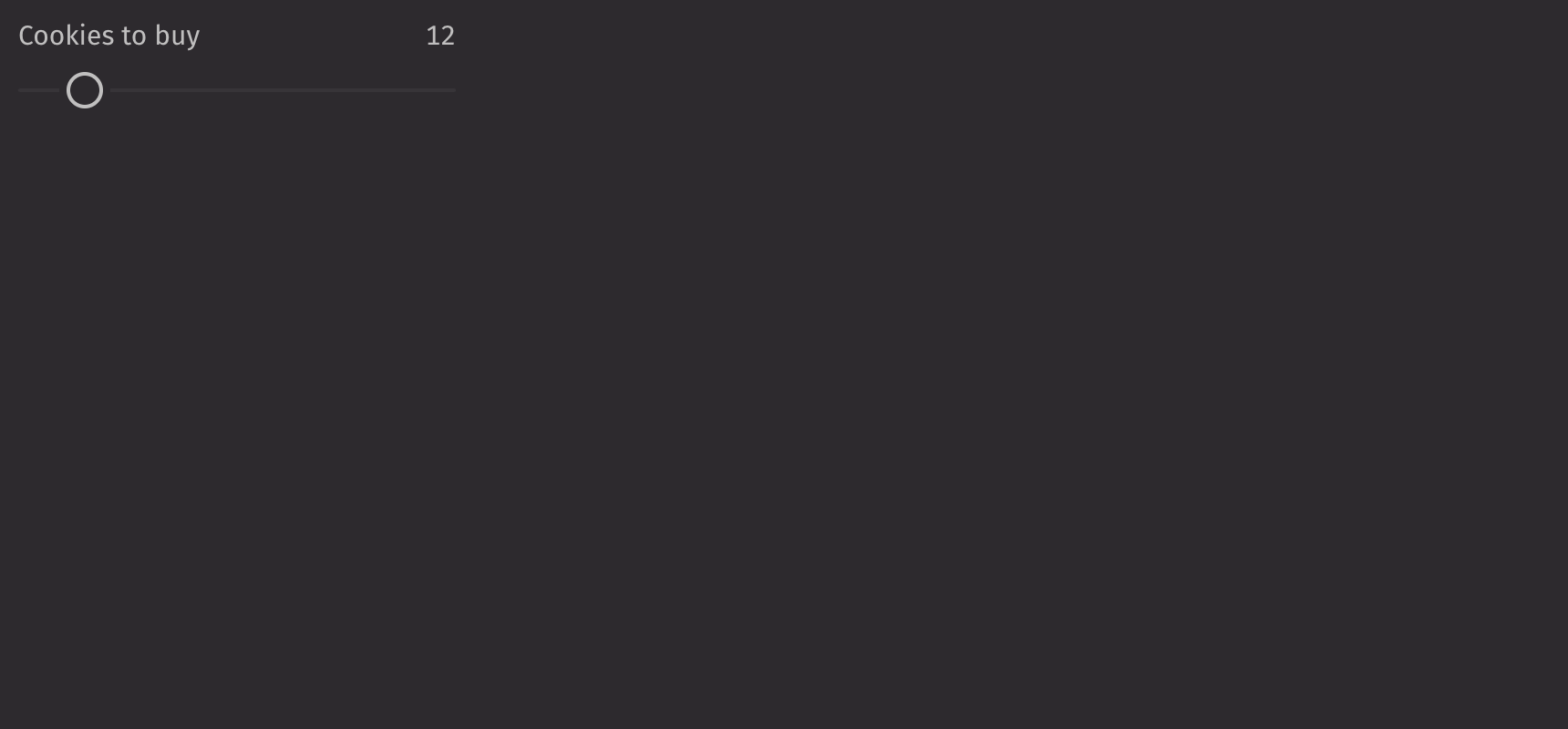
Example
UI recommendations
Recommendations for creating sliders:
- Every slider should have a label specified. Without one, the slider is ambiguous. In the rare case that context is sufficient, the label is unnecessary; you must still include an aria-label via the
aria_labelprop. - The label and contextual help text should be in sentence case.
Consider using a range_slider when users should select a subset range or a number_field when the range is large or greater precision is required.
Value
Sliders are controlled with the value prop and uncontrolled with the default_value prop. This value must fall between the slider’s minimum and maximum values, which by default are 0 and 100, respectively.
Scale
Setting the min_value and max_value props configures a custom scale for the slider.
The step prop changes the increments that the slider changes.
HTML Forms
Sliders can support a name prop for integration with HTML forms, allowing for easy identification of a value on form submission.
Labeling
Value labels are shown above the slider by default but can be moved to the side or hidden using the label_position prop.
Note that if the label prop is set, the show_value_label is set to True by default.
Fill
The is_filled prop can be set to fill the slider. The fill_offset prop can be set to apply an offset for the fill.
Gradient
The track_gradient prop applies a gradient to the slider’s fill.
Contextual Help
To provide additional information about the slider, a UI.contextual_help can be passed into the contextual_help prop.
Disabled
Setting the is_disabled prop disables the slider.
API Reference
Sliders allow users to quickly select a value within a range. They should be used when the upper and lower bounds to the range are invariable.
Returns: Element The rendered slider component.
| Parameters | Type | Default | Description |
|---|---|---|---|
| is_filled | bool | None | None | Whether the slider should be filled between the start of the slider and the current value. |
| fill_offset | float | None | None | The offset of the filled area from the start of the slider. |
| track_gradient | list[str] | None | None | The background of the track, specified as the stops for a CSS background: linear-gradient(to right/left, ...trackGradient). |
| label_position | Literal['top', 'side'] | 'top' | The position of the label relative to the slider. |
| show_value_label | bool | None | None | Whether the value label should be displayed. True by default if the label is provided. |
| contextual_help | Any | None | None | A ContextualHelp element to place next to the label. |
| orientation | Literal['horizontal', 'vertical'] | 'horizontal' | The orientation of the slider. |
| is_disabled | bool | None | None | Whether the slider is disabled. |
| min_value | float | 0 | The minimum value of the slider. |
| max_value | float | 100 | The maximum value of the slider. |
| step | float | 1 | The step value for the slider. |
| value | float | None | None | The current value of the slider. |
| default_value | float | None | None | The default value of the slider. |
| label | Any | None | None | The content to display as the label. |
| name | str | None | None | The name of the input element, used when submitting an HTML form. |
| key | str | None | None | A unique identifier used by React to render elements in a list. |