Switch
Switches allow users to turn a single option on or off.
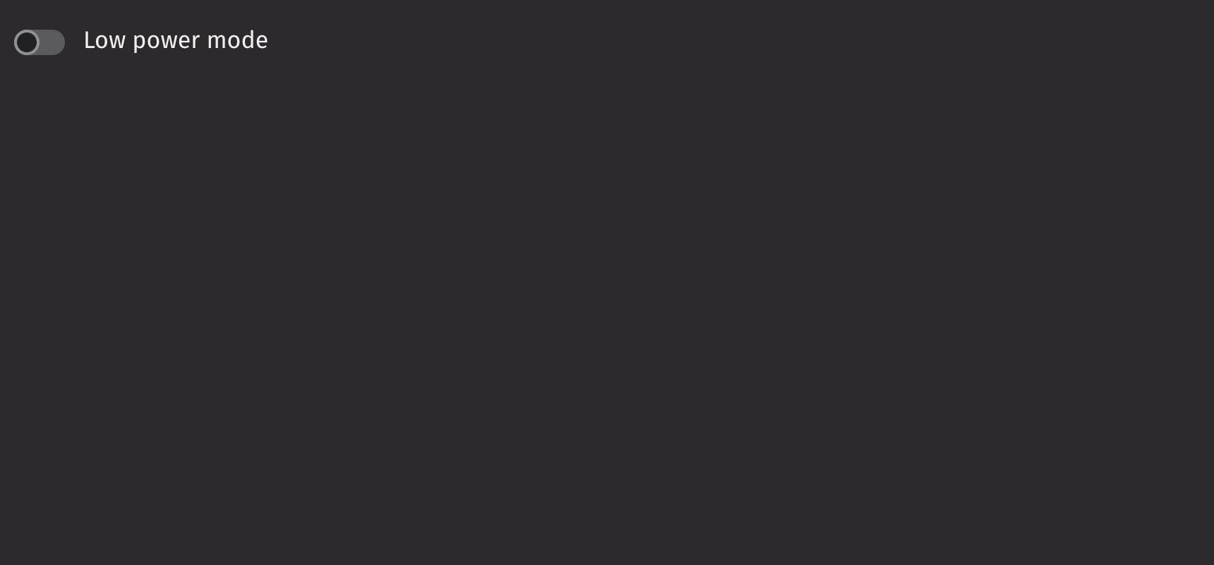
Example
UI recommendations
Recommendations for creating switches:
- Emphasized switches are ideal for forms and settings where the switch being noticed is crucial, while non-emphasized switches suit monochrome application panels to maintain focus on the content.
- Use a standalone switch when the context is clear without a text label, such as next to a panel’s title, to enable or disable panel options.
- Use switches for activation and checkboxes for selection; unlike checkboxes, switches cannot have an error state.
- When a switch represents multiple values from other switches, it should initially appear unselected; clicking it will select and unify all values, while a subsequent click will deselect and reset them.
- Switches can only be on or off; for partial states, use a checkbox, as indeterminate switches are not accessible.
Consider using a checkbox for individual selections or when marking a single item as selected.
Value
Switches are not selected by default. Use the default_selected prop to set the initial state (uncontrolled) or the is_selected prop to control the selected state.
HTML Forms
Switches can support a name prop for integration with HTML forms, allowing for easy identification of a value on form submission.
Labeling
The switch can be labeled by passing in a child. If no label is provided, an aria_label must be provided to identify the control for accessibility purposes.
Events
The on_change property is triggered whenever the switch is pressed.
Disabled
Setting the is_disabled prop disables the switch.
Emphasized
The is_emphasized prop makes the switch’s fill color the user’s accent color, adding visual prominence to the selection.
Read only
The is_read_only prop makes the switch read-only to prevent user interaction. This differs from setting the is_disabled prop since the switch remains focusable.
API Reference
Switches allow users to turn an individual option on or off. They are usually used to activate or deactivate a specific setting.
Returns: Element The rendered switch element.
| Parameters | Type | Default | Description |
|---|---|---|---|
| *children | Any | The children to render inside the input. | |
| is_emphasized | bool | None | None | Whether the input should be displayed with an emphasized style. |
| default_selected | bool | None | None | Whether the input is selected by default. |
| is_selected | bool | None | None | Whether the input is selected. |
| value | str | None | None | THe value of the input element, used when submitting a form. |
| is_disabled | bool | None | None | Whether the input is disabled. |
| is_read_only | bool | None | None | Whether the input can be selected but not changed by the user. |
| auto_focus | bool | None | None | Whether the input should automatically get focus when the page loads. |
| is_quiet | bool | None | None | Whether the input should be quiet. |
| name | str | None | None | The name of the input, used when submitting a form. |
| key | str | None | None | A unique identifier used by React to render elements in a list. |