Create subplots in figures
This guide shows you how to use deephaven.plot to create subplots within figures. Subplots are plots that are displayed together in a single figure, placed in a grid based on row and column numbers. While a single plot with multiple series places the lines, bars, scatters, etc on the same axes, subplots are placed in different sections of a single figure. Typically, subplots are used when the data is distinctly different from one another, or when you do not need to actively compare two sets of data with one another.
Define subplots
Set the number of subplots when you create a Figure. The input names are rows and columns.
from deephaven.plot.figure import Figure

f = Figure(rows=n, cols=m)
n and m are the number of rows and columns, respectively.
Add subplots to a figure
The syntax for a single plot on a single figure is as follows:
from deephaven.plot.figure import Figure
from deephaven import empty_table

source = empty_table(100).update(["X = i", "Y = cos(0.1 * i)"])

f = Figure().plot_xy(series_name="Cosine", t=source, x="X", y="Y").show()
For a single figure with only one plot, specifying rows and columns is optional. However, if a plot has more than one subplot, these arguments are required. After defining the figure and its subplots, you must specify each subplot with a new_chart call. Each new_chart call creates a chart at a given row and column in the figure.
For instance, if you wish to have two subplots, one on top of another, a figure needs two rows and one column.
from deephaven.plot.figure import Figure
from deephaven import empty_table

source = empty_table(100).update(["X = i", "Y = cos(0.1 * i)", "Z = sin(0.1 * i)"])

f = (
    Figure(rows=2, cols=1)
    .new_chart(row=0, col=0)
    .plot_xy(series_name="Y", t=source, x="X", y="Y")
    .new_chart(row=1, col=0)
    .plot_xy(series_name="Z", t=source, x="X", y="Z")
    .show()
)
Examples
In the section above, we created a figure with two subplots: one in each row.
One row, two columns
Let's instead create a figure with two columns and one row. The series Y appears on the left, and Z on the right.
from deephaven.plot.figure import Figure
from deephaven import empty_table

source = empty_table(100).update(["X = i", "Y = cos(0.1 * i)", "Z = sin(0.1 * i)"])

f = (
    Figure(rows=1, cols=2)
    .new_chart(row=0, col=0)
    .plot_xy(series_name="Y", t=source, x="X", y="Y")
    .new_chart(row=0, col=1)
    .plot_xy(series_name="Z", t=source, x="X", y="Z")
    .show()
)
Different plot types
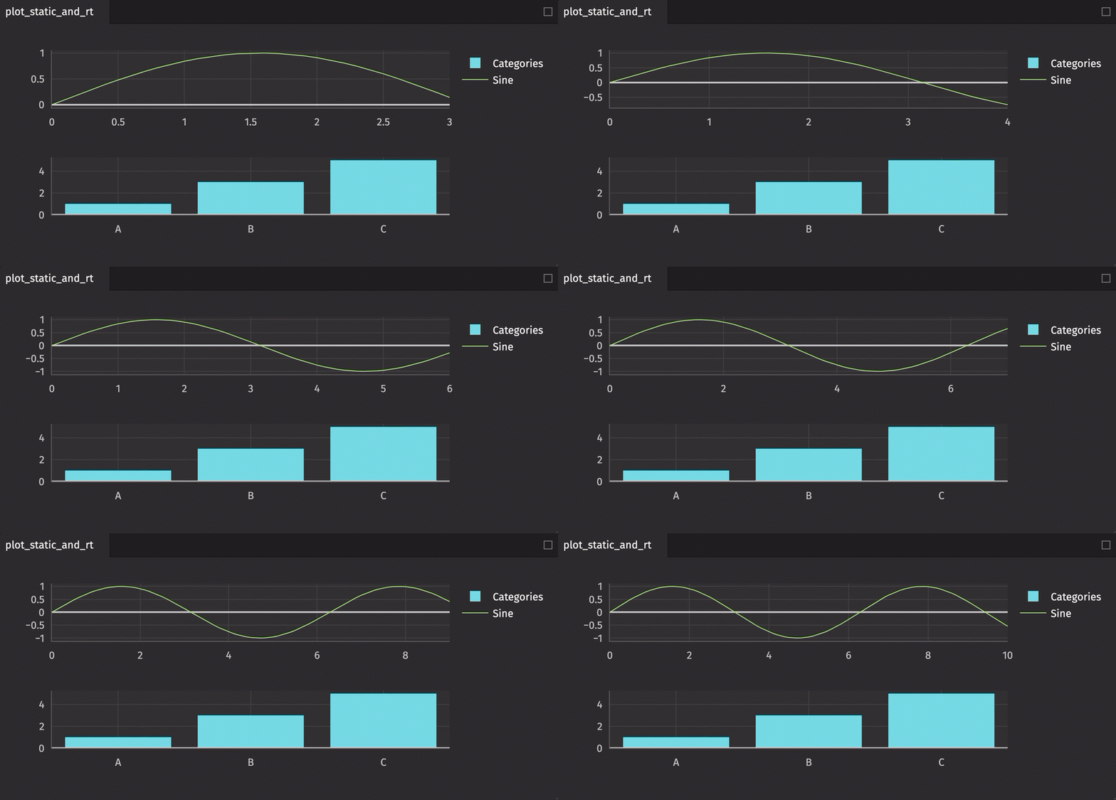
A single figure can handle multiple plot types as well as both static and real-time data.
from deephaven.column import int_col, string_col
from deephaven import empty_table
from deephaven import time_table
from deephaven import new_table
from deephaven.plot.figure import Figure

t1 = time_table("PT0.1S").update_view(["X = 0.1 * i", "Y = sin(X)"])

t2 = new_table(
    [string_col("Categories", ["A", "B", "C"]), int_col("Values", [1, 3, 5])]
)

plot_static_and_rt = (
    Figure(rows=2, cols=1)
    .new_chart(row=0, col=0)
    .plot_cat(series_name="Categories", t=t2, category="Categories", y="Values")
    .new_chart(row=1, col=0)
    .plot_xy(series_name="Sine", t=t1, x="X", y="Y")
    .show()
)
