Size and Theme
Deephaven theme
The Deephaven Web IDE theme can be changed in the Settings menu. The Default Dark and Default Light themes are provided, but you can also create a custom theme.
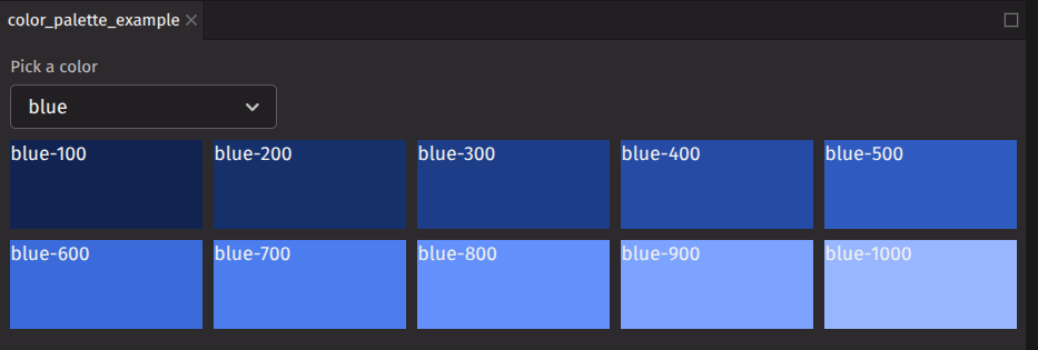
Color palette
deephaven.ui uses the same color convention as Adobe Spectrum. A color is specified with a name and an index number. For example, blue-100 or red-600. In a dark theme, blue-100 will be a dark blue and blue-1000 will be a light blue. In a light theme, they will be reversed. The example component below displays a color palette for a selected color. Try changing the theme to see the difference in colors.
Dark theme palette
Light theme palette
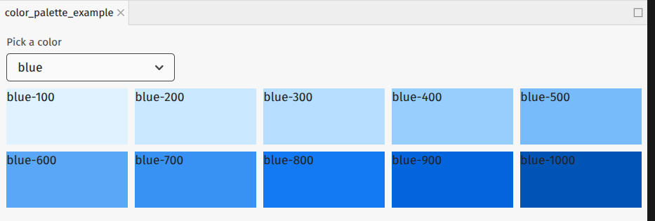
For a full list of colors, see the Adobe Spectrum color values.
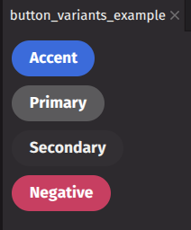
Semantic color
In addition to the color palette, deephaven.ui uses semantic colors which assign color based on meanings. This means that a negative UI element will have the same color throughout the UI rather than various elements having a different shade of red.
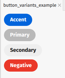
For example, the button component uses variant to apply semantic color.
Dark theme buttons
Light theme example
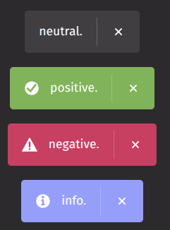
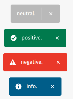
In this example, the toast component uses variant to apply semantic color.
Dark theme toast
Light theme toast
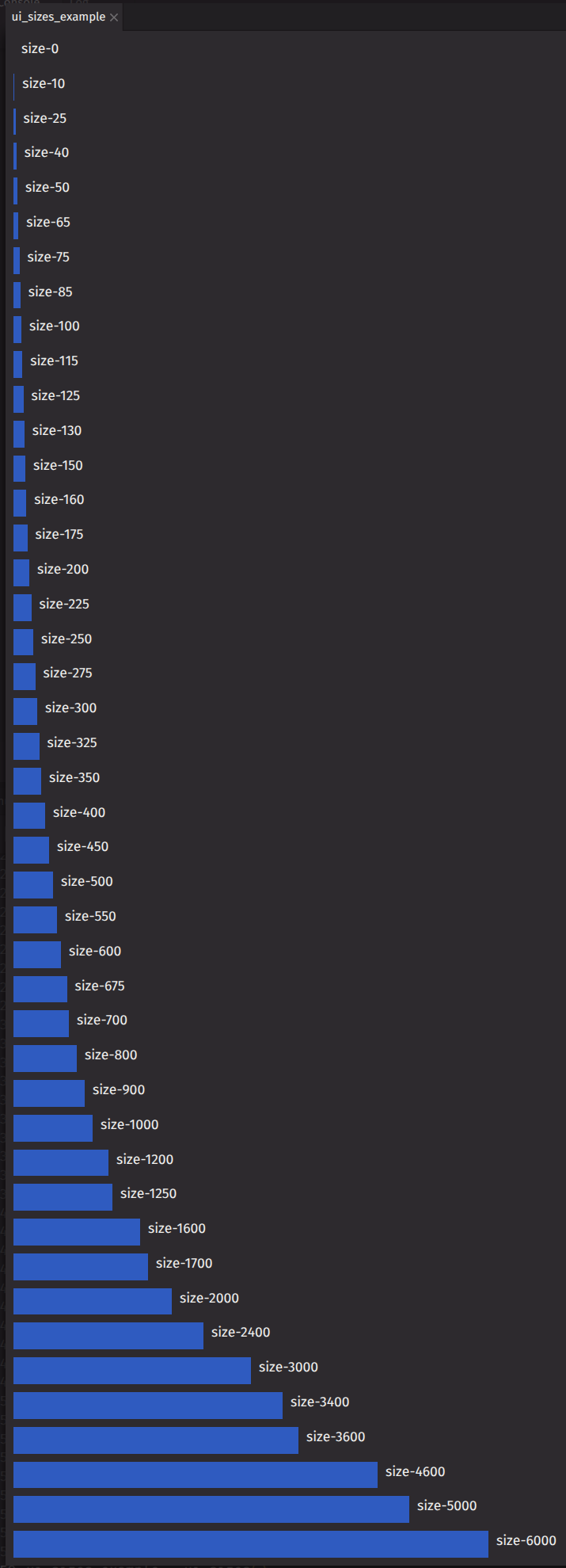
Size
deephaven.ui components will be sized automatically based on layout. You can also specify the size using the sizing props:
These props accept normal CSS values like 100px, 50% or 20em. Additionally, they use an Adobe Spectrum dimension value.
When absolute sizing is required, using dimension values help promote consistent sizing of your layout across components.