Legacy Plotting API chart types
Warning
Legacy documentation: This documentation applies to Legacy Deephaven Enterprise only and does not apply to Core+.
The Legacy plot method may be used to create several chart types, including:
Note
For Core+ workers, see Community Core documentation for plotting.
XY Series
An XY series plot is generally used to show values over a continuum, such as time. XY Series plots can be represented as a line, a bar, an area or as a collection of points. The X axis is used to show the domain, while the Y axis shows the related values at specific points in the range.
XY Series plots can be created using data from tables, arrays and functions.
XY Series Plot using Data from a Table
When data is sourced from a table, the following syntax can be used to create an XY Series plot:
.plot("SeriesName", source, "xCol", "yCol").show()
plotis the method used to create an XY series plot."SeriesName"is the name (as a string) you want to use to identify the series on the plot itself.sourceis the table that holds the data you want to plot."xCol"is the name of the column of data to be used for the X value."yCol"is the name of the column of data to be used for the Y value.showtells Deephaven to draw the plot in the console.
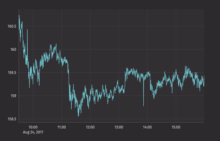
The example query below will create an XY series plot that shows the price of a single security (AAPL) over time.
Note
Python users must import the appropriate module: from deephaven import Plot or from deephaven import Plot as plt
Tip
The xBusinessTime method limits the data to actual business hours.
XY Series Plot using Data from an Array
When data is sourced from an array, the following syntax can be used to create an XY Series plot:
.plot("SeriesName", [x], [y]).show()
plotis the method used to create an XY series plot."SeriesName"is the name (as a string) you want to use to identify the series on the plot itself.[x]is the array containing the data to be used for the X value.[y]is the array containing the data to be used for the Y value.showtells Deephaven to draw the plot in the console.
XY Series Plot using Data from a Function
When data is sourced from a function, the following syntax can be used to create an XY Series plot:
.plot("SeriesName", function).show()
plotis the method used to create an XY series plot."SeriesName"is the name (as a string) you want to use to identify the series on the plot itself.functionis a mathematical operation that maps one value to another. Examples of Groovy functions and their formatting follow:{x->x+100}adds 100 to the value of x.{x->x*x}squares the value of x.{x->1/x}uses the inverse of x.{x->x*9/5+32}Fahrenheit to Celsius conversion.
showtells Deephaven to draw the plot in the console.
Special considerations when plotting from a function
If you are plotting a function in a plot by itself, consider applying a range for the function using the funcRange or xRange method. Otherwise, the default value ([0,1]) will be used, which may not meet your requirements:
.plot("Function", {x->x*x} ).funcRange(0,10).show()
If the function is being plotted with other data series, the funcRange method is not needed, and the range will be obtained from the other data series.
When using a function plot, you may also want to increase or decrease the granularity of the plot by declaring the number of points to include in the range. This is configurable using the funcNPoints method:
.plot("Function", {x->x*x} ).funcRange(0,10).funcNPoints(55).show()
XY Series with Shared Axes
You can compare multiple series over the same period of time by creating an XY series plot with shared axes. In the following example, two series are plotted, thereby creating two line graphs on the same plot.
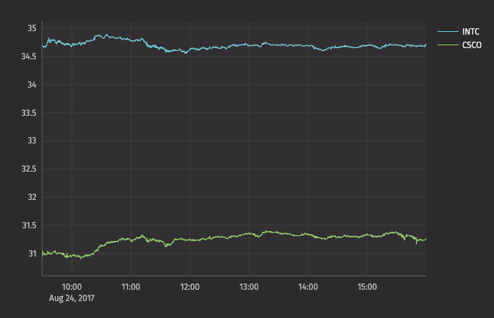
Subsequent series can be added to the plot by adding additional plot() methods to the query. However, the plotBy() method can also be used to do this.
Note
See
plotBy(./)
XY Series with Multiple X or Y Axes
When plotting multiple series in a single plot, the range of the Y axis is an important factor to watch. In the previous example, both securities had values within in a relatively narrow range (31 to 35). Therefore, any change in values was easy to visualize. However, as the range of the Y axis increases, those changes become harder to assess.
To demonstrate this, let's plot AAPL and GOOG on the same chart:
Now, the scale of the Y axis needs to cover a much wider range (from 150 to 950), which results in relatively flat lines with barely distinguishable differences in values or trend.
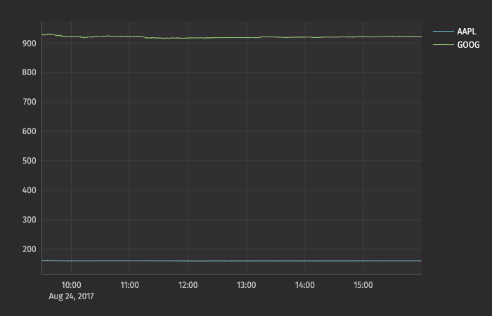
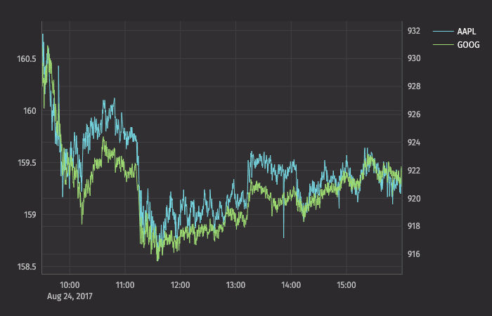
This issue can be easily remedied by adding a second Y axis to the plot via the twinX() method.
twinX
The twinX() method enables you to use one Y axis for some of the series being plotted and a second Y axis for the others, while sharing the same X axis:
PlotName = figure().plot(...).twinX().plot(...).show()
- The plot(s) for the series placed before the
twinX()method share a common Y axis (on the left). - The plot(s) for the series listed after the
twinX()method share a common Y axis (on the right). - All plots share the same X axis.
For example, we can create an improved chart for AAPL and GOOG together:
The value range for AAPL is shown on the left axis and the value range for GOOG is shown on the right axis:
twinY
The twinY() method enables you to use one X axis for one set of the values being plotted and a second X axis for another, while sharing the same Y axis:
PlotName = figure().plot(...).twinY().plot(...).show()
- The plot(s) for the series placed before the
twinY()method use the lower X axis. - The plot(s) for the series listed after the
twinY()method use the upper X axis.
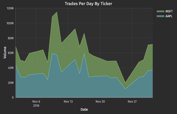
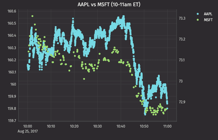
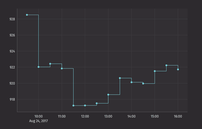
XY Series with Plot Styles
The XY series plot in Deephaven defaults to a line plot. However, Deephaven's plotStyle() method can be used to format XY series plots as area charts, stacked area charts, bar charts, stacked bar charts, scatter charts and step charts.
In any of the examples below, you can simply swap out the .plotStyle() argument with the appropriate name; e.g., ("area"), ("stacked_area"), ("step"), etc.
Note
See Plot Styles
XY Series as a Stacked Area Plot
XY Series as a Scatter Plot
XY Series as a Step Plot
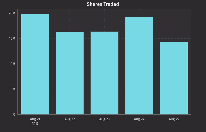
Category
Category plots display data values from different discrete categories. They can be created using data from tables and arrays.
Category Plot using Data from a Table
When data is sourced from a table, the following syntax can be used to create a category:
.catPlot("SeriesName", source, "CategoryCol", "ValueCol").show()
catPlotis the method used to create a category plot."SeriesName"is the name (string) you want to use to identify the series on the plot itself.sourceis the table that holds the data you want to plot."CategoryCol"is the name of the column (as a string) to be used for the categories."ValueCol"is the name of the column (as a string) to be used for the values.showtells Deephaven to draw the plot in the console.
Category Plot using Data from Arrays
When data is sourced from a array, the following syntax can be used to create a category:
.catPlot("SeriesName", [category], [values]).show()
catPlotis the method used to create a category plot."SeriesName"is the name (as a string) you want to use to identify the series on the chart itself.[category]is the array containing the data to be used for the X values.[values]is the array containing the data to be used for the Y values.showtells Deephaven to draw the plot in the console.
Categories with Shared Axes
You can also compare multiple categories over the same period of time by creating a category plot with shared axes. In the following example, a second category plot has been added to the previous example, thereby creating bar graphs on the same chart:
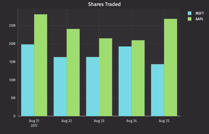
Subsequent categories can be added to the chart by adding additional catPlot() methods to the query. However, the plotBy() method can also be used to do this.
Note
See
plotBy(./)
Category charts with Plot Styles
By default, values are presented as vertical bars. However, by using Deephaven's plotStyle() method, the data can be represented as a bar, a stacked bar, a line, an area or a stacked area.
In any of the examples below, you can simply swap out the .plotStyle() argument with the appropriate name; e.g., ("Area"), ("stacked_area"), etc.
Note
See Plot Styles
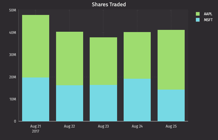
Category Plot with Stacked Bar
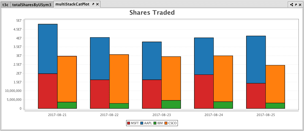
Multiple Sets of Stacked Category Plots
Note
This feature is currently available in Deephaven Classic, and will be coming to the web soon.
Multiple sets of stacked category plots can be created by assigning each category to a group and then applying a plot style:
Category Histogram
The category histogram plot is used to show how frequently a set of discrete values (categories) occur. They can be plotted using data from tables or arrays.
Category Histogram Plot using Data from a Table
When data is sourced from a table, the following syntax can be used:
.catHistPlot("seriesName", source, "ValueCol").show()
catHistPlotis the method used to create a category histogram."SeriesName"is the name (as a string) you want to use to identify the series on the chart itself.sourceis the table that holds the data you want to plot."ValueCol"is the name of the column (as a string) containing the discrete values.showtells Deephaven to draw the plot in the console.
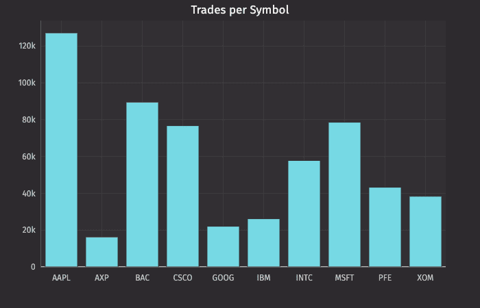
This query plots the histogram as follows:
catHistTradesBySymis the name of the variable that will hold the plot.catHistPlotis the method."Number of Trades"is the name of the series to use in the plot.tradesis the table from which our data is being pulled.Symis the name of the column containing the discrete values.chartTitle("Trades per Symbol")adds a chart title to the plot.
Category Histogram Plot using Data from an Array
When data is sourced from an array, the following syntax can be used:
.catHistPlot("SeriesName", [Values]).show()
catHistPlotis the method used to create a category histogram."SeriesName"is the name (as a string) you want to use to identify the series on the plot itself.[Values]is the array containing the discrete values.showtells Deephaven to draw the plot in the console.
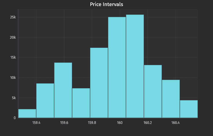
Histogram
The histogram is used to show how frequently different data values occur. The data is divided into logical intervals (or bins) , which are then aggregated and charted with vertical bars. Unlike bar charts (category plots), bars in histograms do not have spaces between them unless there is a gap in the data. Histograms can be plotted using data from tables or arrays.
Histogram Plot using Data from a Table
When data is sourced from a table, the following syntax can be used:
.histPlot("seriesName", source, "ValueCol", nbins).show()
histPlotis the method used to create a histogram."SeriesName"is the name (as a string) you want to use to identify the series on the chart itself.sourceis the table that holds the data you want to plot."ValueCol"is the name of the column (as a string) of data to be used for the X values.nbinsis the number of intervals to use in the chart.showtells Deephaven to draw the plot in the console.
This query plots the histogram as follows:
plotPriceIntervalsis the name of the variable that will hold the chart.histPlotis the method."AAPL"is the name of the series to use in the chart.trades.where("Sym=`AAPL`")is the source data filtered to AAPL.Lastis table column that contains the values we want to plot, and10is the number of intervals we want to use to divide up the sales.
The histPlot method assumes you want to plot the entire range of values in the dataset. However, you can also set the minimum and maximum values of the range using rangeMin and rangeMax respectively:
.histPlot("seriesName", source, "ValueCol", rangeMin, rangeMax, nbins).show()
histPlotis the method used to create a histogram."SeriesName"is the name (as a string) you want to use to identify the series on the chart itself.sourceis the table that holds the data you want to plot."ValueCol"is the name of the column (as a string) of data to be used for the X values.rangeMinis the minimum value (as a double) of the range to be included.rangeMaxis the maximum value (as a double) of the range to be included.nbinsis the number of intervals to use in the chart.showtells Deephaven to draw the plot in the console.
Histogram Plot using Data from an Array
When data is sourced from an array, the following syntax can be used:
.histPlot("SeriesName", [x], nbins).show()
histPlotis the method used to create a histogram."SeriesName"is the name (as a string) you want to use to identify the series on the chart itself.[x]is the array containing the data to be used for the X values.nbinsis the number of intervals to use in the chart.showtells Deephaven to draw the plot in the console.
The histPlot method assumes you want to plot the entire range of values in the dataset. However, you can also set the minimum and maximum values of the range using rangeMin and rangeMax respectively:
.histPlot("SeriesName", [x], rangeMin, rangeMax, nbins).show()
histPlotis the method used to create a histogram."SeriesName"is the name (as a string) you want to use to identify the series on the chart itself.[x]is the array containing the data to be used for the X values.rangeMinis the minimum value (as a double) of the range to be included.rangeMaxis the maximum value (as a double) of the range to be included.nbinsis the number of the intervals to use in the chart.showtells Deephaven to draw the plot in the console.
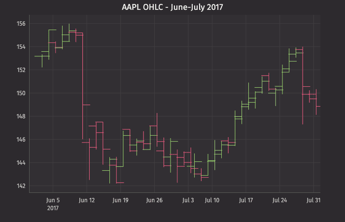
OHLC
The Open, High, Low and Close (OHLC) plot typically shows four prices of a security or commodity per time slice: the open and close of the time slice, and the highest and lowest values reached during the time slice.
This plotting method requires a dataset that includes one column containing the values for the X axis (time), and one column for each of the corresponding four values (open, high, low, close). Open, High, Low and Close Plots can be created using data from tables or arrays.
OHLC Plot using Data from a Table
When data is sourced from a table, the following syntax can be used:
.ohlcPlot("SeriesName", source, "Time", "Open", "High", "Low", "Close").show()
ohlcPlotis the method used to create an OHLC chart."SeriesName"is the name (as a string) you want to use to identify the series on the chart itself.sourceis the table that holds the data you want to plot."Time"is the name (as a string) of the column to be used for the X axis."Open"is the name of the column (as a string) holding the opening price."High"is the name of the column (as a string) holding the highest price."Low"is the name of the column (as a string) holding the lowest price."Close"is the name of the column (as a string) holding the closing price.showtells Deephaven to draw the plot in the console.
This query plots the OHLC chart as follows:
plotOHLCis the name of the variable that will hold the chart.ohlcPlotis the method."AAPL"is the name of the series to be used in the chart.tOHLCis the table from which our data is being pulled.EODTimestampis the name of the column to be used for the X axis."Open","High","Low", and"Close", are the names of the columns containing the four respective data points to be plotted on the Y axis.xBusinessTime()limits the date to business days only.lineStyle()andchartTitle()provide component formatting to the table.2refers to line width.
OHLC Plot using Data from an Array
When data is sourced from an array, the following syntax can be used:
.ohlcPlot("SeriesName",[Time], [Open], [High], [Low], [Close]).show()
ohlcPlotis the method used to create an OHLC chart."SeriesName"is the name (as a string) you want to use to identify the series on the chart itself.[Time]is the array containing the data to be used for the X axis.[Open]is the array containing the data to be used for the opening price.[High]is the array containing the data to be used for the highest price.[Low]is the array containing the data to be used for the lowest price.[Close]is the array containing the data to be used for the closing price.showtells Deephaven to draw the plot in the console.
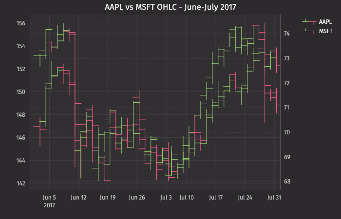
OHLC Plots with Shared Axes
Just like XY series plots, the Open, High, Low and Close plot can also be used to present multiple series on the same chart, including the use of multiple X or Y axes. An example of this follows:
This query plots the OHLC chart as follows:
plotOHLC2is the name of the variable that will hold the chart.ohlcPlotplots the first series."AAPL"is the name of the first series to be used in the chart.t2OHLCis the table from which the data is being pulled.where("Ticker=`AAPL`")filters the table to only the AAPL Ticker.EODTimestampis the name of the column to be used for the X axis."Open","High", "Low", and"Close", are the names of the columns containing the four respective data points to be plotted on the Y axis.- The
lineStyle()method needs to be assigned to each series, so this reference only applies to the first series.
twinXis used to show different Y axes.ohlcPlotplots the second series."MSFT"is the name of the second series to be used in the chart.t2OHLCis the table from which the data is being pulled.where("Ticker=`MSFT`")filters the table to only the MSFT Ticker.EODTimestampis the name of the column to be used for the X axis."Open","High","Low", and"Close", are the names of the columns containing the four respective data points to be plotted on the Y axis.lineStyle()applies only to the second series.
xBusinessTime()limits the date to business days only.chartTitle()provides the title for the chart.
In this plot, the opening, high, low and closing price of AAPL and MSFT are plotted. The twinX() method is used to show the value scale for AAPL on the left Y axis and the value scale for MSFT on the right Y axis.
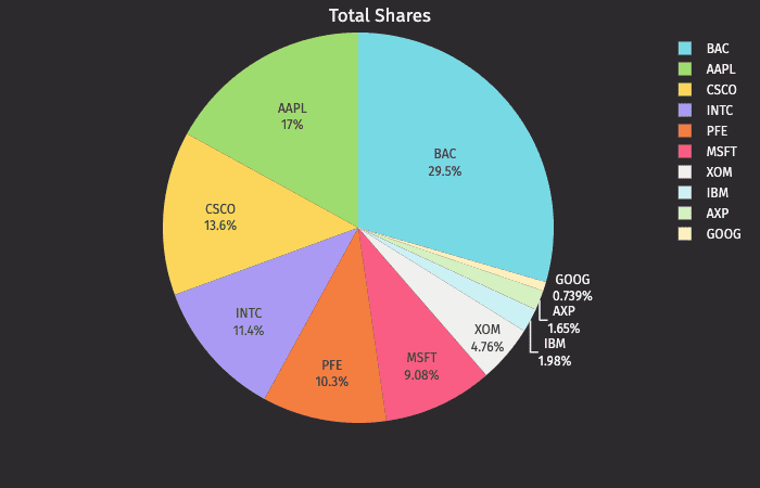
Pie
The pie plot shows data as sections of a circle to represent the relative proportion for each of the categories that make up the entire dataset being plotted.
Pies plots can be created using data from tables or arrays.
Pie Plot using Data from a Table
When data is sourced from a table, the following syntax can be used to create a pie plot:
.piePlot("SeriesName", source, "CategoryCol", "ValueCol").show()
piePlotis the method used to create a pie plot."SeriesName"is the name (as a string) you want to use to identify the series on the plot itself.sourceis the table that holds the data you want to plot."CategoryCol"is the name of the column (as a string) to be used for the categories."ValueCol"is the name of the column (as a string) to be used for the values.showtells Deephaven to draw the plot in the console.
Pie Plot using Data from an Array
When data is sourced from an array, the following syntax can be used:
.piePlot("SeriesName", [category], [values]").show()
piePlotis the method used to create a pie chart."SeriesName"is the name (as a string) you want to use to identify the series on the chart.[category]is the array containing the data to be used for the X values.[values]is the array containing the data to be used for the Y values.showtells Deephaven to draw the plot in the console.