catPlotBy
The catPlotBy method creates multiple category plots per distinct grouping value specified in byColumns.
Syntax
Parameters
| Parameter | Type | Description |
|---|---|---|
| seriesName | Comparable | The name you want to use to identify the series on the plot itself. |
| t | Table | The table. |
| sds | SelectableDataSet | Selectable data set (e.g., OneClick filterable table). |
| categories | String | The column in |
| y | String | The column in |
| byColumns | list[String] | Column(s) in |
Returns
A category plot with multiple series.
Examples
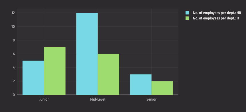
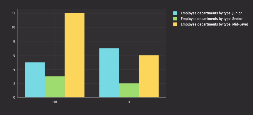
The following example creates two plots with catPlotBy. The two plots show the difference changing the by column makes.