Built-in plotting API
Deephaven's built-in plotting API offers a robust set of methods for creating real-time figures, include XY series plots, bar charts, histograms, and pie charts. This guide provides an overview of the legacy plotting API and its capabilities.
Deephaven's legacy plotting API can be used to create various chart types:
Note
Deephaven Express is the recommended choice for most plotting tasks.
XY series
XY series plots are generally used to show values over a continuum, such as time. XY Series plots can be represented as a line, a bar, an area or as a collection of points. The X axis is used to show the domain, while the Y axis shows the related values at specific points in the range.
You can create XY Series plots using data from Deephaven tables with the following syntax:
.plot("SeriesName", source, "xCol", "yCol").show()
plotis the method used to create an XY series plot."SeriesName"is the name (as a string) you want to use to identify the series on the plot itself.sourceis the table that holds the data you want to plot."xCol"is the name of the column of data to be used for the X value."yCol"is the name of the column of data to be used for the Y value.showtells Deephaven to draw the plot in the console.
The example query below will create an XY series plot that shows the high of Bitcoin for September 8, 2021.
Note
Python users must import the appropriate module: from deephaven import Plot or from deephaven import Plot as plt
Shared axes
You can compare multiple series over the same period of time by creating an XY series plot with shared axes. In the following example, two series are plotted, thereby creating two line graphs on the same plot.
Tip
You can choose to hide one or more series in the plot. Simply click the name of the series at the right of the plot to hide that series; click the name again to restore it.
Subsequent series can be added to the plot by adding additional plot methods to the query.
Multiple X or Y Axes
When plotting multiple series in a single plot, the range of the Y axis is an important factor to watch. As the range of the Y axis increases, value changes become harder to assess.
When the scale of the Y axis needs to cover an extremely wide range, the plot may result in relatively flat lines with barely distinguishable differences in values or trend.
This issue can be easily remedied by adding a second Y axis to the plot via the twinX method.
twinX
The twinX method enables you to use one Y axis for some of the series being plotted and a second Y axis for the others, while sharing the same X axis:
PlotName = figure().plot(...).twinX().plot(...).show()
- The plot(s) for the series placed before the
twinXmethod share a common Y axis (on the left). - The plot(s) for the series listed after the
twinXmethod share a common Y axis (on the right). - All plots share the same X axis.
The value range for the high value is shown on the left axis and the value range for the low value is shown on the right axis.
twinY
The twinY method enables you to use one X axis for one set of the values being plotted and a second X axis for another, while sharing the same Y axis:
PlotName = figure().plot(...).twinY().plot(...).show()
- The plot(s) for the series placed before the
twinYmethod use the lower X axis. - The plot(s) for the series listed after the
twinYmethod use the upper X axis.
Multiple series
Multiple plot methods can be used within the same query to produce a chart with multiple series. However, the plotBy methods include an additional argument that enables users to specify the grouping column to be used to plot multiple series. This greatly simplifies and shortens the query structure:
Plot styles
The XY series plot in Deephaven defaults to a line plot. However, Deephaven's plotStyle method can be used to format XY series plots as area charts, stacked area charts, bar charts, stacked bar charts, scatter charts and step charts.
In any of the examples below, you can simply swap out the plotStyle argument with the appropriate name; e.g., ("area"), ("stacked_area"), ("step"), etc.
XY Series as a stacked area plot
In any of the examples below, you can simply swap out the plotStyle argument with the name ("stacked_area"), ("step"), etc.
XY Series as a scatter plot
In the example below, the .plotStyle argument has the name ("scatter"). Other parameters are defined to show the fine tuning detail under control.
XY Series as a step plot
In the example below, the .plotStyle argument has the name ("step"). Other parameters are defined to show the fine tuning detail under control.
Category
Use the catPlot method to create category plots, which display data values from different discrete categories. Data may be sourced from a table or an array.
When data is sourced from a Deephaven table, the following syntax can be used:
.catPlot(seriesName, source, categoryCol, valueCol).show()
catPlotis the method used to create a category plot.seriesNameis the name (string) you want to use to identify the series on the plot itself.sourceis the table that holds the data you want to plot.categoryColis the name of the column (as a string) to be used for the categories.valueColis the name of the column (as a string) to be used for the values.showtells Deephaven to draw the plot in the console.
Shared axes
You can also compare multiple categories over the same period of time by creating a category plot with shared axes. In the following example, a second category plot has been added to the previous example, thereby creating bar graphs on the same chart:
Subsequent categories can be added to the chart by adding additional catPlot methods to the query.
Plot styles
By default, values are presented as vertical bars. However, by using Deephaven's plotStyle method, the data can be represented as a bar, a stacked bar, a line, an area or a stacked area.
In any of the examples below, you can simply swap out the plotStyle argument with the appropriate name; e.g., ("Area"), ("stacked_area"), etc.
Category plot with Stacked Bar
Category histogram
Use the catHistPlot method to create category histograms, which is used to show how frequently a set of discrete values (categories) occur.
When data is sourced from a Deephaven table, the following syntax can be used:
.catHistPlot(seriesName, source, valueCol).show()
catHistPlotis the method used to create a category histogram.seriesNameis the name (as a string) you want to use to identify the series on the chart itself.sourceis the table that holds the data you want to plot.valueColis the name of the column (as a string) containing the discrete values.showtells Deephaven to draw the plot in the console.
When data is sourced from an array, the following syntax can be used:
.catHistPlot(seriesName, values).show()
catHistPlotis the method used to create a category histogram.seriesNameis the name (as a string) you want to use to identify the series on the plot itself.valuesis the array containing the discrete values.showtells Deephaven to draw the plot in the console.
Histogram
Use the histPlot method to create histograms.
The histogram is used to show how frequently different data values occur. The data is divided into logical intervals (or bins) , which are then aggregated and charted with vertical bars. Unlike bar charts (category plots), bars in histograms do not have spaces between them unless there is a gap in the data.
When data is sourced from a table, the following syntax can be used:
.histPlot(seriesName, source, valueCol, nbins).show()
histPlotis the method used to create a histogram.seriesNameis the name (as a string) you want to use to identify the series on the chart itself.sourceis the table that holds the data you want to plot.valueColis the name of the column (as a string) of data to be used for the X values.nbinsis the number of intervals to use in the chart.showtells Deephaven to draw the plot in the console.
The histPlot method assumes you want to plot the entire range of values in the dataset. However, you can also set the minimum and maximum values of the range using rangeMin and rangeMax respectively:
.histPlot(seriesName, source, valueCol, rangeMin, rangeMax, nbins).show()
histPlotis the method used to create a histogram.seriesNameis the name (as a string) you want to use to identify the series on the chart itself.sourceis the table that holds the data you want to plot.valueColis the name of the column (as a string) of data to be used for the X values.rangeMinis the minimum value (as a double) of the range to be included.rangeMaxis the maximum value (as a double) of the range to be included.nbinsis the number of intervals to use in the chart.showtells Deephaven to draw the plot in the console.
When data is sourced from an array, the following syntax can be used:
.histPlot(seriesName, x, nbins).show()
histPlotis the method used to create a histogram.seriesNameis the name (as a string) you want to use to identify the series on the chart itself.xis the array containing the data to be used for the X values.nbinsis the number of intervals to use in the chart.showtells Deephaven to draw the plot in the console.
Just like with a Deephaven table, you can also set the minimum and maximum values of the range using rangeMin and rangeMax respectively:
.histPlot(seriesName, x, rangeMin, rangeMax, nbins).show()
histPlotis the method used to create a histogram.seriesNameis the name (as a string) you want to use to identify the series on the chart itself.xis the array containing the data to be used for the X values.rangeMinis the minimum value (as a double) of the range to be included.rangeMaxis the maximum value (as a double) of the range to be included.nbinsis the number of the intervals to use in the chart.showtells Deephaven to draw the plot in the console.
OHLC
Use the ohlcPlot method to create Open, High, Low and Close (OHLC) plots. These typically shows four prices of a security or commodity per time slice: the open and close of the time slice, and the highest and lowest values reached during the time slice.
This plotting method requires a dataset that includes one column containing the values for the X axis (time), and one column for each of the corresponding four values (open, high, low, close).
When data is sourced from a table, the following syntax can be used:
.ohlcPlot("SeriesName", source, "X", "Open", "High", "Low", "Close").show()
ohlcPlotis the method used to create an OHLC chart."SeriesName"is the name (as a string) you want to use to identify the series on the chart itself.sourceis the table that holds the data you want to plot."X"is the name (as a string) of the column to be used for the X axis."Open"is the name of the column (as a string) holding the opening price."High"is the name of the column (as a string) holding the highest price."Low"is the name of the column (as a string) holding the lowest price."Close"is the name of the column (as a string) holding the closing price.showtells Deephaven to draw the plot in the console.
This query plots the OHLC chart as follows:
plotOHLCis the name of the variable that will hold the chart.ohlcPlotis the method."BTC"is the name of the series to be used in the chart.tOHLCis the table from which our data is being pulled.TimestampBinis the name of the column to be used for the X axis."Open","High","Low", and"Close", are the names of the columns containing the four respective data points to be plotted on the Y axis.lineStyleandchartTitleprovide component formatting to the table.2refers to line width.
Shared axes
Just like XY series plots, the Open, High, Low and Close plot can also be used to present multiple series on the same chart, including the use of multiple X or Y axes. An example of this follows:
This query plots the OHLC chart as follows:
plotOHLCis the name of the variable that will hold the chart.ohlcPlotplots the first series."BTC"is the name of the first series to be used in the chart.btcOHLCis the table from which the data is being pulled.where("Instrument=`BTC/USD`")filters the table to only the AAPL Ticker.TimestampBinis the name of the column to be used for the X axis."Open","High", "Low", and"Close", are the names of the columns containing the four respective data points to be plotted on the Y axis.
twinXis used to show different Y axes.ohlcPlotplots the second series."ETH"is the name of the second series to be used in the chart.ethOHLCis the table from which the data is being pulled.where("Instrument=`ETH/USD`")filters the table to only the MSFT Ticker.TimestampBinis the name of the column to be used for the X axis."Open","High","Low", and"Close", are the names of the columns containing the four respective data points to be plotted on the Y axis.
chartTitleprovides the title for the chart.
In this plot, the opening, high, low and closing price of BTC and ETH are plotted. The twinX method is used to show the value scale for BTC on the left Y axis and the value scale for ETH on the right Y axis.
Pie
Use the piePlot method to create pie charts, which show data as sections of a circle to represent the relative proportion for each of the categories that make up the entire dataset being plotted.
When data is sourced from a table, the following syntax can be used to create a pie plot:
.piePlot(seriesName, source, categoryCol, valueCol).show()
piePlotis the method used to create a pie plot.seriesNameis the name (as a string) you want to use to identify the series on the plot itself.sourceis the table that holds the data you want to plot.categoryColis the name of the column (as a string) to be used for the categories.valueColis the name of the column (as a string) to be used for the values.showtells Deephaven to draw the plot in the console.
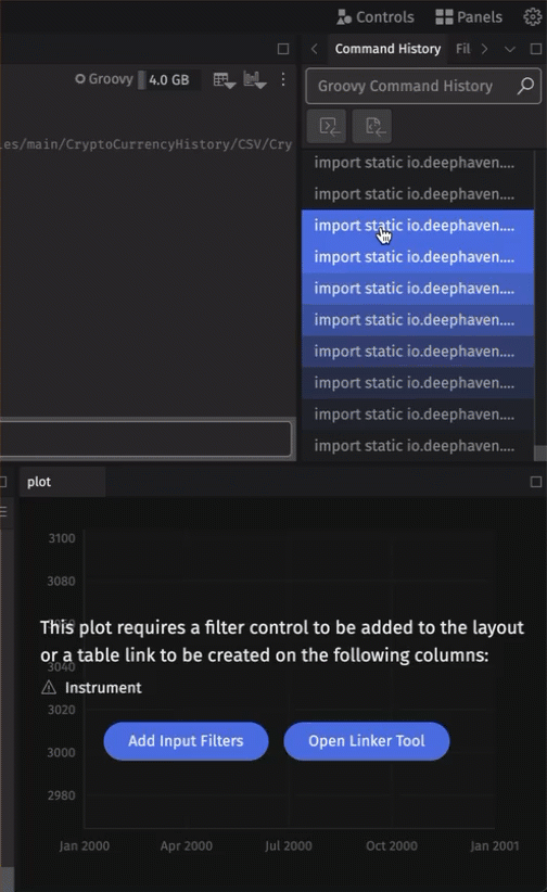
Dynamic plots
Plots configured with a SelectableDataSetOneClick can be paired with Deephaven's Input Filter, Linker feature, or drop-down filters. As the input changes, the paired plot will dynamically update to reflect the filtered dataset.
oneClick
To create a dynamically updating plot - a plot that updates with "one click" in the console -, the data source must be a SelectableDataSetOneClick. This is easily accomplished with the use of the oneClick method:
pTableis a partitioned table containing the data.tis the table containing the data.byColumnsis a list of strings, where each string is the name of a column to be made available for input filtering.requireAllFiltersToDisplay, when set totrue, will display a prompt explaining that filter controls must be added to the resulting plot. By default (false), this message will not be displayed.
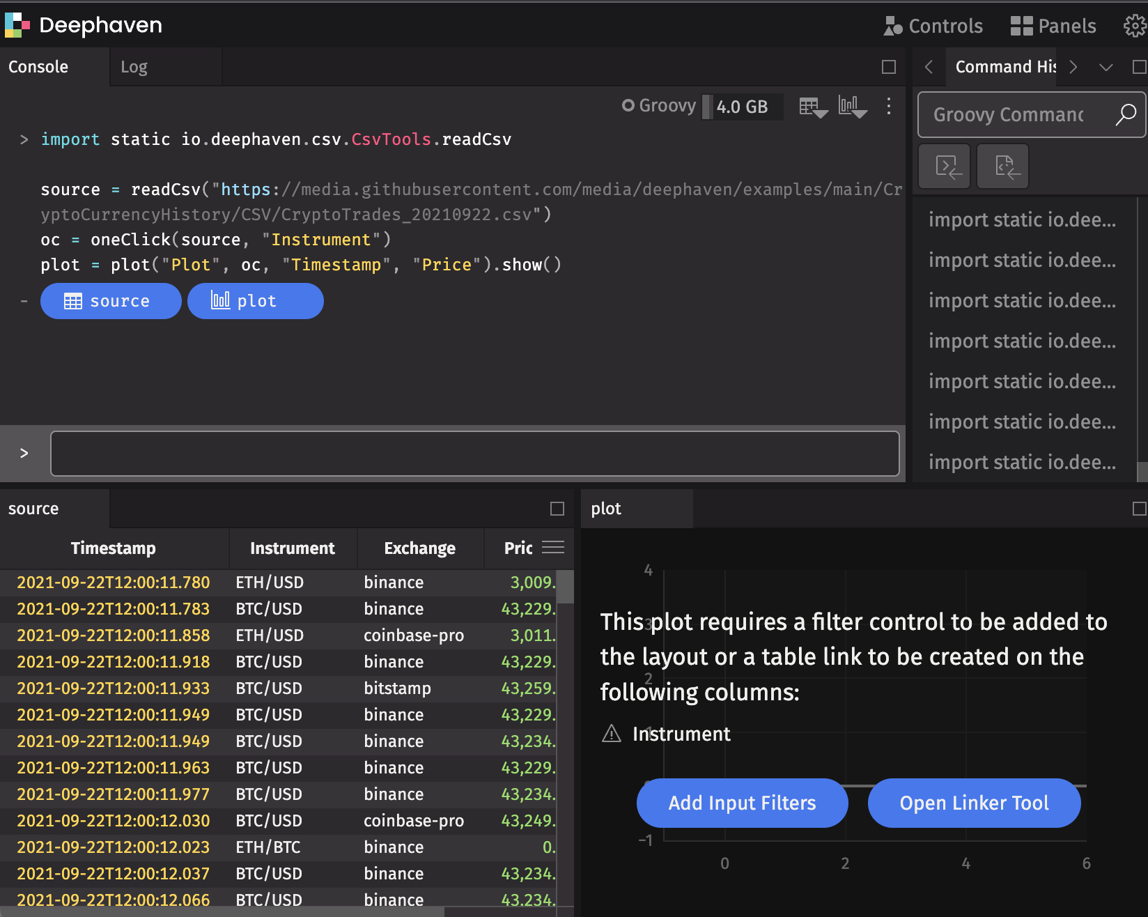
Input Filters
To pair your dynamic plot with an Input Filter, navigate to Input Filter in the Controls menu in the upper right-hand corner of the UI, or select Add Input Filters in the console.
Note
The Input Filter feature filters every open table and dynamic plot in the console.
Linker Tool
Alternatively, you can use the Linker tool to pair the dynamic plot with a table by clicking the Open Linker Tool button in the console or choosing the Linker option from the Controls menu.
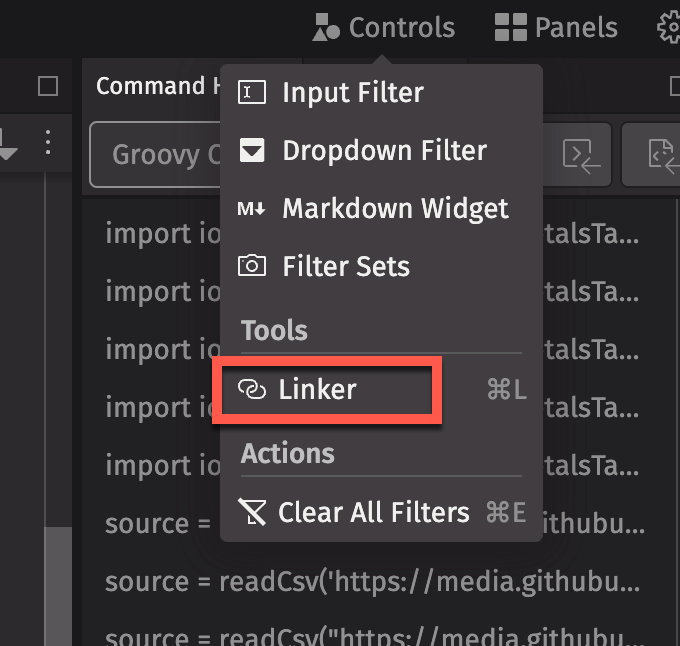

Connect the input column button in the dynamic plot to the matching column in the trigger table. Double-clicking on any row in the trigger table will filter the target (the dynamic plot) to match the input column's value in that row.