Matplotlib and Seaborn
Warning
For Pythonic plotting in Deephaven, we recommend Deephaven Express, a real-time version of Plotly Express. It has built-in support for ticking data, more active development, and fewer potential pitfalls when working with ticking plots.
This guide shows you how to use Matplotlib and Seaborn to create plots in Deephaven.
Install the Matplotlib plugin
Use pip to install Deephaven's Matplotlib plugin.
To include Seaborn, run:
The process for installing Python packages depends on whether Deephaven is run from Docker or Pip. See the guide on installing Python packages to learn more.
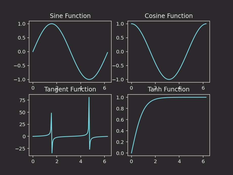
Matplotlib examples
Static plotting
Caution
All examples in this guide use Matplotlib's explicit interface. Users should do the same, especially in examples where multiple plots source data from ticking tables.
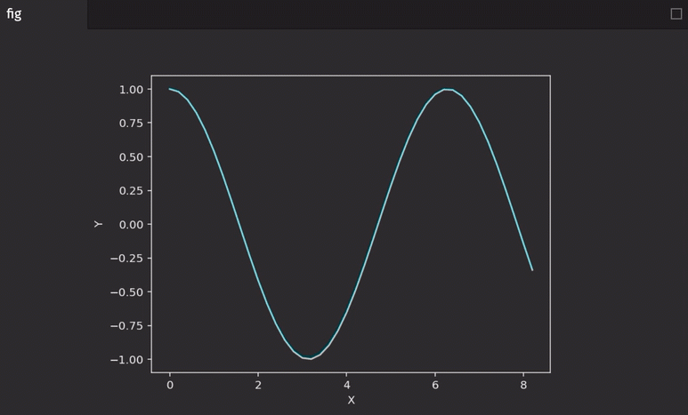
Here is the basic usage of Matplotlib to show one figure:
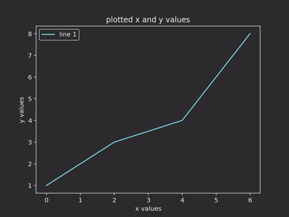
The full functionality of Matplotlib is avilable inside the Deephaven IDE:
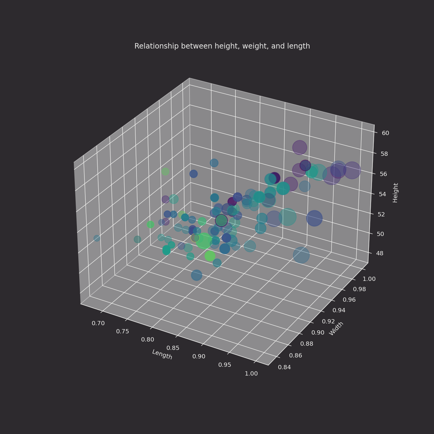
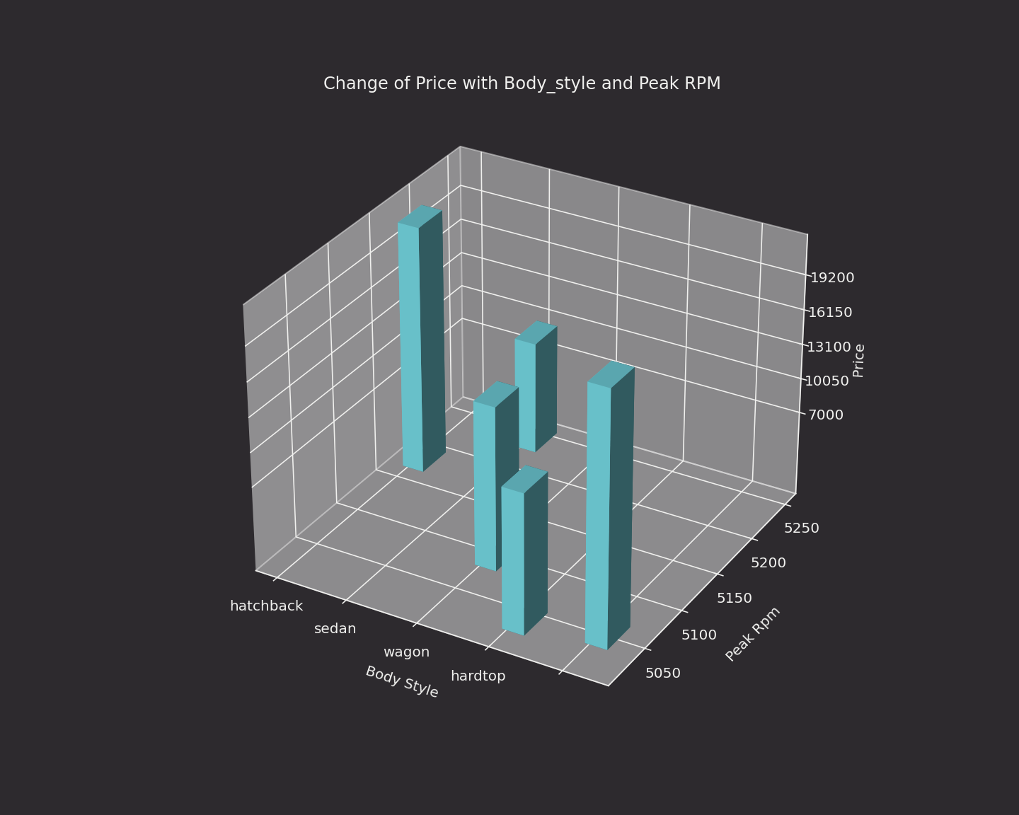
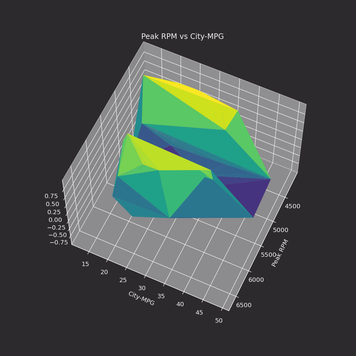
3D plots
Here are some 3D examples. The data, available from Kaggle, needs to be placed in the data directory. For more information see our guide on Docker data volumes.
Real-time plotting with TableAnimation
Deephaven's matplotlib plugin also enables you to visualize real-time data.
To install the plugin, run:
Making a live animation requires two imports:
The TableAnimation class will re-draw a plot every time a ticking table is updated. It needs three inputs:
- The figure containing data (in the examples below, it's
fig). - The table containing data (in the examples below, it's
ttortt_sorted_top). - The function defining how the plot is animated (
update_fig).
See the examples below.
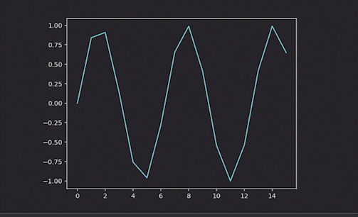
Line plot
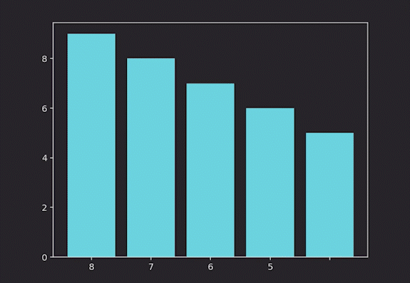
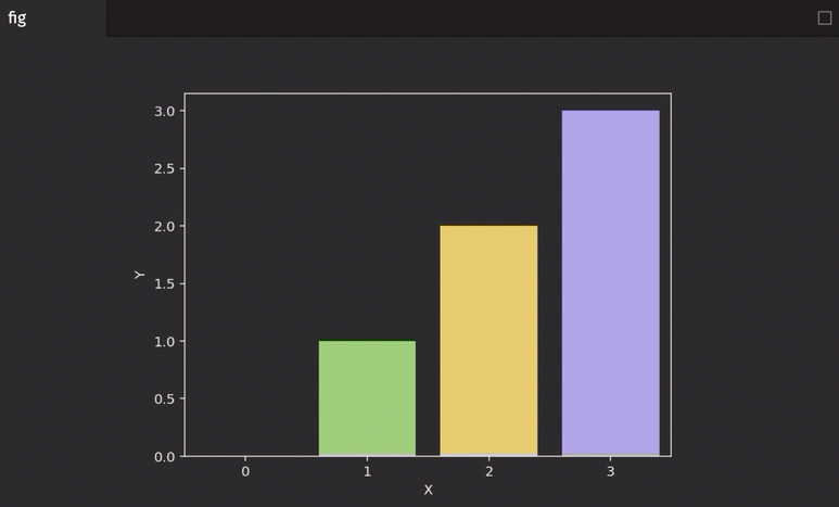
Bar plot
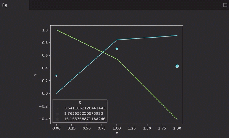
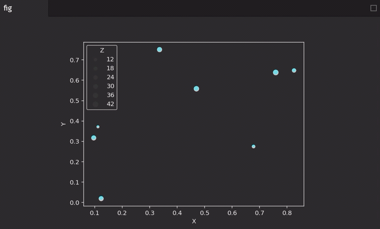
Scatter plot
Scatter plots require data in a different format than line plots, so we need to pass in the data differently:
Multiple series
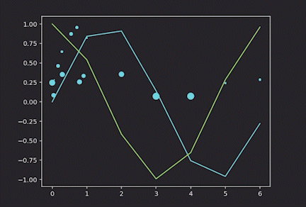
It's possible to have multiple kinds of series in the same figure. Here is an example of a line and a scatter plot:
Seaborn examples
Static plotting
Caution
All examples in this guide use Matplotlib's explicit interface. Users should do the same, especially in examples where there are multiple plots that source data from ticking tables.
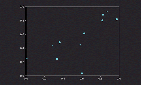
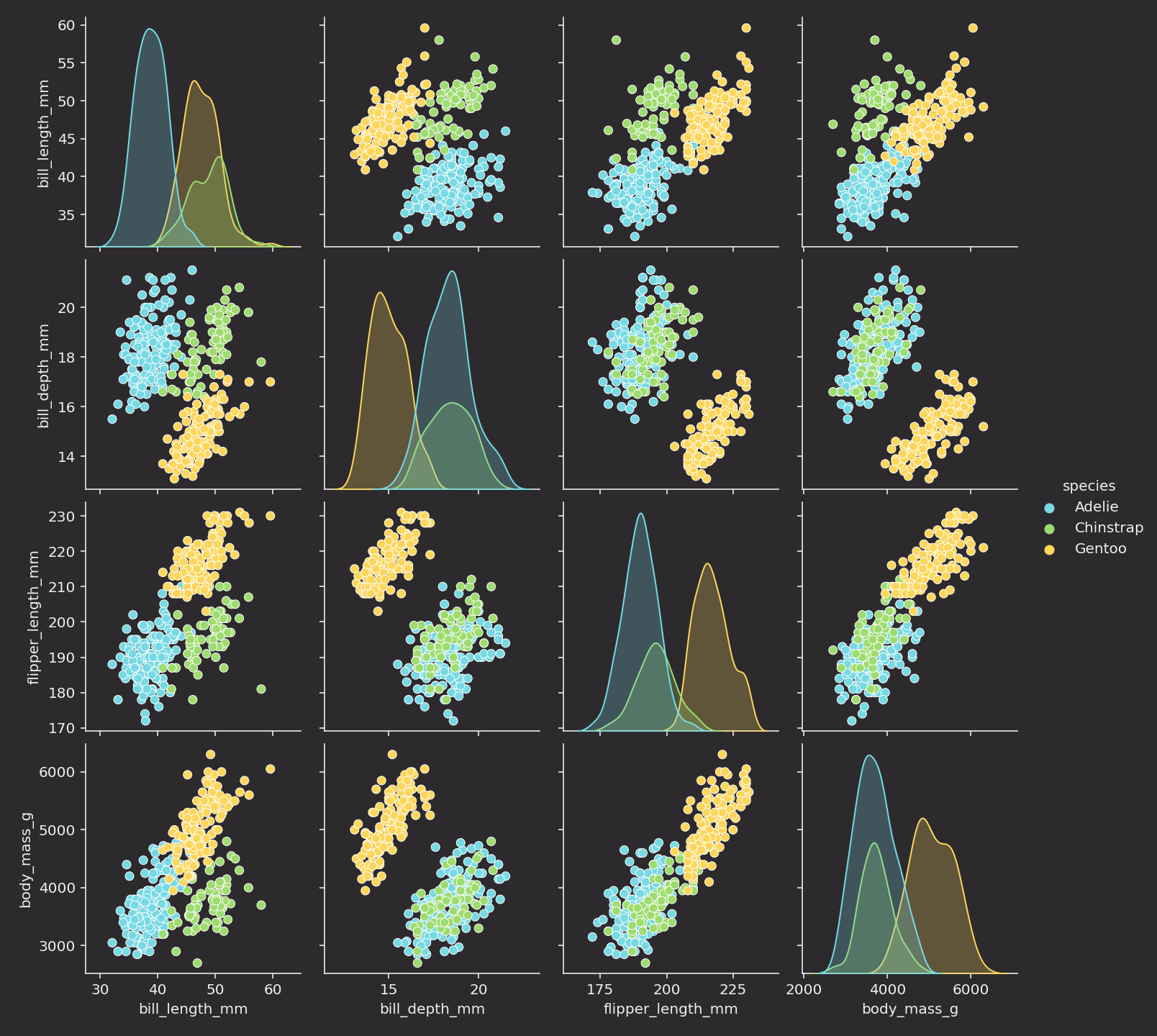
Here is the basic usage of Seaborn to show one figure:
Real-time plotting with TableAnimation
Seaborn is designed to plot data from pandas DataFrames. Unlike Matplotlib, we will convert table data to to DataFrames in the update_fig function.
Line plot
Bar plot
Scatter plot
Multiple series